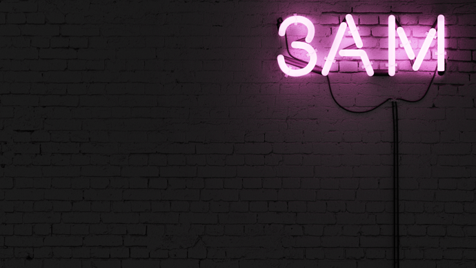
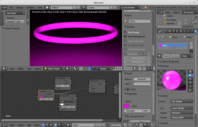
That wall is perfect! Neon looks great too, but I feel like the tube is a bit too thick. Also, you may want to mix in a glossy node using facing weight for the neon itself–I’m not sure how much difference it will make, but I think it would add realism.
Attachments
A bit too thick, I could see that. On your material note though, neon doesn’t really have a lot of color other than it’s emission. It’s often too bright to see any gloss or color. See my attached photos.
Even though it is simple, it works for me. I agree that the tubes could be thinner. And I think that the ambient light on the rest of the wall could have a circular gradient, so that it looks less flat.
And about the composition: Although I really am not sure about this, I think that the neon lights are a tiny little bit too close to the top 
The other thing the mix does (and this is more important IMO) is fades the emission near the edges of the tube. This is visible in your examples. At any rate, it’s just a suggestion–the wall gives this piece the most realism anyway, and that looks really nice.
I see, I will need to learn more about lights and such in my next one. Thanks
nice thing for a wallpaper, good job 
I’m loving it! Simple and minimalistic. Less is more, you know. Perfect concept and very artistic, too.
Congratulations!

