Certainly. I noticed your paint doesn’t have ray mirror turned on, is this on purpose or is the user supposed to do that?
I also fixed the mirror and the seat and made the windows a bit more quaded. Upped the lighting with a hemilight from above. Changed the AO to ‘both’ insted of just ‘add’, which had the sad effect of hiding the license plate, oh well.
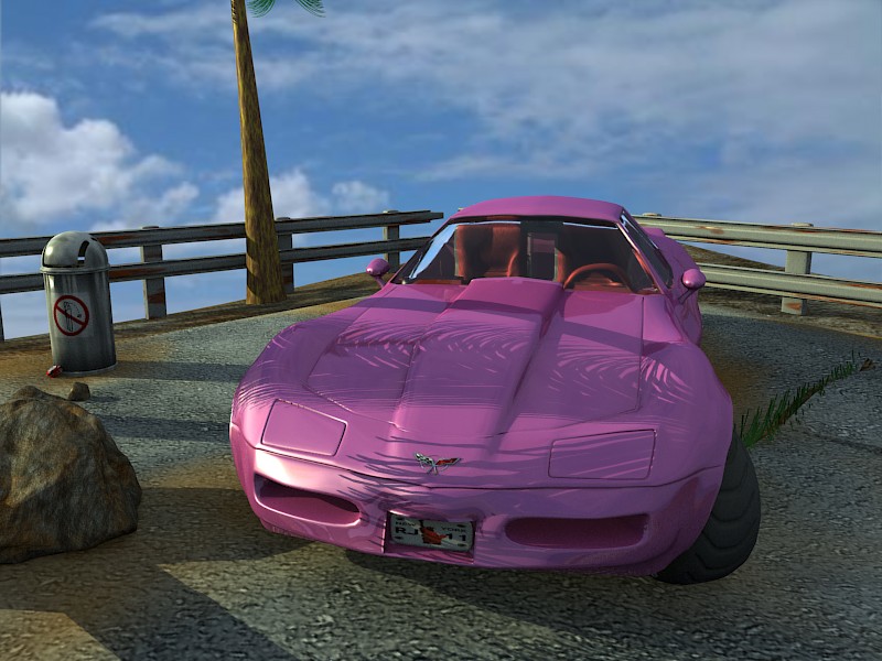
I’m thinking of a “don’t drop your trash on the ground” sign somewhere in the background and a trashcan.
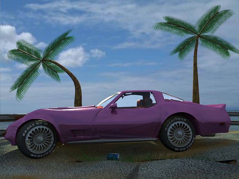
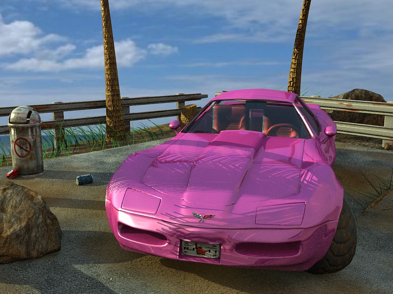
Two new renders for all of you to comment on. I think I’m making slow progress. The lighting is better IMO, you can even see the tire treads now.
Where the tires go into the car, there are many things looking wierd. And still they lineup with the ref-image. I guess it’s time to throw the reference away.
That one set of leaves on the left palmtree looks a bit copied, I think the others are okay.
Second latest is the best of the corvette images.
A thought maybe useless, palm tree or two behind
the car on to the cliff and have those be reflected on roof and
hood and the sky texture also to make some reflections.
That is just an idea and easier written than done.
You’re absolutely right! The roof looks very ‘bland’ in those shots, and adding some palms to reflect really makes a difference. I’ll post yet another shot when I get some time to render one. I’m just trying to decide how I’m going to put the background in.
Yep, I looked at it and that rampshader seemed to be the ‘point’ of your car material? Well, I havent used those things yet and I don’t think the render did your paint justice, so I changed back to mine.
That’s a good idea. Could be much to modell though, but I’ll put that in my “ideas”-bag. I even googled some ref-images and that could work nicely.
The car is all well and good and the ground is decent. For some reason the gravel seems flat instead of lightly rocky. The palm trees don’t fit the scene. Most of it seems to going for a realist look, which is good, but the trees seem to be plastic (especially the palm leaves). Look at some pictures to find a better look for them.
Yeah, it’s just a cloud map with a colorband now. I’ll try and put some rocks in it.
By the palmtrees not fitting in the scene, do you mean they shouldn’t be on a cliff like that IRL, or that they just look like crap?
Yes, the leaves are just dupliverted and therefore look very plastic. I might try to fix them, or then I’ll just take shots from the front view, that maybe being the best.
I still could use some suggestions about what to place in there. Especially the right rear could still use an object to take away the empty space.
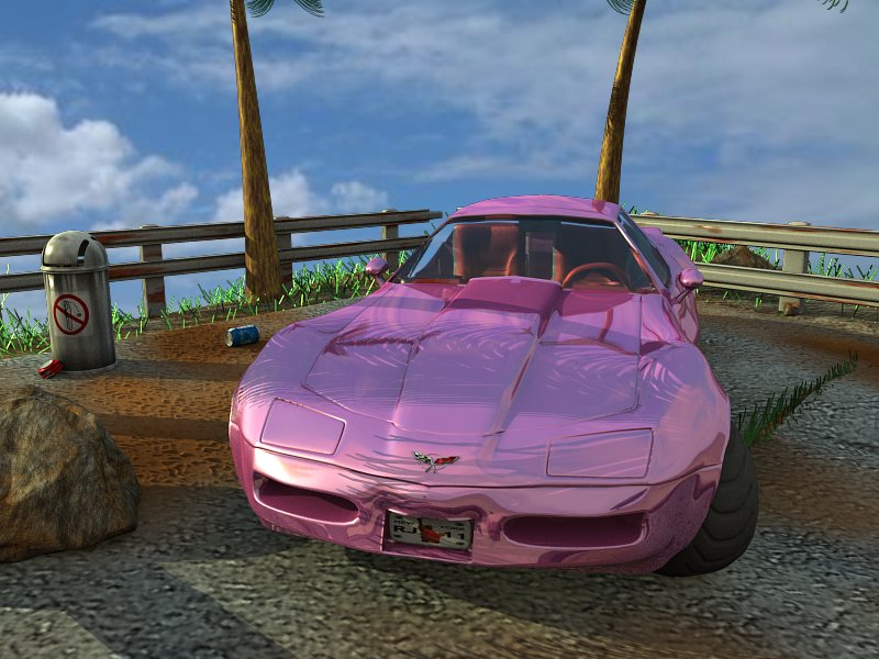
The image is close to photoreal.
I think the air brush look which i see in the image is due
to image having lot of saturation. And due to lack of few realism
things.
A suggestion, make an another version in which you get rid of the current lighting and light it for a nightime scene maybe with only one light.
The ground looked more realistic in an earlier image.
Sorry, but I don’t understand. I googled but still don’t get it. Wikipedia talks about saturation as highly saturated hue has a vivid, intense color, while a less saturated hue appears more muted and grey.. So the image has a lot of colour? As I don’t know anything about colour theory it just goes over the top of my head.
I actually had an idea of trying to make it rain. That could go together with your idea and have less light.
Good calls. I just totally forgot to turn on raymirror for the trashcan and the ground looks way better now. I might have accidentally done something to it at somepoint.
You didn’t say anything about the grass?
The 800x600 image with AO at 12 and AA at 16 takes around one hour on an Athlon2000+, 1GB machine. And thats with an optimized build by Caronte (thx). I haven’t even tried rendering it with a vanilla-blender yet (and wont).
I like the grass in it. But it could be bend some.
And the grass in one thing that has lot of saturation=strong color
=RGB R=0 G=255 B=0 Well not exactly that, but close to that anyway.
The brown area on ground also very saturated.
Vette very saturated.
The over saturated factor makes it look cool=nice=good, but not photoreal.
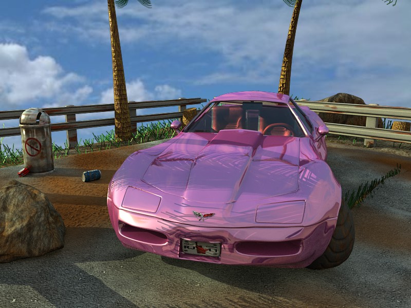
Some things regarding rendering. When you make the altered version
i would recommend rendering osa 5 and without ao, for one thing the rendering time would be very short and would make tweaking easier.
And for this particular image these settings actually maybe make it
look closer to photoreal.
or render no osa 2x pixels horizontal, 2x pixels vertical. Then post process tweak maybe adjust colors and then set image size to half.
I guess this would be same as osa 2.
If you do postprocess it is important that you do it before making the image size smaller.
The can should be the right size, maybe the positioning makes it look otherwise. Variance, as in height or what? A bit more ‘random’ to those particles should do it, if I’m not mistaken. I’ll try to work on it.
I allways thought that that looked better. This way you sort of see that there are leaves at the top of those palmtrees too.
Right again, so it could. I’ll try putting in some curve guides.
Ok, now I’m starting to see what you mean. Those images have all been straight from blender so maybe it’s time I looked into some postprosessing also.
You mean the final render also? Ofcourse I do render pictures with size=50% and lowered AA and AO when I’m tweaking stuff.
Ok, I’ll see about that. Maybe I’ll post an image with lower settings.
It’s been a while. A month actually (and I even posted this to finished projects). I thought about revamping this project, that metal-shader-wannabe left bugging me. I thought that while I’m at it, I’d spice it up a bit.