I still prefer the old one to those proposals TBH.
I think proposers hasn’t made a study over their logos.
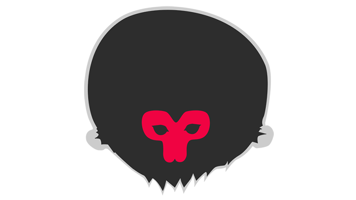
Some are a brutal shakes of logo and mascot concepts and some of them are just random things thrown away in 30 seconds.
The mix of a flat design (which is IMO the right way for a logo) and distorted perspective is disturbing.
I dont. A logo must be simple, all those fur strands make the design complex.
To all those who prefer the original, don’t worry, I heard you loud and clear and I do prefer it too myself (so far).
But at this stage of the research, this thread is more a call for participation and help than a call for voting on whether to keep the original or not, as we are (or “I am” if no one joins the party) too early in the research for taking any decision.
None of the examples I gave are by any means at a final stage and they should be more seen as rough ideas or concepts which should be subject to improvement (maybe the fact that they are vector drawings rather than hand drawn sketches was a bit misleading).
That’s your taste, which is fine, but to give an example, the Marmoset Toolbag logo has some fur and I quite like it personally:
Again that’s your personal taste, but the blender logo has a mix of flat design and perspective and, again, I like it personally (at least I would like it less if it had no perspective at all) :
Though I could certainly argue that the perspective in my examples is too accentuated. I shall at least diminish it.
Well, not really. There are trends and there are graphic design principles. You can find a lot of people here who know how to use the same tools that are used to create logos and a lot of them will not lack imagination, but that is not enough to create a good logo. Experience and knowlege in that particular area are needed. I think the community would struggle comming up with a proffesional looking result. Best thing here would be to hire a good proffesional with loads of experience in this particular area and pay him well. From my experience proffesionals of this kind do not ever work for free. If there are no resources left from donations to move to Disclosure for that, then in my opinion the current logo should be left alone. There are no mistakes in it at least and it looks balanced and profesional enough.
So you are saying he should not try and come up with something better? Even if he fails, it won’t break the old logo. The community won’t be forced to use it.
You think so, but you don’t KNOW that. What if 20 years ago, Ton used the same argument and never tried making Blender at all? At that time, professional 3D was only made by ‘professionals’ with lots of money. You could say the same thing about the open movie projects too.
Trying to do things better, out of passion and just to see if it can be done, is the very spirit of Blender.
That’s a correct observation - I am expressing my thoughts. I think there is a distinction between graphic design and open source programming projects as well as the concepts of free open source and no money involved. I have seen a lot of amazing free and open source software around, but I don’t know any amazing logos done for free. If you have some examples in mind I would love to see them. I suppose there is no harm in trying as long as it is done seriously. It’s just that ‘Everything goes…’ or questioning fundamental design principles does not sound like it for me personally at least.
It seems we both are participating only by discussion. I have no problem with that to be honest, but I see you had an idea, that participation must somehow be more visual… Well… Why don’t you show us what you mean by following your own idea then?
You guys, let’s not waste our time and energy in an unfruitful argument. Constructive critics on the existing proposals are a way to participate and proposing to hire someone is nothing of a bad idea. Now, given how many don’t seem to be up for a change, I’m not very confident about just creating a poll here.
But here’s a way I could see it be done : Bart is considering creating a Patreon to help maintain the website. So I asked him if he would also consider adding a Patreon goal (probably in the last goals) to hire a professional logo maker for the task in the eventuality that all of our trials didn’t get good enough. Let’s see what he’ll say about it.
In the mean time I’ll follow some of your advice to try and improve my existing examples :
less accentuated perspective
less but bigger fur strands on the ape
and some other ideas of mine
'til then, know that I provided the project files for most of my examples in the original thread so feel free to come up with your own modifications (here or there, as you prefer).
These are some Opensource/Free applications with good logos/icons.
Firefox, Logo https://en.wikipedia.org/wiki/Jon_Hicks_(designer), Colloquy, Inkscape, Vim, NeoVim, Sequel Pro, OpenEmu, Vagrant Manager, Tune Instructor, Docker, FontBase, Anaconda.
In the case of the Firefox logo, someone came up with the concept, a designer saw it and made it what is. You saying he should not do this because only professionals can make good logos just is not true. Even if that was true, a professional might be a blender user and decide to help.
Like I said before, at the time Blender started, only professionals created top grade 3D software. If they followed your philosophy Blender never would have happened.
I think there is a distinction between graphic design and open source programming projects as well as the concepts of free open source and no money involved. I have seen a lot of amazing free and open source software around, but I don’t know any amazing logos done for free.
I don’t see the distinction at all. Open source happens because people that are often professionals, that usually do work for pay, decide to make something and work with other contributors to create something. Who says it can’t happen with design?
I suppose there is no harm in trying as long as it is done seriously
Even if it is not done seriously who cares? It is just ONE forum post, there is nothing to lose but something to gain.
Sorry, with your “if… then blender never would have happend”, you are on the wrong argumental trip. blender per se has nothing to do with it’s logo in sense of (your) existance as an open source project/software. And to be honest, if you would have been able (at the moment this is not online anymore) to follow the “evolution of blender-logo”, you might have noticed, that it has been a long, long way up to the entire - and also by TM covered - blender Logo.
Yeah - that example might be a way to do, as I would suggest anyway - taking the “startup-blender-cube” and add the well known typo of ba - that’s what I ment, when I said in my prior post: “… as close as possible to the entire one…” For a first step, very good.
I wonder, is there any licensing issue with the current logo? Like that you are not allowed to use it on the new site for some legal reason? Because the logo doesn’t really look that outdated. It looks minimalistic and nice. I don’t think it needs to be changed just for the sake of change.
The thing that always bugged me a little about the BA logo is that the letters are partially truncated while in the Comic Sans font (almost as if the designer chose the wrong font size).
The letters could fit in the orange box a little better (and maybe a somewhat classier and/or cleaner font could go with it).
My two cents anyway, it can be combined with Burnin’s riff of the default cube. As for whether change is even needed, the entire site is being redone somewhat with the move to Discourse (so a major update can always be a time to tweak the logo).
The current logo is fine, and, let’s face it, none of the proposals here are any good. Here’s my rebranding advice that I would shamelessly charge other clients a billion dogecoins for:
Change the font and get rid of the rounded corners.
<imagine mockup here>
There’s only two types of people: Those that are annoyed by incomplete information.