This is my latest work. I created this using prismacolor colored pencils on pastel board (sand colored) Actual size is 16" x 20". This board is great to use for colored pencils (except for eating up the pencils quicker than paper) because when it’s finished you can spray a varnish on it and frame it without glass (nice money saver). All comments always welcome.
Scott
It’s very beautiful. However, I think that the “cylinders” and the violin look like they’re goint to fall, which blows the “peaceful” theme a bit, IMHO. But very nice nevertheless^^
Very nice drawing. I’ve always wanted to use color pencils to draw like that but, in my city, is very hard to find individual colors and variety. Have you tried Derwent products? They look very good.
I really like the image you have - it’s very reminense of the older types that the masters of the first great paintings did. Look forward to more of your works.
Pretty nice, however i think the middle candle support is a little smaller than the others.
Derwent are the best i’ve tried so far, however, it’s very hard to find where i live and very (VEEERY - something like 10USD a SINGLE PENCIL because of taxes) expensive, so i am using staedtler ones; very cheap :D, i’m not that pro (talking about coloured pencils), so i don’t need the best pencils.
However, i draw some very nice b/w pictures using graphite pencils (and a little of charcoal, and a little touch o colour sometimes) so i buy the best pencils to draw the “final” pictures. To draw the sketches i always use staedtler or faber-castell, very cheap and very nice, the gap between these and derwent is very small. Another nice brand is conte, however some of them are bad.
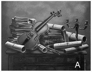
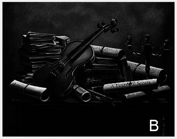
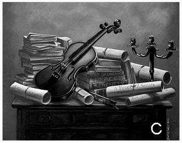
Nice work; it’s a difficult subject with lots of “stuff” in it. With a subject like this, it is really important to work on the structure of the image. That is light and dark composition. Attached image “A” is the grayscale of your original work. The image “B” is its light and dark composition; it is kind of all over without focus. The image “C” is one scheme I generated to clarify composition using light and dark. Do you see the difference?
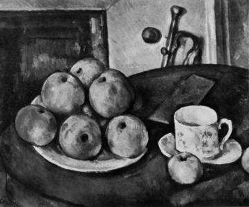
One of the good sources for studying light and dark is to look at Sezanns work. He is master at color. But behind that color is the absolute indestructible light and dark structure!