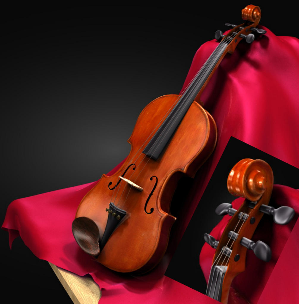
Well, I made this last weekend for the weekend contest. It’s the first project I’ve really finished. I decided to post it here for some tips, and criticism of the compsition lighting materials… everything really…
Great work
My only recommendation is that you change the cloth to a softer or more matching colour…
I’d say try with purple, red or a ‘wine-ish’ colour
really nice! It looks great!
I would recommend maybe turning down the specularity of the violin body and at the same time decrease the hardness a little bit. Also, are you using ambient occlusion?
But really, this is really nice, I’m quite impressed.
Yeah, the cloth was kind of a last minute addition. I was trying to go for a velvety texture, but it turned out kind of glowy, wich I ended up liking, but I agree, I will try some color changes and I am still fiddling (no pun intended) with the spec and nor of the body, I like the neck the way it is though. And yes, I’m using AO. I’ll make some more tweaks and upload it again
Okay, here’s some more tweaking, I adjusted the hues of the body’s texture, and the spec and hardness, and I changed the color of the cloth. I like it a lot more now, what do you guys think?
Oh, and I realized I had turned AO off to save time on that first photo, so this one has AO…
I do agree. I know you’re basically just showing the violin, but it would be nice if the rest of the music room were shown in the background. Maybe a little DOF?
Yep, I’m just starting to learn about DOF, and am really liking it. For this render though, since it’s a desktop, I like the gradient background. I think I’m going to leave it as is for now, and maybe later once I get better, try putting it in a complete scene.
looks nice, but there are still few details that I don’t like:
the front board is too flat - only very cheap instruments have such a flat board, look here: http://en.wikipedia.org/wiki/File:Violin_VL100.jpg
the strings should not have the same thickness and should be closer to the fingerboard…
beside that it’s a very good work…
Oh! Actually, I did paint on an unfinished wood there, but I forgot to save my image that I was texture painting to. That was very dumb of me… I may go back and do it again later, and add on some DoF, we’ll see…


