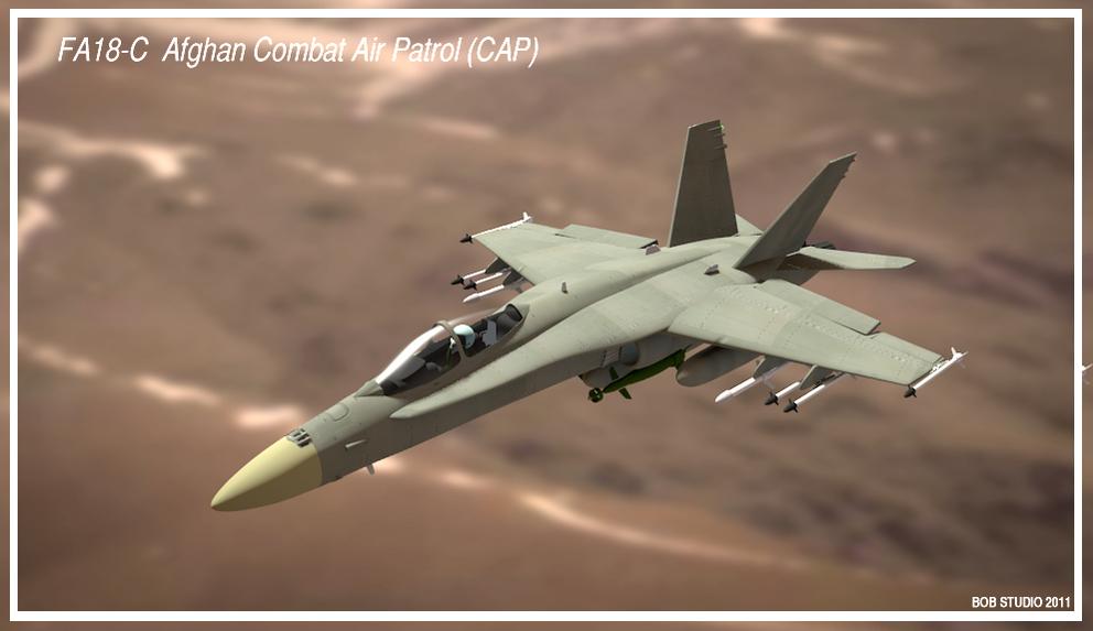
There are many things that could be improved on this picture, but I’ve come to a point where my skills cannot bring me any further.
I’m not into any politics, I just love beautiful planes …
Comments and critics welcome !
thanks, all and have a nice day !
Well, quite well!
I would suggest:
- improve the background: at this moment it does not look like a real, flying airplane, but as a model hinged in the front of something blurred;
- some details look too crude: the canopy frame seems to be to “thick”, the leading edges of the vertical stabilizers seems to be also “thicker” than in the reality…
Nice. My only comments (and it could be because of the focal length of your camera) the size of the cockpit is wrong for the size of the rest of the plane. And the color of the plane is a bit too green. YMMV. Other than that it looks great!
Nice Job! Congrats!
Looks good. I suggest you could try lighting it with the environment lighting and an hdri image. Maybe add some subtle reflections in the glass of the cockpit. Some clouds might help add to the scale and maybe some streaks from the wings. The pose of the plane could be a bit more exciting rather than just sort of sitting there at 0 rotation, try rotating the plane slightly to one side to add some more dynamic energy to it. Maybe also the reflection of the sun in the glass and on the plane to indicate that its a hot climate. To me the blur of the background is ok but perhaps show more of the terrain. It feels quite orthographic at the moment which is probably the reason why the scale seems off.
Hope this helps. Good image, congratulations.
Really nice model!
Only suggestion I can add is that I don’t the ailerons should both be up like that. Unless the hornet is different, I think they should either be flush with the wing or one up one down if it’s rolling. Haven’t had a close look at one but I also think maybe they should be more tapered towards the back.
Still, love it 
hey, you all, thanks for your critics and comments !
@Witold : I’ll keep your recommendation for the canopy frame and the stabilizers. Thanks!
@Place57 : yup, you’re right about the cockpit size. Some of those obvious details you can easily overpass when seeing the image for too long !
@Ricardo3D : thanks for your encouragement ! It’s sometimes as useful as a constructive critic !
@Benwilson : I’ll try your suggestions for the lightning + environnement. Thank you for the good advice !
@James White : you are right, too regarding the ailerons. I was trying to pose them to check on the “animability” of the plane, but forgot to put them back in place.
God, I wish I had more time to spend on this, but given the feedback, I feel compelled to tackle with it again. I’ll try to upgrade it according to your comments.
Thanks again to you all and merry blending !..
It’s definitely good modeling! However the airplane looks like a toy airplane because the background is quite blurred. I don’t think the background has to be that blurred, if it has to be at all.
If you are going with a blurred background you should try having the background streaked to give the impression of speed. Nice job on the modeling of the plane.
Great, maybe a bit of vector blur will make your image more realistic…
OK, given you were all kind enough to comment my picture, I decided to make a few modifications, trying to keep in mind the best suggestions. Looking at it, it’s still greatly perfectible, so I’ll probably move this thread to the WIP section. Err, yes, I made that mistake before. Blame it on … inexperience ? yeah, make it that…
@blenderfan : here I’ve tried with the streaked background, as you suggested, but also gave it a try without blurring the ground at all (or just a minimum for the impression of distance), as Jbest rightly noted. Both results are equally pleasant, in my opinion, so maybe you will help me make this image more perfect than I thought I could make it. Well, enough talking. See you all in the WIP forum. Sorry, moderators.