Tell me what to think, submission is on wednesday … so only 2 days left.
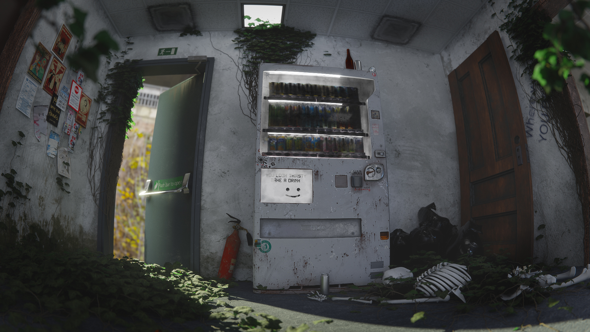
The vending machine on the right side is my reference, so only an image on a cube.
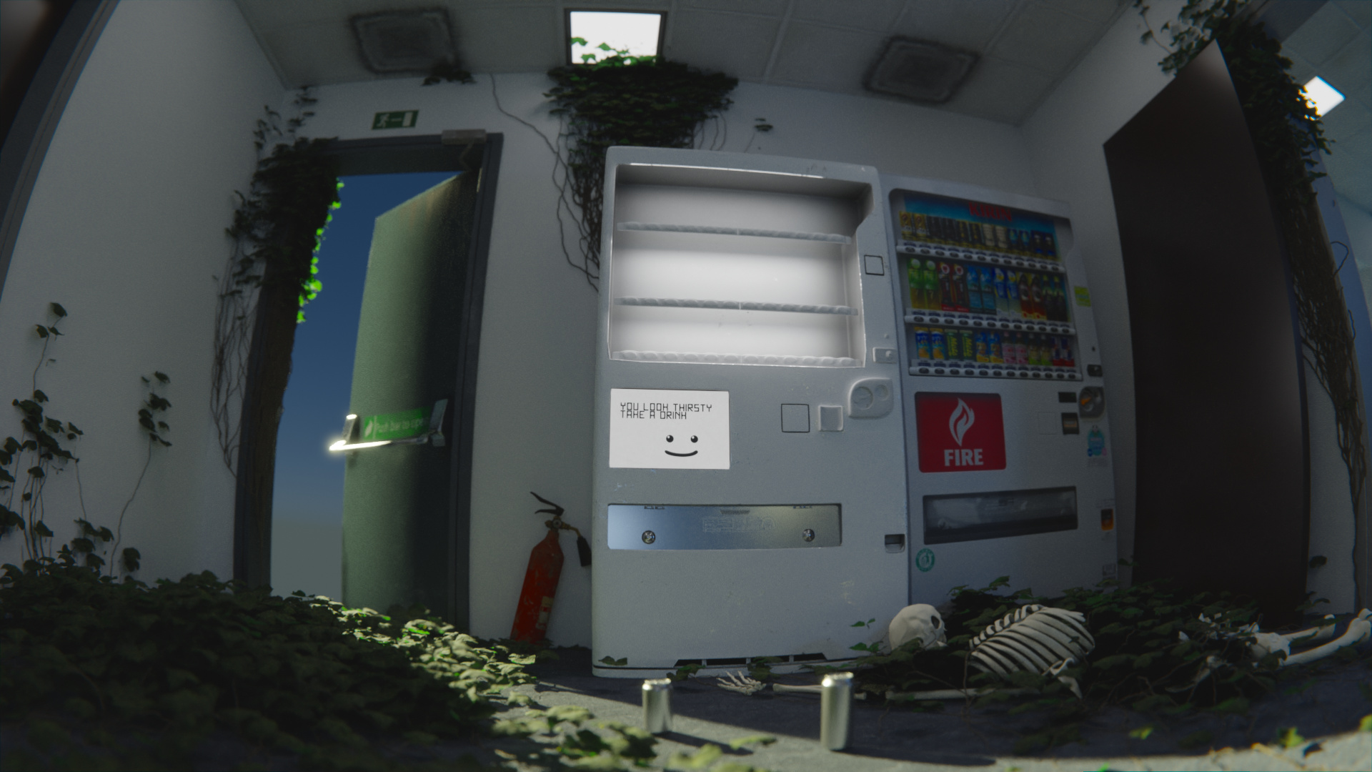
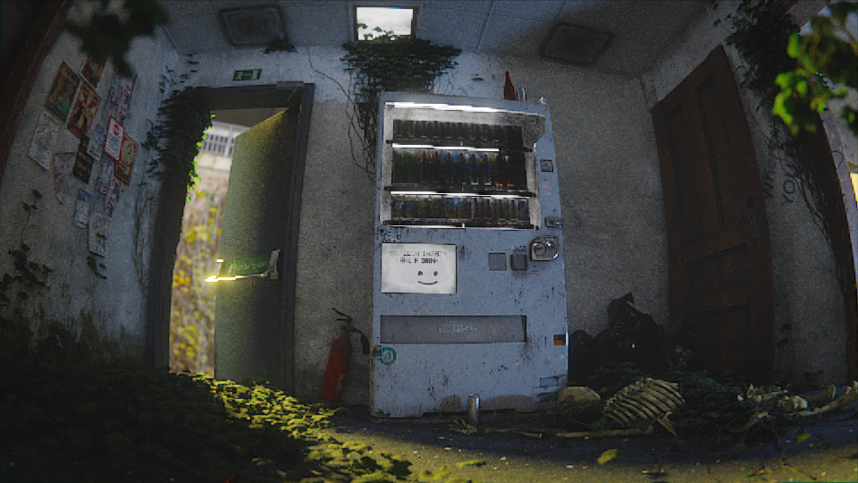
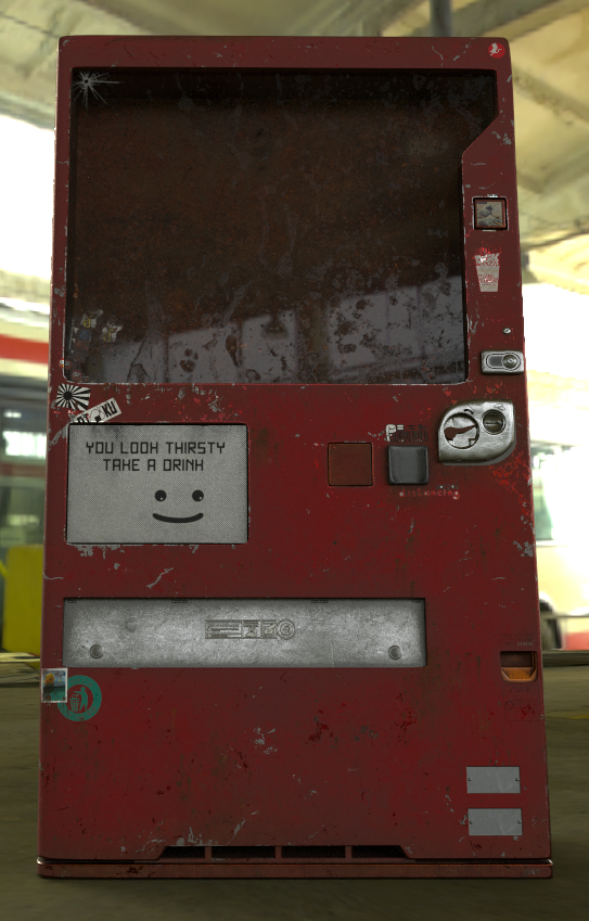
still things to rework, but somehow I just can’t get the “quality” of this image beyond what you see. I need help and I don’t know what I’m doing wrong. First thing I try to go on is the light.
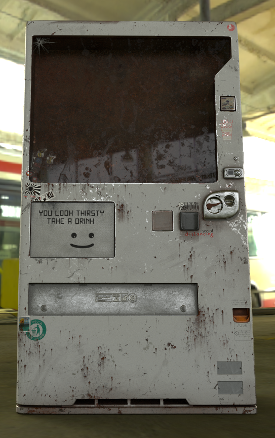
I’d say your textures at the end there on the vending machine are pretty good in fact. The wear and tear looks pretty legit, I like it. Maybe I’d add a nice long crack going across the glass, as something that old and “beat up” would most likely have some cracks in the glass, but that’s personal preference perhaps.