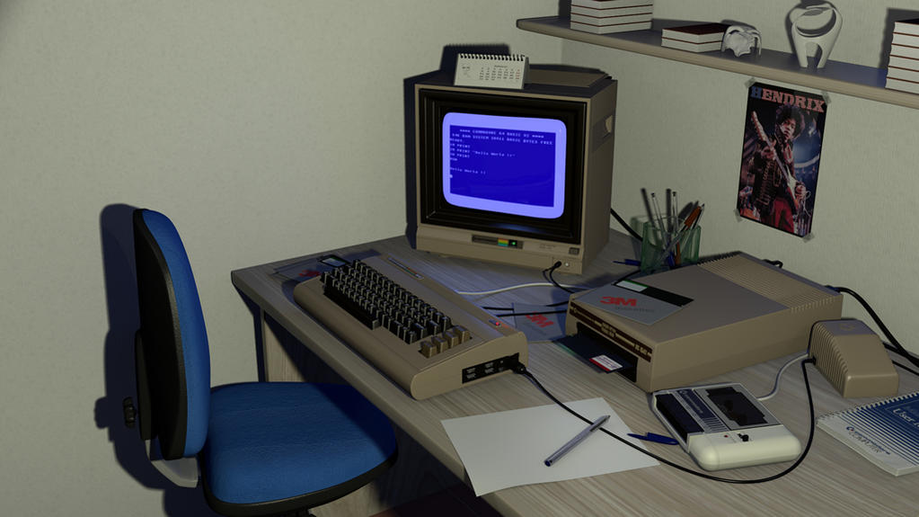
I actually learned coding ( my day job ) on one of these ( basic, oxford pascal… c and assembly too… and it is still working too… overheating after a few minutes excluded !! )
Ignore the books on the shelf… not much work on these… maybe I should just remove them
I have a friend who has a computer of similar age (an old mac 128K). Judging from the size ratio of floppy discs to the screen of his computer, I think your floppies may be overly large (however, his screen could simply be bigger). If you do decide to remove the books, I would replace them with something since it wouldn’t look right to have a cluttered desk and a barren shelf. Your light placement is a bit odd as most office lights are on the ceiling yet your shadows suggest the light is coming from below. Other than that, I like it. The Jimi Hendrix poster is also a nice touch since the walls would be fairly boring without it.
you’re right… floppies are a bit huge, but because they really were huge ( not the biggest actually )… if my memory assists … the mac floppies were already 3 1/2 inch while those of the commodore 64 were 5 1/4 inch and were flexible
but maybe also the monitor is smaller than it should be
thanks for suggestions, i’ll try it with a different lights setup
The books on the shelf are stacked too perfectly and are al the same.
The wall left of the chair is a bit empty.
The texture on the seat of the chair appears to have visible texture seams.
I wouldn’t necessarily say the books all looking the same and being stacked neatly is a bad thing. I stack my books in perfect columns, but I doubt anyone who leaves stuff around their desk like that probably wouldn’t have padantic piles of books.
Are you already using Ambient Occlusion? At the moment the pen especially seems to be floating on the white piece of paper and a bit of AO might help highlight those areas were surfaces are close together. Also on the topic of the pen I don’t know if one would naturally sit like that on a cable, it might look a bit more realistic if it was resting on the page instead.
The whole scene might benefit from Global Illumination which is apparently present in Blender in some form from version 2.56a onwards. It would be a bit more realistic to have a slight blue glare from the screen illuminating the walls and desk near the monitor and in other areas because you have a lot of high gloss surfaces in there. If you want to know more check out this article here:
yes, Multiply at 0.4, maybe was also the shadow due to the light setup to make the pen a little strange
The whole scene might benefit from Global Illumination
I’ve tried to activate it… changed gather from raytracing to approximate and checked Indirect lighting… Blender get stuck in “Occlusion Preprocessing”.
Maybe I’m doing something wrong… I’ll try it again after I’ve read the info in the link you provided… Thanks for the link.
The books on the shelf are stacked too perfectly and are al the same.
The wall left of the chair is a bit empty.
The texture on the seat of the chair appears to have visible texture seams.
For AO there is a thread on this forum that uses a glossy shader to help you with that, or you could try using an external renderer?
I think the threads in the Compositing and post processing section of the support forums
good luck
EDIT: I think there is a renderbranch build on graphicall that supports raytraced indirect lighting, which might help. If not, you could try placing your own GI lamps tactically
I’m using it in a project of my own at the moment and it usually sits on pre-processing for about 20 minutes, what’s the polygon count of your scene? The changes you’ve made so far are definately improvements. At the moment your scene appears to be lit from above which is perfectly fine of course but if you wanted to add a bit more dynamism what if you made a ‘real’ light source, such as a desk lamp or a window or pumping up the light emitted from the monitor. If I remember correctly those old radiation kings used to put out quite alot of light compared to modern LCD screens.
LOL, it wasn’t until I read to the end of the OP that I realized this was a render, not some reminiscing about an old computer. It’s close to perfect, nothing to critique.
For the sake of keeping the mods who frown upon pointless posts in this forum at bay, the shelf on the left of the scene seems a bit empty… I don’t know that most people have a whole shelf for a single book. Great work so far
I reckon the desk needs some dirtying up. Add a specular map with some scuffs and scratches, dust in the corners and maybe a coffee ring or two. Just looks a little too clean right now.
and it usually sits on pre-processing for about 20 what’s the polygon count of your scene?
wow, so it wasn’t Blender… it was just me impatient ( i’ve waited just about a 8\10 mins )
I checked it yesterday, with almost all the subdivision surface modifiers with preveiw = render the are about 1.100.000 vertices looking at the top of the window stats , takes about 50mins to full render
the shelf on the left of the scene seems a bit empty
I agree, but I was trying to figure out wath else to put in there… maybe a floppy box, or maybe a joystick ( i’ve played a lot of cool games with that guy, even my first flight simulator … sorry … I’m getting nostalgic )
Personally it bugs me that the paper is blank, I don’t have a single sheet of paper on my desk undoodled, unsketched on. I would add opened envelopes as they could add something destructed a little, so the scene isn’t in “Mint Condition”. I would add visible wear to the chair as I live at my desk and my chair is worn.
Something which would really move this piece into a whole new class would to add exterior lighting from a window etc… and get rid of the artifical lighting other than the screen.
Example morning light coming in through a window, ability to see a little of the dust spects and a reflect of the room on the computer glass. Right now if looks like ambient occlusion with another harsher source layered on top.
I do not feel that your piece is in the wrong direction, I honestly can greatly appreciate your detail for antique technology, as some are to young to have ever even seen this in person.I am also not sure the perspective gives the best view. I feel a camera angle closer to the table, with objects right up close, and then others visible further back would give greater depth.
Thinking in the eye of a photographer, it just isn’t interesting, but if I am seeing right over the pen, and the computer screen is in the back tucked behind the keyboard and disk reader and I can see the markings then I become amazed.
I think your subject matter is terrific, I think your models are extremely accurate and close to the genuine article, you just need stronger lighting and a better angle for your render to do your work more justice.
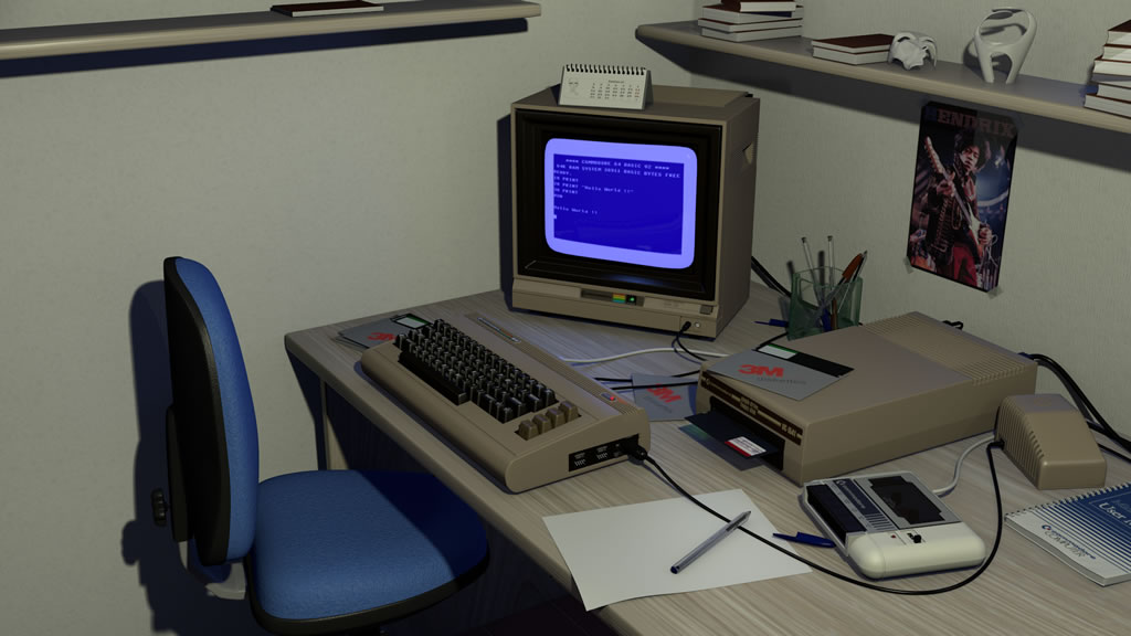
I see my ‘pointless’ original post got deleted, I guess I should have been clearer. What I meant to say was that I like the very first picture the most, because it looks the most authentic. It’s like a snapshot taken with a compact, using its on-board flash. Like so many such snapshots you can see on sites like eBay “Here’s my first computer, bidding starts at $1.” The more you pretty it up, the more you get away from that raw feel of the original. That’s it, just thought it was worth saying. Everyone is so focused on making things look better, but sometimes “worse” is better.
Hadn’t noticed till now that you told it. Thanks for reposting your opinion
The more you pretty it up, the more you get away from that raw feel of the original. That’s it, just thought it was worth saying. Everyone is so focused on making things look better, but sometimes “worse” is better.
I agree, but … now … I’m not a 3d expert… so far away to be it. In fact this is one of the few scenes I’ve ever rendered and modelled ( can be counted in one hand and half :o ) … and I just thought to post it here with the precise intention to try out any suggestion … because I can just learn