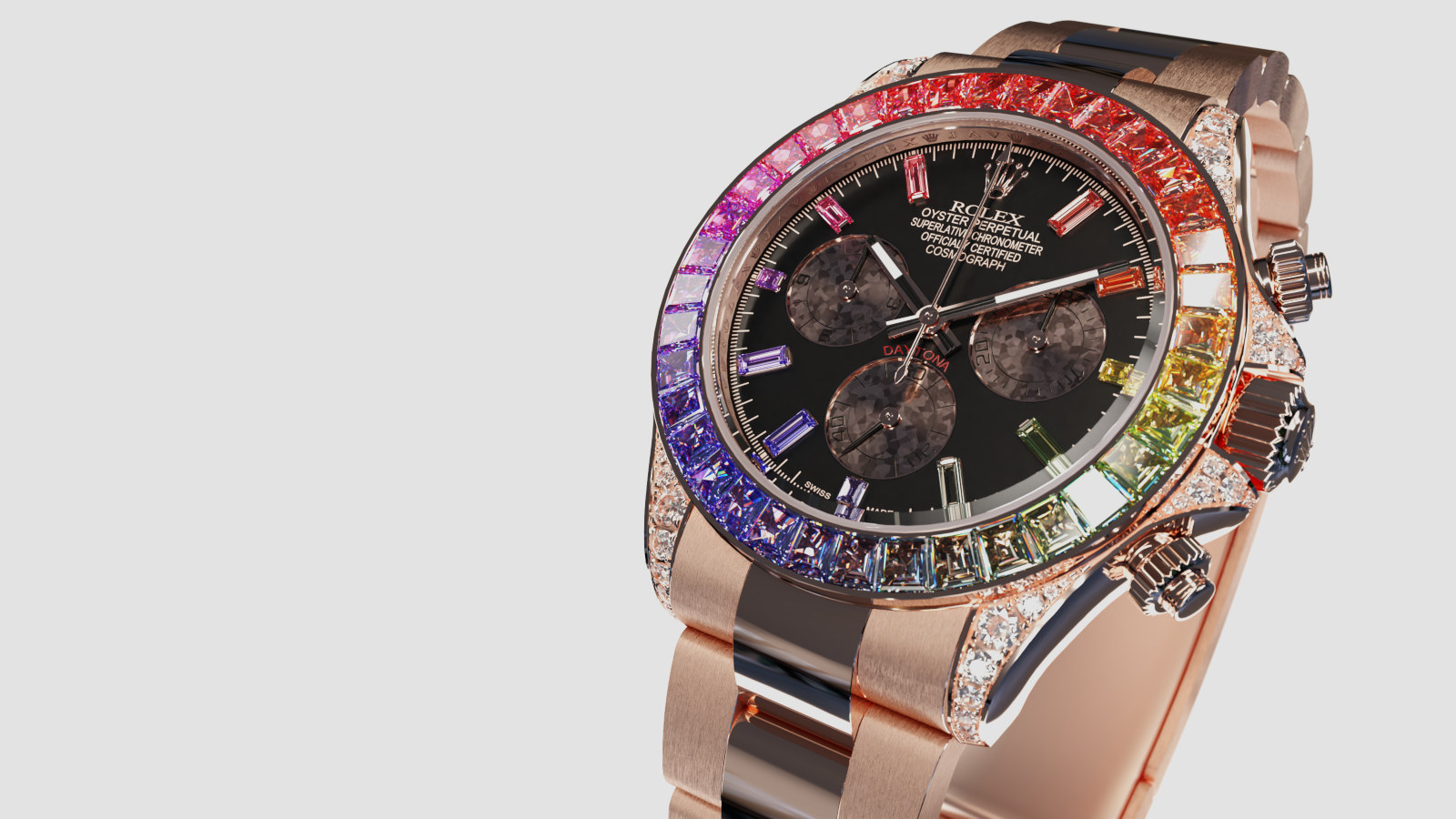
Hi guys,
Not being a graphic designer or illustrator, could you tell me what I can or should improve in this image, or what is not suitable?

I take all the comments … but not the hits ![]() !
!
Thanks
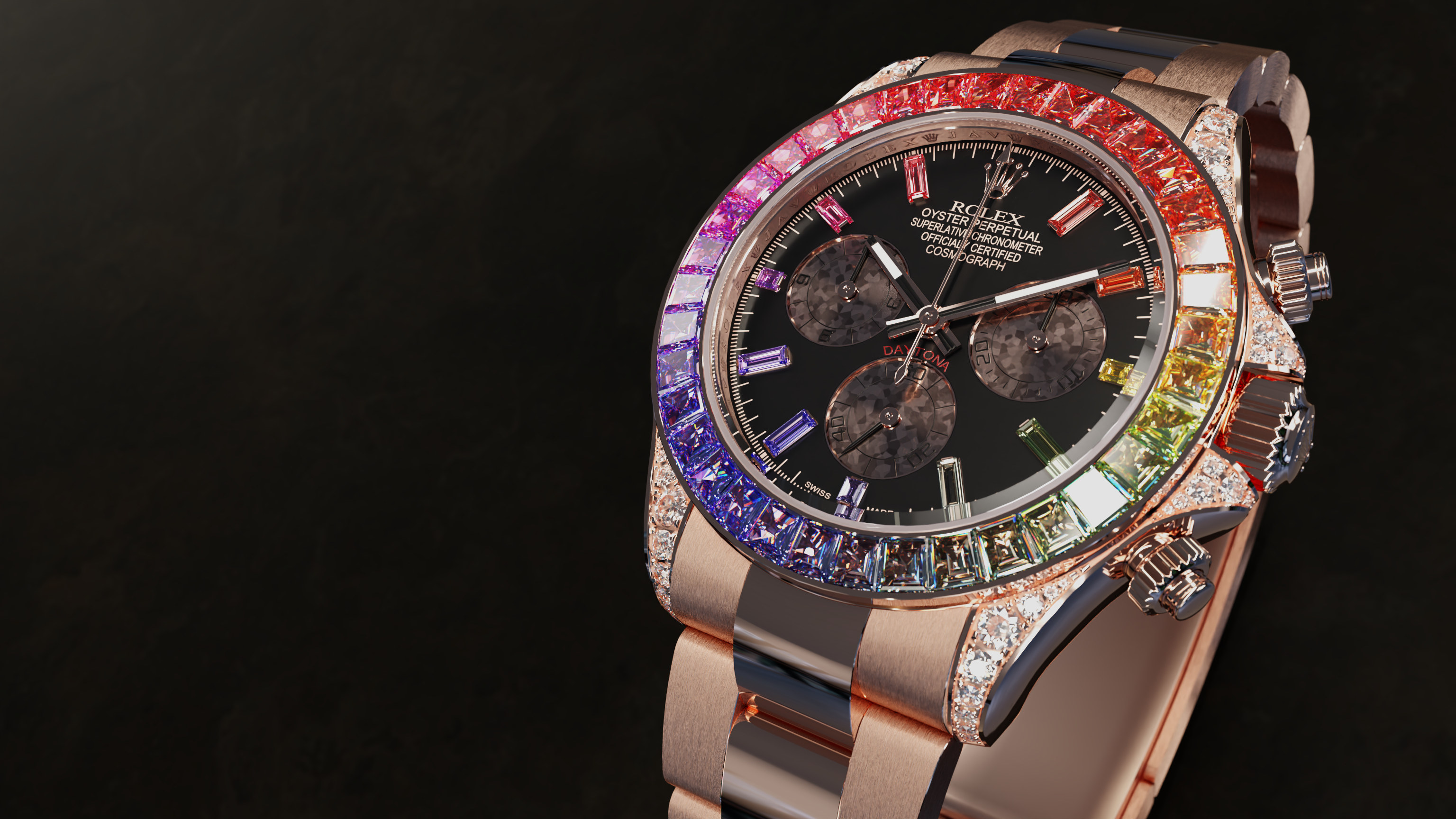
Hi guys,
Not being a graphic designer or illustrator, could you tell me what I can or should improve in this image, or what is not suitable?
I take all the comments … but not the hits ![]() !
!
Thanks
Looks pretty good. ![]()
Maybe the lighting could use some tweaking, to get a bit more realism?
The background is too nervous imo. The watch itself is a christmas tree allready. It would be better to contrast it with a calm background.
Hi,
Thank you for your opinions (which are similar), I will rework this !
@Lumpengnom, I think that when you say “![]() ” you are talking about the watch and especially the effects added in compositing, right ? Is it bad or acceptable ?
” you are talking about the watch and especially the effects added in compositing, right ? Is it bad or acceptable ?
Looks very nice, the background is distracting so I agree with @Lumpengnom it need a more calm background and the steel material that is on the belt need’s more roughness (it seems to shiny and dark imo), but the watch looks bomb ![]()
The product being bright, shiny and blingbling is fine, I mean I guess that is just the way it looks.
Your job as a product visualizer is to make the product look appealing to the potential buyers.
Right now the watch and background are fighting for attention which each other. Imo contrasting the nervous design of the watch with a calm background would solve that issue.
Hi,
Thank you for your answers and your clarifications, I understood well.
Very sincerely appreciated.
I will correct my image in these ways and I will come back !
@Metal_Mouth For information, the watch and the strap are made of a solid rose gold alloy (special Rolex alloy/color called “everose”); do you really see steel ?
See you …
Let me discuss the background and the foreground separately. The background is a monochromatic neutral checkerboard with a tear-off in the front square. Looks good, and something like this is used for a lot of things. But now your foreground. This old-school photographer would say that it is positively solarized. And in multiple colors at once. To my eyes, that “breaks” the idea that the two actually belong together.
There are various creative possibilities here. For example, you could assign a color gradient to the now-mono checkerboard. And maybe it could simply be that now the background contains “multiple colors,” as the watch now does. A successful effect might in fact be subtle.
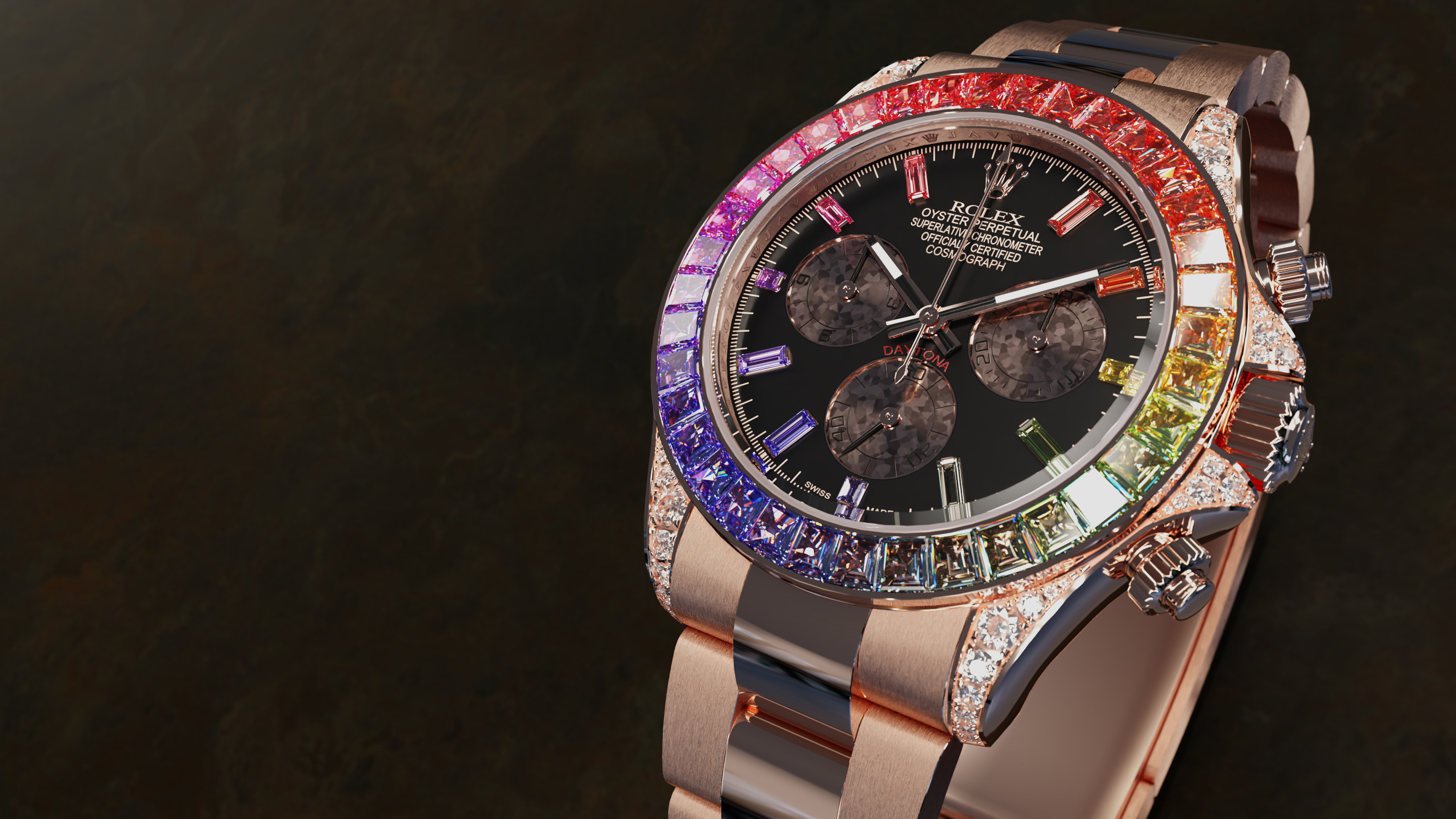
Hi,
Following your comments, I went back and tested without the compositing and with a white background (L), then I removed some lights such as the white screen behind the camera (R).
With too many lights, we “crush” some details (probably less realism), so I will stay without these lights and without the compositing.
Then I looked for a calmer background and used this one :
Personally, I find the result much better (thanks).
Finally, after the very interesting intervention of sundialsvc4, I tried this version (asphalt with small checkerboard of different colors in gradient).
This needs to be reworked, but with well-adapted integration it is obviously also possible !
Thanks everyone, any other comments, what do you think ?
See you…
Is this supposed to be a product shot like for a printed ad?
I would suggest looking at other fancy watch ads and see if you can get some inspiration from those.
I’m not crazy about your backgrounds still, black seems too plain and the other stuff is…kinda weird.
Have you considered an actual blurred photo for your background?
Hi, thank you for your participation ![]() ,
,
Yes, it is in this spirit … but we must put it into perspective (see below) !
Yes, that’s what I did, you can find everything, but a large majority is a presentation on a plain black, white or other background, sometimes degraded with often an image but clearly dissociated !
I grant you, for the second point, it’s only a “draft” to put into practice what sundialsvc4 said and for the first point, I reinforced the values to better see the chosen texture :
Initially, I excluded typographies and “photo” images, I only wanted a beautiful background that highlighted my 3D work. My choice was rocks or stones to recall the gems or the asphalt with the checkerboard to recall the circuit or the Daytona race.
See you …