Hello, here is a scene im working , and testing some light setups, rendered with povray, thanks to a wonderful plugin called Blend2pov by RCRuiz.C&C are very welcome 

Hello, here is a scene im working , and testing some light setups, rendered with povray, thanks to a wonderful plugin called Blend2pov by RCRuiz.C&C are very welcome
super! in this image, you have the lighting down to a T. It’s spectacular. The only thing i have to say about this image is the couch looks far to firm. Now this might be the appearance that you want, but the couch looks very hard. Give it some “bulk” to pad it up a little, unless thats the feel you are looking for. other than that, there’s nothing else left say, keep it up!
Thank you for your comments.
Yes you are right, im not happy with that couch, i agree that it looks too firm.Another thing i need to change its the light, to try to avoid those black spots.Again thanks for your comment, i will post an update soon ![]()
Here is an update, changed the couch, and add some other things, but i still need to adjust the light.
This is a preview, so the render settings are very low. C&C are very welcome

great work, I like it very much. I like the composition and the objects texture.
Ummm your suppose to be posting renders not photographs 
Looks great cant really say much other then that.
Ok I found something the area where the wall meets the ceiling above the couch looks a lil odd for some reason… Kinda like you erased a few areas with a pencil or something.
nice reander ther lighting looks realy good i cant realy see the second image the good to crit
guru,
this is just unbelievable:eek: …wowowowoow…please could u ‘enlighten’ us for light settings and that realistic indoor plant??
chela69
Beautiful render. The sofa does look uncomfortable. The cushions in back are way too vertical. They should slope back some. The arm rests on the sides are too high as well. I’ve seen real sofas like that. But I didn’t like to sit in them.
Looks like Blend2pov is worth checking out.
It looks good.
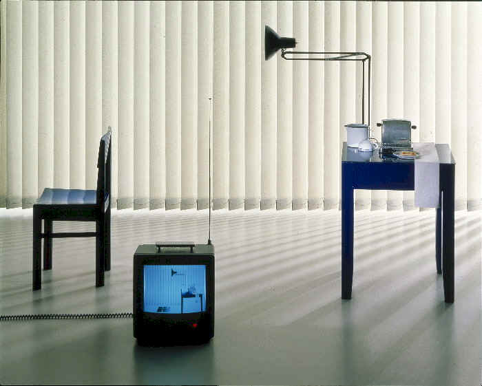
I have not used pov very much. So I don’t know how to do what I suggest. The curtains look like they have allot of light coming through the material that light does not seem to lighten up the room. The back ground out side looks great. the ceiling over the couch has some strange light artifacts where it meets the wall. That might be a low setting thing or you might have to give the wall and ceiling some unseen depth. A little of topic but you may find this intresting.
http://blenderartists.org/forum/showthread.php?t=56312&highlight=living+room
those aren’t curtains shr1k.
If i’m not mistaken those are sperate sections, verticaly.
i’m in love with the cloth on that foot-end.
is that plant a picture?
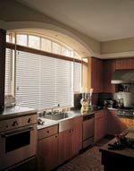
Yes they are vertical blinds I saw that. To be clear I mean the lighting in the room is flat the area on the floor,walls and couch near the shades should be brighter. The light coming through the shades looks good. It may be a realistic looking render. I just looked at a bunch of window treatment adds with Google and some are very close to what you have. The more intresting photos have more light variation.
Good work!!
I think my comments are not tecnical but artistic so you can toss them if you want 
Hello, Thanks for all the comments and suggestions
Here is a new update, i got rid of the light artifacts.
As for the vertical blinds emmiting light, actually if you look at the pictures you posted as examples, you will noticed that the objects and the position of the camera are very different from my scene, and that makes the light looks different.The one with the TV on the floor for example, its almost empty, so the light can travel farther, and the camera is really close to the window.Another thing that i will change in my scene, is the light attenuation, cause i discover now how to use that in povray, and that makes a huge difference. Then i will post an update here
Again Thank you all very much for all the comments and suggestions
PS:About the small plant, its a geometry, and was created with a nice script called Gen3.
PS1: here is a screengrab from blender


Fantastic image! Some minor crits:
-as already mentioned, you’ll want to slope the back of the couch a tad. The cushions look good now, tho.
-the white covering…is it softbody? It looks sort of like a rubber sheet to me, I think because of the angle of the draping, as well as the wavy line where it folds over the object below it. Make sense?
-the coffee table looks like its floating. Illusion?
-balcony flooring…can’t quite make out what it wants to be.
-plants at balcony…darker, I think, they seem a bit cartoonish
-balcony door should be a bit thicker and have some detail (handle, flanges, etc)
I’m curious: have you looked at Indigo? I’d love to see a comparison with Blend2Pov using the same model.
Keep up the great work!
slipknot66,
Great image. I was just wondering, how did you achieve the semi-blurred reflection on the floor? Is it just some noisy normal map? If you would, could you provide some details about how you achieved the effect?
Edit - I was also wondering what you did to solve the blotchiness issue. What radiosity settings did you end up using?
Thanks in advance.
Wow that is fantastic.