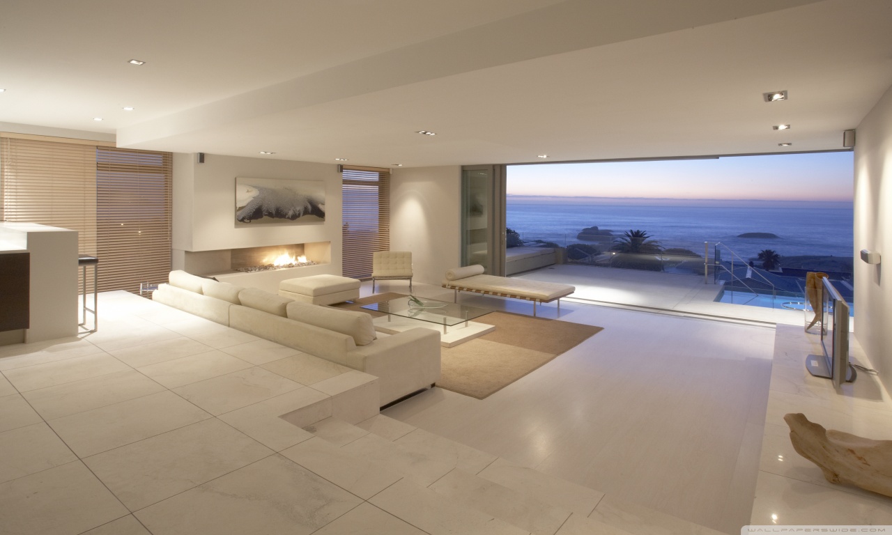
I’ve been toying with finishing touches on this image for a while. Not happy with the depth of field, since it blurs the lower portion of the decorative plant in the near field, but not the upper portion for some reason. I also need to add a specular map to the carpet that has more contrast, since the grain variability is not all that visible.
I’d greatly appreciate some critical feedback on this, if anyone has any input. Thanks in advance.
The texture on the tiles looks a bit stretched or low res. The comp is dominated by the floor and carpet; is that the idea?
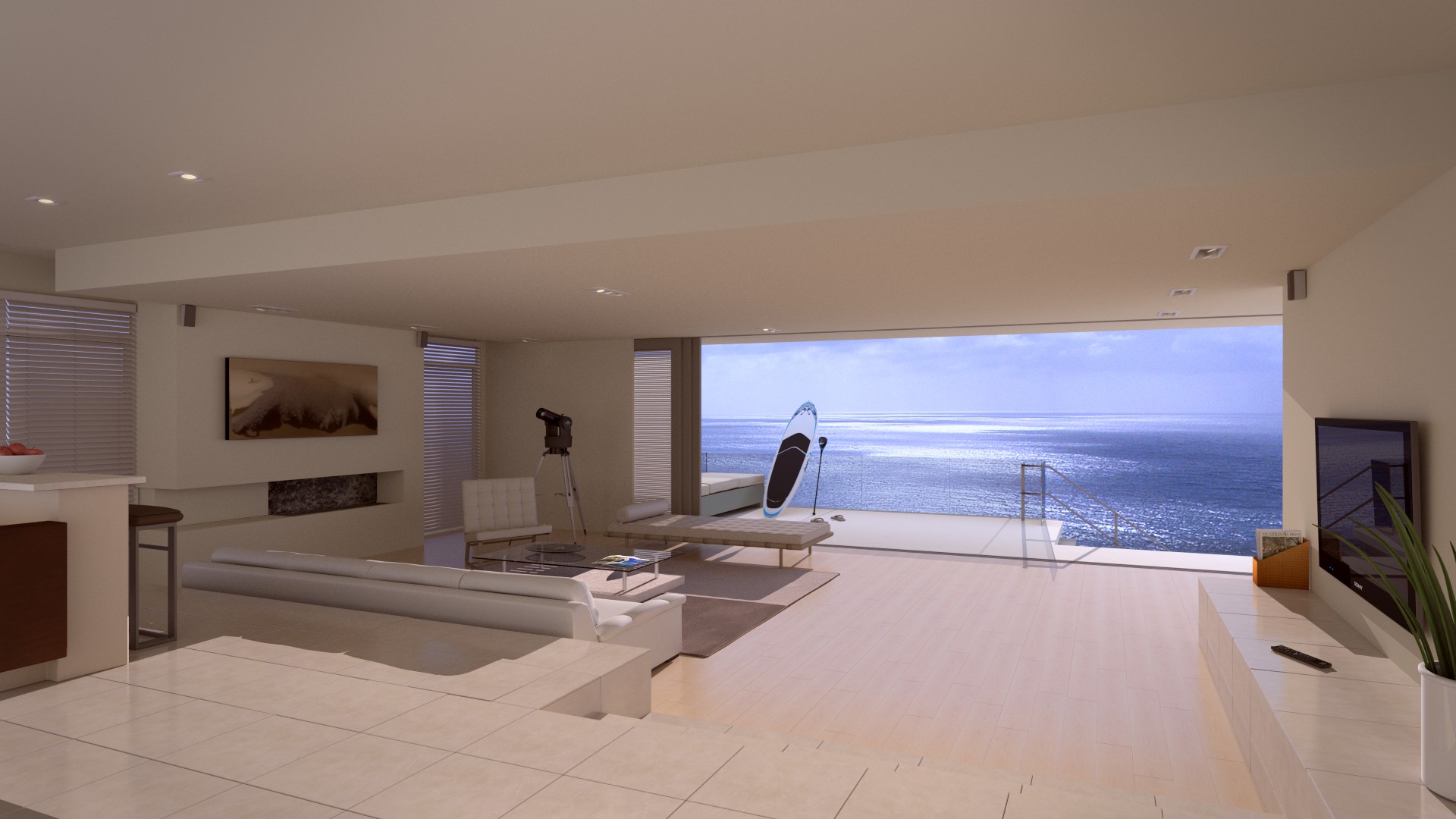
For me the paddleboard is the focal point. It’s not immediately clear it’s outdoors and against the glass railing. I thought it was leaning against the inside of a window at first. Am trying to think what you could do about that.
The tiles are definitely stretched, as I was trying to match a reference photo. For a while, I thought the tiles in the reference were rectangular, but I realized that they’re likely 2ft x 2ft, but appear stretched on the y axis due to the lens settings. I suppose I could remove the y shift and change the lens settings in blender, which I think I’ll try. I found out the hard way, that duplicating camera settings is a lot more difficult than it would seem!
I have the camera focused on the paddle board, but for now, the depth of field just doesn’t look right. Not sure how to fix that, but I’ll play with it some more. As for the paddle board, I think I can simply tint the glass a bit more, which should make it more obvious that it’s leaning against the panel outside on the deck.
I found myself wondering why someone would lug a paddleboard all the way up the stairs. Wouldn’t a place like this have a private beach or at least storage? But don’t change it. I like the touch it adds along with with the telescope and flipflops.
A few more comments: The right side of the image has a CG look. The plant could use some translucency or SSS. Slightly bevel the hard edges on the TV, remote, and shelf (?) so they catch light. Same for the hard edges on the bar stools.
It’s not clear if the remote is sitting on a shelf or the floor.
I had to laugh when I considered your comment about the lug up the stairs - very true! I actually thought of the idea after seeing someone who had a paddle board leaning on their out door deck, but that was probably up only 50 or 60 feet, in a massive cliff-side mansion in Southern California. I think the trek up these stairs would be a bit of a beast, indeed!
I’ll add in some more bevel, I’m usually pretty sparing with the amounts, and apparently I went a little to thin. As for the remote being difficult to position, I think I may need to simply darken the floor tiles a bit, to increase the contrast between the tiles and the flooring? Not sure, but I never did like the appearance of that run of tiles on the shelf that makes up the right side of the image. I’ll try again on the leaves. I tried translucency, but it just didn’t work - hadn’t thought of maybe trying SSS, so I’ll give that a shot.
Nice image. From the perspective of the view to the ocean, that is a huge hike up and probably not accessible.
The ‘cot’ near the board doesn’t look very comfortable, like the sofa closer to the camera. Doesn’t have a plush feel to it.
Is it me, or does the ceiling seem low? Could be the lens distortion doing this as suggested earlier regarding the tiles.
Also, the shadow behind the sofa and the lighting on it gives me the impression that it is in direct sunlight - but I don’t get the sense that the sun is shinning directly into the dwelling.
Thanks, Michael, CD38 actually made the same observation about the hike up. It’s amazing what escapes you when you’re too focused on other details! The stairway is actually a pool in the reference, but I decided to go the route of the paddle board instead.
I looked at the sun angle, and I think I might need to raise it a bit. The reflection off the ocean surface leads me to believe it’s low in the sky, but I think I might have it too low…not sure.
The ceiling is a bizarre setup. I’m guessing it was for wiring or something, because it drops about 10 inches along the far left wall. The camera settings were a nightmare to try to duplicate. I came up with something that is close, but it’s not right, and I feel like the near field is more “stretched” than the reference.
Thanks for the input. It’s hard to get people to review your work and allow for improvements - can’t improve without criticism. I really appreciate it!
I loaded the reference to compare. I couldn’t bare to leave the tiny TV, so I replaced it with a nice 40"
With the open plan and that enormous walkout, I’m guessing the dropped ceiling also contains some massive beams.
I had the same issues with the sunlight angle. They don’t match up. Plus light coming in that low might be redder.
So the tv remote is on a ledge or shelf. It’s totally not apparent. You need some shadowing or other clue, otherwise it looks like one big floor. That big L-shaped tile in the lower right corner looks odd too. It needs a grout line.
I hadn’t thought about the redness of the sun angle. It’s an awkward balance, because as I increase the sun angle, I end up with a shadow in the near field that looks weird. I might actually change the camera location to be a little to the left, since it really contributes to the “one big floor” problem. That way, I’d see a little bit of the shelf and it might help with the perception of the height difference. You’re right, at this point, it all just blends together. I notice that in the reference image, the gloss on the tiles really makes it stand out from the main floor, which has far less gloss to it.
Thanks again for all the feedback. I"m going to sit down with it in the next couple of days and I’ll repost the updated render. Thanks again!
Ha - thanks! I actually tried to match the lighting scheme of the reference at first, but it was a train wreck. Way too much noise, even at 3500 samples, and it just looked off. I ended up going with a more daytime backdrop to avoid the internal lighting and noise, but as it turns out, the sun angle is causing me some new headaches - oh well!
G’day, Pacific Doc!
Your scene, from what I can see in your image, has been modeled quite nicely; I have no immediate criticisms about the modeling. The extra lighting details have improved it immensley as well. However, I believe you’re trying to show too much of your work in your render at the same time - it makes it difficult to know what to focus on or determine what the purpose of the scene is. I believe it is best to move the camera so it focuses on a certain part of your room. For example, perhaps your render could show the couch with the TV in the background - an open book could be facedown on the couch. Together with the modern style of your room, it would suggest that this is a place of relaxation for today’s modern man/woman. That’s just a suggestion though, since I don’t know what you were aiming for (was it to demonstrate your modeling skills, or did you want to communicate something through your render?).
In the link, he describes common mistakes used in architectural modeling, and provides suggestions and how to avoid them and improve your scenes. There are more videos like this on his channel.
Thanks for all the replies and critiques. I made some changes to the camera settings, and shifted it to the left a bit, mainly to allow for some perspective to be seen. I could see, after CD38 mentioned it, that the right “bench” area actually looked like it was part of the larger floor.
There’s now some bevel in the floor panels. It was supposed to be a flat laminate floor, but I think the bevels help give the floor some depth. Also added a magazine collection to help with the perspective and fill in that space with something functional. There’s also now some translucency and SSS for the plant in the near ground.
I tried adding some DOF, but it makes the image look terrible, even at small f/stops (13+), because it blurs the floor tiles.
Thanks again for all the helpful feedback and suggestions. I’d love to hear if you guys think these changes made some improvements to the problems.
Thanks, Andrew. I shifted the camera to the left and down a bit, and I think it makes the background work a little better. I’m still not happy with it, but it’s a little better, I think. I’ve maxed out my scene, in terms of what my GPUs can handle, or I might try adding an ocean sim to replace the imported image plane. Thanks for the feedback.
Ahhh, I like it allot personally, but I love the ocean. I’m actually doing a really similar scene myself. The lounge chair seems a bit off. The angle seems odd or something but its hard to make a judgement call from that angle. I love the mood of the scene though!
Also I’d like your feedback on my image as well since I am still learning and am a greenhorn.
What makes the picture look wrong to me is the lighting balance. There is way too much light across the floor near the camera for the lighting level outside.

 But don’t change it. I like the touch it adds along with with the telescope and flipflops.