Apartment Building

This started off being a short little exercise, but I ended up taking much more time on this than I expected, so naturally, I want this to look really good.

Everything at the moment has basic materials with no textures. The shading is set to solid. The lighting isn’t final. I plan on putting on a sky texture. I’m considering going with an evening shot. I still need to figure out what I’m going to do with the street. Maybe I should throw a car or 2 in there. I was thinking of putting some trees in between the buildings. and maybe even changed the dimensions of the frame. The windows are no good at the moment. I still need to add sky reflection and stuff.

I would love some critique.

Attachments


  • you could separate the rounded balcony meshes and set them to smooth shading, so you get rid of that localized tesselation
  • there seems to be a normal direction issue on the top floor, above the first window, to the left of the corner
    …maybe it’s something optical, but recalculate normals on that section, just in case.

looking good so far, time to tweak the world parameters :slight_smile:

looks pretty good at this stage. I’m on a very similar project right now, did you do the grass with the standard particles method? Does it add much rendering time?

if you want to decrease that big vertical perspective but keeping the view : just move the camera back and set a bigger optics to the camera, something above 120 will do the trick.

Here’s my go at evening lighting. I’m not really too happy with it. I’ve been working on this for about 4 hours, and it just looks really bland to me. Lighting never really was one of my strong suits.

What do you guys think?

for the grass I used hair particles. It didn’t add too much render time.

Attachments


Critiques aren’t my strong point, but from what I can see, I think you could make the shot much more interesting with a more interesting skybox. The sky, right now, is pretty bland.

Other than that, I like it! Nice work. The streets seem to be missing their markings, though (the lines and such). Adding those cars you mentioned will probably help with the street’s empty look =P

Nice work.

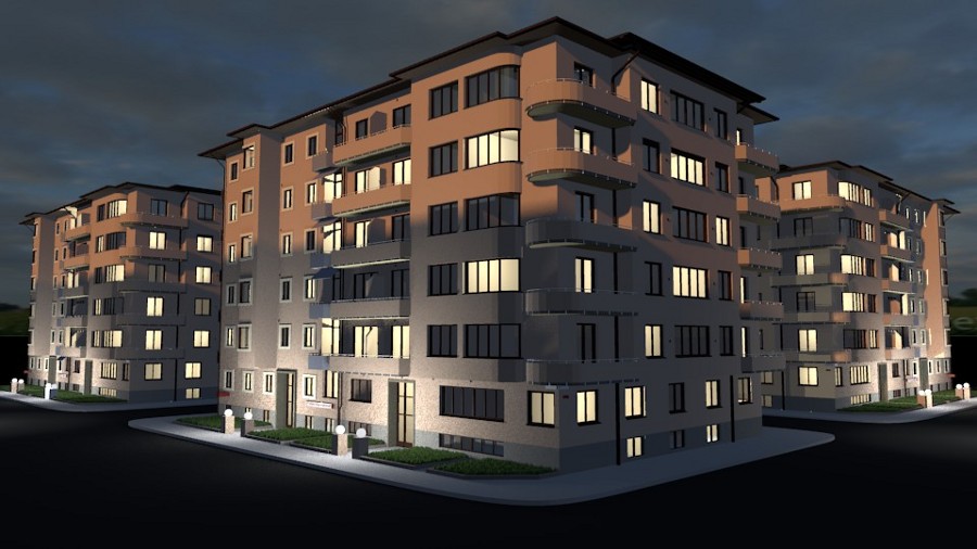
Lighting-wise you could do a few things. The evening light idea is good, but if that is evening sun, then there would still be a lot of blue (or more commonly purple) light coming from the sky to fill. The uplighters are way too powerful, which is why the picture looks out of balance. They should look quite insignificant in comparison with the sunlight. Also, if there were that amount of light on the building, there would be a lot more on the clouds in the sky.

I will say this on a line by itself – There is nothing wrong with parts of your image being dark!

I say that because there are so many people who are averse to dark areas on CGI, yet real dramatic photos often have dark areas. If you fill every part of the screen with light, it will look bland.

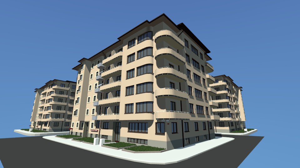
I personally would try to change the viewpoint, too. You have a very architectural view here, rather than a dramatic one. You could view it from closer, looking along and up at the building, or down from above, or whatever, but your current composition is a bit too symmetrical.

Personally, I would model the light you are aiming for with a dupliverted sphere of very dim purple lights, and a second one with no top, to mimic the sky, which tends to have more light from the edges at that time of day. Then a single orange one for the sun, surrounded by an orange area light to mimic the glow off the clouds near the sun, and make the uplighters blueish. They should reach only one floor at full intensity, fading off before the second. I would also add a camera flare and/or halo on the uplighters. If you model anything on the opposite side of the street, then you will also need to add some area lights on the front of the building where the light is hitting it, to provide the reflection off the building.

Put something in the way of the sun, to throw a skyline onto the front of the building, and move the camera down to street level, looking up at the lit face in the left 2/3 of the image, and the dark side of the building, lit mainly by sky purple and the small uplighters/streetlights, in the other 1/3. The dark/light contrast and the orange/purple against the blue/purple colours will break the image up and emphasise the time of day.

Matt

I took some of your guys’ advice, and I think things are starting to look way better!

I know there’s still lots I can do to this!

Attachments


this looks Awesome! good job Scotchtapeworm

I really dig this one. It looks very natural. Even the way that you shot the photo different. good job.

Looking way better.

To add realism, I would add a few pictures to the walls of the rooms, and perhaps change the wall colour a bit from room to room. I know some apartment blocks insist that the whole thing is magnolia, but surely there would be a rebel somewhere.

The other thing is to soften all the lights apart from the sun. Particularly the light coming from the windows is throwing very sharp shadows. Oh, and the ‘sky’ light on the right hand side of the building is throwing a sharp shadow under the balconies, too.

My feeling on this would be to try to add either a wet street or a frosty street. That light is evocative of winter evenings, and a reflection from the wet surfaces would add something.

Just thinking as I write, but you could add Christmas decorations etc. in the windows, and a tree out front. Not easy to model though.

Have you tried using renderlayers and nodes? It helps with lighting, as you can render the scene with each lighting item separately, ( sun, sky, uplighters, room lights etc.) and then combine them in differing proportions without re-rendering. Saves a huge amount of time. Even if you need to re-angle or re-colour a light, you only have to re-render the scene for that light, rather than all of them. it becomes more critical as you soften your lights, as render time leaps skywards.

Matt

My personal Deadline for this project is Wednesday, so that means I had to hustle and get this thing done! Sure there’s some more I could have done with it, but I feel it’s just about time to wrap it up and move onto something new.

So I’m doing a little bit of post processing in Gimp. I painted over some lighting errors,I added some depth of field, color correction, added glow to the light bulbs, and added some grain over the whole picture.

However, while I was messing around with blending layers for the grain, I set it to Additive, and came out with a pretty nice result that looked just like morning! I went back into blender, and turned off some of the lights, and redid everything in Gimp to get my morning shot.

I’m surprisingly happy with the morning shot! It was an unintentional mistake that I feel turned out pretty nice.

Obviously these two renders aren’t realistic in the sense that the sun is in the same spot for both dawn, and dusk.

I personally like the morning shot better. What do you guys think?

Both look really good, except they look more like really good miniature models of the buildings, rather than an actual photograph of buildings. I don’t really know what’s making it feel this way, but I think lightening the depth of field effect a bit and adding more unique objects within the buildings (behind the windows) and on the balconies would help.

What is causing the miniature model look is the depth of field. GIMP and Photoshop users often use a narrow band of sharp focus in a blurred photo to imitate tilt-shift and create fake model shots.

Looks really nice!

But I would turn down the depth of field! Like oiyou said this makes the modell look like a miniature! And I would make the shadows appear at the bottom of the building, not in the middle. You could try to make the shadow appear as a silhouette from other buildings or something like that. In your pictures the shadow goes straight through the whole picture!

I thought it looked like a miniature too. I went to go fix it, but I realized that I merged too many layers, so It wasn’t a simple fix. I did however get it looking right. I posted the final renders here.

http://blenderartists.org/forum/showthread.php?t=192412