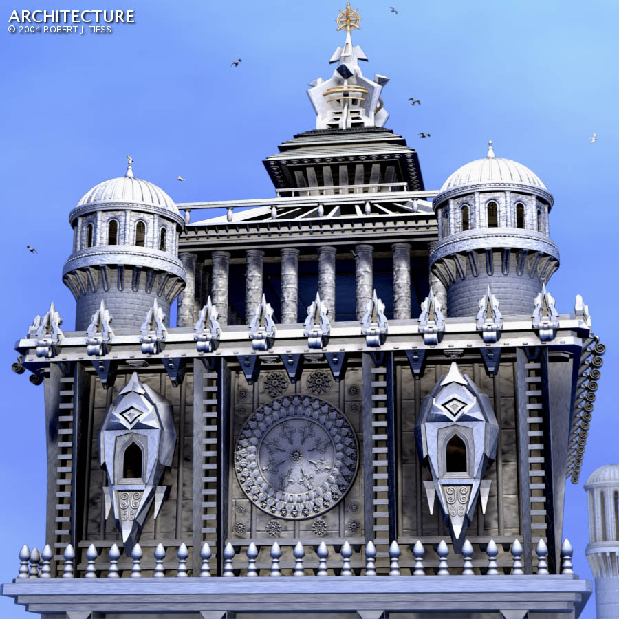
Design time was most of Sunday. Approximately 3.2 million verts in this scene. Render time with AO (10 samples) was about five hours. One very basic L-shaped line texture was used for brick-like nor value, and the rest are all procedural textures.
If I have time I’ll post some alternate angle renders.
O_O
just great…, great modelling
only crit is the composition… maybe you can build another bigger/higher building behind it.
or maybe add some clouds or a sunset
Nice, so when I build me a house are you going to help me design it?
I like the way you have a varity of styles incorportated into one building.
Well done.
Paradox
The birds all seem to have the same poses, the design is good on the outside but it doesn’t work…
Its good as far as modeling and textering (except the blue) and lighting go’s but I’m sorry to say that I don’t like it, its lacking something, something that is present in most of your other images but not this one…I can’t explain what I mean but thats just the feeling I get…
shul: Thanks so much, shul! I have some birds in there already, but maybe a dove would be a nice touch
Cyanid: Thank you Cyanid. There’s another set of structures behind this but only one can be partially seen (lower right) within the given camera angle.
paradox: Thank you very much paradox That would be some house I wanted this to be eclectic in design while making a unique architectural statement, so hopefully that’s what it turned out to be
mystery00: Yes, the sky is blue I see no problem with that Out of the 1,000+ blends I’ve done so far I’ve only used blue prominently as a color a couple of dozen times. The building is white/grayish in front of a blue sky with ambient occlusion turned out (so the sky texture/color affects the overall image). The lamps are white and slightly yellowish (with two negative lamps in the two nearest windows). The birds were just a little something extra I had done and probably aren’t worth considering much. Many have the same pose but some are different. Two in fact are perched but barely noticeable
Jerri: Thanks for the feedback!
BgDM: Thank you very much, BgDM. While I tried to achieve some sort of cohesion and logical flow in the overall structure, I know it’s far from perfect. I’m not sure if AO is overaccentuating where elements meet and if the lighting setup or high camera setting (70) detracts. Stylistically, I admit it’s a bit odd I’m in the process of trying some non-AO and alternate lighting renders. If anything looks better/more convincing I’ll post it.
heh, like we say here it’s a general “sillisalaatti”. meaning all sort of things put together… and even though it’s quite “look at me” kind of render, and clearly there is lot of modelling gone into that, and escpecially duplicating… I have to say, sorry, but I dont much like it.
nice modelling ,but maybe split it into 3-4 different buildings…
Hey basse I think you just gave me the perfect title for this
Thanks also for a very good idea: this might be a source of several new renders. A lot of modelling went into this, so maybe something better could come out of it
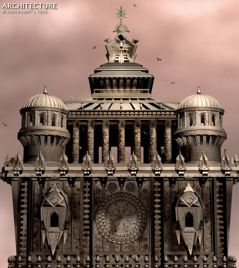
The second one looks just wonderful, but you should do something about that bottom line. Currently it just seems to end there (the architectural pretty doo-hickeys give that impression), but it should look like it’s much bigger and extends 100m downward.
Carnivore: Thanks, and thank you for the helpful feedback! There are some more details below, nothing like the top though, but if I do another render I will show more of the height. In the first render set I went for depth and level of detail instead of tallness. I have a number of cameras in the scene, as I usually do for test renders, with one looking up from lower down in the structure. That one obscured the top details too much though. But now that we mostly see what’s “up there” (there’s more yet obscured by the current camera angle/setting) another angle might be interesting. I wasn’t going for a dramatic or towering quality in the first renders, just a frontal view to reveal major elements. Camera angles can make great differences in any given render. This is one of the greatest things about 3D art I appreciate: the ability to alter a point of view and bring new perspective to a piece and to the viewer.
No, just one day, all day Sunday. As basse pointed out there’s a number of duplicated elements in this piece. I had been working on my F1 entry up to the last few hours as CurtisS can probably tell you I sent him some frantic e-mails towards the end (nearly 17 hours for the final render on the f1!)

 Good job for 1 day.

