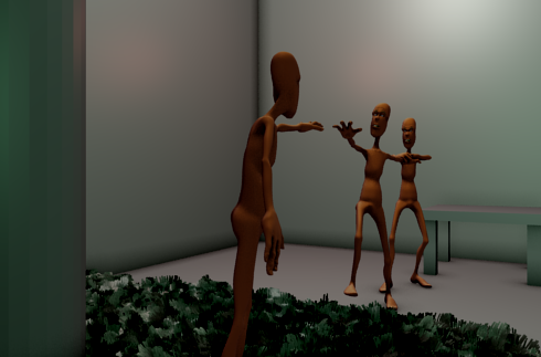
ohkay … latest update … the composition of the scene has changed … the mad man is running to the mad world and the doctor, who was just about to give him a shot is dragged along … there will be a tilting chair under him …
will add hair on the doc … i was thinking a goatee … and also specs … to make him look more doctory …
i’m going nuts trying to figure out what i’ll put in this forest, its color scheme etc etc … i have thought of a snake like creature on one of the tree branches … and one more creature in the center towards which the man is running … its all tentative and i need more ideas!!! help please …
It seems like he’s running toward something specific, as opposed to just running towards the woods. Putting some sort of animal or creature in there may give him something to be running towards. Great ideas though, I’m liking where this is going.
I like it =)
I think going with a lush green rainforest would make it seem a lot more mystical and happy-insane-fairyland like.
Some suggestions on things to add…
-Filing cabinates behind the subjects against the wall (maybe have moss growing on the leftmost cabinate)
-Papers on the doctors desk.
-A trash bin beneath the desk.
-A medical diagram on the wall
-bushes on the forest floor to fill it up a little more with foliage
-Maybe some flowers
-Thicker grass
-Monkeys, snakes, birds(maybe thow a toocan in there?), maybe a frog in the foreground, crickets, possibly an aligator or a tiger (probably a friendly-looking version).
When you fill in the trees with branches and leaves, the forested area will look a lot fuller.
heeeeeeeeeeeeeeeeeeeey asano and browntb!! thanks for the response! I’m working on some of your suggestions asano , I had gone out of the city, away from my PC for a while , took a big break from blending, now im back, did some little modifications on trees, , added leaves … also figured out a basic concept for the friendly alien character ::
Ive done some vertex painting on it for the colors and also added a clouds normal mapped texture… I want to do more texturing on it … like i want to add some spots only on his back and tail, im kind of a nooob as far as UV texturing goes . can someone please give me links to some good tuts for texturing models like these?? basically i want to add textures at only specific parts of the body … I also want to find out about using checkered maps for texturing … i dont have any examples, but it involves using a black and white chekered map to texture a model … what is that all about?? any help??
Loving the alien creature! This should really give your “patient” somewhere to run to!
Pablo gives a really nice material/texturing tutorial on his Venom’s Lab DVD where he goes through the node setup for Fraka. I highly recommend checking it out!
Hey, no problem. It’s looking good. The tail on the alien looks a bit stiff though, maybe have it relaxed laying on the ground? The perspective makes it appear almost as if it has a ‘kink’ in it.
I don’t think it’s getting too cluttered. I would say, keep adding things in, but keep in mind the focus of the image when you place things (probably the charcter reaching out).
The tree trunks could use some better lighting, they are a little dark at the moment. I think that some compositing nodes are in order to make a glow effect for the forest area.
I also think that you could use particles for your tree leaves. You’re just rendering out one frame so I don’t think that would be problematic. There are some floating leaves at the moment.
Look up a tutorial on the tree wizard. That’s a really easy way to make good branches/leaves. You already have the tree base mesh, so you can just add the spheres to indicate the area you want the smaller branches and the leaves, then you just push a button.
Just a suggestion on how to make the piece fit together more, you could have elements from both worlds kind of creeping into either side of the piece. For example, have plants or vines or something growing up next to the chairs, and then have the wall extend into the forest world, maybe with an ornate picture frame hanging on it. I think that would look good. I like your piece so far, it’s really cool!
The characters are really awesome,one crit though:the composition seems a bit boring.
Here is a quick composition based on rule of thirds with good old Mancandy,the focus would be on the face of the crazy person.Just a tip,if you don’t like it,ignore it:rolleyes:
I agree that the composition looks a little boring right now, but I think the camera angle isn’t the problem. It just looks a little barren at the moment. When you’ve got everything in the scene I think it will come together nicely. It would probably be a good idea to pay close attention to the position of your vines & moss to guide the eye through the scene.
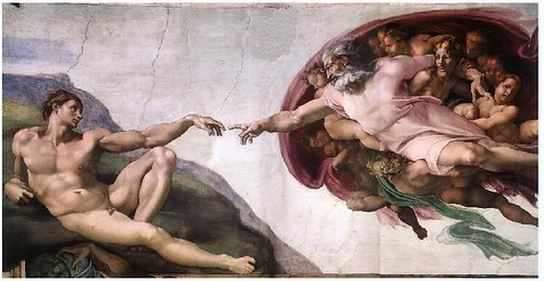
I think you should focus on the story your scene is telling. I like your idea, but I think the poses aren’t yet telling the viewer what is going on. Clewers suggestion is good pose wise, though I feel maybe the composition should be spread out a little more laterally. Something a little like this?
Obviously not the lying down part, and rather than a band of angels, you might have the doctor holding the patient back.
hmmmmm … i agree that the composition IS a little boring … the thing is that i added clothes on top of the posed character after applying the armature, so reposing them will be a little hard … i’ll think of a way to tweak the poses a little to add more dynamism, also will work more on camera angles … meanwhile, heres a render of material of the room floor and table and wall…
Me likes:) Oh and i think it’s a great idea to make the fantasy part more glowy, I,m not entirely sure what your setup is, but it would propably be possible to control the effect with a blend texture across the screen… Keep up the good work:yes: