Joni Hello I would like to know more about the texture and material of the curtain
Hi! it’s simple difusse mixed with transparent and a pattern in black and white as a factor.
First shots are impressive: i’d like to know more about the lut thing. And how strong were your lamps?

Thanks for your comments, I found this which opened my eyes.
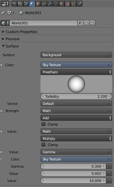
I had to crank up the lighting with an emission mesh in 30. For the world, I decided to go with the old Sky Texture instead of an HDRI, here you have the settings.
so you set “Wide Dynamic Range View” in the Color management panel and crank up the light strength? No curves? And which contrast preset?
Here you have, contrast preset, curves and most important node from composition, if you don’t use that, you will have a very washed out render. Let me know if you use this stuff!
The important thing to understand is that you won’t have 0 to 1 of value anymore, you will have -10 to +6.5 in theory.

I played a bit, but can’t find its usefulness: if i have to fiddle with postpro nodes, where’s the advantage for viewport rendering?
It’s useful for real world lighting. it enhances the range of value in your render.
With the sRGB display, you will be limited to 0-1 Value. This is not how the real world function. I am still learning it tho.
In the viewport rendering I only work with isolated object to work with materials into a separated layer and then exported as an asset into Asset Manager, then I append it to my scene, which was rendered before to achieve the mood of the room. Maybe is a wrong way of working, but I found my workflow very sustainable for future project. I end every project with new assets.
Sorry for my improvised English!
Cheers!
Thanks Joni, i have read the docs, but so far i can’t get better results. The whole subject is really interesting and I’d like to learn more to master this different workflow, that looks like the holy grail of tonemapping in blender.
But, as I wrote, it should work without postprocessing in order to see in the preview how the final render will be. Giving contrast in compositing destroys the scope of the whole thing imho.
What i understood is that light intensity in the scene should match real world values, so how much strenght should the sun have? how much for the sky? and other lamps? is there watt unit correspondence somewhere?
thanks
Hi,
this wide dynamic range view thing is very interesting. We should open an extra Thread on this, togehter with troy_s, i think he made it.
If i got it right, this WDRV (wide dynamic range view) is similar to HDR Photography. If you render your scene in WDRV, you can then store a set of images from your rendered scene, setting the exposure value for each single image from EV-10 (In steps of +1) to EV+6, which will result in 17 images, each in its own exposure. Then you can load this set into a HDR Software such as picturenaut or HDRProjects and composite the values.
Am i right with this ?
This is a misnomer.
Every transform from the scene referred domain to the display referred domain is an aesthetic and creative choice, whether you realize it or not.
Even sRGB’s EOTF (aka transfer curve) is a creative choice. Just because you appreciate the contrast doesn’t mean it is a neutral view choice.
Using a proper colour managed pipeline, you can embed your own CDL choices into files and flip them on the View as Looks as you wish. A dark scene? Use one creative choice as a base. A sunny scene? Use another.
I have been working on a Mark II set of LUTs that use the same dynamic range of ten stops down (2^-10 * 0.18 scene referred) to six and a half stops over middle grey (2^6.5 * 0.18 scene referred), which I hope to release soon. This includes a no-need-to-grade default.
The downside of course, is that by providing something that doesn’t require grading for many people, is that they fail to engage the concepts, which is by far the most powerful aspect to this whole discussion.
No. Sadly terms like HDR and such just confuse people.
The sole goal of the LUTs is to generate images that are closer to being photographic, which is a key aspect of being “photorealistic”. Terms like HDR just confuse people, as “high” is in relation to something, and no one really understands what that is in relation to.
Great renders by the way…
Further reading:
With respect,
TJS
Hi Joni, great work here, I would say as feedback:
- Try lowering the glare a bit, right now it’s two exagerated.
- Regarding the shot of the table, the trees angle and the interior angle don’t match, making the house to look like it’s inclined, match the vanishing point between them.(I’ve seen through the years this is a common mistake when people use backdrops)
- I know it’s not obvious and it might sound picky but use HDRi always, a sky node doesn’t contain the same amount of data that an HDRi could have, I’m assuming you are also using a sun lamp along with the sky node… If so a sun lamp also lacks of crucial data which you could need on reflections, translucent materials or even if you are showing the sky in the render and then you need to post-process it. It’s hard to explain here but all I can say is HDRi is the best choise when it comes to inteior/exterior rendering.
Best regards,
Sebastian.
Wow! Thanks for your comment! After your great explanation there is nothing more to say, just let me highlight a few revealing lines.
Couldn’t agree more on that.
Can’t wait! If I can help in any way, please let me know.
Thanks! I Hope being using these setting properly.
Thanks for your feedback Seba!
Maybe it seems too exagerated, but was intended. About the vanishing point, you are right, when I started with the first angle, (from below) I never even think about taking a few more shots, was just an excersise to test this DRV. That’s why this isn’t working from every angle ![]()
For interiors, I am choosing to work with Sky Texture node, I don’t need the extra info an HDRI can provide. And there is no sun lamp on the scene!
For Exteriors, I couldn’t find a better way than a good old HDRI… yet!
Cheers!
Oh ok, I guess you are trying to simulate an overcast day…
Got it. Let me re-phrase it:
I see in the screenshots, that Joni kindly posted, that he used a color balance node in the compositor and even with strong settings, so I’m guessing that his final render looks very different from what he sees in the preview. That is where I say this workflow isn’t practical. Imho of course, but reminiscent of this thread: https://blenderartists.org/forum/showthread.php?282540-Cycles-tonemapping.
Correct. The current default view is a basic log-like encode. There are many reasons to use a log-like view, not the least of which is that it allows an imager to visually evaluate their image “as data” and determine if the values are adequately exposed for deep shadows and highlights.
Further, using the default view is also a good shaper for an encoded, display referred file format such as TIFF. This allows an imager to save a display referred file format for grading in another application.
The extent of turning the default view into an aesthetic grade would be achieved merely by the addition of a single CDL node. Further still, these CDL settings could be easily converted into a CC file, and loaded on for instant viewing as a Look, or saved to file immediately with the Look baked in.
A single CDL node is trivial given the vast power and creative opportunity such a pipeline offers.
And this is where I can’t convince you, nor have a desire to try. The idea that there is some other magical solution that doesn’t come hindered with tremendous shortcomings is, well, naive. Every serious imaging pipeline uses a very similar approach, and the gains are tremendous.
The idea that one can light a scene to a single view is both myopic and fraught with a lack of awareness as to the transforms any display referred image bakes into it. There is simply no solution that involves tonemapping that solves this worth even a penny.
TL;DR: An imager needs a fixed view transform that balances the technical goals with their particular aesthetic choices. The above process allows an imager to have a fixed and well defined view transform in addition to having the creative control to generate their own instant-preview looks as they see fit.
For those that are actually generating imagery and attempting to use a proper photograph-like dynamic range, feel free to ping me or ask in this thread and I will do my best to help out as much as possible and explain nuances that might be missed. BSE might also be a good forum as it leaves the information readily accessible to future travellers.
With respect,
TJS
I feel like you’re missing the point that i actually want to learn, i’m not even trying to oppose any theory here. The problem might be of “language barrier” kind, since I still find hard to follow the terminology full of acronims, where each acronims is linked to a new one :spin:
things I’m quite sure I understood:
1: current blender colormanagement sRGB “sees” the scene with too few f-stops, much less than what we are accustomed with photography
2: Wide dynamic range view lut “sees” quite like a camera, allowing to use real-world like light intensities, as to say we can reproduce into our scenes realworld light interactions (with crazy high values for sun for example) which will work just like we are used to see in potography, without burning to white colors exceeding +2 f-stop limit
3: looks are a bunch of aestethic presets
things I’m confused about:
Can’t I tune the result in the viewport and bypass compositing?
Why everything looks so washed out? Why the need of contrast presests?
thanks anyway
Happy to help. Let’s see if I can answer some of your questions in a manner that will help you along. I’d hope that some of these end up on BSE, as it helps other imagers facing the same issues. Would you mind posting them over there possibly?
100% correct. The history of the sRGB EOTF (intensity curve, as sRGB also has other facets) is that it is a display referred transform only and never intended for rendering in any way. There is much confusion as to what sRGB is, and where it should be applied.
Again, correct.
Photography as it exists as an aesthetic is learned. That is, the limited dynamic range of film is an aesthetic response that over time everyone has learned to identify, even if they can’t quite put their fingers on it. That dynamic range however, is not unlimited like some of the artificially reconstructed tonemapped imagery out there.
The transforms loosely deliver a consistent set of values for an imager to build their work around.
Blowing out to white can be entirely fine, depending on the aesthetic needs. One could argue that photography will always have something that might risk blowing out to white due to the limited recording capacity of film. How and where it does this should be controlled.
Correct. And an imager is capable of adding their own, based on their own desires and needs without too much experience and / or knowledge.
No, and this defeats the concept of a managed pipeline. I won’t go into details, but the moment you are tweaking on a viewport render, you are technically already grading, and you might as well grade in a controlled manner.
The upside of doing so is that you are able to perfectly replicate your grading efforts (assuming you learn how to use the CDL) and leverage that work as you work forward.
Because I designed the set to accomplish a few things:
- To introduce imagers that might have absolutely confused and muddled concepts to a more structured set of mental models that will elevate their work.
- To give imagers a working basis to build upon that is flexible enough to store in limited, display referred formats.
- To force imagers to ask the very questions you just asked.
If I had simply given imagers a turn-key “this works”, imagers such as yourself wouldn’t be asking the extremely valuable questions you are asking right now.
The key thing to grasp at the core of this basic view transform set is “What is the difference between the scene referred model and the display referred model, and why is it important to imaging and rendering?”
The transform between the scene referred model to display referred is critical for rendering, especially in a consistent manner. In particular, something that is lost when using generic tonemapping operations, is how middle grey is mapped, and what values it is mapped to, in addition to the characteristic transfer curve applied.
The basic view lacks contrast for this very reason, as covered in the GitHub readme. It is a log-like curve much like many others out there, which accomplishes two things reasonably well:
- It is useful to an imager that is lighting their work, allowing them a super-vision that permits them to view their shadow and highlight detail simultaneously. That is, it allows them to see their image more as data than simply as an aesthetic output.
- It is a very useful curve for cramming maximum data into a limited, display referred output format such as a 16 bit TIFF. By providing a flattened looking image, all values are given an optimal bit of data which allows for maximum flexibility during a grade.
So the basic view, while perhaps not being immediately aesthetically pleasing (although many log-like looks are becoming popular in mainstream imaging), is useful from an analysis and encoding perspective.
Looks are also extremely useful as they don’t touch the underlying data. That is, you can flip between a Look based approach and leave your scene data untouched. As you might have guessed, this is incredibly useful for previewing some possible looks without mangling up your data.
Hope this helps for now,
TJS