hello, i’ve worked really hard all month on my BG christmas competition entry and was fairly dissapointed when i didn’t even get mentioned, when other artworks (that consisted of a christmas tree and a snow man outside a window) which looked like the had been whipped up in a couple days, did. I’ve been using blender for nearly 2 years for heaps of different things.
I was wanting to know what my entry lacked, where too much work was going and how to make the image better? or more noticable.
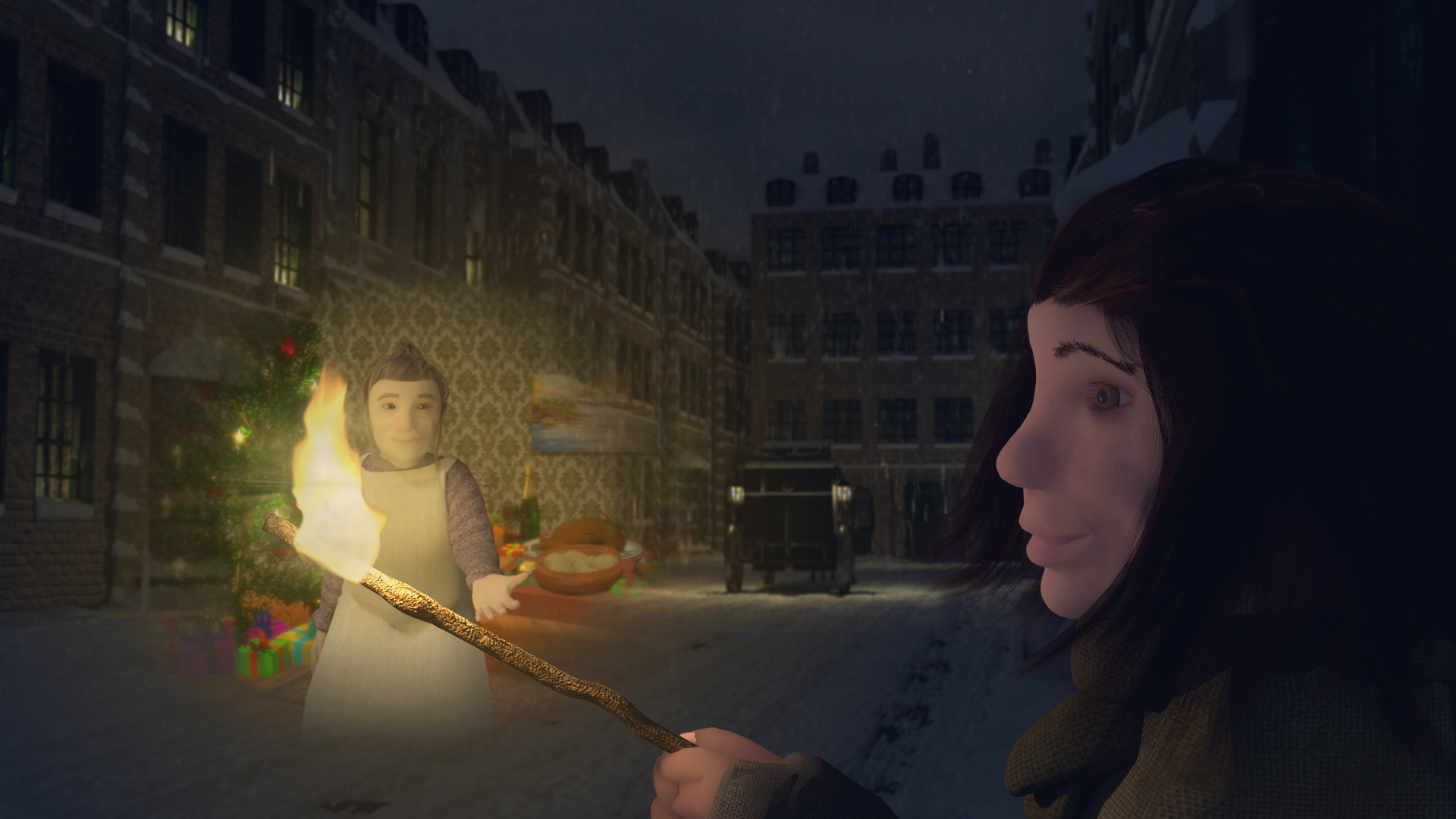
I can tell that a lot of work went in to this piece.
From a technical standpoint:
The face is too clean and SSS is too deep for the scene placement
Texture stretching in several places
Elements all seem to be separate; no continuity.
Artistically,
The color palette is too broad
The vision appears in a noisy area of the scene, and doesn’t catch the eye
It’s admirable to take on not one, but two human characters close up in this scene. The originality and storytelling are also well thought out. Good luck revising!