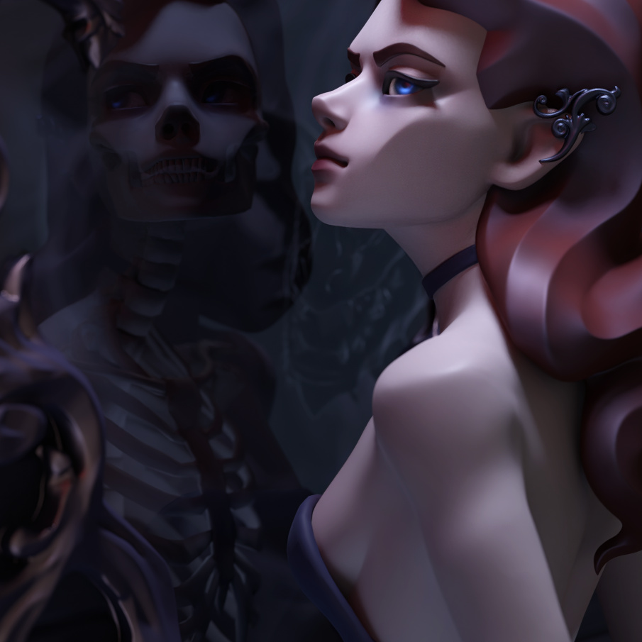
If there’s something to improve, I’d say it’s the specularity. There’s a bit shiny/plastic feeling to everything - that might be worth toning down. Unless it’s by design ;).
Also, maybe a little catchlight in the eye? I do love the blue there, by the way.
Other than that, a very nice image, I like the style very much, and the face is great. Well done.
I really like your style It makes my day whenever you make something. Do you sell prints?
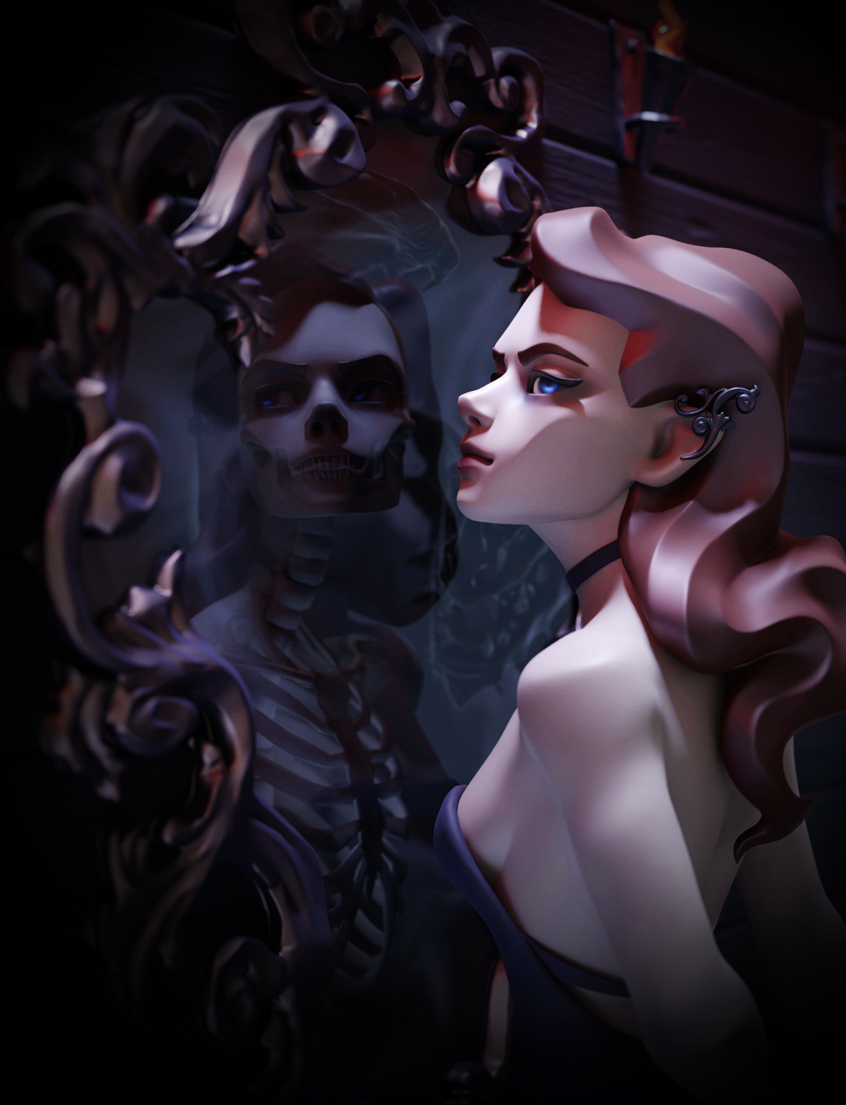
In terms of critique- your contrast is definitely good, but the overall light level is a little low. I do see the demon, but it is admittedly difficult, just because the whole thing is so dark. If you were to lower the specularity at all, you would definitely need to brighten this, because the only highlights or midtones come from that specularity.
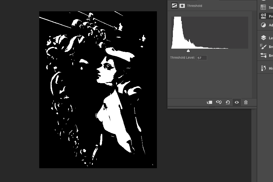
And your weighted Lightness midpoint is 57. In other words, the average brightness of any given pixel in your work is 57/255, or 22% of maximum brightness. I’m not saying you should increase this drastically, as the darkness matches the style, just slightly
I like the character and the models in general, but the lighting is really putting you down here. Try with some more contrast or re-doing the lighting setup, at the moment it is just dull for such a great character model
If you pull down the background and lighten the reflection it might retain a dark feel, focus more on the main subjects and increase the apparent contrast without you having to change the lighting too much.
If you have set it up with object/material IDs it could all be done in post.
Seems like I am in love with plastic) I’ll try to change it =)
Where was no dissent light in the scene to give nice looking catchlight so I went with the emissive blue) but it does missing though…
Thank you so much for feedback! ^.^
Thank you, Joseph! Maybe I will Never had that idea before)
Hm, this is so AWESOME! I see everything OOvOO
I did check the levels, and even increase white by good 15%. I felt like it wasn’t enough, but I didn’t wanted overbright some parts (spectacular ones). And I decided that it would be dark and mysterious I need to work on materials now)
I really appreciate your help and for make it so clear!
@Alvaro_WS Thank you! I will defiantly consider changing the lights =) I didn’t brighten up the reflection, case I was afraid to scare people with it horrifying bones… ( ಠ◡ಠ )
@organic That is a very useful composition advise! And OMG I’ve never looked up the ID maps in Blender before! Thank you so much
If you ever start selling prints, I’ll be your first customer
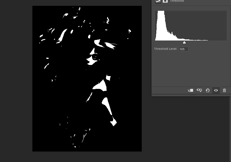
If you ever want to check your light levels, that’s the Threshold adjustment in Photoshop. (I’m sure other programs have it as well.) Far right is pure white (255), far left is pure black (0). Everything in between is the lightness of all the pixels.
It’s pretty simple to get your max lightness- just move the slider to the furthest point on the right. Unweighted average is (max lightness + min brightness / 2), or you can eyeball it Weighted average has a method, but honestly, I usually just eyeball that one. Either way, once you have your weight average and your max lightness, you should have a really good idea of how you are using lightness in your image.
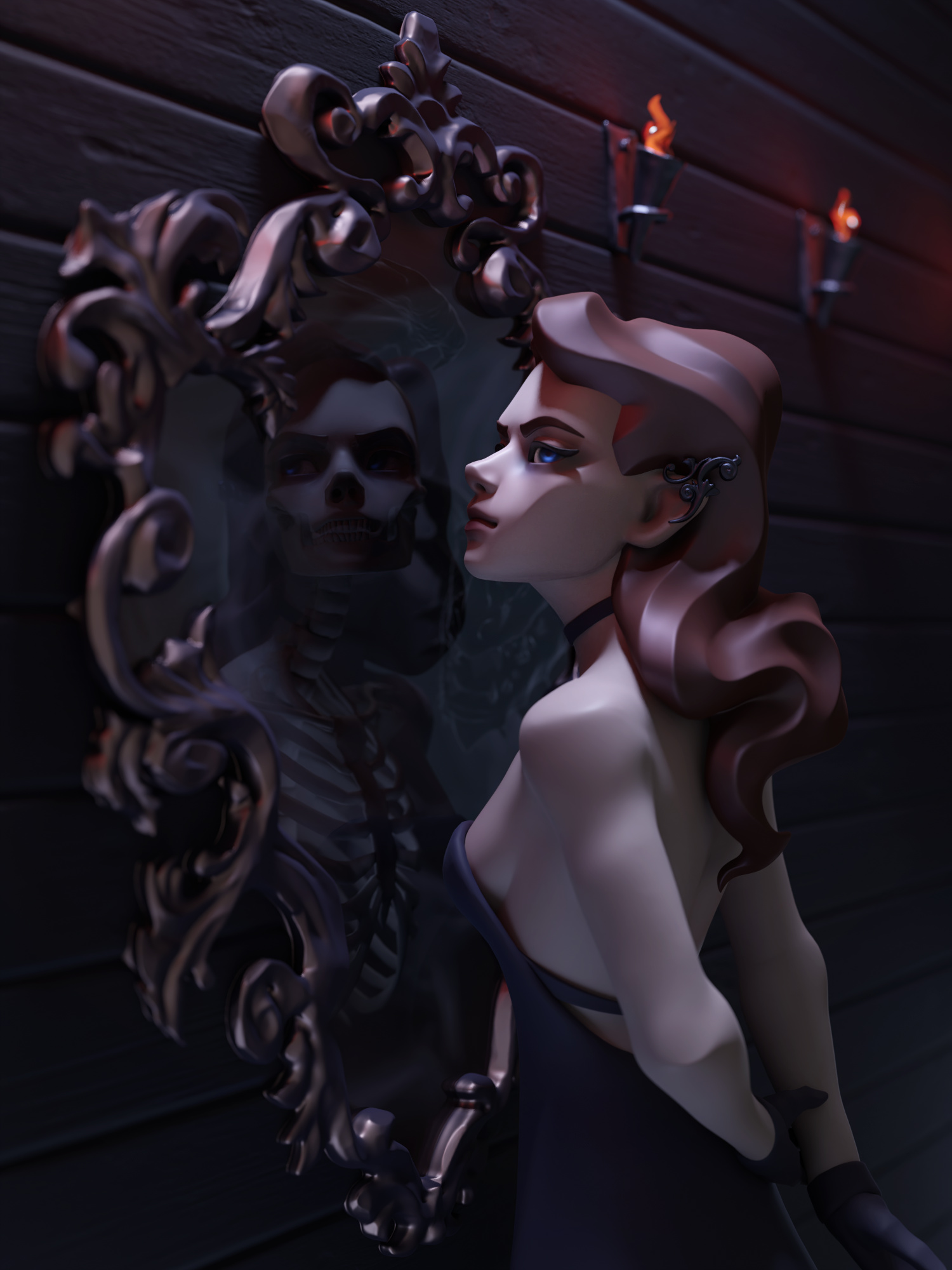
Great mood! I really can’t find anything to improve here, but I think, that the light from the torches is a bit too red. I suggest using a Blackbody node for the color input - that way the colors are more natural.
PS: What’s the name of the game studio you work in? I would really like to check it out.
Really interesting subject. I think you’re really close … but as it sits the eye just wanders around the image. There is a lot of detail in the mirror frame screaming for attention, and it pulls the eye away from the skeleton/demon in the reflection. The lighting on the character is about the same as the rest of the image - and the brightness of the highlights on the frame compete for attention. Additionally, the background elements are generally kind of secondary in a dramatic character image like this - the most important elements are the woman and her reflection - so you want to light, crop, and post-correct with that in mind. What I’m referring to is that the lights on the wall kind of lead the eye off the canvas - and you probably don’t want to do that.
Whenever working on an image like this, and thinking about cropping, you begin at the outside and move your crop inwards - as you go, keep asking yourself, "Do I need it? Do I need it? (to tell the story) and if the answer is “No” - crop it out. When you get to the point where you say “Yes” - you stop.
Please forgive me for manipulating your image, but here are some ideas you might want to consider:
An exposure adjustment, contrast adjustment, crop, and vignette:
Again, I really like the “story” here - I think a few material and lighting tweaks, and a bit of post-work would really make the image and “story” pop.
Thank you! Yeah, I’ve colored them evil red a bit too much
It’s Galament Software, originally they not about games (it’s their first project) so where won’t be information on that, but soon (¬‿¬)
Wow! OovoO Thank you so much for your time to give this feedback!
You have so good points there! Real professional art critique
I was really straggling with the light, case I didn’t wanted to bring a lot of attentions to the reflection. I wanted it discreet, so viewer didn’t noticed it the first. But I kinda failed.
But the power of crop is real ヽ(゜∇゜)ノ
I absolutely adore it!
I can hardly stand to critique such a great work, my petty gripe is with the background wood planks… in fact I wish they were more simplistic, or something? Maybe it’s the bump texture in stark contrast with the beautiful flattened style you have going on your edges, which I love to death. Dang it’s just so cool, I will never make such a great work.
Thank you! (*~▽~)
I think you’re right, wood doesn’t seem to be in harmony. It could be more stylized.
And don’t doubt yourself, it’s the matter of practice and determination!

 so I went with the emissive blue) but it does missing though…
 Never had that idea before)
 I need to work on materials now)

 Weighted average has a method, but honestly, I usually just eyeball that one. Either way, once you have your weight average and your max lightness, you should have a really good idea of how you are using lightness in your image.