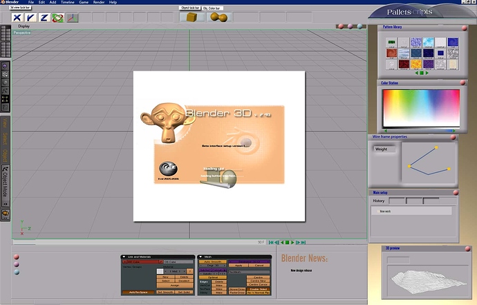
I like how the old setup is already but I thought I would take a shot and try to mess around with the gui in adobe
to make it look less “intimdating” and more of a kicking gui like the other
apps . This is just a beta adobe PSD . I didn’t even finish it nor do I plan to. Just alittle something I thought up for a rainy day. Give your feedback on it; tell me if i need to change it or if its ugly. ![]() .
.
Forgot to note that the whole image is how I picture it. the extra boxes arent from a diffrent program but apart of the image I made. didnt want anyone to think otherwise  … My friend is the one that asked me about that 5 mins ago…
Looks even more intimidating to me.
'Cause I’d have to relearn it all.
There is no need to redo the blender gui! I realy like it as it is right now. Maybe some more different looks on the buttons but no big changes. And as it looks in your gui, it looks like a lowbudget bad modelling program. to much “windows”.
Thanks for the feed back Kothe and Fuzz I guess your right. I just wanted to see if anyone would like the swanky version that i thought up of (jumbled thoughts of cinema 4d meets adobe photoshop meets maya meets blender). Just wanted to see what I could pull off in adobe. 
i think it looks cool the only problems i can see apart from the ones alredy stated is that it makes the work spase smaller and i like a big workspase
I like it the way it is. It shouldn’t go too “maccy”.
to uggly
to heavy
i love the actual 
If blender had interface like that… nothing would keep me from switching to Maya/3DS MAX. 
Looks nice, but half of the space is wasted by some menus, and buttons you do not use, beacouse Blender has shortcuts for them, which makes working faster, than trying to find a button in some menus.
 i really dont like it. I love the actual.
  %|
%|
Sorry, but I like it the way it is. It’s compact, and everything is right there. I have tried other apps, and the tools are scattered around the whole screen.
It would be cool to have more button/window styles, but for the GUI, thats about it.
Maybe the abillity to make you OWN buttons for blender? 
Maybe I should Make some cooler buttons for the pre existing buttons. Also maybe throw in some nonsense images for the primitives like the other programs to spice it up. Later today ill make a few buttons and see if you guys like em 
I prefer the actual
It kind of looks like a crappy version of Pinnical studios video editor  or like version 3. somthing of TrueSpace (I hated that app. all the buttons are in wireframe, you cant even tell what they mean.)
