Yes, this is part of depsgraph & copy-on-write work.
We have, as well as some similar alternatives. Again, this is very early stages of development, https://developer.blender.org/T54844 will be updated with sub-tasks as we encounter each new topic.
Yes, this is part of depsgraph & copy-on-write work.
We have, as well as some similar alternatives. Again, this is very early stages of development, https://developer.blender.org/T54844 will be updated with sub-tasks as we encounter each new topic.
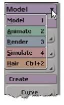
That main menu bar as the horizontal bar at the top of the 2.78 interface makes me remember Softimage.
A possible option will be to add toolbar panel on the left side of the interface as XSI.

Each of these toolbars contains menus of the commands most commonly used for tasks in their area.
These toolbars are also displayed on the main menu bar.
Hi
I found reference to old XSI timeline functions, i duno if will be useful for this development, but i think is good info to share.
I like what I see ! Not familiar with XSI but I’ve heard a lot of praise over time. As per the shelf tools, I’d say they probably belong in the sidebar/toolbar rather than the top-bar, because they’re usually editor-specific. Does that make sense ? In any case, some sort of docking system (or just keeping the tabs really) would be nice.
I can, with the tool active I can select several polys by using shift + left click:
Do you plan to add viewport sliders ? For example, to change background image opacity
Video tutorial:
Addon (or builtin preference/setting) could literally type the name of the selected tool somewhere (viewport for example).
Image tutorial:
Either like in the video tutorial described above, or each screenshot is taken when hovering the tool icon in which case the tooltip shows the tool name.
Text tutorial (no images at all):
Reader identifies the tools by using the tooltip (or the addon/setting showing the name of the tool selected by him/her).
That is quite true - the level of duplicate information I see is often a struggle for my students when learning Blender because
you can find the data at multiple locations providing no logical path to where things should be or could be found.
compounding also that in other areas not everything is duplicated or visible adding more to the confusion
Feels like looking at an app for a tablet.
Where do we put our addons on the panel?
This is where I want the tool/prop-bars in blender to be located. That is, they should not be part of the viewport. The reason blender 2.5+ added these panels into the viewport is apparently because of how the window system and keyboard-invokation-centric operators worked, forcing this design. A very negative effect of this is then when the viewports shrink, so will those tool/prop-bars.
I just don’t like the tool settings at the top.
I am curious about this too.
I have to say - considering that this is also work in progress - the new UI visually shapes up quite nicely.
Why? doesn’t it make sense?
I want to add that this works on multiple meshes at the same time.
IMHO, UI design is going on a wrong route:
• tool settings need more room than the top bar allows;
• losing of vertical space on screen is the main problem, not horizontal one, the tool settings fit better to the side panel.
For tool settings, yes, but the the blog post mentions it’s also going to be where the sculpt/paint brush options rest. Those are very extensive though, much more so than mesh operator options - personally I often tweak parameters while sculpting, and going through pop-up menus every time I wish to change something sounds a bit tiring. Maybe the docking idea can be extended to those panels as well, so that we can keep any of them handy.
Sourvinos, agreeing with you here.
Ah yes for those - thats pretty true
I share the view that the toolbar itself never really worked well but for add-ons and tool settings Sculpt it offers vertical expansion
I m curious how they will solve this
You trying to start WW3? :eyebrowlift2: