Actually, it’s per face, so let’s hope they will fix that.

Yep. That’s what they call a ‘terminator’ problem. It’s a pretty common “new 3d renderer” type of bug, because it shows up with the simplest way of calculating shadows(per face). I am not sure what kind of solutions there exist (except increasing the amount of faces), but I am sure they’ll have something in mind.
Cycles has(had?) it as well a few years ago with the toon shader.
In fact, also because this calculation for face in the case of a head dynotopo sculpt, kill the framerate, so perhaps with a toon shader could be remedied, even if the selfshadow would be lost.
New shadows project the geometry, and are really expensive. It only will work with scenes like sketchup.
This may have been mentioned so apologies in advanced…
Having seen the recent “random colors overlay” in workbench I wondered if it was possible to implement a color by layer/collection/group feature similar to sketchup using the same or similar code?
Seen here in livestream with Pablo: (15.29)
A random color is assigned to the group/layer/collection rather than object.
It’s extremely useful to organise this way.
Fascinating to see viewport handling my large mesh with ease now.
THe mesh outline is all I see though no ‘mesh’, is that normal for current state of dev ?
NP if so just wodnering…
Also, while viewport is much faster now,it still takes a very long time to get into EDIT mode, is that also a known issue ?
Thats all I got, ty devs for all the hard work you all do 
Eevee particle hair
9 Likes
Can I just say, 2.8 is going to be amazing. Thank you devs.
Indeed !
I think they will do something like this for the header.
Having it transparent is nice to gain some space in the 3dview.

2 Likes
Exactly my thought! 
Next level of flat:

Not a big fan, I think I will make my own since normally we will be able to do it.
2 Likes
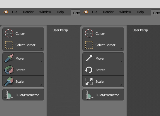
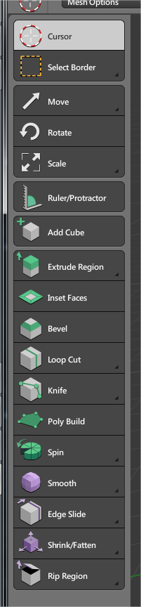
The new edit icons are fine, move, scale and rotate… well… but sculpt brushes I think that must be classic icons render, nobody will create this icons for his custom brushes, will be hard to read.
I have always liked this token simplified icon set style, maybe this could be flat base style?
https://brsev.deviantart.com/art/Token-128429570
I am a little concerned that we are focusing too much on what the icons will look like. ( I am a graphic designer so of course I would love to see some beautiful icons) I really don’t want the devs to waste time by keep redoing icons to try and make everyone happy.
Talk about the icons go almost nonstop for the past week or so. Wouldn’t it be better for the devs to focus there limited time on features and not so much what the icons will look like?
I am no programmer but I am sure once we take advantage of the code quest with all the wonderful features getting added, surely we can come back to worrying about what the icons will look like after the code quest.
Just my 2 cents
4 Likes
It’s a designer who made the icons, not a dev.
And we will ve able to use custom icons so it’s not really an issue.
1 Like
True, but its the devs who have to keep going back to the code to swap out icons and then adjust from there right?
I know this is easy to do but I would rather have there focus on the more complicated task, before they leave in a few months.
PS, you should donate SPEEDFLOW to 2.8
Excuse my bad Paint mockup but I wonder if it is possible to change the 3d window lighting flyout to include access to the background colours? and make the circles much smaller along the lines of my illustration - no need for massive blobs like the old sculpt ones…

Could buttons with options be immediately expanded when you click on the bottom right corner (triangle icon area)?. We are losing valuable microseconds with the current system 
1 Like