Definitely looks like a bug ! It’s not supposed to do this.
It’s a problem with the range, the pie works better if the mouse pointer is near the center.
1 Like
Pie menus are not standard on right click, regular menus are… So it’s probably not a good idea for the standard keymap…
Blender needs to be hassle free by default… ![]()
3 Likes
it’s angle based
1 Like
![]()
![]()
![]() this is becoming a fiasco
this is becoming a fiasco
when did simplicity got lost… FFS it’s a simple project (at least was in 2.79) ![]()
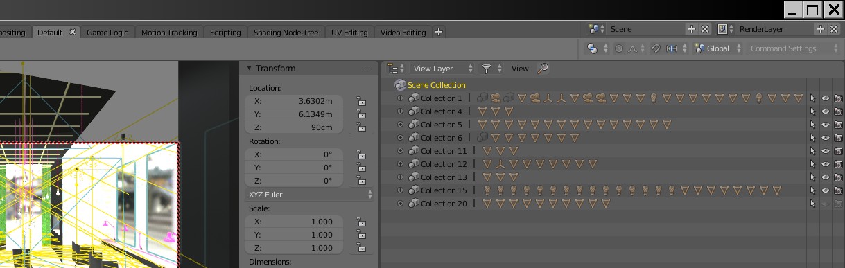
to which collection does selected object belongs too? (yes, it’s last in line thus occluded) ![]()
damned cluster fuck
& where’s ‘only rendered’ now?
my humble suggestion: option to keep old UI … yeah, at end i’ll adapt again
Yes… it is also getting much, much slower to work with.
4 Likes
Yeah the collection thingy can get very complex and mind-bending, its like playing 3D chess against a vulcan.
Also piling icons horizontally in an vertical panel/window…
3 Likes
I do not use Pie Menu, I do not feel comfortable with it.
Anyway, perhaps the selection method would be clearer and the problems mentioned above would not happen, if it looked more like a “Pie” (with well-defined portions of the pie):
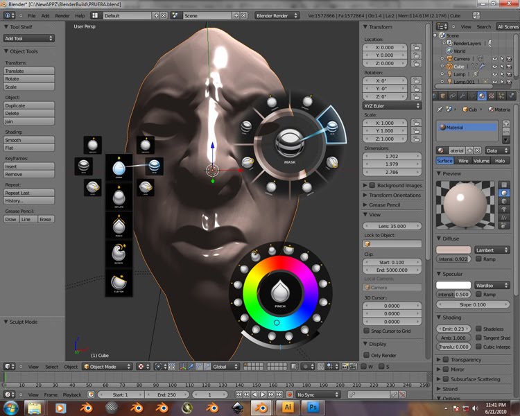
Even highlighting could have different colors in different Pie portions to make it even clearer.
(Images obtained by searching “pie menu” in google)
9 Likes
Those are your old groups being automatically converted to collections isn’t it ? Surely if you had built your scene with collections in mind this would be different, more readable ?
@SonicBlue @TheRedWaxPolice is right, this is not related to the space the buttons occupy in screen space, but by angle (360/8). It’s behaving normally, it’s just that the buttons are unevenly sized…
1 Like
Is it old news that modifiers now works in 2.8.
I don’t know if it’s planned, but you should be able to pan horizontally to see every object in it.
Also, that’s just a preview of what the collection contains, if you click the plus button (+) it shows every objects inside with their respective name.
Old Layers, Groups, Visibility selections… a mess.
Old way layering (M), old way grouping (ctrl+G), select and hide all selected (H)… outliner overviews…
No, sorry to disappoint, the new way is not faster.
1 Like
I somewhat agree but with transparent header and toolbar backgrounds it’s actually clean and clear what belongs to what region and no way near as offensive
1 Like
it’s only half finished.
 Yeah, had the same first impression until i got to start using, working with tools. Then everything collapses.
Well, Siggraph 2018 is not years away.
I had a feeling of too ambitious announcements when planning last year. It occur to me round the Xmass it will be delayed by a year or at least a half i think.
I’m reserving judgement until the tools populate the header more (see the inset tool) and until the new widgets are more fully formed with the numeric entry fields as per william’s proposal
2 Likes
Actually, the new collections are absolutely amazing, definitely one of the best new features in 2.8. Learn to use it and I am sure you will love it. If you don’t want to learn new things you can always stick to 2.7 
Let’s just give them a few days to let them iron these things out  I think the top bar will work, it just needs some tweaks so that dropdowns do not cluster together as much
2 Likes
Know how to use them, but are still more time consuming and less maneuverable. As if road signs became hurdles on the road. Should hold more informational value than occluding workspace visibility and flow.
All i can really say… now i start to see advantages of soon to be previous Blender iteration.
1 Like
Most of the time when something new is great, there is no issue, everyone know it will work.
It’s like that for eevee and workbench, but not for the top bar.
I’m waiting for the devs to show me it can work, but I’m very skeptical.
1 Like