The properties editor is the place where all the settings and properties should appear in a contextual manner, nowhere else. So untill that happen, hot mess is our friend. ![]()
Do you know if it is an intentional feature the possibility of ticking checkboxes when you click on any part of the whole row item?
This is something we have in 2.7x too. If this is not something to which someone finds some benefit, it would be good to be able to solve it in 2.8 by making items marked/ticked only when you click exactly on the box.
As it works right now, I have eventually made accidental mistakes in T panel by marking unwanted options when using a graphic tablet pen, which is very sensitive.
By the way, does it have the same behavior in Windows?. I do not know if it’s something that only works like this in Linux.
1 Like
Same behavior on Windows
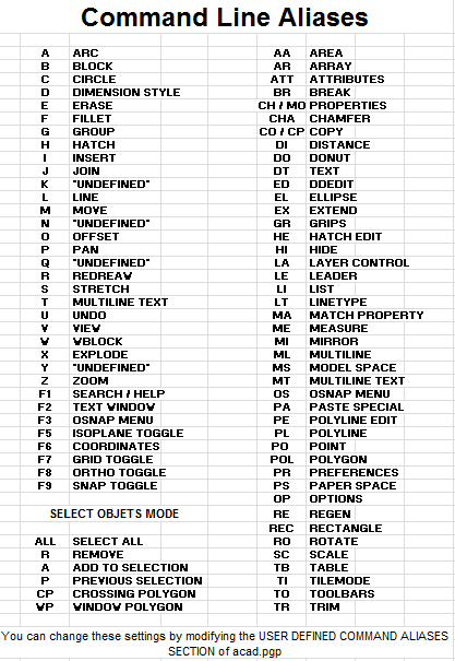
Speaking about of keyboard shortcuts, in the course of my life the fastest and most intuitive is Autocad’s shortcuts, with the commands formed by a pair of letters and confirming it with the space bar or with sending. Those who have used Autocad in the past can understand …
Autocad can indeed be really fast, but I feel most of that is training the user to type commands.
You get pretty quick at typing ‘rotate3d’ after doing it 1000 times a day.
The shortcut options are nice, especially with multiple shorthand options.
Well, on university I was using Autocad, Revit, 3dsmax, now Blender, and honestly they are different but I can’t find any of them better/worst. I was not doing a lot of sculpting/animations, only archwiz/archinteriors and I have to pick the one I like most - Blender 2.79 with tweaked pie menus is the best for me.
The thing with autocad was that you had to repeat it milion times a week, that’s why it seems to be better/faster/more natural.
That was what I was getting at. Right now the properties panel works as just another preference panel for the most part with some object properties thrown in. The properties panel should be smarter and it should know what object its dealing with so I can edit the properties for the object I actually want to work with. Almost every other app who has properties panels works this way. From Unreal, to Unity, to even Godot. A properties panel should only show you relevant information for the object selected imo.
I don’t need the Render properties there all the time. I don’t need the world settings there all the time. Right now before you can even get to your mesh objects properties you have to go through five tabs (render, view layer, scene, world, and now workspace). If you want to just change the color or intensity of your light, you have to go through seven tabs. The same if you want to change your cameras properties. This just strikes me as clunky design if they want new users to know what’s going on.
if I select a light, it’s properties should be the first things I see in the properties panel, I need to see it’s transform data, I then need to see it’s light intensity and color data, etc.
The properties panel should at most show four tabs per object by default with additional tabs added when modifiers (like particles or Rigidbody) are added.
The N panel imo should go away. It doesn’t really need to be there to be honest and is a kludge that was added because the devs had nowhere else to put stuff. Some stuff there is redundant, some is already getting moved to the top bar, and others should be in the properties panel anyway.
1 Like
How does it work? Should you first press a key to open a field to enter the shortcut/command?. So would it be similar to how the search feature works in Blender then?
@anphung, Thanks.
The keyboard command may be ‘rt3’ very short.
There are many ways to use software, to be productive you need to know the shortcuts.

Not really similar, in the list that is useful you have to search, but slows you down.
I’m not saying I didn’t know shortcuts. I prefer shortcuts workflow over buttons one - first thing I got with my mac when I was learning Illustrator and doing a lot of stock work with it was to buy KB Cover for my keyboard. What I’m saying is that I was using shortcuts on Autocad, 3dsmax, Revit, and Blender and yes they are all different, but with things that I make, they are just different, not better/worst from each other. And now, after few months with some small, really small tweaks over defaults, I find myself working comfortably in Blender and not missing the 3dsmax way. When I approach new software, I assume that people developing it are at least as smart as I am, so keyboard shortcuts have some reasons in that particular software workflow. I did same with the blender - I was struggling a lot for first few days/maybe weeks but I got used to it and I like how it is.
1 Like
This keypress mode change means that we press “2” for edit mode. So that means the “2” key is available as a hotkey while in edit mode…
So you press 2, and enter Edit mode with your last submode selected, “vertex select” for example. Press “2” again and move to “edge select”, 2 again and you’re in “face select”. Hold down shift (add), ctrl (skip), and alt (remove) while pressing “2” and you could get all the combination modes as well…
2 Likes
It feels very awkward to me. It requires remembering which number goes into a mode to change the submode. If you hit the wrong key it changes modes. Considering how frequently you switch submodes while modeling I think that’ll get extremely annoying.
If it were up to me, I’d probably go tab->pop up mode menu->1-5 to switch. Then 1-3 is consistently the submode switch.
That’s something that I had proposed in the entry of developers web site. I had not thought about the other thing you said with modifier keys, and it would really work excellent. At least for Edit mode, I do not know if also in other modes that have sub modes.
I do not understand the fuss with those who propose a key for each sub mode, it would complicate even more to be able to remember all the available modes and sub-modes. They also seem to forget that it is important to be able to enter Edit mode with the last used sub mode, without having to make an effort to remember what it was. Also when you press “2” key to enter edit mode, you already have your finger on that key, so changing submodes would be really fast.
And for those who prefer pie menus, I’m sure they will be able to configure it too.
Thinking about this it might be even simpler…
Press “2” and you are in Edit mode using your last selected subselection mode.
But HOLD DOWN “2” and then press “e”, “v”, or “f” to directly enter Edge, Vertex or Face selection mode from any mode or to change the mode if already in Edit mode.
You could even add Shift and Alt to add or remove. So if Editing with vertex selection you could press Shift-2-e to add edge selection.
If aliases are introduced to the search menu. You can get this workflow
You’re right man… I even suggested that in the devs page https://developer.blender.org/T55043#504140 but no love as always… 
The N-panel has 3 uses:
-
Its useful for changing properties while in full screen. Those options aren’t duplicated. Those are the options people want to change the most often while working.
-
It holds custom properties for rigs. Its more common for folks to build their rig UI in a panel that is separate from the tool panel. It keeps the tool panel from getting too cluttered.
-
Each tile (not each editor) can have different settings. For example, if you want to, you can lock the camera to the view of one tile and make a pseudo widget for moving the camera while you are working in another 3d view. If they were to move this feature to the property editor, they’d have to build in a way of referencing each individual tile from there.
I think enhancing the n-panel makes more sense than getting rid of it. There is no reason it can’t become something like a mini property editor. It should be capable of showing all the same properties the property editor does atm. We could even potentially hide the properties we don’t need, and pin sub options we find useful to custom tabs.
1 Like
But once again, cycling between selection components will mess up your active selection since Blender converts it.
Blender is already kinda famous for the “tabbing into edit mode” thing so I think invoking a mode-selection pie menu with “tab” would be the better choice. As for the number keys, I have 1, 2 and 3 keys bound to Verts, Edges and Faces selection components since changing selection modes is actually the most commonly invoked command in a modeling session because most tools in edit mode use component selection as a factor in their behavior. Instead of having to call a menu and then selecting my component I just change it with one button press and it have saved me literally hours of time in my modeling sessions.
6 Likes
Yea, I think the best approach is to incorporate pie menus in some way. You could hold 2 down to get a pie menu that has vert, edge, face, and last mode. Pressing 2 like normal could just function the way tab does now.
PS: You can still enable multiple modes at once with the buttons on the 3d view header.
1 Like