Ah, ok, thanks! 
I do not know where to talk about this, Interfaces / usability thread has been closed.
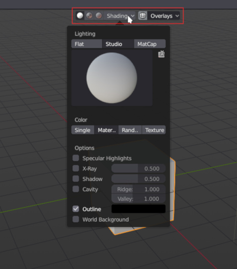
I’m not sure if this is still WIP, but center is not the best position for those options in the red box.
With some of those options it is good to be able to see your work in 3DView while you try different view modes, and in some cases the menu can cover part of your work and it could be annoying.
I’m not sure in what position it would be less intrusive to 3DView.
6 Likes
I like it in the middle…you know what ‘pan’ is?
Too much moaning here about imperfections IMO 
Have to agree, it was better when it was on the side.
I guess they testing different positions.
2 Likes
Yea, having modelling tools are on side and shading tools are at center is weird ¯\_(ツ)_/¯.
In logic of middle - more accesable=more important, we rather actually model than play with display settings.
But I guess thats because of consistency (other editors also have snapping options on right).
I hope that powerusers are gonna be able to change that placement, cuz’ if you are experienced, having important options in more accessible place is more important than logic and consistency.
And the other thing: Important options/modes/settings are now hidden inside popovers. Is there a solution for that (serious for me) issue?
Well it’s a well-worded and reasoned argument, I’m all for it.
For popovers about display options, user should have ability to create presets for display.
By calling a preset, you will change several settings at same time without opening a popover.
For popovers about tools, brushes, a tool settings tab was added to properties editor.
User should be able to see content of a popover as a traditional panel in this tab.
1 Like
I would request an option to just align them all to the left, thank you very much.
By the way, what happened to Automerge Editing? The icon is gone from the header and I can’t find it in any menu.
1 Like
Remove of icon was not problematic as long as Automerge Editing was still present in Mesh menu like in 2.79.
But Mesh menu was rewritten after move of Vertex, Edge and Face menus.
I think restoration of automerge editing checkbox was forgotten at that moment.
IMO, most pratical choice would be to restore icon button in header
2 Likes
Loving the direction they’re going into. But just want to share something others have mentioned already.
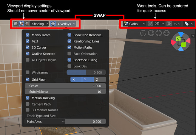
I think it’s important to note that currently the viewport display settings are a lot of fun to play with, so perhaps most people see no problem with its placement due to the quick access at the center. But once you’re really working on projects, I predict it’ll be less practical.
11 Likes
Man, you guys got a point… When did that happened? It was fine on the right.
This is a huge regression, and can be quite problematic…
I hope the devs can see that.
5 Likes
I have to agree. It makes more sense to have the editing options top and center, since you’ll be using them far more often than the shading settings. It was better the way they had it previously.
Plus, it makes more sense to have the shading and overlay dropdowns on the right anyway, since it groups all the viewport specific stuff together in one area.
3 Likes
I also agree with you
1 Like
They’re trying to make it “consistent”. I respect that, but there’s a point where consistency does not matter. Who cares if options are on the right inside the image editor, and on the left inside the 3dview ? What matters is ease of use, practicality.
5 Likes
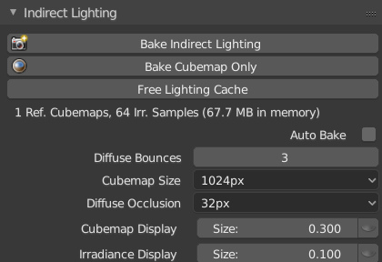
Initial implementation of Light Cache in 2.8 branch:
4 Likes
Wow! is it available to download now?
Not yet. From tonight it will be available in buildbot builds.
You do not expect it to work well right now, it’s just the initial implementation. Currently the image textures are not updated correctly when you load the file with saved cache, you have to make some changes in materials nodes for it to be updated (at least with my test file)
1 Like
The viewport interface now allows you to hide any extra objects and elements that might distract during modeling or scene assembly
https://lists.blender.org/pipermail/bf-blender-cvs/2018-July/111938.html
It would likely be the same for just admiring a slick looking scene in the realtime Eevee view.
Is just me or object selection in large scenes is much slower than in 2.7x ?
The way that it’s now is almost unusable for me.
17 Likes