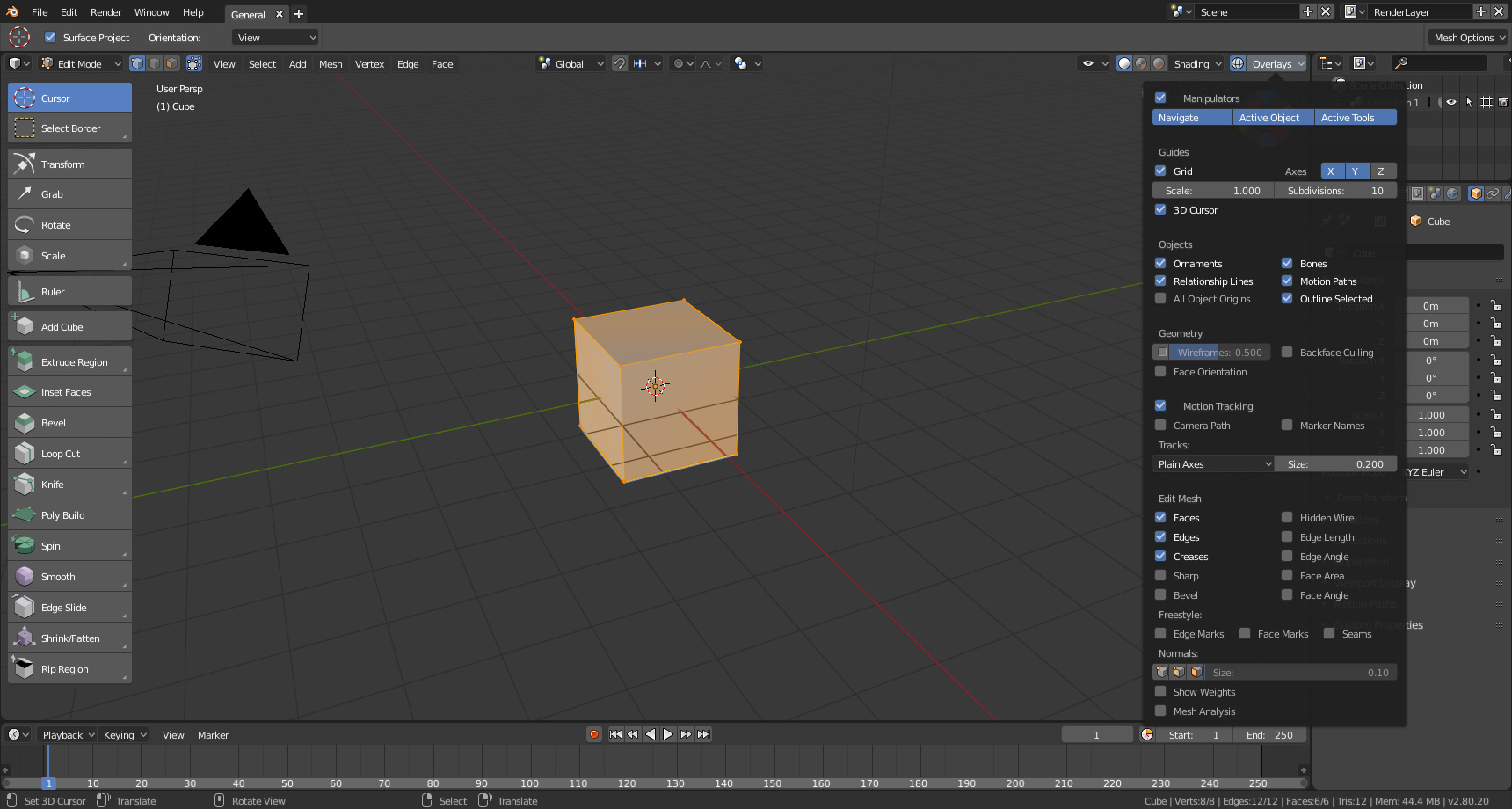
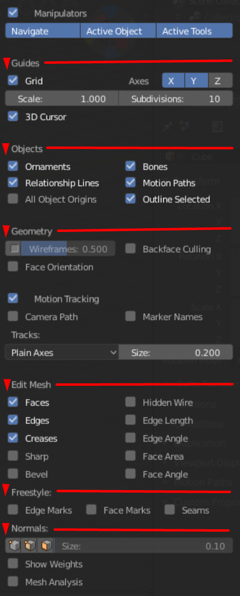
How big is the overlays panel in edit mode? Can you take a screenshot?
Also you could upload your fresh builds somewhere, here/discord. 
How big is the overlays panel in edit mode? Can you take a screenshot?
Also you could upload your fresh builds somewhere, here/discord.
I’m pretty sure he checks the dev talk forum regularly. Especially the threads about the UI and Theme, Etc. I think he even mentioned in this week’s Blender Today stream, that he does look for feedback in the forum and R-Click-Select. 
But yeah, Screenshots & Videos really do convey the issues better and gives more depth to the Criticisms/Feedback than a dry wall of text. 
Hmm, getting bigger and bigger.
But fortunately we’ll have this:
And yeah, I use windows. Thanks anyway.
Yeah, we talked about that, remember?
Glad they are on it already. ^
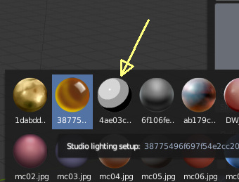
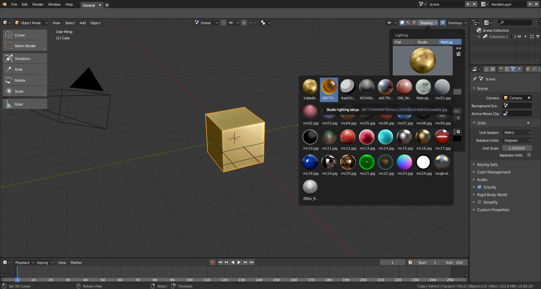
The matcaps list size is not a big issue imo, cuz once you choose a matcap the panel disappears.
However, the matcaps thumbnails on that list could be a bit smaller, so we could see more matcaps on the screen at once, and browse them without scrolling too much.
Perhaps the list should not be closed when choosing new matcap so it is not tedious to try which matcap best suits your needs?
List closes when you stop mouse over for example.
Well that’s another story… And could be nice too, for faster switching of matcaps… But then the size of the panel comes into play again… 
I hope the Mesh Options button are moved from the far upper right side of the interface. It feels really hidden. It should be on the left, where all the modeling and work menus are, not above the outliner.
The tool settings tab is the new home for this…
Well, so list does not close when choosing new matcap, smaller matcap thumbnails, smaller list width, and list to remember last position when open (currently if you have many matcaps, it always comes back to the top of the list every time you open it).
Just proposing something here.
Yeah, I noticed it. But what’s the point of having the button cluttering (in my opinion) the interface?
The topbar and the tool settings are supposed to have the same settings iirc. So people who prefer the topbar or the tool settings tab can choose which way they want to work.
I myself I prefer to work with the tool settings tab in the properties editor, in fact, once the new tool settings system is fully functional I will pretty much hide the topbar for good. Unless they make this kind of topbar: https://blender.community/c/rightclickselect/4Hbbbc/how-about-a-more-regular-topbar

Few more Pablo tweaks to Shading Popover.
https://lists.blender.org/pipermail/bf-blender-cvs/2018-July/111983.html
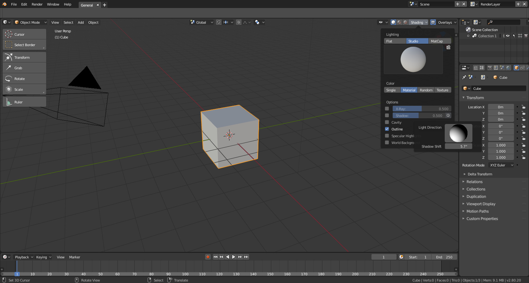
Shadow settings (little gear has the popover with the light direction):
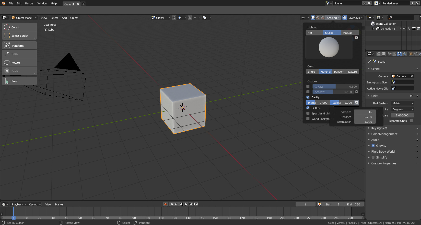
Cavity settings:
Smaller matcap previews:
Definitely much more Functional having the option boxes added to the entries in the pop-over menu instead of a deep dive menu in properties editor. Could use some clean-up though. But I’m sure that will come too. Pablo on 
Thank you Pablo, I’m really happy you listen to us
This is much better, continue like that!
Cool stuff…
Are they reading this thread or what? 
Let’s cheer a beer for that !
The matcap I made is included now… Yay… ![]()