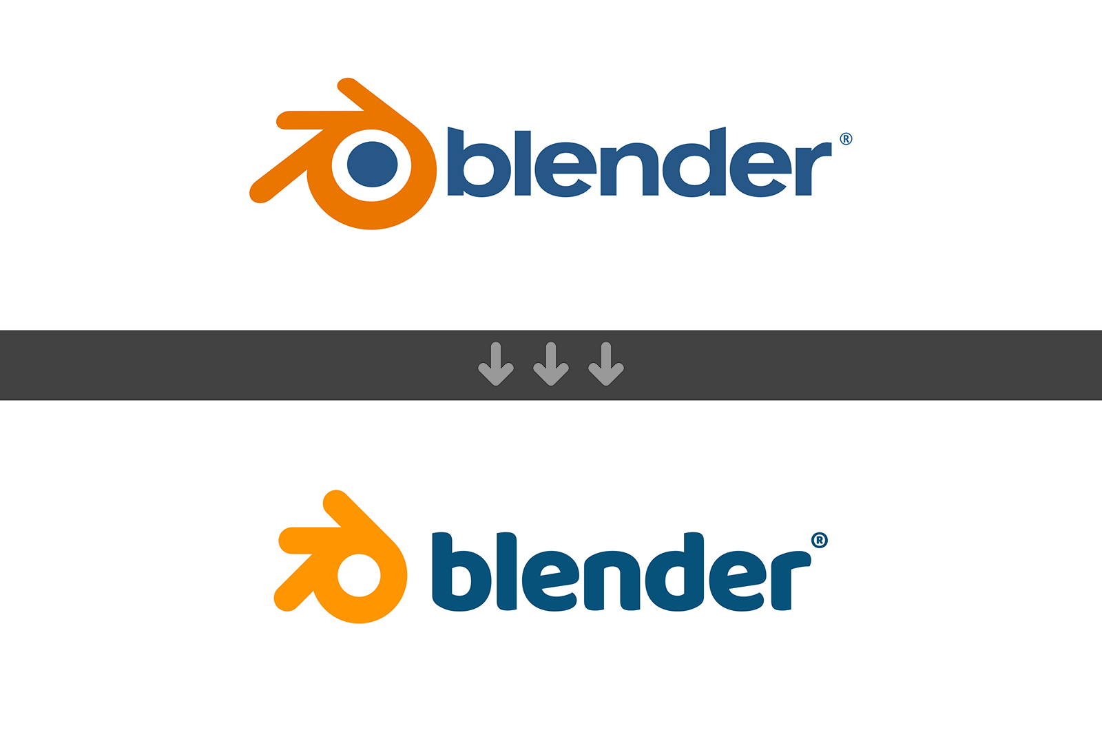
I was never very happy with the Blender logo myself.
And as 3.0 is upon us I thought I finally create a proposal for a refresh on it.
I know many tried and failed - and this might easily be my fate too.
But my approach is not a full rebrand - changing everything - I only intend to do a “makeover” for the 2020’s. Because I honestly believe that’s enough.
The Behance project is filled with images and descriptions so I rather don’t upload much of it here again.
Please check it out, and let’s discuss your opinion on it. I really-really hope you’ll like it!
Brands should evolve the same way as (and alongside) the software they represent.
And especially if there are leaps of improvement on one side, there should be representative updates on the other too. (this does not work the opposite direction :))
I made the proposal because I believe it would improve Blender’s appeal as a brand.
The software is advanced and professional and more approachable for many years now and I believe its logo lags behind and doesn’t represent it well. Honestly it doesn’t look professional enough.
I am also not a fan of the current logo. It’s pretty bad to my taste how but I can live with it.
The proposed logo is pretty nice. But I think it is not enough.
Blender needs broader brand redesign. It needs to be really thought out considering many products and properties of Blender as a whole: Blender itself; Cycles and Eevee needs separate brand identities; Blender Foundation; Blender Studio etc. These properties needs to work well together design wise and have strong separate identities as well.
It’s a huge job and I doubt one person could take care of this.
I’ve changed my mind a bit after seeing the Behance project. After seeing how it integrates in the context I’d say I wouldn’t mind just the change of the logo. It doesn’t break much of the current brand identity but to my taste it improves on the current logo design.
Fair enough. But how is it a simplification like the firefox logo? I know what happened there but here the only thing which became really simpler is that I removed the blue dot.
But for me that change is justified because I really wanted to make the logo work better in smaller scale and in single color. It’s not just for the sake of simplification.
Also the old font reminds me of a free font site from the late 90s. But it’s 2022 in a month.
This was exactly the idea!
As I wrote there, huge redesigns bumped back from the devs and the community multiple times.
My goal is to make a small but very valuable change.
From the distance it should feel the same as the old one, but for the trained eye (which most of us are in the industry) it should look more professional.
Brands evolve, true, but the actual Logo and Blender are both trademarked and registered in the EU and the US, and changing it is not as easy as anyone might think.
As far as i can remember, i’ m not sure if BF actually own the logo (source: https://web.archive.org/web/20070225155355/http://www.mopi.nl/blogo/p7.html , but it seems BF actually got the rights to it https://www.blender.org/about/logo/) so it’s not a thing of changing or not. Also AFAIK, nowadays any brand design has to be reviewed by copyright and trademark lawyers with all the paperwork, time and money required to do so (hint: not cheap, The big “A” can do it every 2 or 3 years, since has lots of designers and far more lawyers working for them, also AFAIK they have quite some deals in place with Adobe and Fontworks, so they allow to use their IP under certain conditions). Also i honestly doubt that Ton wants to actually change it, and i might guess because the same reasons suzanne wouldn’t be ever removed from Blender. Also there’s an aditional problem: The fonts used. Depending on where you live, fonts can be copyrighted or patented, so :are you sure you can actually use the depicted fonts for a logo?
But you can try reaching Ton at the mailing list or via Chat. You have nothing to lose
(Before anyone ask: been there, done that, but not for anything closer to BF)
Sorry to be that guy.
I don’t like the proposed logo. Current one might not be the best, and yes, some refinement might be a good idea.
But the proposed one screams FisherPrice to me. I hate dumbification and childification of brands and products. Hate the simplification just for the sake of it.
This new logo is better. It IS simply better.
In today’s information overloaded world we need to simplify things to be more focused on important information incoming to us.
Less is more.
What would be an acceptable amount of “refinement”? Who decides on that?
Is that some kind of pre-defined percentage you could tell me where you wouldn’t say OMG it’s too much change?
Is it perhaps the amount of bezier points I could remove?
If it’s that then I removed 4 bezier points.
That defines the circle I removed. But you can desvribe a circle with 2 bezier points so perhaps I only removed 2. is that too much?
I changed very little in the logo.
All well thought through and justified in my opinion.
Sure you can dislike it, but don’t just say it’s too simplified. How is it too simplified?
How could it be less less?
Please read the Behance project where I talk about the whys on each changes.
Shown side by side, the current logo grabs my eye far more strongly that the new one. The varying thinness of the shape and center dot helps lend it uniqueness (although the dot feels too contrasty, seems to work better in monochrome).
As for the type, the new one is more llegible but rather too bland. Some kind of middle ground between them would work better. If anything, it’s there where I’d rather see changes, because the letters’ tops (“n” an “r” vs the rest’s) feel inbalanced, as if they didn’t match each other. It hurts the eye.