Taken from the other thread and migrated the answer here to keep the information in one place.
I would be lying if I didn’t consider that at least a part of the payload of Filmic. The concepts are more important than the actual configuration, it is just that it apparently took a configuration to get folks interested in the concepts.
If you have any questions that you think I can answer regarding transforms and LUTs, feel free to ask them.
Exactly. In terms of colour science, the colour primaries for any colour space are simply “just another colour”. Frequently there are more than a few different ways to mix to the same resultant colour in the CIE xyY model by mixing various wavelengths. What this means is that while it might seem like a mathematical blooper to permit pure primaries from any given colour space, it simply is a falsehood. So that means that the colours that are arrived at from the Notorious Six™ need to be considered absolutely legitimate colours, and tackled accordingly, despite their rather unique formulations.
Part of the issue is a logical misconception because there is a broken form of desaturation present in any transform that permits values to push into the display referred limit. That is, under the sRGB EOTF, values appear to desaturate. The problem is, they aren’t actually desaturating, but rather changing entirely. It makes more sense to consider that the distance between values are what determines the final chromaticity coordinate of any given colour mix. Under RGB, when we simply let a value continue to ascend towards the display referred limit, we are actually changing the chromaticity coordinate of the colour in a way that is not a desaturation. Colours will drift to the pure R, G, B, R+B, G+B, or R+G combinations. If you watch some animated features, you might even spot this in their colour handling sadly. There is a question on Blender Stack Exchange that has some visual examples.
So what is “correct” desaturation? I’d suggest that there isn’t a single clear “best” out there, but I would consider what is “best” in the contexts of someone wanting to do imaging manipulation. We can speculate that fully desaturated would amount to the white point colour of any given reference space. That is, in most RGB colour spaces, R=G=B is an achromatic colour, which happens to be a colour itself. What we would want is a colour encoding model that allows us to march a very intense and saturated colour towards that value, without much drifting along that line. While it might seem like an easy task, colour encoding models such as Lab* have well documented problems with this. For more information, Googling “Lab blue turns purple” or “Lab red turns yellow”.
The reason that a “neutral” desaturation makes sense is that it gives someone the most flexibility with colour grading while also doing an aesthetic thing that “feels right” as a result of a learned mental model. If you want to push some of that desaturated colour back into the highlight region, it is possible to do so by augmenting the saturation on the values in the post-display referred encode. I believe the recent GDC 2017 had a discussion on the Frostbite engine doing exactly this; desaturating correctly, then doing a post-grade to push saturation back outwards. This was needed for some games to push the colour of explosions outwards stylistically, which happen to be very intense and post difficulties in a colour pipeline.
There is a contemporary colour encoding model that delivers a rather acurate model for these sorts of things, better than the ratio based approach currently in Filmic. It’s something that will land when I add in the wider gamut reference space rendering. It has opened a can of worms though, and as a result, I have to move more slowly on integrating it.
Exactly.
And again, suggesting that a pure blue primary “isn’t natural” is completely incorrect. All mixtures of the Notorious Six™ are entirely legitimate. They are simply another colour in the gamut a particular reference can deliver.
Anyways, desaturation is quite a fascinating topic if you delve into it. What should happen? What do we excpect? Why? What does adding HDR displays into the mix with high intensity output do to our perceptions of desaturation? What models work for mapping and modelling it? Where should desaturation begin and how fast should it happen? What happens if our reference space is wider gamut than the destination display space?
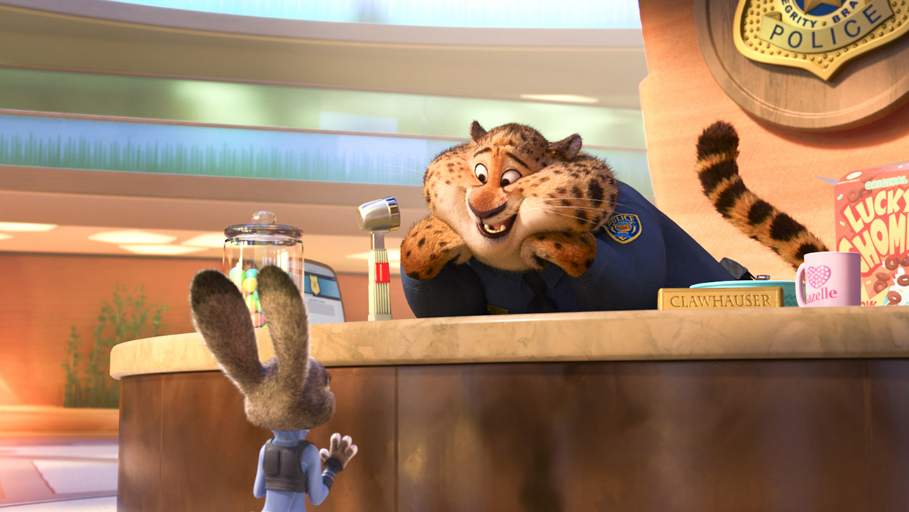
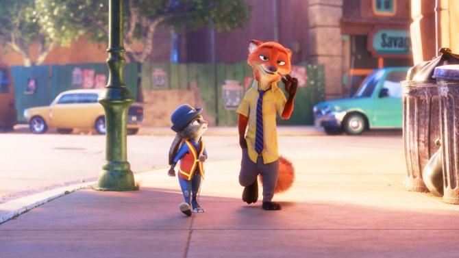
If anyone has an interest in the aesthetic side of things, I’d encourage an A / B comparison of Zootopia versus Monster’s University. The former has some subtle hints that their desaturation view transform needed help, while the latter is a rather masterful result. Quite an impressive study.
I’ve included three examples from the OpenEXR reference images demonstrating how colours become broken. Notice how the colours in question always end up deviating to the Notorious Six™. The sky turns an incorrect saturated cyan, the trees a yellow, etc.
In all of these demos, don’t mistake the more saturated colours as being the colours in the original encoding; they are actually incorrect overly-saturated broken colours. That is, they are broken ratios drifting to the Notorious Six™.
Troy,
is the object of Filmic photorealism? I take HDR images (one right on, one +2ev, one -2ev) almost all the time to get the details that a “right on” shot misses. They are beautiful to me, but not necessarily photo-realistic.
How do your images relate to desaturation in Blender Cycles renders? I didn’t think photos and renders
were equivalent color spaces (?)…aren’t they completely different beasts?
Are those images above a composite of 3 or more?
A / B comparison of Zootopia versus Monster’s University. The former has some subtle hints that their desaturation view transform needed help, while the latter is a rather masterful result.
Can you show us what you mean, or what should we look for?
In terms of technical details, the object is to give folks a reliable view transform that they can use and weaponise in their work. This includes photorealistic work as well as Pixar-esque types of work. There’s now quite a few examples out there that have some rather crazy cool, and utterly non-photorealistic, subject matter.
You still need a reliable view transform to get proper results when you are manipulating images. Grading to get that sort of crazy tonemapped look is entirely fine, but doing the math on broken values is nothing but a time suck that leads to less than optimal results.
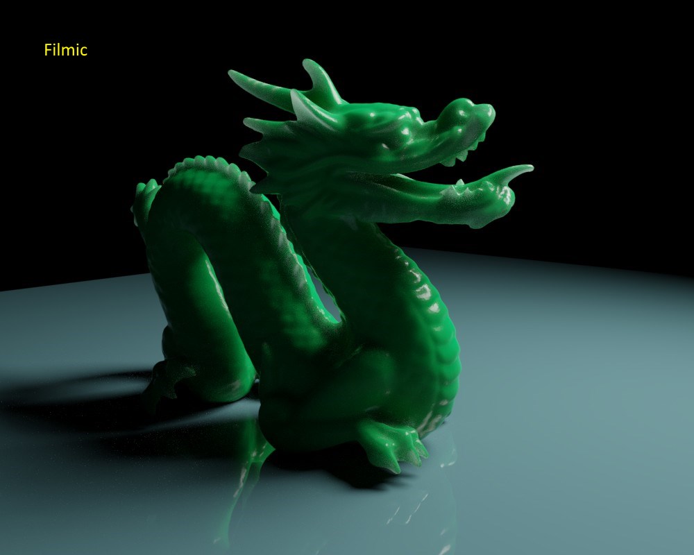
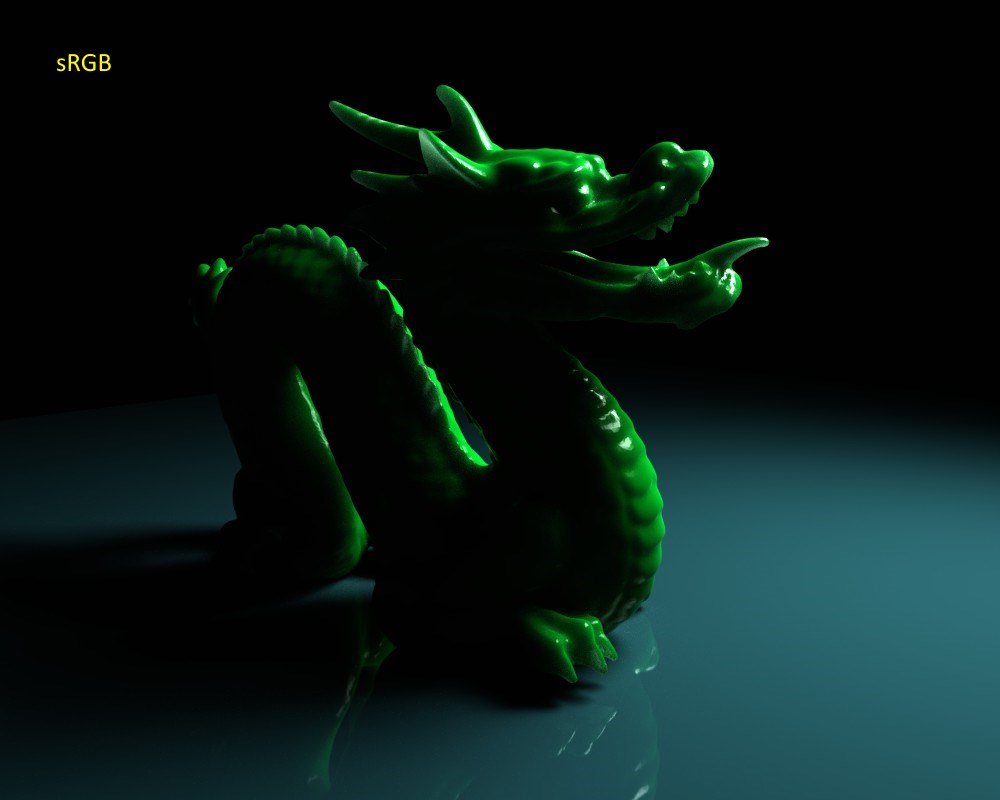
The above images are A / B samples. What you are seeing are the OpenEXR sample images under two different view transforms. The one with the crazy cyan and incorrectly saturated drifted colours is the sRGB EOTF. The one that represents the original colour ratios more accurately is Filmic.
Not a colour space, but a facet of scene referred versus display / output / device referred differences.
In the case of an OpenEXR scene referred image, where the values go from some low value to some possibly sky-high value, you still have to consider how those values get to the display referred domain. In the case of the above, the sRGB EOTF yields busted up results, where Filmic tries to grab a broader range of values and deal with those very high intensity values more gracefully while giving someone the creative weapon to augment the output[1].
Those are properly generated EXRs from the OpenEXR repository, based off of a merging of a good number of brackets. That means that in the case where there might be a direct sun in the picture, you are dealing with something that would require an ND 3.0 (10 stop) neutral density to capture the sun values in coordination with the scene’s other values, even at the fastest setting a DSLR could capture.
It’s speculation as to their respective colour pipes at this point, but Dominic Glynn’s fingerprints appear to be all over Monster’s University. If you look at the following images, you can see some similar trends that folks might recognize. In particular, look for what feels like drifting to the Notorious Six™. It should be noted that these are images from a huge company with many talented minds behind the work, and that grading plays a key role. If you look at the Zootopia work though, there is a hint that some effort was put into dealing with the saturation issues in a grade. I believe the most recent Lego Batman film had some issues on that front as well.
Compare against the Monster’s University stills, which don’t quite do the project justice as they are captures that may or may not be entirely indicative of the final master in the movie. Still, you can clearly see some interesting details. I’d add that the work is absolutely stunning to watch with your colour eyes focusing on the lighting…
Apologies for the last four images. This forum software leaves a little to be desired when you hit the three image attachment limitation.
[1] With the caveat above. There are more ideal colour encoding models to get accurate results that are currently not utilised in Filmic.
Those are some eye opening images Troy. I wonder if that saturated highlight look might not be a conscious choice though, to make it more of a candy color style?
Yellow on countertop. Cyan in sky. Yellow in street.
I would suggest there is a consistent and reoccurring conflating of “broken colours in highlights, suppressed” with “saturated highlights.” One is potentially an error. One is a creative choice.
Do you think the lavender-pinkish sidewalk due to the Notorious 6 or just
artistic choice?
I like the overall cooler color scheme and lighting of Monsters U, vs the washed out warm tones
in Zootopia (just judging from your samples scenes)…but I’m legally color blind, lol.
Thanks for the detailed reply. It’s eye-opening to see some of the technical details that go into
these scenes.
BTW, I asked this in the other thread a while ago, but didn’t get your input on it, the replies
were not clear to me: Does “Use Curves” help or negatively impact Filmic? I.e. is it useful or useless?
Hi Troy, have you been contacted by the Blender developers to work on the Filmic’s implementation into Blender? I’m asking it because from the last Developer Meeting Notes it seems that there’s nobody working on that actually.
Anyway, yours is a great addition and improvement to the look of our rendered images even if I still need to learn to well balance lights with the False Colours option. Thank you.
I thought it was when we save the blend (?) Seems like a logical idea…file size is slightly
smaller for Filmic than the same blend with sRBG.
But I’ll let the Devs hash it out. I’ve already made it my Pref for Color Management,
and even if it isn’t included in Blender (as default or in the list of options), it’s easy to
add.
I’m trying it with the Disney BSDF…love it.
(render comparisons to follow)
I personally think it is artistic choice. Look at the strong color scheme in the rest of the scene:
Green in lightpole, fence, leaves.
Blue/cyan in car, sign, windowframe, with darker blue shades in clothing and refflections.
And the lavender-pinkish is used several places as well.
Animated cartoons like this tend to have very strong color themes, and I don’t believe studios would leave anything to chance and limitations, but rather work hard to overcome any obstacles to meet the art direction.
I am not an artist per se though, so I could be wrong.
Zootopia looked gorgeous on the big screen though (and I don’t think anyone was thinking about the ‘notorious six’ or tonemapping in general when watching the movie). My guess was that it was purely a design decision, because I can’t imagine Disney of all companies being completely ignorant on color management topics.
Though my question which I have been trying to get answered is this, is Filmic curves literally the only way to go in terms of color grading and tonemapping? Can’t a tonemap be considered good enough as long as it crushes various issue such as burnout?
It needs to be done right if there is going to be an overhaul on the default configuration. There are other important patches regarding colour in the pipeline.
I am reasonably sure having OCIO configurable is on the map.
Sure. Could be. That orange wall and desk flukily happens to turn yellow in the hot lights? Sky just happens to turn a cyan? Green trees and the green shirts randomly bloom to yellows. Car in normal exposure area is a richer blue that wanders off to cyan in the more highly exposed region? The indigo shade in the sidewalk that coincidentally drifts off into magenta?
It is speculation, but as someone that has become all too sensitive to spotting it, it jumps out like a blinking neon sign. Again, compare against the totality of Glynn’s work as a baseline.
You can choose to push out saturated highlights in a grade. If you do that however, you would be pushing out the original colour, not broken ratios.
Quite a contrast between Filmic and sRGB, at least in this case.
BTW, I didn’t realize I could switch between the two without re-rendering
before saving the render as an image. In fact, change the curves and all the
other settings in ColorManagement without re-rendering as much as I want, and
save each resulting image…cool! (difficult way to animate!)
Here’s the blend. Would appreciate it if anyone would tweek it to get the best render & lighting. 4a.blend (11.2 MB)
Rendered ~11minutes (1000 samples)
you messed up your file, the sample pictures are faulted: you set base contrast for sRGB too, which is an unfair comparison.
Also your green color has 0 in R channel which is better to avoid (i mean the 0 value in a channel)