You could bake the normals of the higher detailed areas, then join the mesh i suppose… I can’t think of another way really, i’m not to skilled when it comes to armatures and rigging.
You can parent meshes to bones. You probably don’t want to deform metal arms and such. If it were real it would not work that way.
Composition test with the robot: at the end I’ve menaged to rig it decently ( It’s official, I hate rigging, there should be a tutorial explaining how to create high poly mesh workflow for animation, I’d seriously want to take it!!!), but to avoid extreme deformation I had to change a bit the pose I had in mind, implying there’s a lot more of the back of the legs shown then I planned, so I’ll probably have to detail them a little more, ghhh.
It’s looking good although I must admit that I was a bit surprised by the camera perspective. I always thought he was standing. And imho the distortion at the right side is a bit heavy. I wonder how this would look with a longer lens.
I’ve tried some different composition setup:
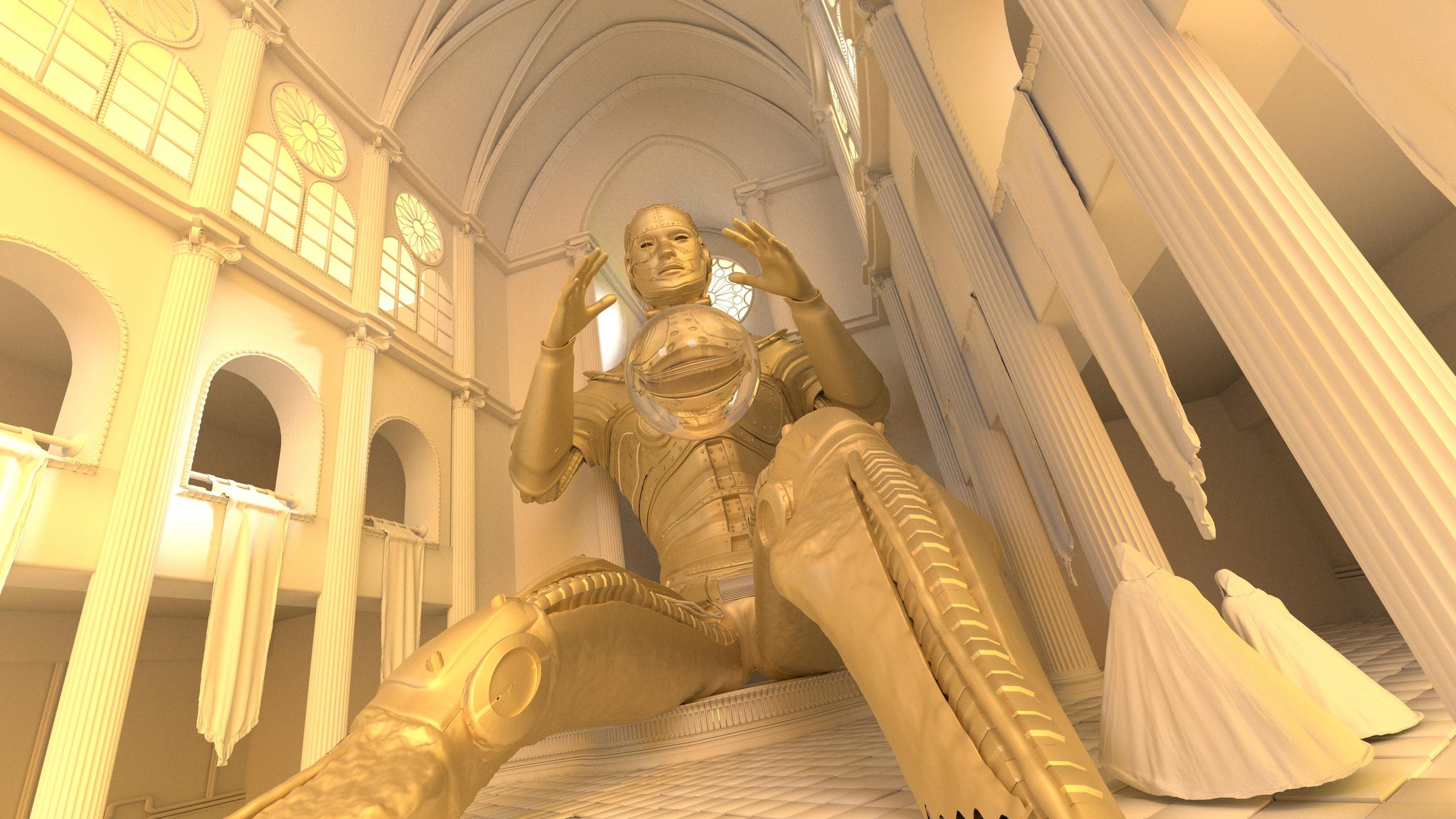
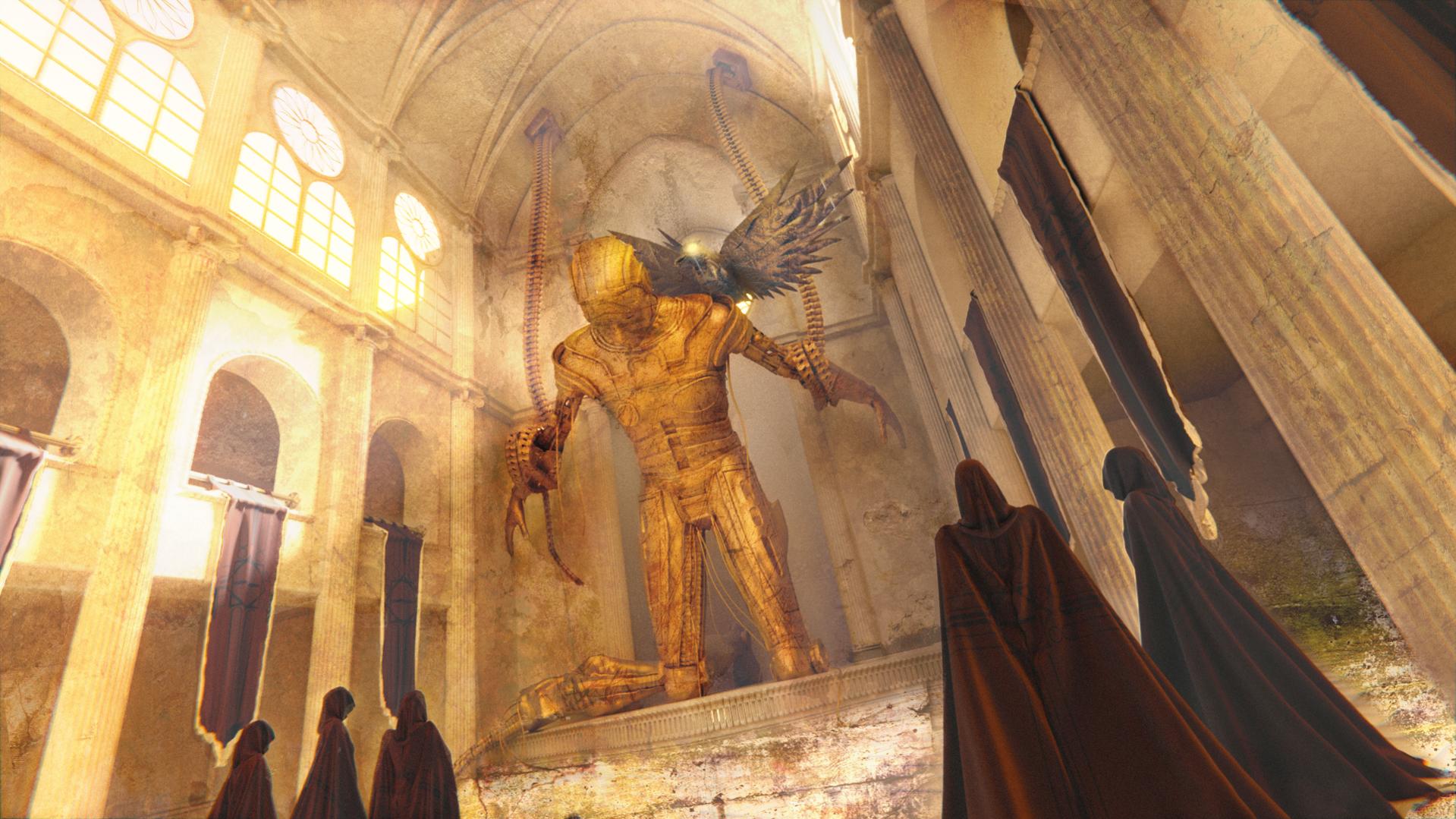
1-“Giant Prometheus” : the one posted before: i liked the scale, but as some friend of mine stated :" how the hell could he get inside the church, since he’s so big?" … fair point, ahahaha. It had huge rigging problems in the legs area, so I’ve decided to call it quits.
2-“Chained Standing Prometheus”: No image for that, I’ve made a test with the standing prometheus , chained to the walls. Maybe it was the scale, maybe it was too small but I did not like it at all, seemed to lose a lot in term of impact.
3-“Beaten Prometheus”: it’s the one here, and I think I’ll stick with this (maybe I’ll leave the foreground leg on the left, I don’t like it). The scale is not as big as giant prometheus but It feels big enough, and I like to overall feeling of the image.

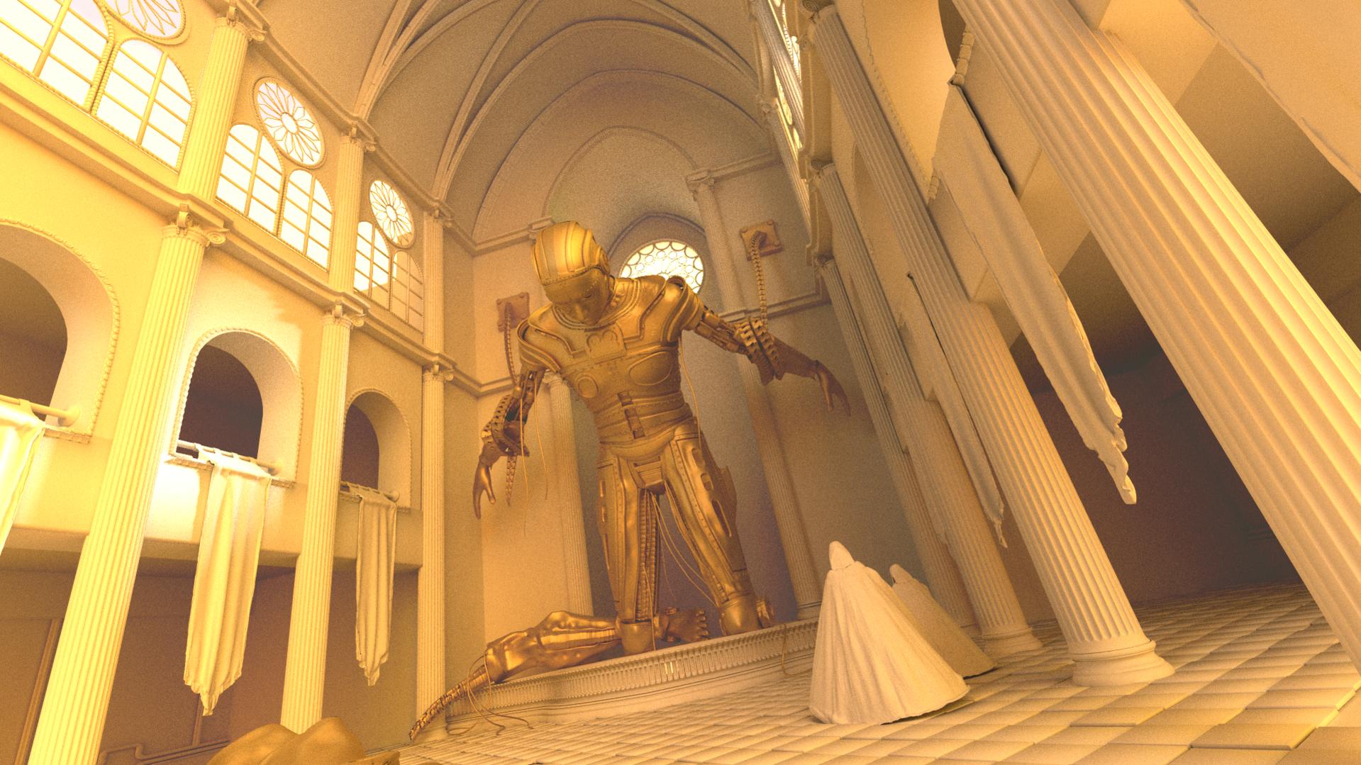
The level of detail is simply insane. I like the last image most. The only thing is, I didn’t realize he was chained :no:
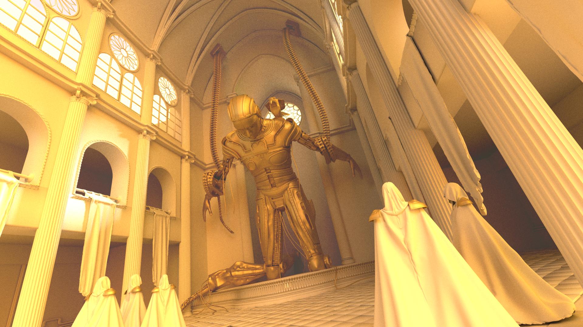
Thank you! I’ve made the chains bigger and sticked to the ceiling to give more appeal and add more drama, lol. I’ve changed the model for the hooded figures, now they are 5 and more detailed. Since I’ve changed a bit the theme ( from Prometheus the bringer to Prometheus the fallen ) this night I’ll try to model the eagle that in the myth tears his leaver everyday to put on its shoulder.
I like the new version much better. And the fallen Prometheus is surely a much more dramatic topic. I also like the fact that the main lines in the composition lead to the robot. But your main subject is quite far away in the cathedral. Would there be a way to bring him more to the front? That would also make him appear bigger.
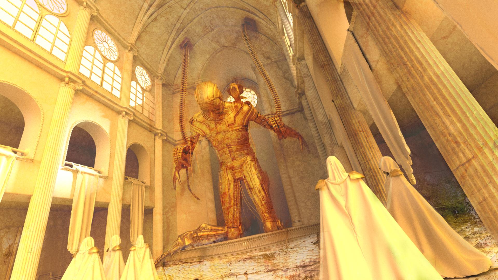
Ok, there we got with the last version of the week! As you see I’ve tweaked a little bit the figure ( Bigger chains hanging from the ceiling, one leg is full to enanche the dramatic impact of the other broken ).
There are the new hooded guys too, little bit saint seya style, ahahahah. They are the reason why I put the robot at the end of the cathedral: I want the viewer to fell part of the group of the hooded guys , and so I gave that distribution to the 2 groups ( you should feel as part of the right nearest group). I’ll try to enpathize the robot during composing using volumetric light / god rays on the figure.
Ah , obiouvsly the crow is a basic basic blocking, Tomorow I’ll detail and make it as a robot.
They are the reason why I put the robot at the end of the cathedral: I want the viewer to fell part of the group of the hooded guys , and so I gave that distribution to the 2 groups ( you should feel as part of the right nearest group).
Yeah, that’s working well. I had that feeling immediately, when I was looking at the latest image.
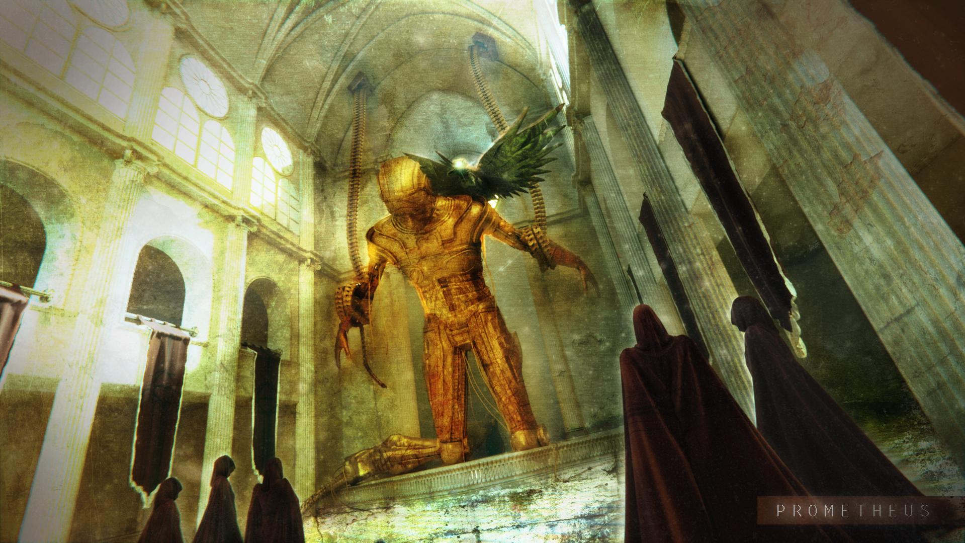
Yesterday I’ve almost completed the eagle modeling and I’ve tried some light setup and some materials, but I was not satisfied with the later, so today I’ve tried to visualize the result I want to achieve on the last render, and I must say that I really like the result. I’ll probably have to remake the hooded guys because I can’t work on their UV properly, and the same goes with the standards, sigh.
The composition is looking good now and the extra layer of grunge is nice also. It appears rather monochromatic and light at the moment. Do you plan to add more colors? I’m just curious and don’t want to suggest more colors with this post.
Hi there, long time no see but work kicked in so I had to switch priority, ahahhaah.
In the last few days I’ve made some test about texturing and volumetrics.
I had to recreate hooded guys because I could not texture them properly: this is one of the main values of attending this kind of competition, it’s so easy to spot your weakness ( and understand where you are getting better too). In my case, I’ve noticed I lack a solid workflow, specially for high poly modeling: i need to understand better when is ok to unwrap model, create UVS, how to create proxy. I’ve bought CGMaster T-REX class and I’ll try it as long as this project is over.
Further more I need to learn to control better lightning and texturing, I don’t find a lot of tutorials about it, they tend to be a little bit “quick and dirty” , while I’d like to get more understanding.
Getting back to my last render, here you can spot the eagle in its final form: i’ve added volumetrics ( overnight render, 7.000 samples and clamping) but i’m still not sure about the blending, I’ll have to work. Texturing is almost ok, I’ll tend to have a 2 main color setup ( yellow - red ) and work on values: I’ve seen that plenty of Steampunk artwork tend to have a brownish - yellow - red palette, I’m trying to sticking to it , and It’s kind of an excercise to me because I tend to create night shoots, mainly.
There we go, it’s over: at the end I’ve decided for a colder feel like the one I was planning at the beginning, but I like it. I’ll stop looking at it for a few days , and eventually try something later to refresh my eyes.
At the end of the day it was a really funny experience teaching me my faults but showing at the same time the progress achieved in an year of serious blending, so I can be satisfied.
This is soooooo good!
Thank you, really appreciated!
Wow, interesting how this turned out. It actually appears like a painting. A bit too much for my taste but I still I really like the story. Did you achieve all the effects in Blender? I would be curious 
thank you, I’ve decided for a painting look on purpose, exaggerating some features and losing in realism.
plenty of composition was made on PS (I was thinking to do a breakdown video in a few week): all the effects were possible in compositor, but they are easier to achieve in PS.
To understand better, the image consists in 2 main pass , volume pass + normal image. At this 2 main pass I’ve added a grain + stretches pass and a dust pass ( consisting in 3 main diffused level with different level of blur ), and some effects like vignette. As you see, it’s all about overlaying, screening and dodging levels, eventually with some mask as factor.