By default, you can only change your username up to 3 days after registration in Discourse. You CAN however, always update your ‘display name’. If available, this will be shown in addition to your display name:
I don’t think the Blenderartists Forum is the kind of Forum where this kind of behavior might be a problem. Also how would you keep people from creating multiple accounts? IP bans? Paid Account creation? That would be a huge bummer and make users abandon the Forum sooner or later.
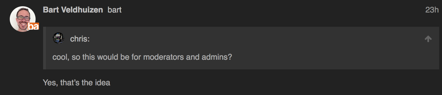
Hey Bart, will you run the site alone or will you have moderators and so on? And if so, is it ok to ask who will be in the crew?
Fweeb will remain in charge of the moderation team, we don’t plan on any ‘staff’ changes there. I hope to get involved a little myself as well (personally, I’d really like to help with more frequent featured art, for example), but I’ll have to balance that with my work on BlenderArtists and Sketchfab too ![]()
Congratulations - fun fact to learn that you were one of the original NaN people!
So much respect for the NaN people and giving us Blender!
I don’t think the Blenderartists Forum is the kind of Forum where this kind of behaviour might be a problem.
No this has happened before…
I have never been on a forum where this has not happened before…
Also how would you keep people from creating multiple accounts? IP bans? Paid Account creation?
how to prevent it from happening… I’m really not the one to ask on how any improvements could be achieved… I’m just casing my vote (again for whatever that is worth) to working towards any method that might help…
(perhaps the coming ‘Block Chain’ technologies will address the problem… )
and come to think of it I believe one of the ideas behind the creation of the Blender Cloud and it’s paid monthly subscription was to have a forum that would have fewer trolls… thinking that the monetary drain on the troll would discourage there enthusiasm for making trouble…
however in my online experience with such paid forums the Trolling actually was worse behind the Monetary Curtain than out side of it…
Anywayz… all just MHO…
Congratulations! B@rt !
Totally Agree, with CGStrive!
Also, IMHO, there are too many colors. Orange, and shades of dark gray + white are ok to me. “sign up” and “log in” buttons should probably be orange as well. Maybe use special colours like red or blue would be useful, but just for very special and not frequent highlights.
Of course that is my opinion, because I’m often confused when i browse sites with too many colors (some times pointless, whit no clear meaning or purpose).
Also, If possible, it would be nice to apply some material design principles to enhance the readability. Just some drop shadows where needed would help i think!
Another question: Signatures?
Noticed none on the test site. On most art/cg forums people like to have signatures to link to their Artstation/sketchbooks/whatever.
There’s a plugin to support signatures, but like here, if we were to add that plugin, the signatures would be text-only and we’d only allow a few lines of text.
1 blender nation
2 systems
There won’t be signatures - Discourse considers them disruptive to the conversation flow and I agree. Each user has a profile that will appear on his ‘card’ when you click on a username. You can add a description and links there:
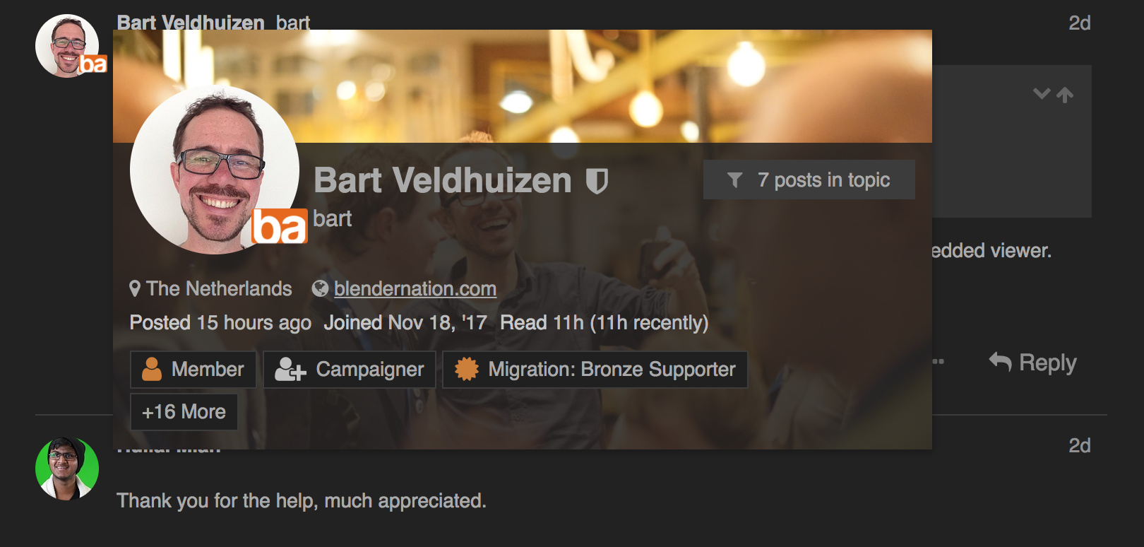
Here’s my full profile card:
https://forum-test.blendernation.com/u/bart/summary
@others - I’ll take your design/colorscheme suggestions into consideration, thanks!
I just enabled Blender ID login:
https://forum-test.blendernation.com/t/blender-id-login-is-now-available/213
Another question I’ve been wondering about is the size of the avatar display in the threads.
In many forums dedicated to creative ventures (CG, game creation, ect…) the avatar image bounds in the threads are 128x128 pixels at minimum (examples include the CGsociety and the Unity community). This also wouldn’t be near as much a burden on board design today because the majority browse such sites at a resolution of 1080P or larger.
Since the profile cards already display them in a larger size, it shouldn’t add much to the amount of bandwidth needed.
Larger avatars are nice and all, but the discussion, the artwork, and the support are the focus of the site. Avatars are there to let you know who you’re talking to. They don’t need to be super huge. The interface designers on most social media sites seem to agree with this sentiment.
In my humble opinion, BA is not a social media, is a forum for artists, which often love to show a piece of their artwork as own avatar, so squared and quite large avatars would be appropriate.
And as you can see I don’t use any avatar at all.
paolo
From what I’ve seen, what is popular in the area of forum design doesn’t always correlate with what gets high marks among users (Unity Tech. tried to change the design of their forum to something ‘trendy’ using Lithium, and the backlash was so intense they rolled back to the old Xenforo site).
Sometimes, following a trend can be seen as a step backwards. We’ve got to not the fact that many things that are popular is not because it is better.
Well my biggest irritation of trends is the “Flat UI.” I absolutely hate it. I’m sure Blender 2.8 will default to it because “trendy.” As long as they don’t remove the ability for shaded/3D themes, then whatever. But the main reason I don’t like it productivity software is static information blends in with interactive information/controls. Even worse are some of the colorless, low contrast, flat themes, where “grayed out” (disabled) controls blend in with enabled ones.
It does not bother me as much on web sites, but the overly spacious web designs, where you get very little information without lots of scrolling irks me a bit as well.
Most issues I have with the new BA site I don’t mind so much because I can easily fix them with Stylebot. I use Stylebot to fix all sorts of web sites that I visit on a regular basis. Mostly to “de-phone-ify” them, so they look good and are efficient on my big desktop monitor.
I should also mention really great thing on discourse is you can append .rss or .json to almost any url to use with whatever reader/feed to keep an eye on whatever you want. For example if you want to monitor a tag “feedback-wanted”:
Normal URL: https://forum-test.blendernation.com/tags/feedback-wanted
RSS URL: https://forum-test.blendernation.com/tags/feedback-wanted.rss
JSON URL: https://forum-test.blendernation.com/tags/feedback-wanted.json
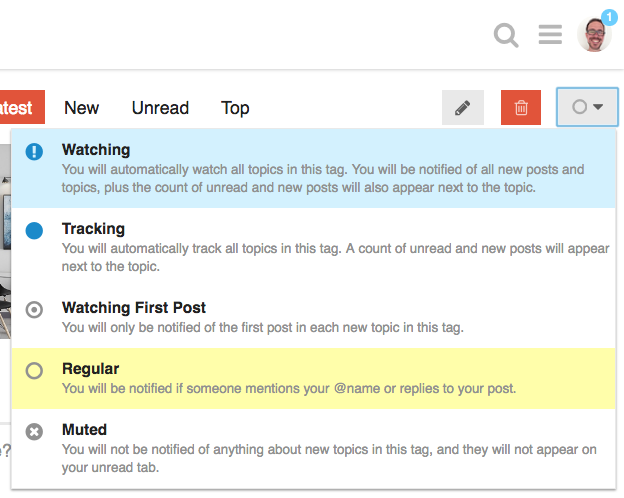
Even better, you can ‘watch’ tags just like you can with topics! You’ll receive regular notifications that way.
To try, go to a tag page, and find the circle icon:
Hey another question: Any chance the “Materials & Textures” forum will have either sub forums or the support category have dedicated forums for individual render engines?
Like a “Cycles” forum and an “Eevee” forum, etc?
I personally have a biggest problem with division of main topics between Latest News and Blender and CG discussion. The naming of these is so ambiguous to the point that they are nearly interchangeable. For example, my two favorite Blender threads, the “Brecht’s easter egg surprise: Modernizing shading and rendering” and “Blender 2.8 development thread” are threads of the same type and caliber, yet I have to go two two different sections to check them out. It feels very fragmented.
I really hope this fragmentation of topic sections can be resolved along with transition to discord. I’d suggest these General Forums categories:
Announcements: A section dedicated solely to a press release style announcements of new versions and important news.
Blender: A section dedicated to any general threads about blender
CG Discussion: A section dedicated to any general threads that are not directly Blender related (general CG threads about theory, technology, studios, work experiences, learning experiences as well as other software).