I’ve never been a fan of Discourse, but I can use any interface so it’s not a huge deal. I can always use CSS and js overrides to get just about any result I want. I am curious about two things though.
1/ What was the motivation for the change?
I know Discourse is loved by some and hated by others, but overall I have never seen anything particularly attractive about it in terms of looks or functionality. Was the change motivated by concerns about vB licensing and/or coding quality?
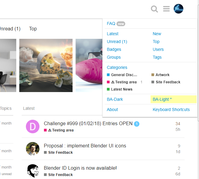
2/ Are you planning on having a light variant of the theme?
I like dark themes, and am happy to use them in isolation, but the problems with them are a/ they don’t handle some lighting conditions well (being particularly vulnerable to light hitting the screen at an angle) and b/ the vast majority of the web uses light themes, and usually you will be operating multiple tabs with a range of sites, which means any site with a dark theme becomes the odd one out and an irritating change in contrast for general web use.
Gumboots; I think the fact that Discourse is FOSS is one factor in its appeal.
Then there’s the comments I’ve read in other communities about how the quality of Vbulletin took a nosedive when they released version 5 (the software is no longer known for quality and many boards have abandoned it).
Oh good. Thanks for the tip. I hadn’t looked that far in the test site.
Yes I had heard about the problems with vB, ergo my question. They were also jacking licensing costs to insane levels at one point. Although for the money Discourse are asking just about anything looks cheap by comparison.
Edit: Found some answers to my questions over in this thread.
Just looking around the test site a bit, and I had noticed some comments about avatar sizing earlier in this thread. Usually that would be easy to deal with via custom CSS (userContent.css or similar, depending on what your browser supports) but for some weird reason the Discourse crew have forced avatar sizing in the HTML.
That’s a very odd choice for an app which claims to be up to date and responsive. It’s a practice more suited to the 1990’s, back when tables were used for layout and use of CSS was limited to a few colours and images. If avatar sizing was done via CSS (and they have to have CSS to make the avs round anyway) then anyone who wanted bigger or smaller avs could easily get them.
Edit: Bloody hell. Discourse is still using tables for layout. WTF?
Kinda makes a joke out of earlier posts about how we shouldn’t be using tables these days, when the app being pumped as the solution still relies on tables.
To be fair, for the type of layouts forums use, tables are the most appropriate. It’s general website layouts with simple “header, nav, content, footer” that really shouldn’t be using tables anymore.
I mean, I am neutral to the software itself, if it works it works, but the ‘we shouldn’t use tables anymore’ mantra tends to be more used by people who didn’t even do web dev back when tables were used to layout all the stuff, than people who actually knows what it refers to.
I agree that if it works, it works. I’m all for using tables where they’re the best solution. After all, they were invented for a reason and they are valid HTML. But their purpose is not for layout and they’re usually not the best option for layout anyway. Forum index page content is not actually tabular by nature. You can easily get a standard forum layout without tables, and it’s more flexible without them. You can get a sort of limited responsiveness with tables by dropping cells via display: none; as screen width decreases, but you can’t actually rearrange content the way you can with divs and/or lists. The other point is that using tables for layout is a bugger for anyone who has to use a screen reader. Arguably not a consideration for a visual arts forum, but a relevant point when it comes to coding for a wide range of users.
And, as someone who has had to work on bad old days coding that relied on tables for layout, I can tell you that the more modern methods of doing layout are far easier to work on. They even used to use nested tables, and that way lies madness.
Honestly I don’t care if its tables or what not, I just want to be able to better format a post on the rarer occasion(and I do agree with Fweeb that’s a fairly rare case) that I’m typing up a longer - more complex reply to a support question. A perfectly reasonable compromise IMO is to only support markdown tags when just typing in the quick reply editor so that quick reply’s can be typed up quickly and distraction free. Where for advanced formatting we can reasonable be expected to go through a visual interface with the mouse affecting only the final output result perhaps.
I think most answers have already been taken care of by Fweeb and others. The only input I’d like to add here is that while I’m definitely happy with feedback or suggestions, we should not try to solve issues until they prove to be an actual problem that affects the majority of the users.
I’d rather work with the new site for a few months and then carefully make changes that are important for many people instead of starting by adding layers of plugins and modifications to satisfy individuals before we’re even live.
At this point, the only major change I’m trying to get before going live is a ‘grid gallery’ option for art galleries and tags.
Thanks for asking We’re still doing a lot of testing and tweaking right now. Especially getting all the different kinds of attachments and internal links right turns out to be a real challenge. I hope we’ll be able to finish this stage this week and move to the actual migration next week. Please take this estimate with a grain of salt, but I’m hoping to make the switch within 2 weeks. I’ll keep you guys posted when I have more information.
But no it doesn’t necessarily do all I’d wish for, still better than nothing. Tagged as an official plugin whatever that means.
If Bart and/or his developer finds this acceptable that would be great, if not I’m certainly not going to cry over it - just wanted to know if it even is an option.