After seeing the amazing “Blender is…” video, released last year, I got inspired by Karen Lee’s segment, by using Blender as a motion design tool, as a motion designer myself I want to focus on working with my 3D skills too, so I decided to create fake ad’s as personal projects.
For the first project, I have decided to create a soap commercial for a company called B.O.B (Bars over Bottles), it’s a Brazilian small company that focus on natural ingredients, eco-friendly products.
It took over 2 weeks to completion, from storyboard to final render, here’s the result:
 - 3D promo video")
![]() Styleframes:
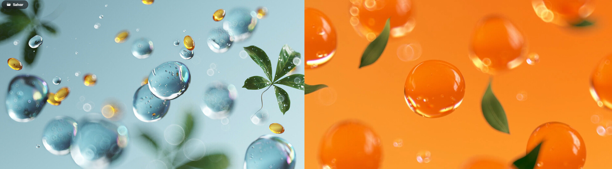
Styleframes:


![]() Mission
Mission
It was very inspired by this Pantene Ad, so my goal was, if I managed to do 1% of this high end quality commercial, my task was accomplished.
Result
It was a great experience!
A lot of animations was using geometry nodes and the liquid simulation was done using Flip Fluid, it was hard since it’s my first time doing simulations, but I think it managed to give a good look.
Closing thoughts
I’ve receive a lot of positive feedback, some said it was lacking some shot’s with hair, to give a more explicit use of the product and a lot of people said they look delicious, which got me concerned, maybe next time I will do some candy ad haha!
Cheers!
You can check the next chapter of this saga here