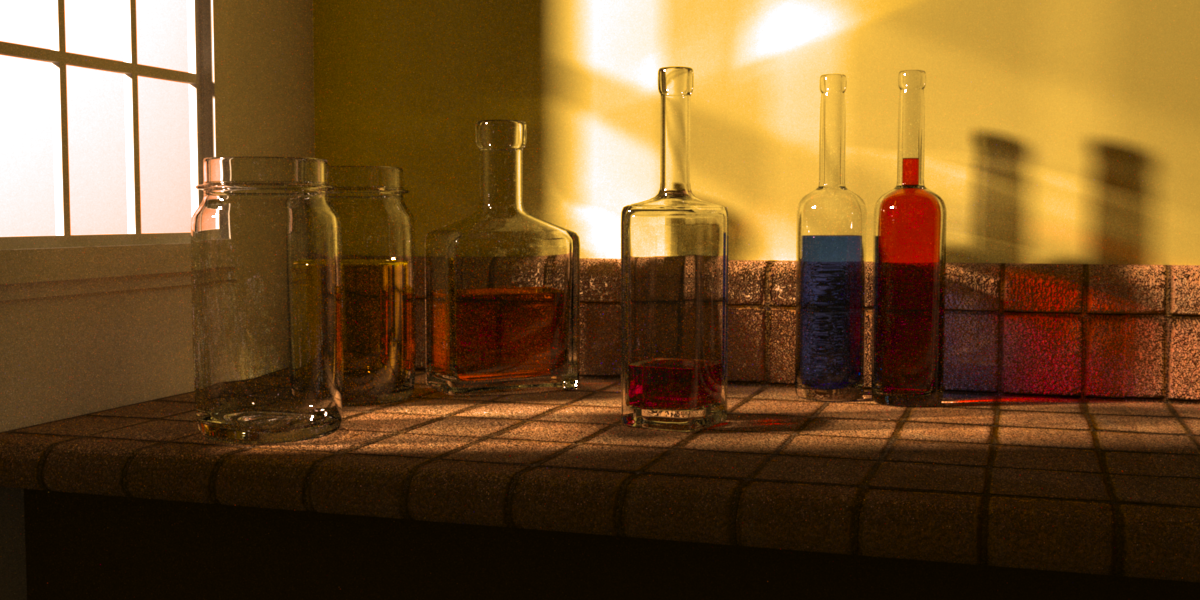
The render took about 16hrs on a Core2Duo w/ 2G ram. This is completely raw with no post-pro (or even gamma correction, which I know it needs :D).
Problems I’ve already identified and am planning on fixing for the next render:
Gamma/color correction, noize reducetion etc.
The bump-map on the tile is WAY to strong making it look like sandstone instead of ceramic
The scene is a little too dark.
The colors of the fluids need to be better…well, they just need to work better in the composition.
If you see anything else I can fix, let me know. I’m especially looking for composition advice (placement of objects, light, shaddow, colors, camera angle, etc.)
hmmm…I guess I really don’t understand gamma and unbiasedness…but I’ll take your word for it. I think I was trying to say it looked a little dark…
Thanks fer the portal suggestion. Very helpful.
I did put a meniscus on the liquids but you can’t really see it in the render. Perhaps it’s too small…
As to having no point, you’re kinda right. Part of this is on purpose as this was intended to be more of an exercise. But I’m definitely open to suggestions as to how I might make my composition more meaningful. I really just want it to be a visually pleasing still life with lot’s of light and shadows and glass and caustics.
It is very grainy. I’d vary the colours of the liquids in the bottles rather than being mostly the same and the empty bottle on the far left looks to be out of place.
@spacetug Good idea’s, thanks. Is that render yours?
@Richard You’re right about the jar on the left being out of place (I just stuck it there to see what it would look like). As to graininess, are you refering to the texture of the tiles (cuz that’s the aforementioned bump-map issue) or the quality of the render?
The background below and to the right of the window looks very grainy and this grain seems to be showing up in the bottles infront of the background. I like the lighting but looking at it again, I like when the light hits the liquid so you have that splash of colour, you don’t get that nice colour when the liquid is in the shadow.
English: This image was created by Gilles Tran with POV-Ray 3.6 using Radiosity. The glasses, ashtray and pitcher were modeled with Rhino and the dice with Cinema 4D.
no, it’s not.
Oh, good. Cuz I’m not really a fan. Too plastic looking. The modeling isn’t spectacular. The specular and reflections are really harsh, but the diffuse and shadows are way too ambient.


