just an image of the actual state of the render.
some problems appears…
change the color of the final image, but it’s not the final “touch”
eyes are now textured… but also it’s not the final version
hands are updated!, and rigged so them can has more “action”
the guy updated, now has shoes, texture for her cloth, and some minor changes…
the watch of the guy has a problem with the curve, i have to solve it now…
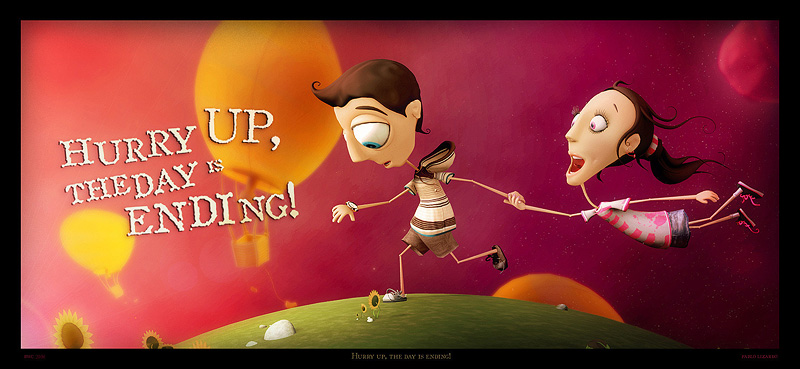
do you have suggestion for the enviroment??? :no:because i’m thinking if i have to leave it simple or add details, for example little, buildings, rocks, clouds, more people? well, please tell me!
Rocks and clouds. Arent there already rocks? More rocks!;):yes:
I attached a tweaked image in photoshop of your render.
I suggest a more dramatic change from day to night to enhance the cartoon feel of the image. I simply added an orange rectangle on the left, a blue one over the right part. Blurred them, and applied them as “color burn” over your render.
I also suggest you add details on each side to give both side a distinct look. I.E. adding the moon on the right, and added flower petals flying through the air on the left.
But seriously, very nice style you got there 
good job.
Attachments
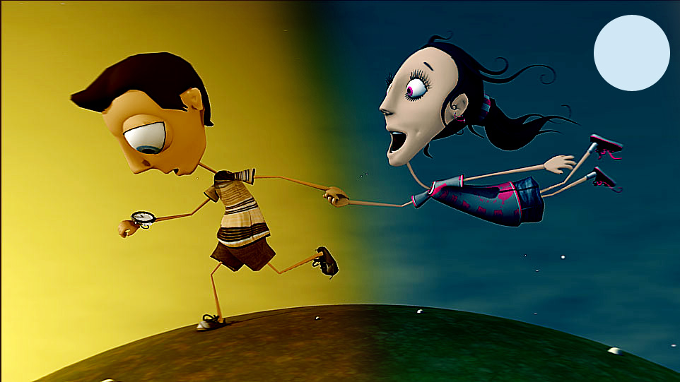
Yeah I’m with Ecks on this one. I think make the contrast between the two more distinct and maybe even try to give the two a different color temparature warm red on the left and blue cold on the right.
I reall dig this one
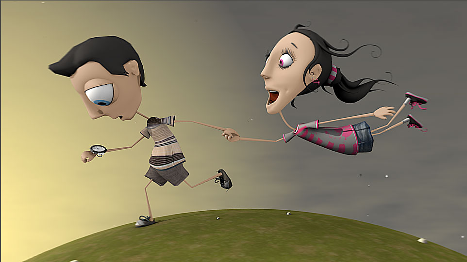
after post the last image I made another painting over the render so i can quickly preview modifications, here is the image.
then i read the comments, so the image is not updated i think, but i will work on your suggestions.
blend4jesus: thanks, yes, definitly more rocks! i’m thinking about clouds, i will made a few test to show it…
ecks! : thanks for the image!, il like that!, meaby with minus intensity, but i like it!, also the flowers and moon are really good proposes, i will work to put that on! thanks again! 
musk: thanks, for your support! i will work on the temperature!
Attachments
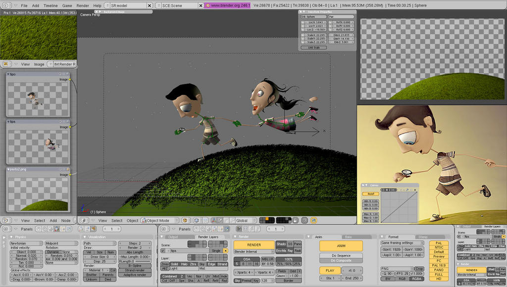
trying to use another “focus” or point of view for the image.
Characters maybe had to be smaller and more on the right side of the composition. what do you think?
Attachments

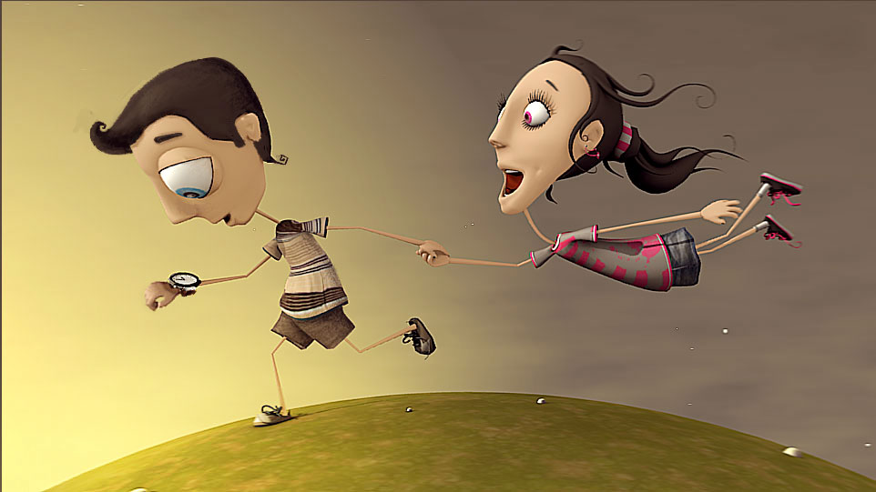
-I have a suggestion, I think if you rotate her body a lil on the X axis so more of her tummy is visible she will have a stronger pose-
-I hope I explained that right-
great work on all of it Pablos.
the style is soo you. i like it  i have one suggestion though. maybe if you make the girl right hand not bended (just make it straight) it will give more dynamic movement to her body. so it will be more convincing gesture on how she dragged. if you know what i mean
  just my little opinion. great job
Very cool character designs!
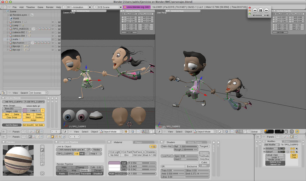
Do you love screenshots as much as me? well, i forgot in all this time to post some screencaps of my workflow, here is some images showing also some minor updates:
I was very lazy in recent days… sorry for that… :rolleyes:
in the next days i’ll post some images more, the day is ending and the time too! :spin:
Attachments
btw, thanks so much for all your comments and critics!, is very usefull your support!, thanks again!
Oh, that new grass looks so great. I’m looking forward to see the next render!
wicked stuff! love your style!
i like your style … i know this seems to be a little late, but i would love if you increase the contrast between the two character a bit …expression-wise …
for example … the face expression of the boy, that hurries, looks on his watch and actually runs should be more “active” and the the expression of the girl should be more sleepy and not laughing
i mean … you have an active character with a passive face expression and a passive character with an active face expression …
Hey pablos looks cool!!! Keep it up!!