
One of the few projects that I have ever finished Feedbacks always welcome
Basically it’s beautiful, I love the car, modeling and materials look good.
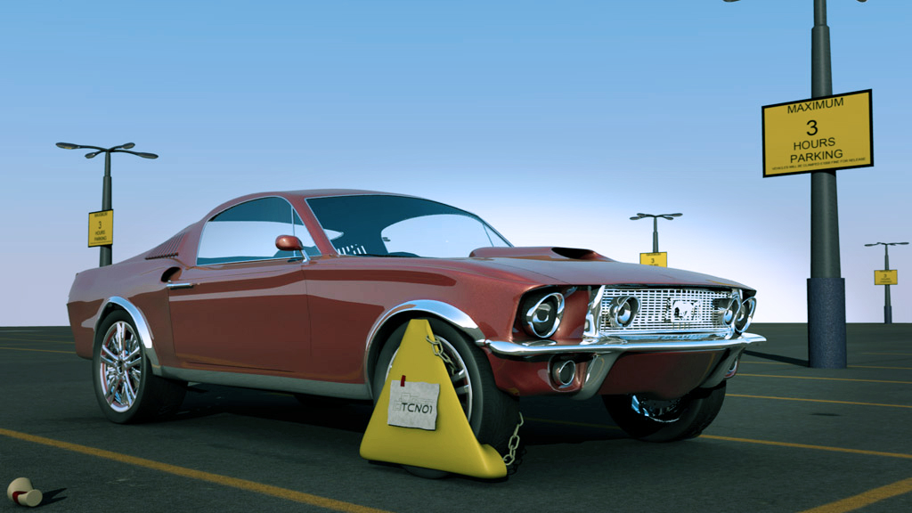
The interior needs thickness, the headlamps lack oomph. The repeating lamps, drop em or blur them out with DOF. The ground texture could really be improved, color variation on the sign and lamp post. (dirt) Fisheye lens would accentuate the boot, and add interest to this scene. Had more typed but lost it due to the new forum, just not used to it yet.  Attempted color correction attached.
Very nice car model, but the rest of the image is slacking.
The materials need some variation and the other models need detail.
Also you can see the edge of the ground. Maybe add a wall there?
Some compositing is due: Focal blur is a must. Maybe some colour correction to add to the mood?
I had thought of something else, im sure… but now i forgot 
Thanks too 3dementia i noticed that the back is pretty off-color? Like pretty major different color red…
Awesome awesome render, but you need a good enviroment to do this image some justice- perhaps composite it on a real photo?
Sorry For the late replies uni work was catching up with me
Thanks for the advice about the post pro! it does make the image look alot better
I can see what you mean about the image being lacking the bare-bones environment wasn’t doing it any justice

This is the latest version added a bit more to the scene and have done some work with the compositor and photoshop
Lookin really nice now… only those b/w lines at the bottom (dunno what they are) are very distracting.
Also the focal blur looks very… odd. the pole just behind the car seems to have been blurred the same as the stuff in the distance - now that i look, everything but the car seems to be blurred the same… it looks very odd… and you can no longer read the yellow sign properly either
thanks! i can see what you mean about the blur don’t know why i didn’t notice it earlier. I will have to take this back to the compositor and work with the nodes
hmm, i think a more complex backgound would be better suited, even if its just the top of a parking lot.
great model though
I think the background is fine, the foreground is distracting…
I dont know what you currently used for the focal blur, but use the defocus node

latest render fixed issue with defocus node
@Casio23 its not a multi-storey carpark its just a normal parking lot without much round it i’m guessin you saw this on the blender guru focused crit
if i can think of something to add to the scene that doesn’t detract from the image i’ll put it in 

Very nice!! Only your logo is too big and theres a lot of noise under the car
your newest is miles better than your (already really good) first render, i love the fact there is a real baackground and that the colours look much nicer 
Thanks I can shrink down the logo and i had turned down the samples on the ambient occlusion to speed up the render my comp is rendering higher detail version now
Thanks i’m glad you like it
Excellent work. Thank you for sharing the evolution of the piece with us as well.
Im really liking this, but i would thicken the glass. It looks thin and is not dark enough. Everything else is really good. I think that the light poles don’t do your car justice though. They look unrealistic at the base. Maybe try another/a texture. Great stuff!
Very nice indeed!
thanks for the comments
@callmeishmael thank you for taking the time to look at my work
@JVillella thanks for the comment i’ll take a look at the light poles hopefully i can improve on the textures also i have added a solidify mod to the windows should make them thicker
@phonybone thanks you!!