Capturing accurate diffuse values from paint samples? Scanner? Spectrometer?

Hi All
I’m interested in capturing physical paint samples (ie printed on cardboard) and using them in Cycles (with filmic) with a high accuracy to reflectance (light/dark).

I aware of RGB values provided from paint manufacturers and also their LRV (light reflectance) values however I do have difficult in replicating the appearance in cycles (principled shader) using these values (inconsistently too light, too dark what have you).

I do architectural renderings and receive complaints that my materials don’t “look” like their real counterpart even if it’s only a slight disparity.

I am hoping someone has some advice or workflows on the topic, thanks.

1 Like

I don’t know that there’s going to be any one answer and I don’t think just getting a spectrometer will be a fix-all. Color science is a multi-headed beast.

If you have the RGB and reflectance values, I’d start considering other potential issue points. I don’t know what your experience level is, so I’ll just fire off some things to consider:

  • Surface texture - Drywall, for example, can have different types of textures that will cause it to appear lighter or darker. Microfaceting (roughness value) also affects brightness.
  • Lights - If using light objects, are you using physically correct values (blackbody for color and watts for strength)? If using HDRI, does it match the real world counterpart (Climate/weather, season, direction, brightness. This can play huge on the perceived color)
  • Are you using a color managed workspace in all post processing software?
  • Do you have a good quality monitor, and is it color calibrated? (And if using windows 10, make sure that pesky night mode is turned off.)
  • And maybe most important of all, are you sending finished works to clients to be viewed on their crappy, incorrectly calibrated, company issued budget monitor from the 90s? In which case, none of the above matters, and of course the image isn’t going to look like the real thing. :slight_smile:
1 Like

If you get complaints that materials don’t look like what someone expects, the issue might be much easier to solve that messing with measuring colors. Maybe your shaders need tweaking? Or lights? Or textures? Or maybe the feedback you receive is… how to put it nicely… produced by whining clients who don’t really know what they want except they want “something different”.

Can you show some examples of what is complained to be not like it should look?

As you use Filmic for your colormanagment,you want to have the midtones calibrated well.
Its done very easy.First make a new material with a diffuse shader with a value of 0.18 .use this material to your main object.then switch from Filmic to falsecolor and adjust your light strength,untill the keylight that hits the main object is grey.then switch back to Filmic and switch your material back to your PBR or what ever you use. (side node.i dont know how often i have posted this mehod,it should be pinned)
now your have calcibrated your scene like a Photographer with a grey card.

the only reason to capturing diffuse values for your self is if these materials doesnt exists as PBR materials,and you want that “scanned”.
maybe you can give as more information about that.you can find allmost every material in the net for substance painter ect.

these links maybe are interesting for you

I am taking RGB and LRV values from this website http://www.colourdesigner.net.au/palette/colorbond

For the most part they are ok (good) however some of them come across wrongly when using the LRV value provided as the V component of HSV in the material base colour.

For example the most questionable on that website the LRV’s of colour Manor red = 9% and Terrain = 7% or Deep Ocean = 9%

For reference their “black” colour is listed as 5% (sounds correct)

So I take their RGB, convert to hex then paste into Blender and change the diffuse value to that LRV
Manor Red develops me something like this
-floor is 0.8
-exposure is set so that diffuse 0.18 is close to 0.5 in output.
-lit by hdri from hdri haven

manor%20red
Seems very dark?

When in reality it is quite a rich red
3c72954909cdf5fb_0075-w240-h179-b0-p0-- download

I am wondering perhaps the some of the LRV on the website are incorrect, or I’m using them wrongly? It seems the more saturated the colour is the more incorrect the result.:thinking:

Thanks for your thoughts

I understand.Never heard from LRV values before,but they a very usefull for Archvis.
To me the LRVs are very clear.These are the reflection values, from the given Material, measured at 10° observer angle.
i am guessing the colors are sRGB values for the web?or do you have real color value numbers/chart?
its late i try something tomorrow.

you are right,the colors from the fotos looking more redish.are you sure these are the colors(manor red)?

on this site the color seems the same.

here two renderings,i am not sure how to mix the reflection.with white reflection color like fresnel reflection,or only diffuse /glossy with same color.

here both methods manor red with 9% reflection


From looking at that website and reading about LRV, it seems that those values are in sRGB, meaning you can convert the RGB to hex and drop it in to the colour picker. The LRV seems to just be an indicator of something’s luminance (a weighted average of linear RGB) so that is a result of the RGB colour, not something you have to enforce. Here’s what I got for Manor Red (be aware the colours here might be a bit off):

You’re also not going to be able to reproduce the saturation changes under different light sources, because that is due to the interaction between the emission spectrum and the absorbtion spectrum of the material. Under cloudy/indirect daylight, colours from cycles should look close to the ground truth.

LRV means Light reflection value,and is measured at 10° observer angle.and range goes from 0-100.

look page 5-6

the question is,is the rRGB with the reflection value, or only diffuse color without reflection?.i am guessing without

It is hard to know without them stating it somewhere, but it seems like a reasonable guess.

As far as I’ve interpreted LRV is about the diffuse reflection ie: how much % light the colour reflects (not glossiness) as these paints can be bought at any glossiness/sheen level.

Basically black paint having LRV ~ 5 and white-white paint around 90 – this concept is reflected consistently throughout the samples on the website. You can find their darkest black has LRV=5 and their brightest white=92

The RGB’s I consider as a representation suitable for on-screen viewing and comparing.
So I felt by using the RGB to gather the hue and saturation and taking the value from the LRV detail, I could get a match… doesn’t appear to be the case.

We could simply take the RGB/LRV as a guide only and adjust manually by eye - with a large margin for error.
So I’m at the point of wishing to scan the colour from a physical sample from hardware stores.

_

Below is a result of taking Hue from the website, LRV 9% from website and manually adjusting saturation to 0.95
Closer in terms of colour but I think still a bit dark
manor%20red2

Here is photograph of sample card on office paper in overcast condition with moble phone:card

How LRVs are measured

These values have been determined with reference to the
CIE Tristimulus Y10 9 Illuminant D65 and the 10° colorimetric observer, in accordance with BS 8493:2008+A1:2010.

The Y co-ordinate represents lightness and extends from 0 (black) to 100 (white) and has been used as a measure of light reflectance values (LRVs)

the above is from the PDF file i posted.I read everywhere in the PDF from colorcontrast,and i think to have a lightness value for the color in question ,this is the LRV for.

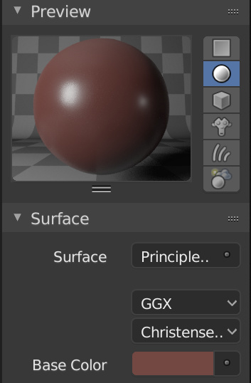
yes this has nothing to do with roughness or glossiness.

the LRV shows the consumer a easy way to read how light the paint is in comparsion to other colors and its LRV to make a choice based on colorcontrast.

I read that contrast difference of 30 LRV are the best contrast ratio for planning your coloration of doorframes vs wall colors ect.

however i would use the RGB colors as there are on the website or as HEX code into the Colorpicker

you dont have to divide the color or altering the saturation or something,because these are reference Norm colors like RAL

if you want to make a material from this for rendering,i would use a IOR of around 1.5 .this is a common value for carpaint,plastic ect.

edit,another interesting read
https://www.satra.com/spotlight/article.php?id=426

and c&p from another source

Light Reflectance Value is often confused with the term intensity. Intensity is about vividness or dullness, is the colour clear or muted.
Value speaks strictly to the lightness or darkness of a colour.
The LRV is the total quantity of visible and useable light reflected by a surface in all directions and at all wavelengths when illuminated by a light source.
The LRV is a measurement that tells you how much light a colour reflects, and conversely how much it absorbs. LRV runs on a scale from 0% to 100%. Zero assumed to be an absolute black and 100% being an assumed perfectly reflective white. An absolute black or perfectly reflecting white does not exist in our everyday terms. Approximately speaking, the average blackest black has a LRV of 5% and the whitest white 85%.
Below the mid-point of 50%, and you know the colour will tend to be darker absorbing more light than it will reflect back into the room. Thus, an interior lighting plan that accounts for the darker colour should be a priority. Colours with LRV higher than 50% will be lighter and will reflect more light back into the room than is absorbed.
The Light Reflectance Value is a guideline. A relative point of reference for predicting how light or dark a colour will look and feel once applied to the walls. It is not a set standard by which to choose colours. Rather an indicator to help you make your best guess.

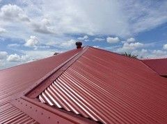
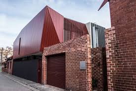
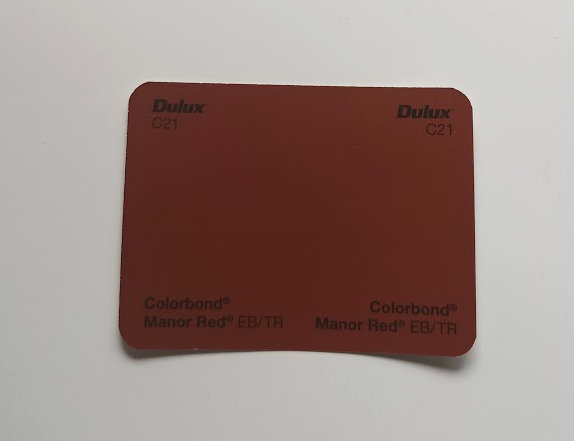
another manor red source

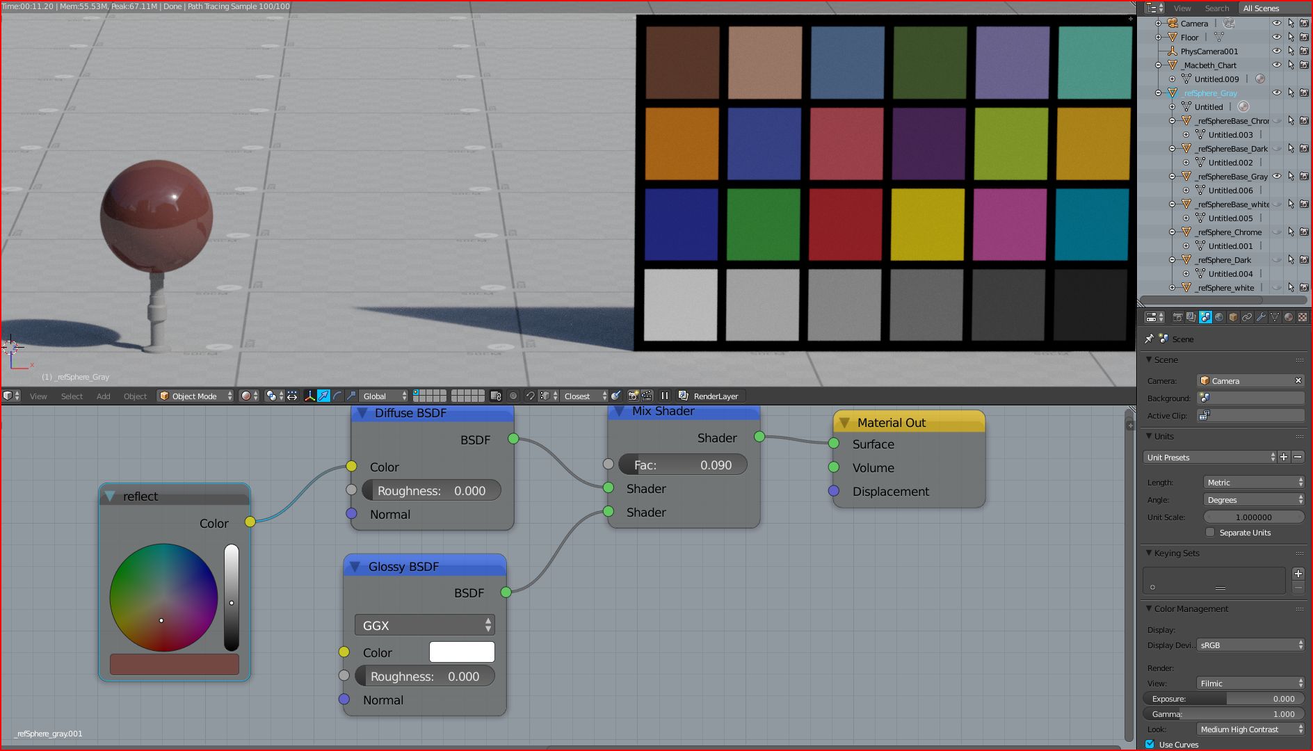
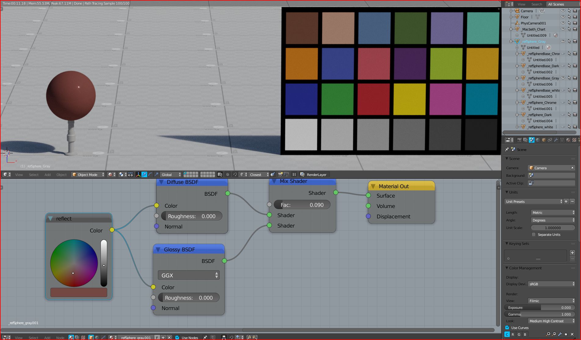
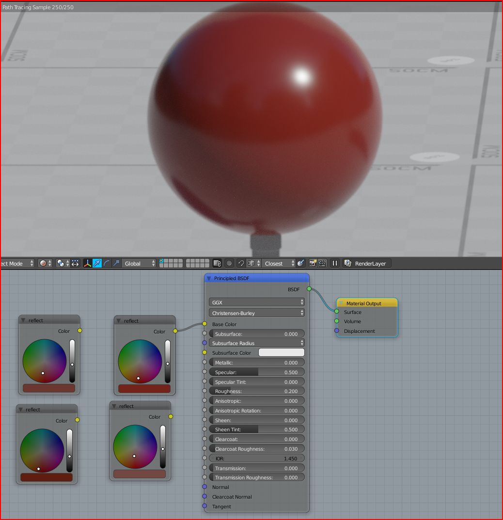
i have found many different values for a manor red,here a render with a more redish version.

I don’t want to seem controversial, but what about having a good lightrig/lookdev scene as pixelgrip pointed out in his first post. Then try to eyeball the color and then see if it fits under various lighting condition . Also by making all your material in the same scene you’ll see if they seems coherent together. And finally you try them in the final scene.
Sometimes this could be much simpler and will look more correct than taking some “real world” values without knowing how to convert them inside blender.

All this remind me of this : https://youtu.be/m1PkSViBi-M?t=1174 where the resulting gold shader obviously look wrong, but because the author as faith in the number he gets convinced that it’s realistic.

All that said I’m not into archivis so I don’t know how clients are picky and looking for realism.

Interesting thread anyway !

It’s becoming apparent that the numbers on these websites can only be considered a rough guide. Which is sad. Seeing so many different versions as you say of “Manor Red” with greatly different values. I’ve seen now websites stating LRV of 22.6 for this same colour, even others showing a different hue (bordering on orange).

Interestingly though, the less saturated colours appear quite consistent (and they render out good too).

Eyeballing seems like the best option for the time being.

When you first stated you were using light reflectance, I thought you were referring to the refractive index and extinction coefficient, which can be used to model a material’s properties.

This LRV is not something you should be using in your material somewhere. The property the LRV value describes is already modeled by the BSDF. You just have to supply the color and roughness.

As I stated in the first post (Which could have been more detailed I suppose) proper lighting and scene setup was all that was required to match your real examples, given the original Manor Red color. And that was without taking the time to find the best HDRI match. :slight_smile:

The RGB values are not suitable for direct use as diffuse colours. They are intended for web/print. Take a look at the black colour for case-in-point.

I have found this document from a powdercoating supplier http://amia.com.au/wp-content/uploads/2012/03/D1000_RGBValues1.pdf
The reflectivity values seem pretty reasonable with very slight eyeball adjustments particularly with saturation.
Cb_Manor%20Red

After a few days of back and forth adjustments and eyeballing I’m pretty happy with the consistency in this colour set. Thanks for your thoughts all :slight_smile:

They’re intended for paint mixing software. You can take those RGB values into your local paint store where they can be converted to a Pantone equivalent. The Pantone matching system is design for consistency between computer and physical display of colors.

In any case, I’m glad you found a solution. At the end of the day, eyeballing it until it looks close enough usually works just as well. :slight_smile: