If you really want to I can enter super nitpick mode.
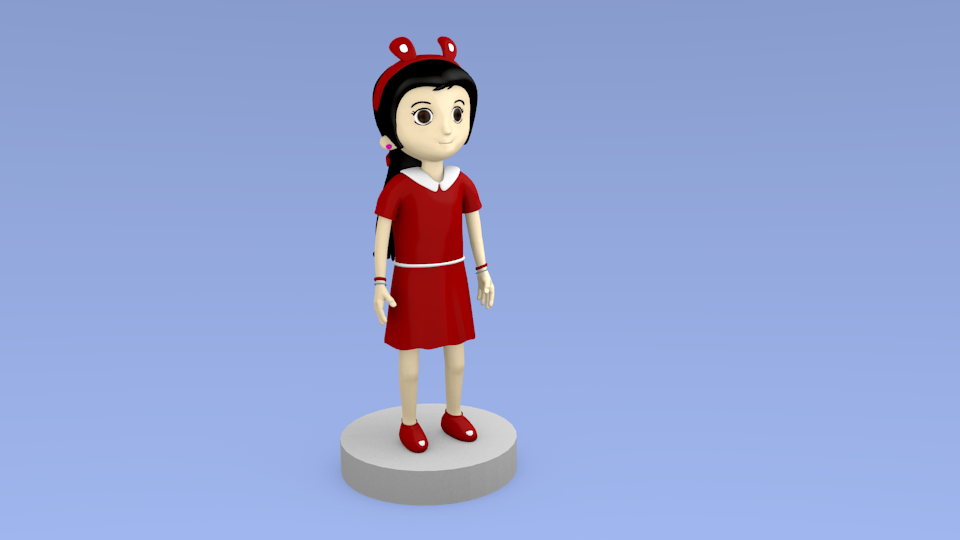
The specularity on the hair makes it look kind of plasticy. You could either go for an anime style hard specularity or remove it completely. You could also try cycles hair, could look good.
I would personally lengthen her legs and shorten the torso, but this is a personal preference I guess.
The thing in the ear could look more shiny and reflective.
The shoes don’t seem to have a rim so they look molded to the feet, the opening at the top could be a bit bigger (and thicker).
The shadows on the model are gray which doesn’t look that appealing, you could have them slightly red or blue or something.
The eyes could have a stronger specularity so the character looks more alive.
The skirt could be a bit more folded/wrinkled at the bottom.
The clothes and the hairband could be brighter overall. Just a bit though.
The character is standing on a gray pedestal thing in space. If you want to animate it you should put it in a plausible environment.
So far it looks pretty good overall. My biggest issue is the legs and feet. If i cover them up, it looks a lot better. The rest of her, you have good, clearly defined forms. However the feet are very blobby and there’s no clear distinction between the left foot and right foot. The legs have the same problems, there’s not enough definition and they don’t appear to be distinctively left or right. Lastly before I go, the creases on the sides of the bridge of her nose bug me. They seem out of place given the overall smoothness on the rest of the character.