It looks better, but I think you should increase a little more the SSS scale and make more yellow the SSS radius color, also I think the hair on the body looks great but maybe you should add a second hair particle system to make the small hair around all the body
@Al_Torres:
I’ll try fiddeling with the SSS scale and color. Thanks.
There actually already is small hair all around the body ;). It’s easier to see if you look at the enlarged image.
Ok, i saw the hair now, I think you should increase the amount of hair then, because it looks like all the hair is focused just in the head instead of the whole body
Man it is looking really good now, I like it. I have to agree that there still are some problems with the caterpillar shader, but atm I think this is really good.
I bet there were people that have adivised you to give some glossiness to the leaves, i would also give some sss to caterpillar)
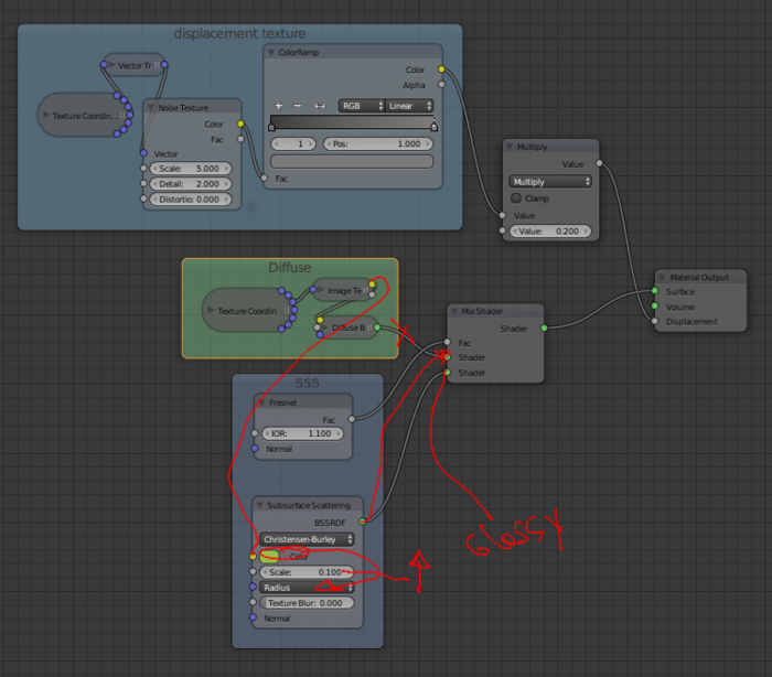
it sould scatter light a tiny bit, now it looks completely diffused 
I think it looks really good. It’s so much better after you changed the composition. Actually that first image after you changed it is my favorite. I think the shadows felt more real. Also, the SSS is looking a little on the “Glowy” side for my tastes. But I think you should trust your instincts on this.
Also, and this is a more personal thing but I really love the little hairs on his back. I feel like the DOF is knocking out all the details of the hair down his back. For my tastes, I would increase the DOF area a bit to see the hairs better.
Hi! I think that you don’t need the diffuse, From my study of skin I learn that the SS is enough:
The radius is a color, you have to tune it to make it the color you like to be the scattering, or you can input an image of the colors you want.
Well that is what I think I would have done, just in case.
Anyway, awesome art!
Yeah, this is pretty much perfect. Probably could do with abit of gloss or shiny on the caterpillar and i would call this done 100%.
Hi, I didn’t read the whole thread (don’t have the time but still am interested by your render), so sorry if I repeat anything.
The first thing I would do is to use good PBR materials like Andrew Price recently showed us :

Personnally I’m gonna use this everywhere from now on.
About the composition, there’s not much happening anyway, so you can put your camera where you want, we won’t feel the scene very differently. What I would do to make the image a little more interesting is to add another character, like an ant on the same leaf the caterpillar is eating, so that we would start to wonder what’s gonna happen. Then the composition and camera angle could suggest very different situations, like :
- the ant is probably not alone and its friends may attack the caterpillar
- the ant is alone and peacefully carrying its own piece of leaf or doing whatever ants do
etc etc…
Now I picked the ant because it can be a threat but you can put anything you want and make anything happen in your image. Also being original is very important (which an ant isn’t)
But composition gets a lot easier when you tell a story.
Just in case clarification is needed on the radius property :
Kind of. It affects the resulting color but the property defines how deep each of the RGB colors can go through the material before being completely absorbed. So it’s not like RGB values with unexplicably different units and behavior.
Hum… so what happens when you input an image in the radius?
I haven’t tried that yet. But the result should show that image, though an image has maximum values of 1,1,1 while the radius can be as big as you want, even bigger than the object itself. But you can use a math node to multiply the RGB values of the image to get bigger radii.
In any case, I’m sure about what this property means. You can check this Blender Wiki article to confirm it. In fact it’s just a simplification of the real thing. Any matter that absorbs light do it more with some wavelengths and less with others. So a complete version of the property would be a curve to tweak up or down along the whole spectrum of visible light. But fortunately our eyes have 3 kinds of cone cells (RGB), so we can just tweak those 3 colors and get the same result, in the same way you can get white light either by mixing Red, green and blue or by mixing every color of the spectrum. (Tell me if I wasn’t clear enough)
I think I understand now the differences, RGB is limited to 1 per chanel, but radius is not. The benefit of the image is that you can do all kinds of variation, and with the radius you get one color.