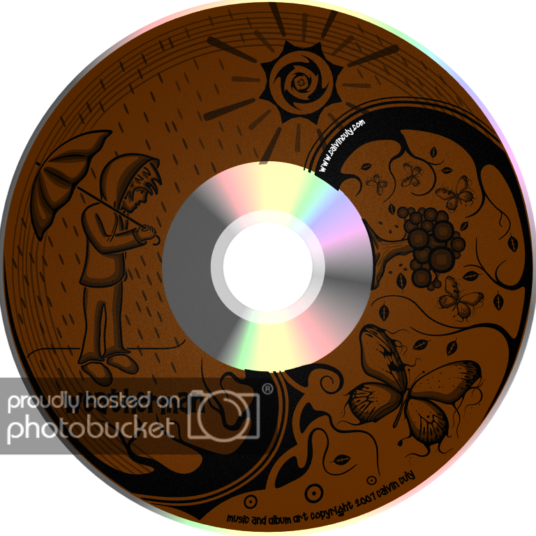
Hey everyone! So I made this cd cover design with blender for a little album I’m doing. I just read RobertT’s thread with his thoughts on Blender’s 2D capabilities and thought I’d post this. I ended up burning it onto a lightscribe disk and it turned out really well. Comments and Critics appreciated. The reason some lines in the middle aren’t totally lined up is for printing reasons. Enjoy
Very cool application of Blender. I think it could use some lighter highlights here and there, like on the tree and the butterfly wings, and the raincoat/umbrella. Or perhaps the light brown color could be a lot lighter. The design itself works really well in the round. Especially the big branch/root thing going through the center of the disk. That’s got a nice feeling of flowing to it.
neat,… but yes i cast my vote for some highlights here an there, would really pull more focus into it, instead of “hurry up and put it in the PC” not saying anyone oozes over CD art. but i like to open the case and the CD image “jump” at me. it doesnt have that “jump” factor yet, but it would if you put some highlights.
Hey thanks for your comments. There aren’t highlights cause the disks i have are color and it burns in shades of gray so I was kind of limited in that area but I do agree it would have been nice with highlights
Excellent! One picky little thing… The shading on the person seems wrong when looking at where the “sun” is located.
I would enjoy hearing more about how you created it in Blender.
OK. I’m not familiar with lightscribe so I didn’t know the limitations. Given the medium you are working with, it’s an excellent job! five stars.
This is wonderfully creative, Crititrozoz!
Five stars from me 
My favorite is the butterfly. Such excellent design throughout.
Thanks so much for posting it!
RobertT
This is so cool! Looks just as good as, if not better, then most CD’s I own!
Awesome work man.
And those butterflies are absolutely sick dude!
woah nice stuff!
Wow thanks so much guys. The process for making it is pretty simple. Just made the camera facing straight down and placed everything below it. The shapes are all just planes extruded so its flat facing the camera. Theres 3 basic textures. Black, then slightly transparent, and more than slightly transparent lol. and i just layered them very closely to each other so the fact that the camera isn’t in orthographic mode doesn’t make much of a difference. Glad you all liked the butterfly, it was the first part I made for it.
CurtisS: Haha, guess what. I didn’t even mean for the rest of it to match up with lighting, I added the sun last and didn’t even think about that, but you’re totally right about the guy. Thats funny. I guess I should have put more effort into it in that regard.
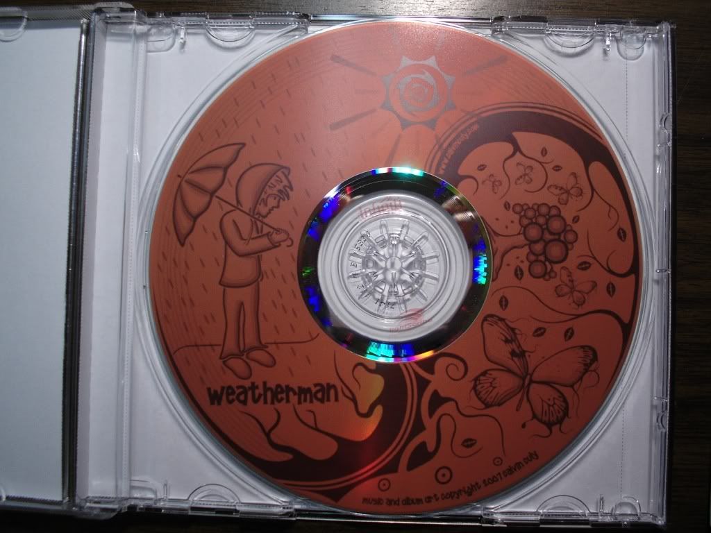
Thanks again for all your comments. Here’s a quick photo of the actual CD:
awesome, and very cool use of blender!
Thats awsome Crititrozoz, the CD looks great.
Whoa… what brand of Lightscribe discs do you use? The ones i get are nowhere NEAR that dark. The darkest i can get on them is like a medium tone. The ones you have look like they get near black o_0. Do they start out as Black when you buy them?
Really nice CD cover! Looks really professional, and it has a really cool flow to the art in it!
Keep up the fantastic work!
Cuby
Great stuff. 5 thumbs up.
Thanks guys.
Squiggly_P: No, the photo might just be a bit dark. I got one of those 25 cd sets with 5 of each color so it starts colored and burns shades of grey onto the cd. they’re infinity brand. you can just barely see it on the disk photo in the middle. thanks again everyone for the encouraging feedback.
to achieve lighter colors, you ofcourse shade all the rest of the pic and leave highlights untouched
.b