fambros
I’m Anubis; Give me your hand . . . I know the way . . . <<>>
glaurung
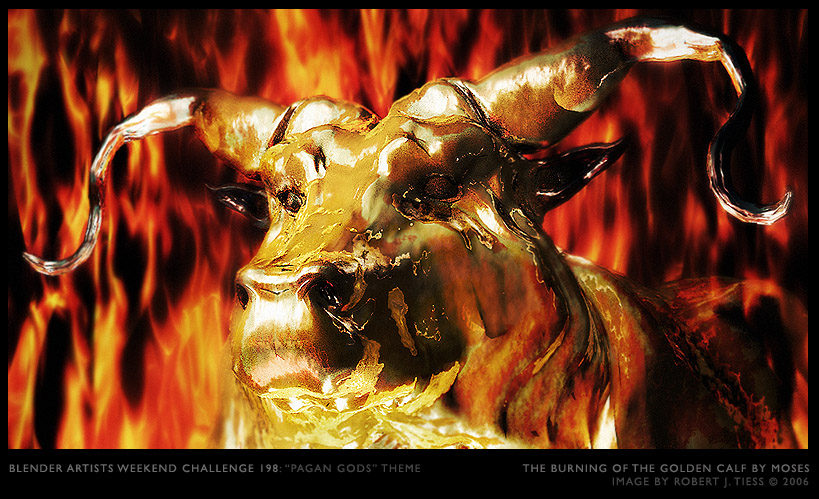
It is Ulmo, Lord of the Seas in Tolkien’s Mithology. ENTRY IMAGE
jackblack
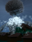
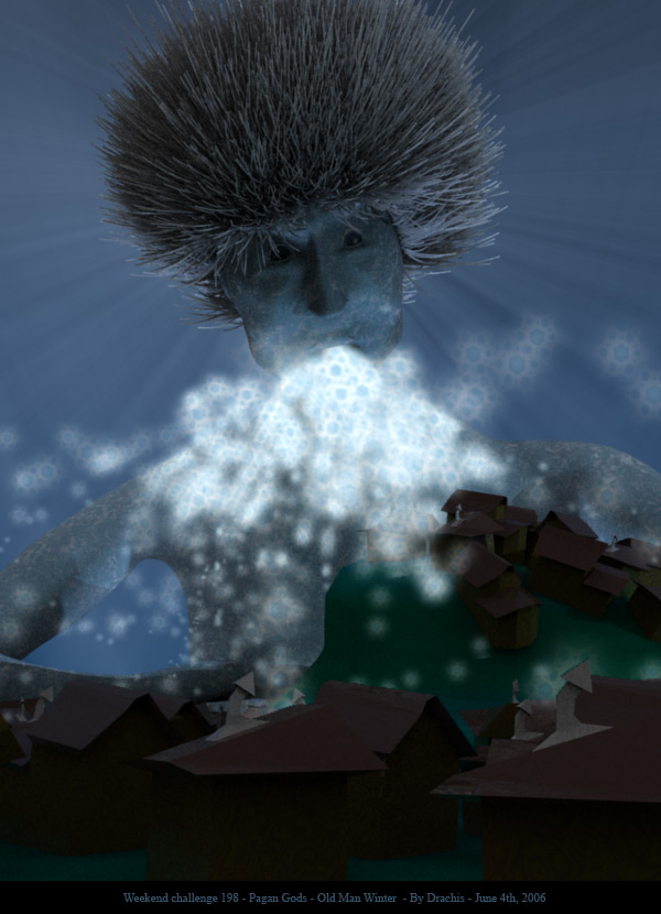
The Pagan God Blender
(In a time when passage to the Third Dimension came at great cost, a Saviour came from beyond the Great Firewall to create free passage to the Third Dimension.) ENTRY IMAGE
r3615
Freely inspired from HP Lovecraft ’ s “Call of Cthulhu”… ENTRY IMAGE
Oh this one is going to be difficult.
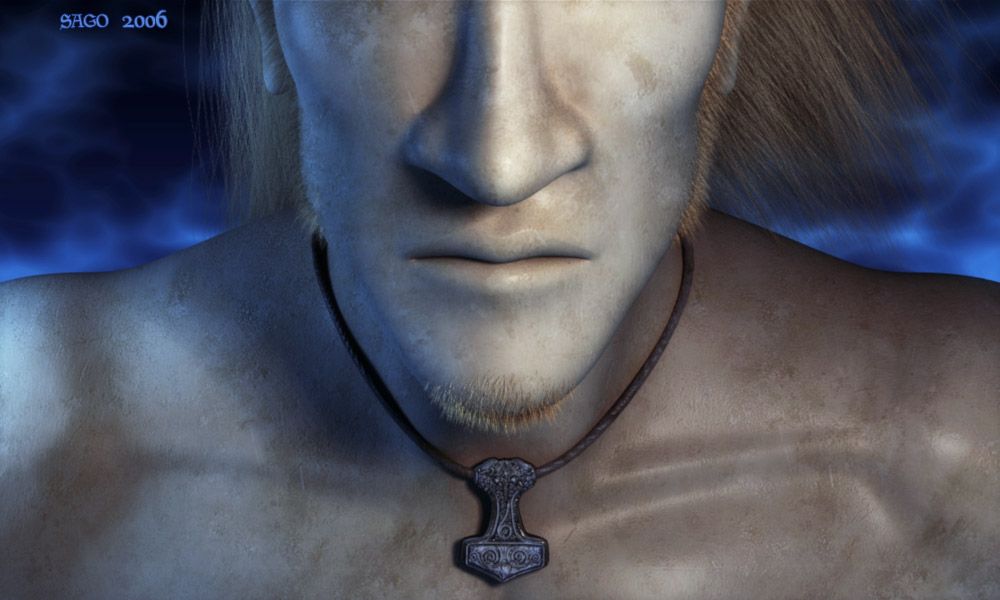
I love Sago’s entry. I’m a big fan of Norse mythology. Only crit would be that there should be more emphassis on Mjolnir itself (it’s Thor’s hammer for those who don’t know). It could be bigger. After all, it is a mighty battle hammer.
The Pagan Megan! ha lol. Good one lol. I love the guard’s look and style. very original. Fits perfectly in the background too.
Ashraf’s god of war is an awesome model. Just looks a bit too plastic.
Robbert didnt participate and if he did it would have made the choice even harder. great entry as usual
thanks all who voted for me! i’m gaining on sago and i hope to win!!
i voted for jackblack, awsome professional looking image!
r3615’s work was awsome too, very artistic
Tyfric’s work was awsome too, love big juggs, especially on cat women!
sago’s work, i loved the mullet, i loved the dry skin, it kind of looks like my skin, when it gets real dry and itchy i take sand paper and dip it in battery acid and scrap away, haha, just joking on you, the modeling looks excellent, and its the best hair i’ve seen on a blender model. three more votes and we are tied, i would love to drop you in this challange, but it would also be good to have you go into challange #200 over confident so my victory will be that much better! you should have entered bikkidikkie, he should have won this one!
robertt your work is brilliant, if both you and sago entered your orginal entries we would have a huge challange here, but i guess i will have to wait untill challange #200, you and sago have no chance!!!
Slep,
I couldn’t finish most the ideas for this work (like giving him more accessoiries and his real hammer), but I thought it still looked good enough to submit. The lack of those attributes makes it more… uhm… symbolic, which worked for me.
Hmm, when did Bikkie-Dikkie get so popular?
I submitted Mjolnir cause that one was a huge improvement for me, both technical and visual. Though I liked Bikkie-Dikkie’s concept and style, I can’t ‘qualify’ it as the same ‘quality’-work like Mjolnir. Guess I was wrong.
Ack N-Gon, calm down! If you can’t make something better you can’t call it shit. jackblack’s image did it for me… reasons? Concept, Visuals (Grass and Texturing in particular) Execution of the project and telling of the story in a still image. Great image, by the way, what skymap did you use jackblack? I couldn’t decide before I looked at jackblack’s image because first I was drawn to Sago’s image then I realised it was only his neck so that really brought it down, then Wu’s, (No Comment) haha, asharaf’s looks great but doesn’t really have that ‘I am a The Greek War God… Fear Me!!’ feel to it.
Actually, most part of his neck is covered by his chin. And if you’re not able to see the rest (other than his neck (which you cannot really see)) that’s a shame. Took me quite long to make btw (yes, even the neck you can’t see).
Sago, it was very, very well modeled and textured, but the thing is, how does it fit into ‘Pagan Gods?’ What story does it tell? What is the concept? Where is he at? Technologically? Great. Conceptually? I’m just not seeing it. No offense, I’m only trying to constructively critique your work. Although looking at my skill level I am in no place to do that.
Jackj, I could have chosen to focus on the complete head and face, and call the work ‘Thor’. Surely then you would’ve known how it fitted into ‘Pagan Gods’. But I chose to make it less obvious and more symbolic (hence the name of Thor’s hammer Mjolnir and the little pendant). Harder to understand (for some people), but still functional enough as far as the topic goes. From a visual point of view, I chose an unusual focuspoint (lower facepart and chest), which makes it more esthetically unique (for a portrait). Whether you like it or not, that’s a completely different story.
Also used that particular texture for different materials in Bikkie-Dikkie, In the Moonlight, Lovebeam II, Extra-Terrestreligion, Into the Light, Lunch-luring Light, Mime is sooo sad, Prehistoric Question, Tattoo on Wall, Rock gives birth to Metal, Ton Roosendaal Action Figure, Curse of the Unreachable Booger… did I forget something?
Haha, what can I say, I just love that texture. And it’s fun playing the 1-texture-game (use 1 texture as many times in as many works possible).
Ha ha, I’m not so sure ‘The Sag’ really has quite the ring… but anyway, the pendant doesn’t make a whole lot of sense, I can only guess that is something Thor would ‘Wear’ but I still don’t quite understand the fact of the background. It is just that the image is a little… empty. I do like it but if it had more of a ‘god’ tone to it such as his War Hammer in the shot it would have done it for me.
 >>
>> >>
>> >>
>> >>
>> >>
>> >>
>> >>
>> >>
>> >>
>> >>
>> >>
>> >>
>>