That was a fun theme. Challenging and a lot of room for creativity. Lots of very good entries too.
Here are my comments to some entries (sorry, but with 35 entries it is hard to comment on every single one of them):
texasfunk101: Love the “Child’s Dream” feeling of the image. A self-made rocket with duct-tape going to the moon: Sounds like the kind of thing every kid who wants to be an astronaut imagines.
#BlenderDude: Funny take on “Big Brother”. I would expect something related to 1984, but that’s a pretty big brother too! Nice low-poly style. Also, the normal-size guy added a lot to the composition, well done.
fdo: Very realistic, specially the trunk and the leaves. Lighting is also pretty good. But the water-drop below the tree looks funny. It looks too big (5cm of diameter I would say), it is too spherical and ignores gravity (at this angle, it should easily slide to the left).
KingofSpeed: Really amazing colours, and I loved that ant! The ground is really nice too. The spheres in the middle confused me a bit. If they are supposed to be water drops, the shape would be wrong. But I see that other water drops around them have the correct shape, so I suppose this was intentional. They look pretty cool though.
DM9: Nice Lego figure, very detailed. Even without reading the title (and barely knowing the hero), I can immediately say this is Deadpool. I’m just not sure if the gun in his left hand is in a good position. It blocks the view of the character and is out of focus. On the other hand, it intensifies the defocus effect of the macro shot.
Hiryuusan: Nice hair and the colours are smooth and calming. But I think the picture lacks some focal element: I suppose the flower in the middle was supposed to be the important part, yet it gets easily mixed up with the respect for having mostly the same colours and shape.
bazevedo: Are you saying that blender is slow?  I liked the model, and the snail looks really moist. The trail behind it looks a bit funny though. It is too watery instead of being jelly.
RayVelcoro: I liked the rust on the wire. I think this could have a very strong feeling to it if there were some rags on the wire (to show that someone tried to pass through it). The image could be a bit brighter. Also, the raindrops seem to ignore physics: They are not hanging from the wires, but around them.
Fulip: Funny idea. I also liked how this looks like an old photo with a bad camera. The imperfections on the dice are also well made. Just one thing is wrong: How come there is no space for the weight in the right part of the dice?
purbosky: Interesting idea, and the cells look really cool. Alas, the reddish effect on the whole image removed almost all contrast, and so it is hard to concentrate on anything. I think you should’ve only made shadows or highlights red.
skadoosh: Nice shroom! The grass and stones are also cool. The mushroom looks a bit plastic though. As far as I know, mushrooms are a bit permeable and do not become shiny when wet. But maybe this one does 
BlenderrMan: Nice model. Is the console supposed to be 4mm long? I think the scene is a bit empty though.
Dragonfire: Nice model, but there is something on it which bothers me. Maybe the black spot on his left eye looks too much like an human iris and so I expect to find the same thing on the right eye. That is, for some reason my brain tries to find a human face here, but it doesn’t. I also liked the lighting in his right leg: It shows the SSS pretty well.
finalbarrage: I really liked the reflection on the marble. If the guy were holding a camera it would be quite funny. The floor is pretty nice too. I just think the scene is a bit empty. Maybe if somebody’s feet were visible in the background?
FlyingBanana: They are called love bugs for a reason! I really liked the bugs. I’m not sure if they are accurate (I think the left one is missing a lot of its body, like wings), but they are definitely cute. The leaves are pretty cool. I just think the DoF effect is barely noticeable: Everything seems to lie on the same focal plane. I think if the leaves were bent away from the camera, it would be more visible.
joshwinkler3d: That’s a cute little spider. Even though I dislike spiders, this one looks pretty friendly. Also, I can’t help but to think that it is going to give that flower to its loved one. Let’s just hope it is not for one of FlyingBanana’s love bugs, otherwise your spider will end up with a broken heart
robproctor83: All glory to the hypno-toad! I really liked the frog face. You transmitted very well the feeling of “everything is impressive but I couldn’t care less” which frogs have. Models and textures are pretty good, but the frogs actually look artificial (e.g. porcelain). Maybe they are too glossy without looking wet, or maybe there is no Subsurface scattering effect. Also, the left frontal leg looks a bit strange. Maybe something went wrong with UV mapping there?
dudecon: Really cool model. I think the frontal shot is much better than the initial side view. But I think you shouldn’t have cropped away parts of its head. The eyes are nice (are they really shaped like this in real life oO?). I think the yellow could’ve been somewhat more saturated though.
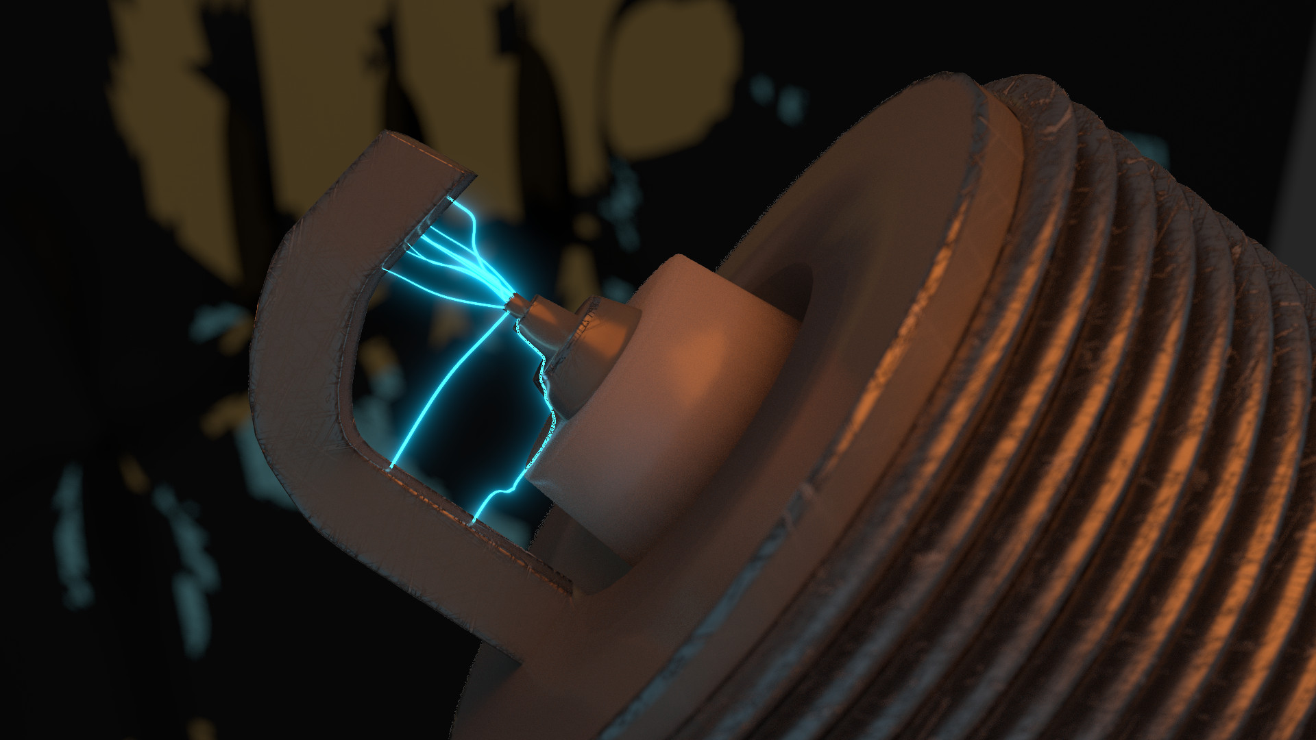
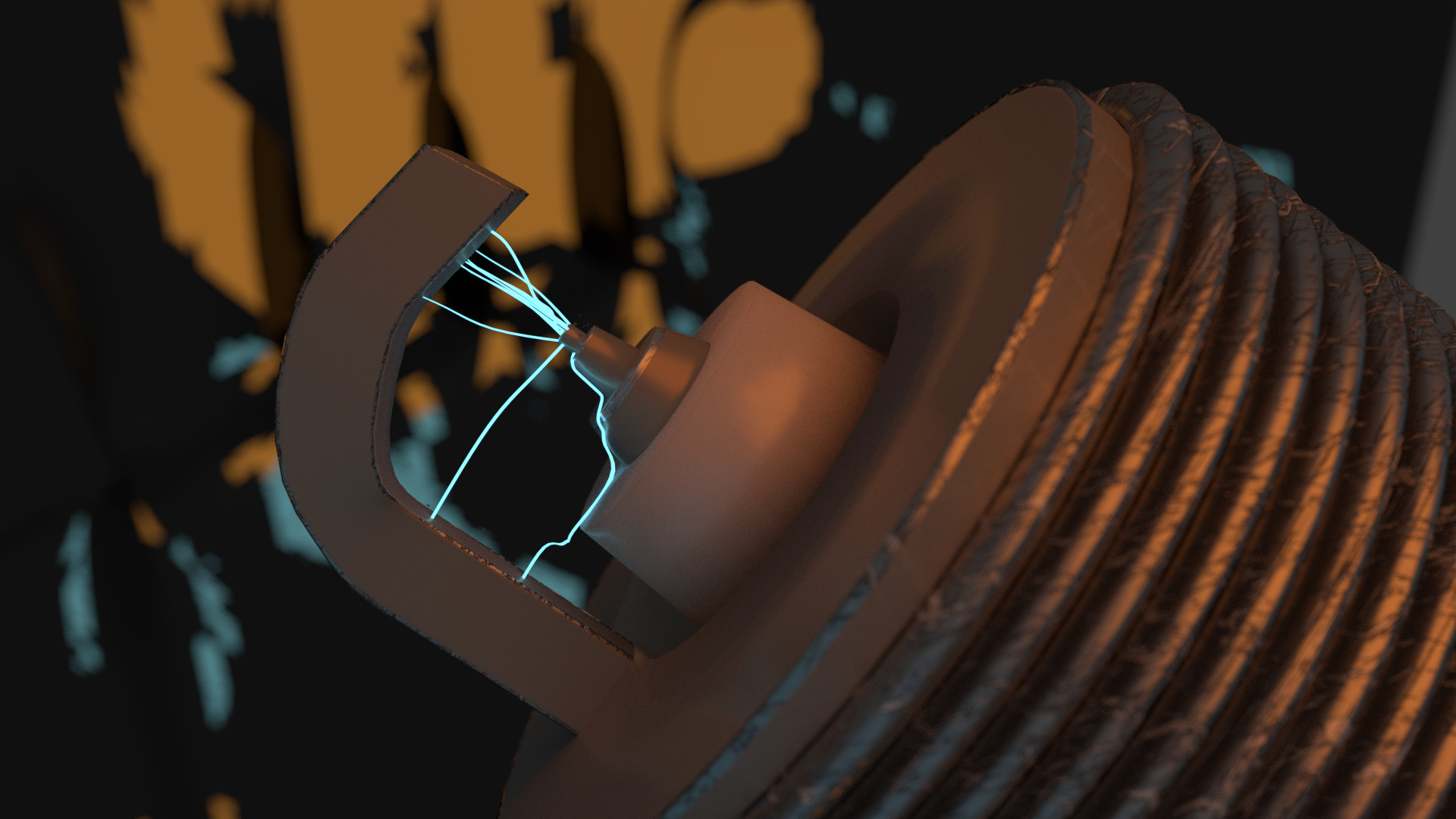
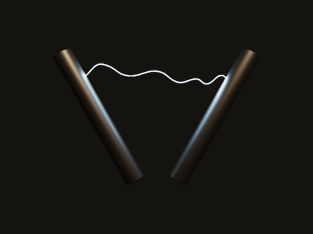
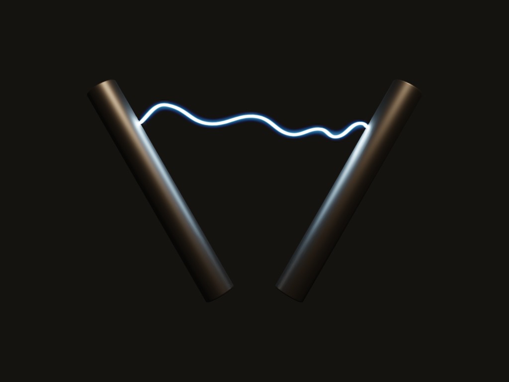
david.speer: Nice lighting (not to confuse with lightning) and colours. I can only guess what this is, but it looks cool. The sparks look a bit funny though. They should be glowing, and they shouldn’t be so close to each other. Bifurcations would also look cool, but maybe in a spark of this size they do not happen.
caz747: Nice ship, and I liked how the title is in perspective. The ship itself is a bit dark though: There is more light in the background than in the foreground, which in this case does not help the composition of the image.
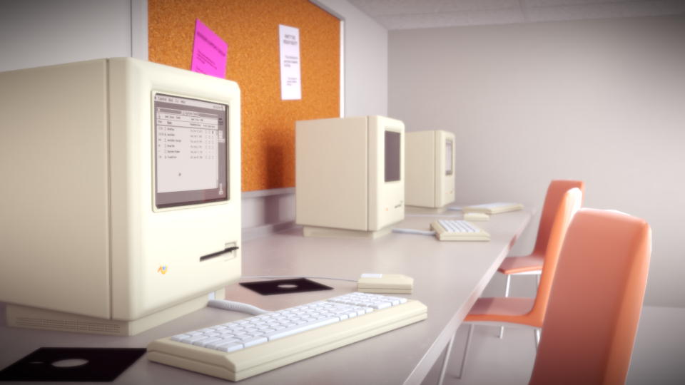
fcharr: The models are nice, but some feel out of place. For example, what is that loudspeaker doing there? Why is the keyboard not in front of the monitor? Also, I think you should have chosen one of the models as the central one and placed it close to the camera, with the others filling the background and middleground. Currently, it is hard for me to know what am I supposed to look at.
Photox: Really nice colours here, with the red cherries livening up an otherwise “dead” scene. The ice is pretty cool.
appie.123: Strawberry fields forever! Nice modelling and texturing, this really looks like a real strawberry. I wonder how you made the little “holes”. Making everything by hand seems like a lot of trouble, and boolean modifiers often destroy the geometry.
Bunnyhog27: Nice beans, the plants look really organic. The background could be a bit more blurred or maybe less green in order to not draw attention away from the foreground. The raindrops themselves are good, but I think there are too many of them, and some are in unlikely places (like below the leaves).
Helge: There is nothing I can say that would do justice to this. It is simply amazing. The character is well made (apart from the little thing with the left foot) and detailed, the overall atmosphere is really cool, lighting is perfect. Nice play on words too! I wonder if he can see dwarf planets with such a small telescope. At first it is a bit peculiar that an astronomer is carrying a hammer and wearing steel armour, but for a dwarf it might not be uncommon. And maybe he is not an astronomer and is just spying on his neighbour
Actually, that would explain the smile on his face.
Miatpi: Nice piece of sheet! I really like the way you did a detailed view of fabric. The final version with the bed bug is also pretty cool. There could be some differences in colour between the foreground and background though. Maybe if the pillows where dark red? Also, the individual strands appear to be too big (I would guess around 4mm of diameter). But maybe this is the bed of Helge’s dwarf!
Beam Ninja: Yay, more guitars! It took me a while to see the guitar though. The overall lighting is good, but the camera is not focusing on anything interesting.
RobertT: Really good, vibrant colours! I like how everything appears to be spiraling towards the centre.

 this week I ended up with one my tired corner of the room entries. In hindsight I probably should have just done the CPU, focusing on details and materials. As for the disorder / keyboard placement, I didn’t think much of it. It’s a setup most computer technicians tend to have. Inconvenient, but temporary.