Challenge #768 Voting CLOSED

I would have focused slightly more on the brain, also balancing left and right more with the electronic device on one side of the image and the brain on the other. Compacting the scene overall a bit more in height also gives more focus to the main subject, without loosing the vastness of the glass the brain is floating in.

Here is a quick mockup for illustration:


@DM9 Thanks for the image, that helps - I can see what you mean. Also, the display is a bit big looking at it now - fixing that would probably solve some of the spacing issues.

@RayVelcoro Thanks for your vote.Much appreciate it!
I listened your advice about torso and I did some improvement


Job well done, str11! Cheers.

Some comments:

RayVelcoro: The idea with scrabble was nice, and I liked the light contrast. The way that the pieces are not perfectly aligned was a nice touch. I just think the blur at the bottom was too strong, giving me the impression that the pieces are very small (maybe a few millimetres wide). Also, what are gabalists anyway?

purbosky: This reminds me a bit of the things I did with LEGO when I was a kid: A bunch of connected blocks without any recognizable shape. I would also leave the blocks in the same chaos that you represented here, much to the disappointment of my parents :wink:

xamenzie: So cute. The poor fellow seems to be in pretty bad work conditions, he doesn’t even have a desk :wink: I liked the cube style, but his legs are a bit strange, it feels a bit as if he is sitting on top of his back, or that his bottom is very huge compared to the legs.

stilltrying: You truly ran out of inspiration, making a poop joke :stuck_out_tongue: I can’t see his face, but I can totally imagine his expression when he realized there is no more toilet paper. I just think the lighting is a bit flat, which is a bit strange for a bathroom.

oJB: Cool how you place the viewer in 1st person in the image, holding the brush. I suppose someone who is forced to paint will not have much inspiration.

alf0: Although this is just a simple sphere, the material looks nice. For some reason, it reminds me of the suit of some superhero.

TomZed: Beautiful lighting. I also liked the idea of a “speechless feather” to symbolize writer’s block.

NerdyGtal!: That lamp in the foreground reminds me of some Asian gadgets with faces on them which are totally useless but cute :wink: The lighting is pretty nice too.

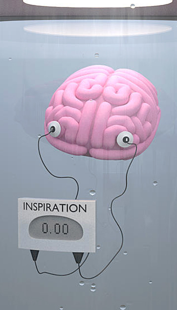
joshwinkler3d: You did manage to make an otherwise disgusting scene to look cute. I really liked how those electrodes look like eyeballs, and how the wires look like arms of the brain. In what unit is inspiration measured? Millisuzannes?

fdo: Nice use of empty space. Also cool how you approached the theme in a somewhat indirect way, representing emptiness as a symptom of lack of inspiration.

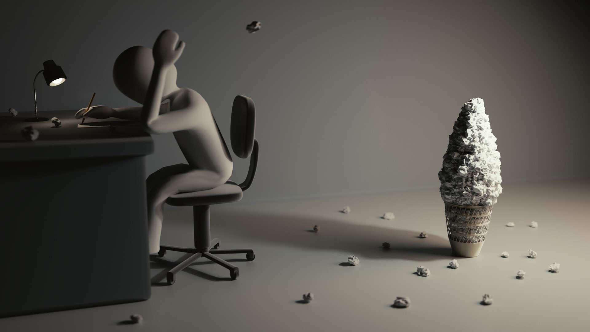
str11: That guy is really good at throwing paper balls if he managed to make that tower :wink: I just think there is a style clash here: The right side seems detailed and somewhat realistic, while the left is more toon-like.

R.M: Simple but nice. Good subtle usage of colours too.

caz747: Brute force. If it ain’t working, you ain’t using enough. The tank looks pretty nice, but for some reason the fire and letters are rather cheesy. I think adding some debris or fallen letters would’ve looked better than the fire.

DoriNori: I must say I smile when I saw that Helge added your entry :wink: I still wonder whether the nothing is new or not…

Evivivi: Really composition and story. I think you manage to integrate the image of the brain nicely on the scene, without being too obvious that it is 2d. I just think the blur at the bottom makes this look like a miniature.

fcharr: Nice how you used many of your old models here. This makes me think of having many possibilities (play a guitar, play soccer…) but, due to lack of inspiration, all possibilities are just crammed into one room, getting dust.

DM9: Cute little guy, and cool usage of 2d inside of Blender.

burnin: I spent quite some time looking at this loop. I can’t help but to see a giraffe coming out of the submarine.

OLG: Funny play on words. I also liked how the wire inside the lamp is glowing red, as if it was bright a few seconds ago, but is now cooling down. The shards have some weird shapes in my opinion, they should be more pointy. I think it makes more sense to cut the big ones by hand using the knife tool.

Piet: Funny how you featured all entries in your image. Also cool, subtle usage of Suzanne :wink:

Helge: I took me a while to understand the tin foil hat, but now that guy looks like some creepy paranoid :wink: I loved his expression. I just wonder what the egg is for…

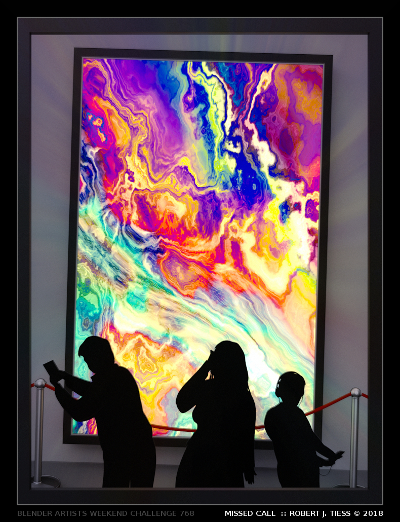
RobertT: Nice play on words with the title. Apart from what I said on the entry thread, I wonder if the painting is also a form of “lack of inspiration”, in the sense that it doesn’t have any recognizable shape or meaning (at least to me). The colours are beautiful, though :wink:

Photox: Funny how this is the last entry, kind of saying that the entries are gone :wink: Cool style, looks like something from a comic book.

thanks Millani, I was thinking being overwhelmed by possibilities was a source of inspiration blockage. I also placed some of the models in impractical locations to emphasise this. Seems like the idea didn’t take, since here we are Wednesday, and 0 votes for it. I would even argue a big ouch for anyone with 0 votes, since the empty entry got at least 1 0_0

As always thx for the comments,Millani ! I agree that the blur, in combination with the (extreme) small focal length didn’t work out that well. Room for improvements indeed. Also. its not gabalists but qabalists, don’t know the exact meaning but its the word that gains the most points in Scrabble i learned. :slight_smile:

Thanks, Millani, for the comments. I was messing around a lot with the text and how it looks but settled for what I had as time was running out. I will have a look at it again as I think your idea sounds better.

And as fcharr said “Ouch.”

I just waited 10 min for Dorinori’s image to load >.< I didn’t want to vote until I had seen everyone’s work. It was until a long while that I understood that there was no image to load and that it wasn’t my internet getting slow on me :x Well played, you tricked me.

I ended up voting for Xamenzie. I pretty much like the whole piece. Good job everyone! There were some nice renders in there. As for me, count me out for this week and next week. I’m too damn busy for my own good. Wish me luck, I might survive it!

Thanks! I wasn’t certain how many people would understand the jokes, since not only you need to understand German, but also a bit of Berlinerisch. I wanted to add a “Ich bin ein Berliner” as well, but wasn’t sure where :wink:

@Millani thanks for comment

@Millani, thank you for the comments and the personal feedback. You are right about the edges. I kind of focused on the quick explode modifier trying to get some random pieces but then failed to follow up and ensure the composition looked the way it was supposed to. Didn’t even think to do it manually. Its hard to see the forest sometimes when you have a pretty tree (trick) in front of you.

Regards.

Great entries from everyone. Nicely done.

Thanks for the feedback, Millani =)

This was one of the more complicated procedural textures I designed in Cycles, and I decided to go with this one, after hours of tweaking, primarily because it seemed, to me, to express such sadness to the museum goers.

I manually darkened the central area so it’s more visible:


That expression is really there, in a more subtle yet recognizable way, within the complex Blender procedural.

Essentially, “hidden in plain sight.”

Here’s a link to the original image.

I was pleased with the colors as well, which, for all their vivid qualities, seemed to have gone unnoticed by the persons preoccupied with their digital devices.

RobertT

@RobertT Ok, that just blew my mind. Very subtle indeed.

I once (accidentally) managed to make a shadow of a person with a procedural texture. By increasing the contrast (and with some imagination) it is possible to make out the shadow of a person with the arms hanging from the broken chains. It was cheer luck, but it fit the theme of the image so well…


Here is the original image.

Attachments


I’ve got something wrong. high live the language barbarians. It should not be a criticism of your work. translated by google.

It’s amazing when that happens, right?

By the way, great idea and render!

With abstract shapes there’s always the potential for “pareidolia” (https://en.wikipedia.org/wiki/Pareidolia), but sometimes a pattern, even a complex one, really does emerge with distinction!

One really interesting Cycles procedural I created, while trying to do new things with Cycles internal textures, was what I wound up calling “The Woman in the Garden.”

Attached is a detail of that:


I’ve learned a lot since then, mostly through simply experimenting with various Cycles nodes parameters and inputs into and from procedural textures, and now I’m waiting for a fairly stable beta of 2.8 to be released so I can test and hopefully release a bunch of Cycles procedural textures examples (several dozen).

RobertT

@RobertT Thank you for your kind words!

It is indeed amazing when you are just experimenting around with things, and something cool comes out of it. That Woman in the Garden is very interesting too. It looks a bit like those impressionist paintings, where colours are more important than shapes.

I’m looking forward to see your examples with procedural textures.

@Millani: Thanks! The egg is an Easter egg, suffering from a lack of inspiration. :slight_smile:

Doesn’t sound like fun, but good luck anyways. :slight_smile:

And… the winner of Weekend Challenge 768 with 21.74% of the votes is… TomZed!
Here’s to all the great participators…

RayVelcoro : 5 : 10.87%
purbosky : 0 : 0%
xamenzie : 4 : 8.7%
stilltrying : 1 : 2.17%
oJB : 1 : 2.17%
alf0 : 0 : 0%
TomZed : 10 : 21.74%
NerdyGtal! : 4 : 8.7%
joshwinkler3d : 1 : 2.17%
fdo : 6 : 13.04%
str11 : 2 : 4.35%
R.M : 0 : 0%
Millani : 1 : 2.17%
caz747 : 0 : 0%
DoriNori : 1 : 2.17%
Evivivi : 8 : 17.39%
fcharr : 2 : 4.35%

https://blenderartists.org/forum/attachment.php?attachmentid=517817&thumb=1
Speechless Feather

@TomZed congrats on the win, look forward to seeing more of your work.