Interesting how a thread about the Renaissance ended up on Star Trek 
Some comments for everyone:
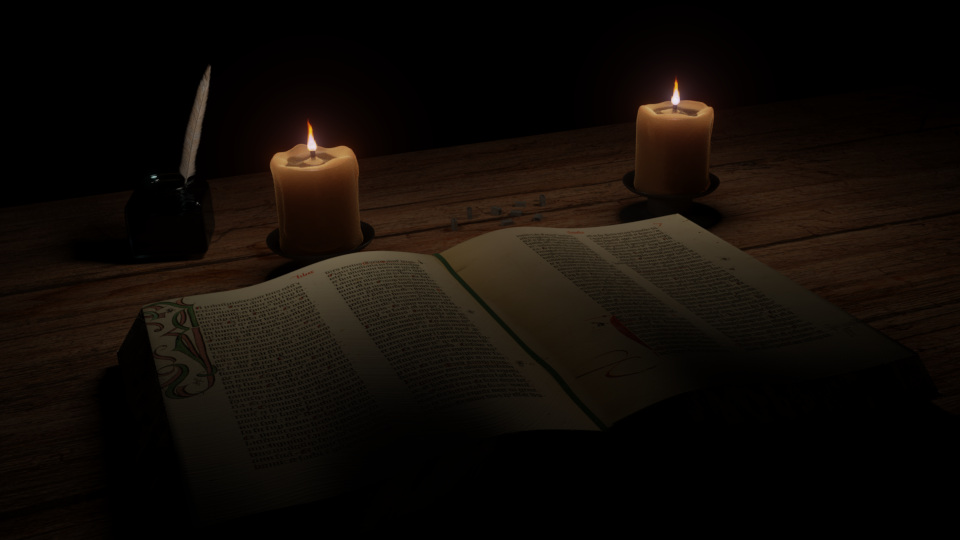
3dnotguru: Nice atmosphere and mood, you captured the dark feeling of those times nicely. It is a shame the print types didn’t show up very well.
dat_boi: I liked how the jar is reflecting a modern kitchen, even though the image mimics a common setting of Renaissance paintings. The fruits look pretty nice, specially the watermelon.
The only weird thing for me are the grips of the glasses: They look too thin, and I think the right one would break if you filled it!.
Also, the grapes seem to be floating, but maybe those are the plastic ones 
And I found the info about the watermelon being different back then very interesting (although, after some research, I’m not sure if it is really true).
Photox: Nice beard. I liked how you made multiple shots of different angles, making me feel like I’m getting to know the character. While the expression in the top right looks friendly, the one in the bottom looks more worried and thoughtful, showing multiple aspects of his personality.
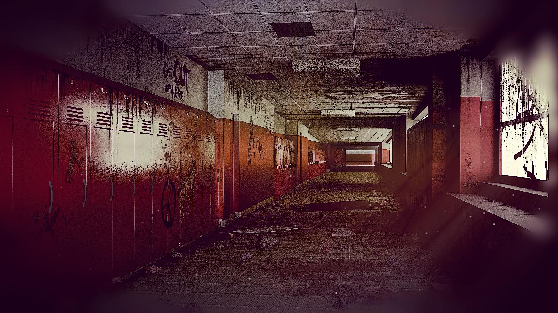
beau11: Loved how you managed to transmit the effect of perspective in the image, with many parallel lines converging at the end of the corridor. The regularity of the perspective contrasts nicely with the otherwise chaotic look of the scene. I just think it is missing a focal point (maybe a person at the end of the corridor?).
fcharr: I liked how the statues seem to be interacting with each other, with one going like “I’m going to fly!” and the other “You silly, you have this heavy thing attached to your feet!”. They have an interesting facial expression, but some of the proportions are off (if you intended to make a human, of course. Not sure about Klingon anatomy…): The legs are a bit too short, and the torso too long. But otherwise it is nice.
granite_skull: Really nice action-figure! It would be really cool to have one of this on top of my desk. I liked how he has colourful clothes, but looks tired, dirty and in bad shape.
purbosky: I liked the pose, it made the statue seem to be in action. The veil (calling what she is wearing “clothes” is a bit of an exaggeration ;)) looks nice. I just the background could be of a different colour or maybe darker/brighter in order to be more easily distinguishable from the statue.
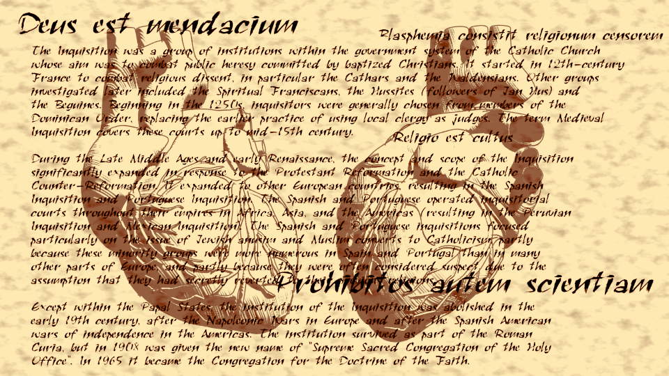
eyelight: That heart looks really nice, and I liked the drawing effect you achieved. The text seems to be getting a bit in the way, specially since it is just a encyclopedia description and doesn’t add to the mood of the image. Having some semi-transparent passages going in front or behind the hearts might be a better idea.
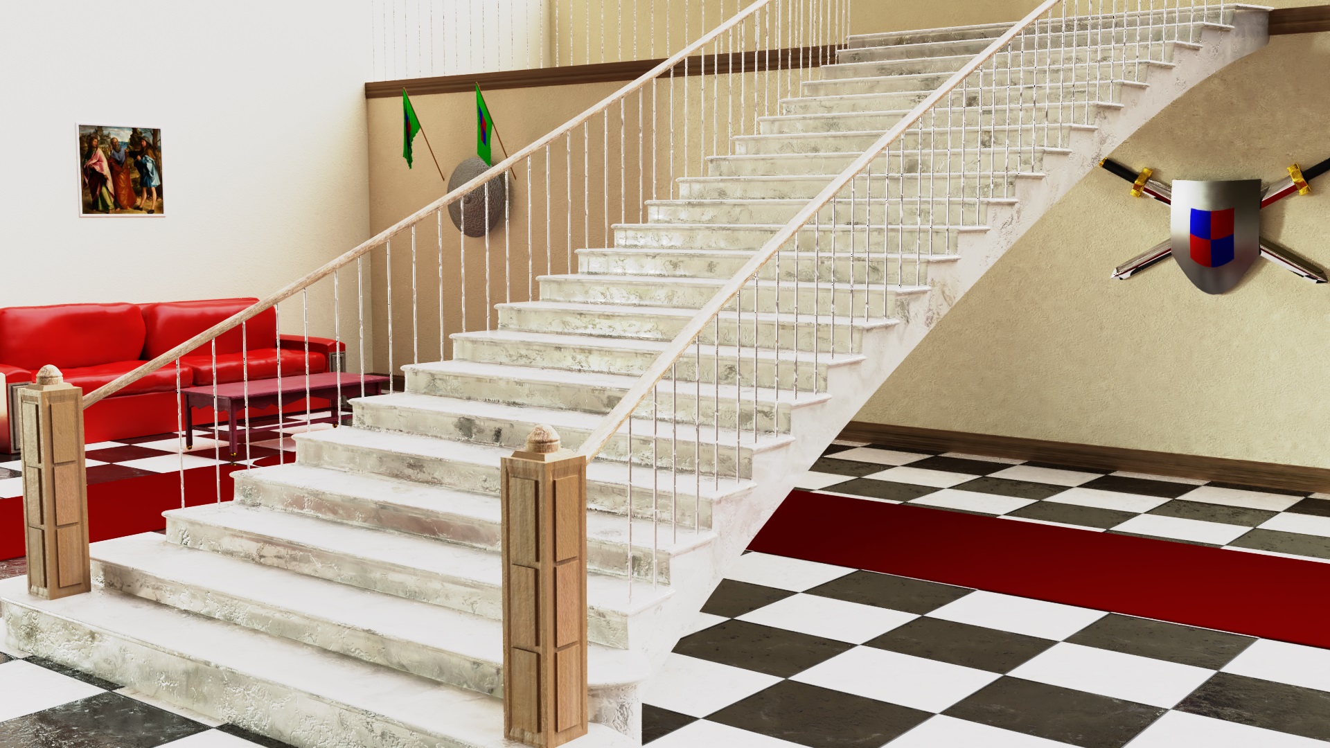
FlyingBanana: Being a Renaissance Fanboy must be quite expensive! The staircase looks pretty nice, missing only the red carpet on top of it. But I’m not sure if it would be very stable without much support, specially if it is made of marble.
OLG: Like I said on the entry thread, I loved the details of the cabinet. The plates inside were a nice touch (good thing that Blender can put things inside the cabinet without opening it :D).
Helge: Haha, is Renais the one sitting on top of the sauce? I liked how you made a collage of letters for the label, making this look like the work of a child. What is the right most vegetable on the label, by the way? I see tomatoes and carrots, but I don’t recognize the other two (I hope one of them is not hands…).
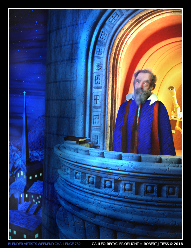
RobertT: Really loved the colours. The red light inside looks warm, familiar and comfortable, while the blue light looks cold and mysterious; Galileo seems to be more interested with the vast unknown of space. I liked how both his eyes and the telescope are looking and the sky and have that highlight typical of eyes.
Mission accomplished. Beam me up, Scotty!
 ]
]