Challenge #910 "A secret place" Voting CLOSED

This week’s theme: A secret place

Which entry would you like to see win?
(If you cannot decide, pick up to 2.)

  • KickAir_8P
  • 2Rock
  • fcharr
  • deltaray
  • arcticwasd
  • Millani
  • Gismo_Wander
  • david.speer
  • Watndit

0 voters

After 2 days of voting, a winner is declared: The voting will close on: Wed, Dec 2, 2020 11:00 PM.
The winner picks the theme for next week.

If the winner doesn’t supply a theme before Thursday 22:30 GMT, the organizer will select the theme. In this case, the winner’s theme will be used the next time we are lacking a theme on Thursday 22:30 GMT. :slight_smile:

Having selected the theme, the winner will not be eligible to enter that week. They may however still submit an image, but it won’t be included in the voting.

This week’s winner:
ba-feature-20201207-wc

Pure Entries

KickAir_8P: Suzanne’s Not Telling


2Rock: Secret Heart


fcharr: Behind the Book Shelf


deltaray: What’s inside the default cube?


arcticwasd: The Place of the Hidden


Millani: Secret Moon Base


Gismo_Wander: I tell this my mom !


david.speer: The Blue Stair


Open Entries

Watndit: Underwater Hideout

(This time I go Open with textures from cc0textures.com and postprocess in Krita.)


Non-competing Entries

Helge: The Dragon’s Lair


3 Likes

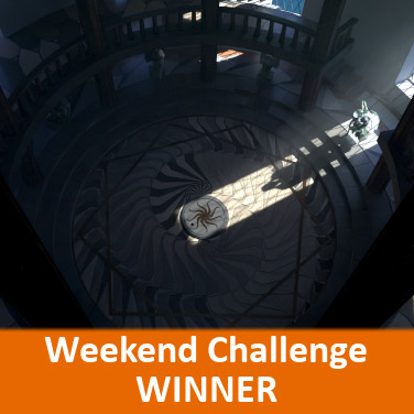
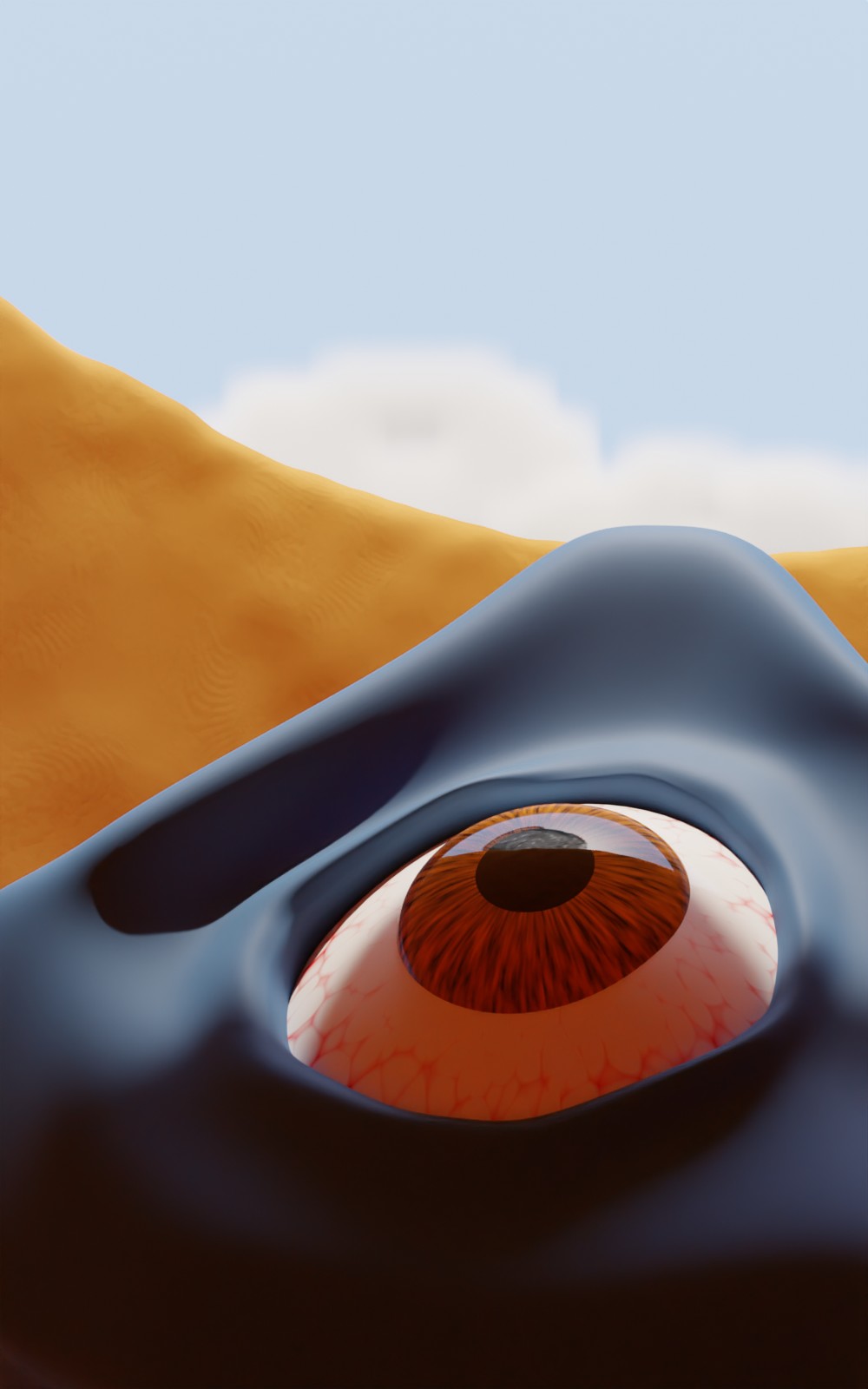
Suzanne’s Not Telling by Kick Air

The composition with the perspective makes this piece stand out. I see thirds and triangles and abstraction. The colored lighting might be a tad saturated and there is a level of detail difference between the eyeball and the rest of the objects.

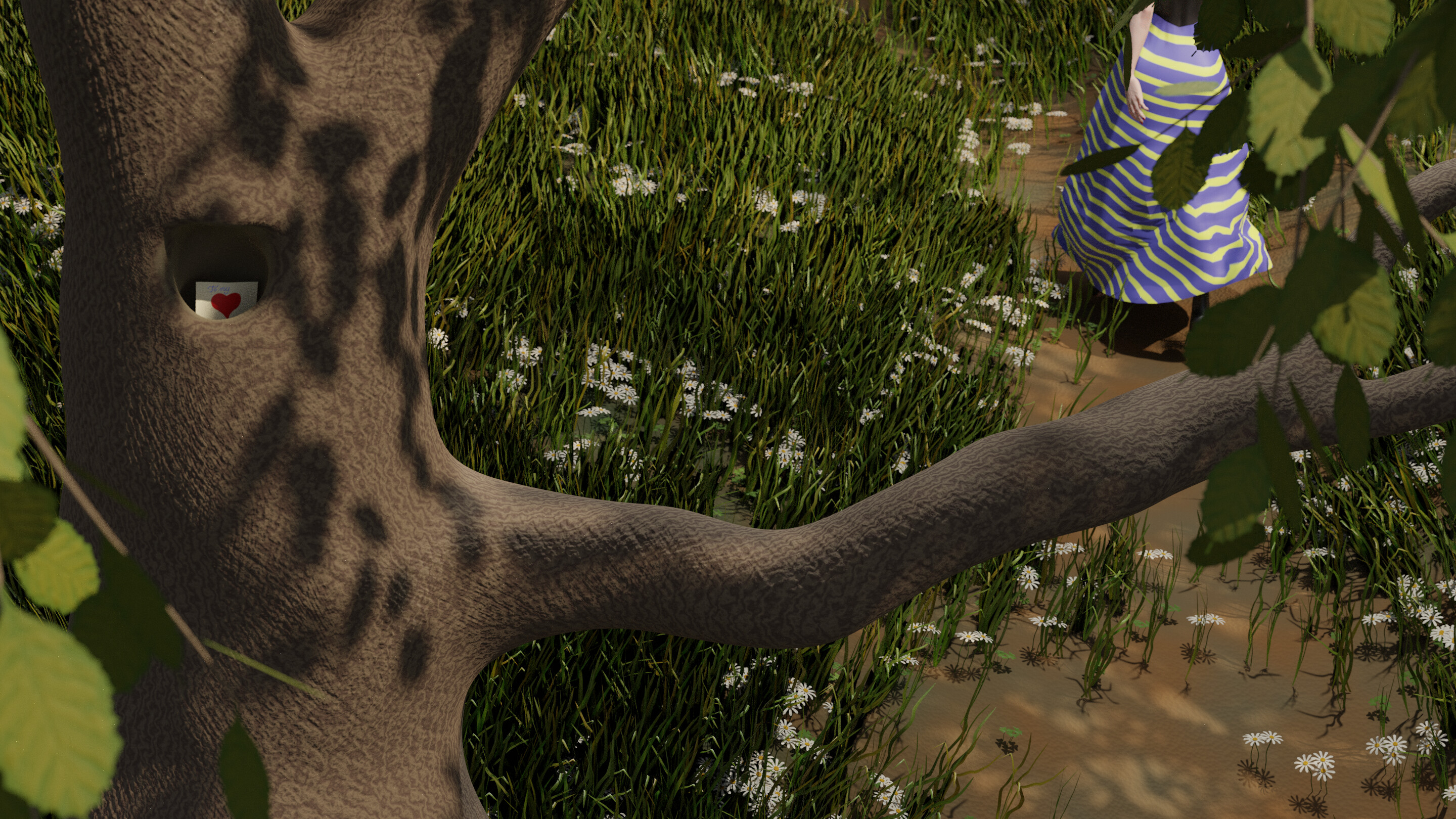
Secret Heart by Two Rock

Very good nature rendering. I had trouble telling what the dress was. The leaves obscure the shape of the arm. Good angle from up high and interesting idea. I kept thinking it was a playing card like from a deck of cards, but downloading the full resolution I could see the little detail “To my”. I feel like depth of field might help a lot.

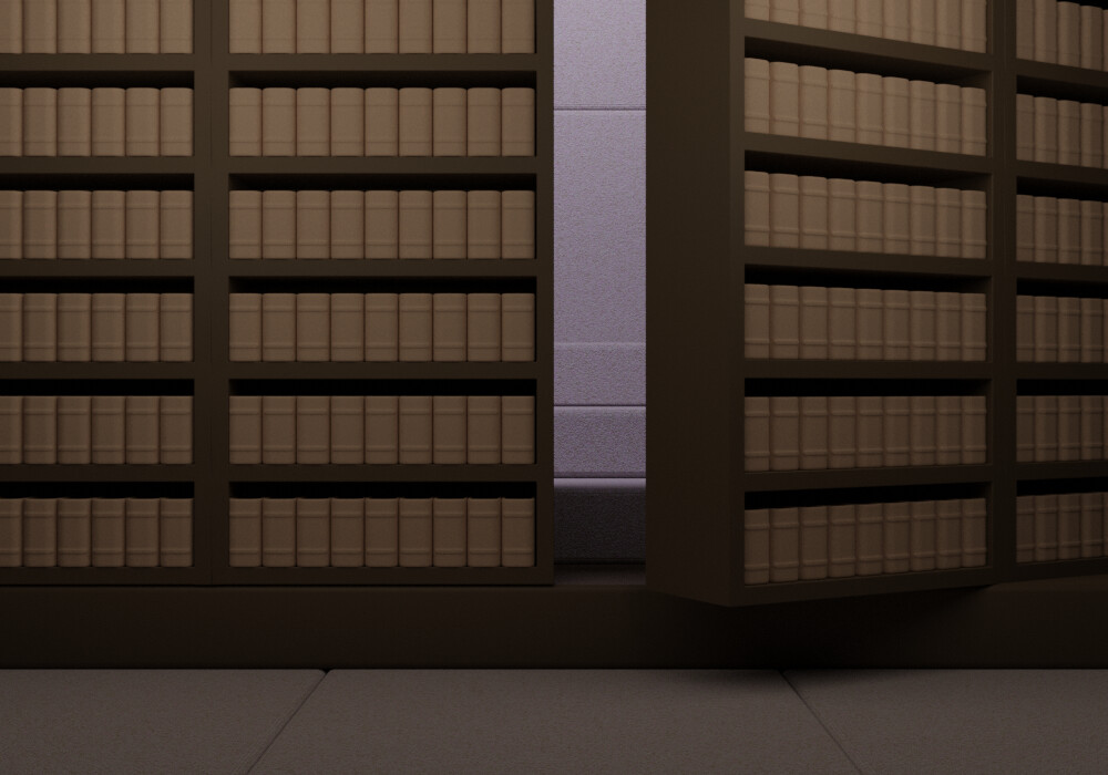
Behind the Book Shelf by Fcharr

Good use of repeating elements to model all the books but it would benefit by removing a couple or varying the color. The composition is very centered. I might have liked the behind part to be obscured somehow… mysterious… either in darkness or mist. Maybe play with motion blur (heavy) to show the swiveling bookcase.

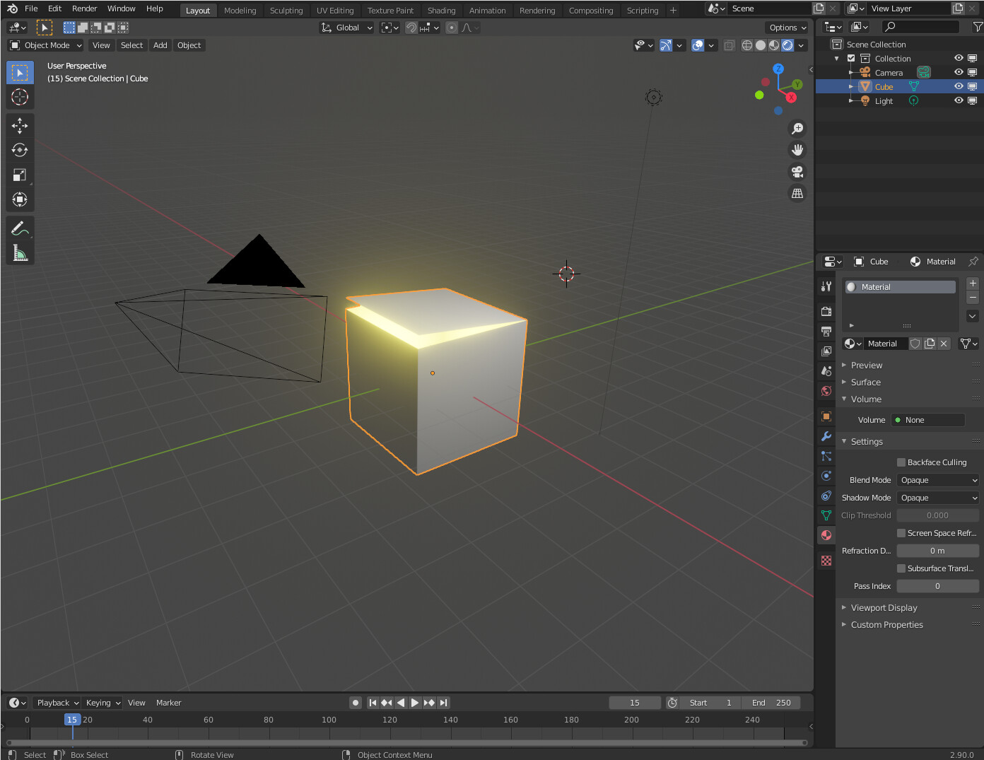
What’s inside the default cube? by Delta Ray

Very clever and fun for blender users. Wins for cleverness and coolness. Neat idea to use a screenshot. I feel like you could show it is inside Blender with less UI clutter (e.g. hide the 3D cursor, lower the size of the camera). The bloom effect is well done and good color choice. Very smart way to make a great entry that looks good without modeling a lot.

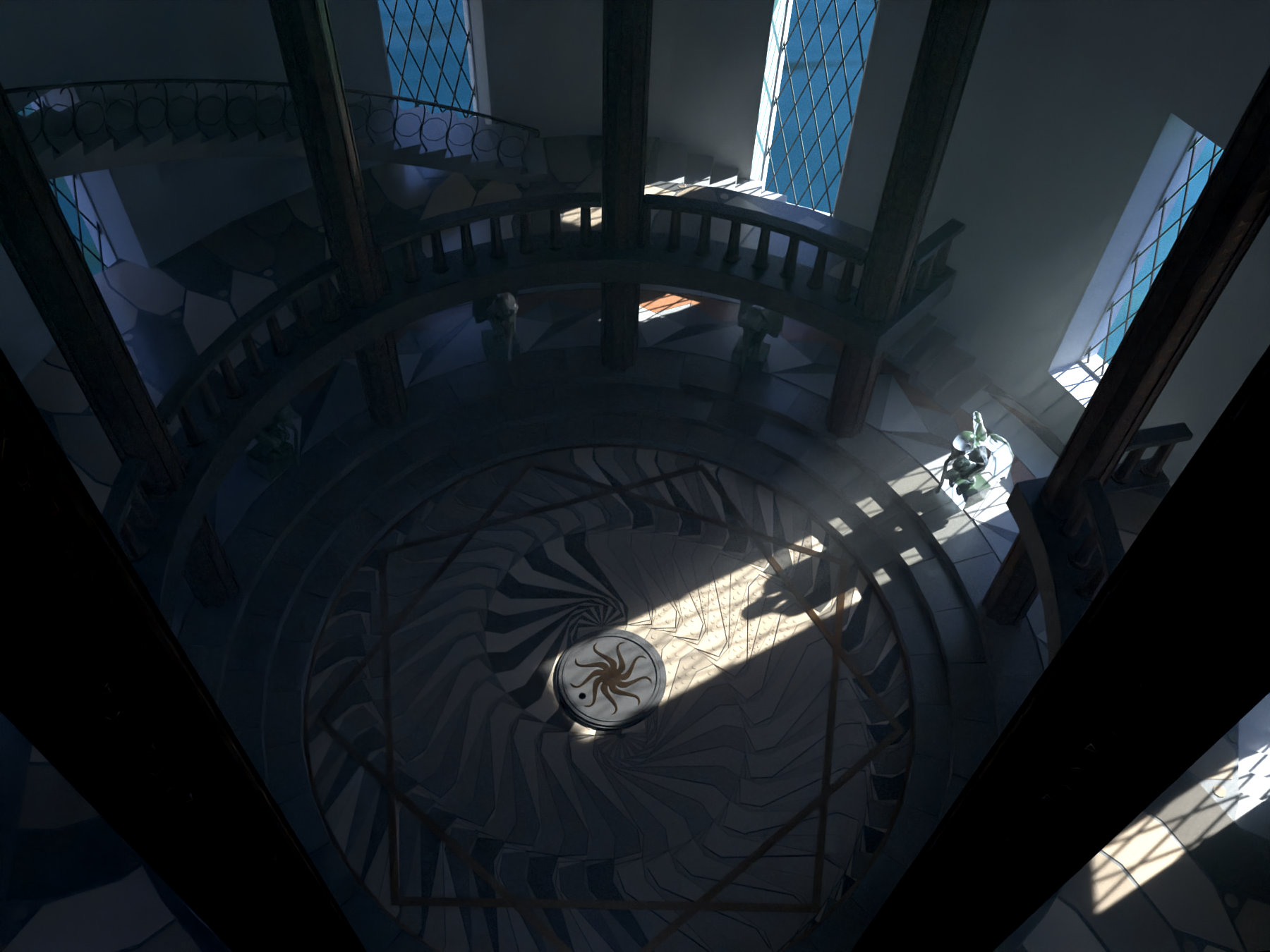
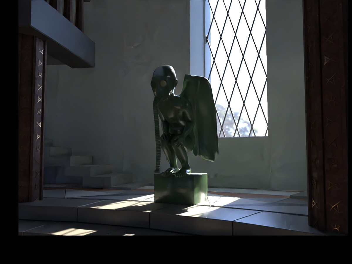
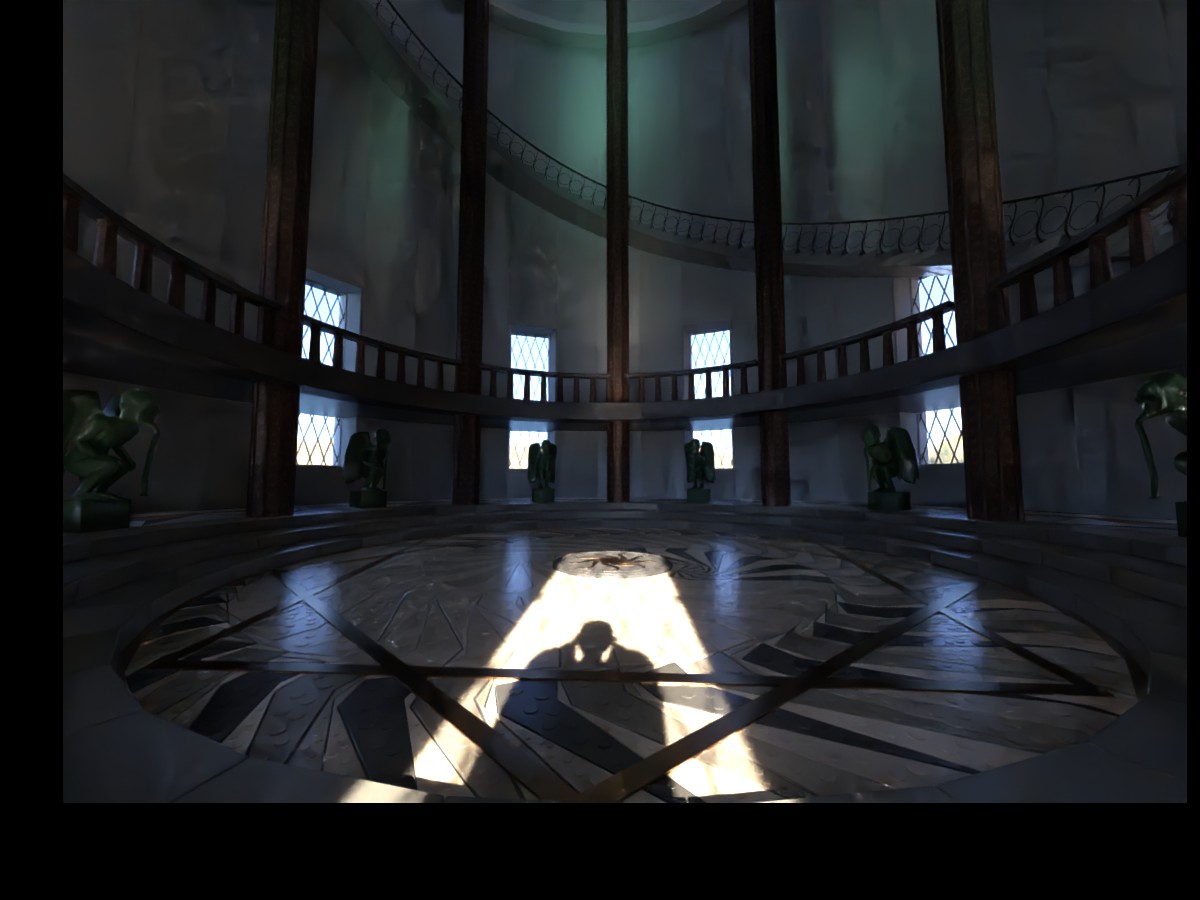
The Place of the Hidden by Arctic WASD

Fantastic detail. Seeing the banister and the backlighting with shadow just feels “expert”. The lighting is perfect. You can tell the time that went into it; it is not lost. Then there is the floor design… very “artistic”. It made me think of the Dark Crystal and those armored beetle guys. Even at full res it was hard to discern the figure at right but maybe intentional? Zooming in I can see a chair and something squatting on it but I can’t tell what that protuberance behind the neck is. Might try to crop a little off the bottom (not sure if it would mess up the effect of the circular floor).

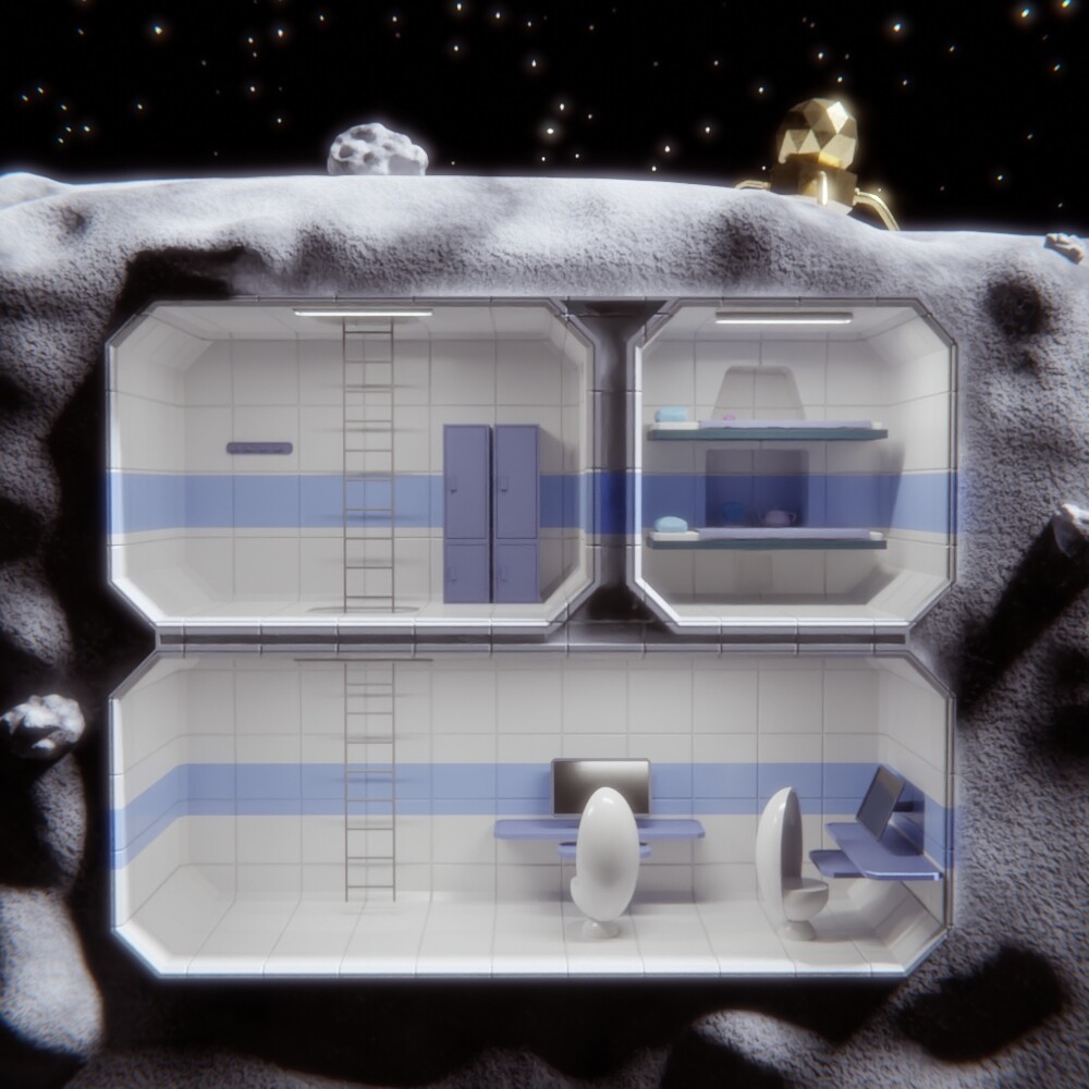
Secret Moon Base by Millani

The concept is near and dear to me. I like the style. Very fun and creative design. The low poly gold lander unfortunately feels apart from the rest of the objects. It would be nice if the background (everything but the interior rooms) was darkened or had no bloom. I now feel like both objects on top might be better removed and the overall work enhanced. The rock could be moved to the top left room as a specimen. The details of the rooms tickle the imagination.

I tell this my mom ! by Gismo Wander

It does kind of look like an alien inside the fort. The colors of the light are neat and the geometry is cool. The handmade sign is well done and doesn’t distract. The moon is possibly too obscured. It does evoke the theme very well and makes me wonder what happens inside. Would like to see a little more of the geometry out of shadow although my screen may be dark. The green strands of light almost look like rendering artifacts at low res and at full res it is still hard for me to tell what exactly they are. Also a very central composition. The title would be better as “This, I Tell my Mom” or “Untitled”.

The Blue Stair by David Speer

The more I look at it, the more I appreciate this piece. The cool and warm lighting is a nice effect and the stone layout on the square central columns is good. I feel like a greater contrast between the lightest lights and darkest darks would be welcome. Along this same line, maybe the room the viewer is in or the the staircase itself is more in shadow. I feel like the orderliness of the square stone grid in the arch gives away CGI. Moreover, things like the lights could be slightly different wattage or at different heights or slight angles to make it more real. Also not sure if that is the same grey texture color throughout. Lacks the impression of actually being there (seems more like a tripod than a first-person view) - which could be helped by angling the camera up the stairs like where someone might be looking than at a perfect right angle to the floor (or a shadow cast from the viewer).

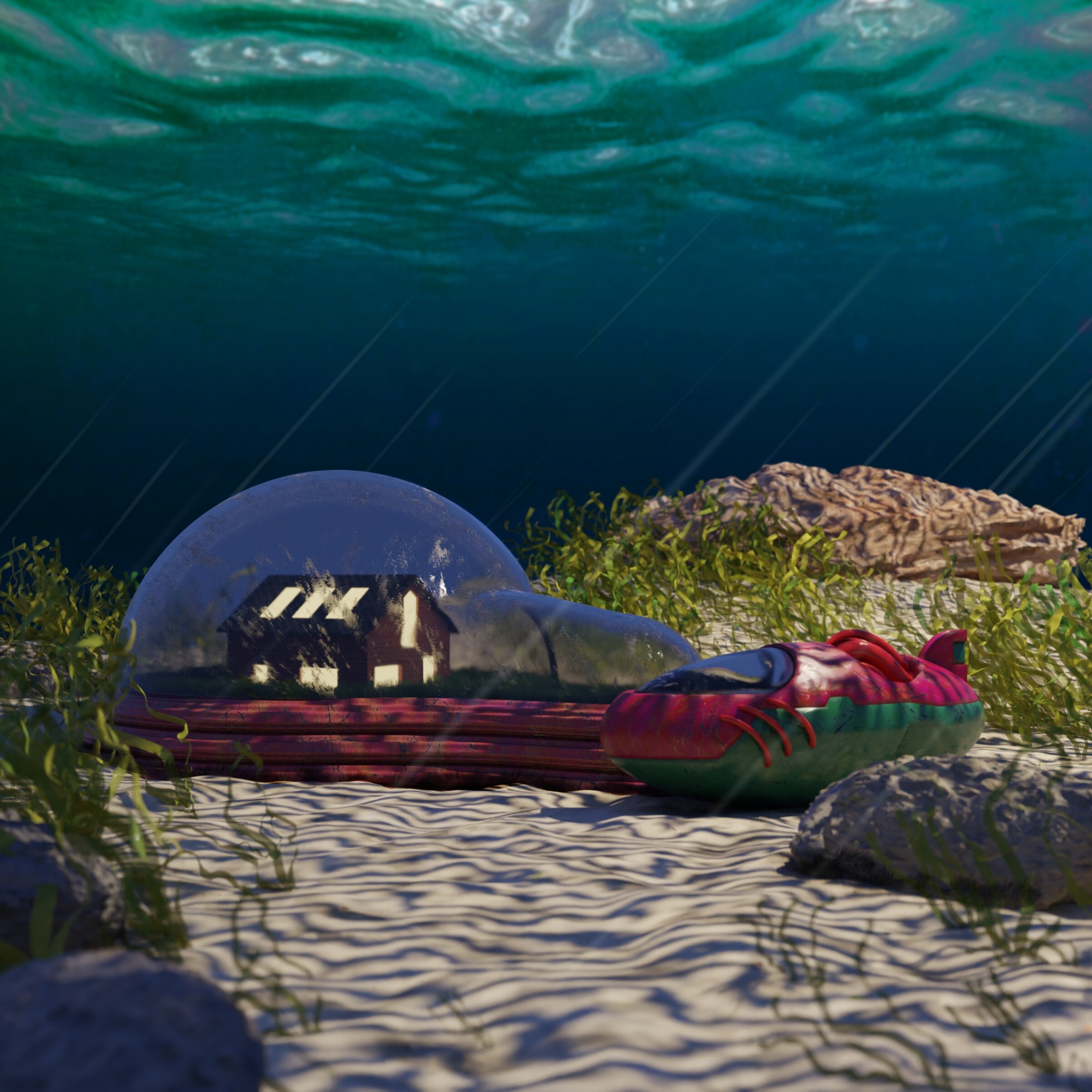
Underwater Hideout by Watndit

Brave to try the underwater scene, it almost captures it but needs more effect of depth, color, volumetrics. Quite saturated on color. Good imagination and good theme entry. The glass is almost but not quite right. This is probably EEVEE? I had trouble getting good glass effect too. It has a little bit of a vintage CG vibe. The highlights for me are the overall concept, the cool vehicle with the fin and the ripply water up above. The shape of the glass enclosure is not so attractive and would rather it be just a hemisphere. Also not sure what material the base of the enclosure is. The rocks look great, the sand looks good, but something about the lighting of the sea floor (caustics made by the surface of water) is either too contrasty or too regularly/evenly spaced. The light streaks do help the underwater effect.

The Dragon’s Lair by Helge

Nice creature, somehow cute but also ugly and strange. The little wings are adorable. Reminds me of a toy but also looks real. Very good composition. The vignette effect is a smidgen strong for my tastes (would almost maybe have no backdrop). Looks at all that candy – great materials and nicely placed. The textures are really great overall. A little hard to see the teeth like the eyeball stands out (do they have subsurf scattering?): maybe reposition them, brighten them somehow. I like the shapes for the general effect: a circular mound, a circle in the center and the head kind of an oval. Lots of interest in the things happening in this image! I like the style.

6 Likes

Good insights, thank you! I pretty much used this challenge to start experimenting with high poly to low poly workflows.

I used it on everything but those torches.
Ended up creating 8 normal maps in all, 5 of which I’d consider clean.
(Time constraint, I used the bad ones anyway and just tweaked the strength to try to hide them - hah)

That’s actually only one brick reused throughout the entire scene and one square stone used 8 times
Per step.

I have a long career of not finishing weekend challenges, but I like to participate :slight_smile:

1 Like

Yeah, it can be tough to finish. I just got in on my first challenge last time :grin:. Congratulations on the finish! I forgot to mention the thing that jumped out at me right away - the floor material, it looks incredibly smooth compared to the rest of the scene. Might be a cool effect that doesn’t match the room.

That’s wings :smiley:

1 Like

Thanks for taking the time to go through all these entries. Every now and then we have these kinds of marathon reviews. They are a lot of work to make but always a pleasure to read. :slight_smile:

Actually, the original effect was even stronger which enhanced the feeling of looking into the dragons secret hideout. However, it obstructed the view on too much of the candy treasure. And like most people on social media, when given the choice between privacy and candy, I choose candy over dragon privacy. :wink:

Indeed, they could be a little brighter. This was one of the things I skipped when I noticed that it was almost 5 AM, already… I usually start working on my entries on Saturday night at about 11 PM. So, this one had already taken a little too much time and so I called it a day.

There are a few other details that didn’t make it into the entry:
- scaling down the eye and ‘connecting’ it to the head in a more natural way
- adding more candy
- adding different types of candy
- replacing the background with something more “cave-like”
- updating the skin-bump map with the diffuse map’s “spots”
- adding some cute scales to the skin
- adding some kind of colorful dragon egg
-… :wink:

2 Likes

sorry :sweat_smile: they are ufo´s .

to cut a long story short in the beginning i wanted to tell an other story… :sweat_smile:
but i’m forgetful sometimes.
thank you for your opinion i want to try to learn from it. a foreign look is very valuable :grinning:

1 Like

Ah, a classic UFO. I had thought it was a streamer of light like a light cord for decorating the tree for some sort of night party.

That is how the aliens really are: they hide in plain sight. We look but we just don’t see them. That’s brilliant now that you tell me what it is! A figure just out of sight… some dark obscure shapes in the sky that are UFO’s… (I wonder if others got this.)

It’s nice to know everyone has a list of things that didn’t make it into the final artwork!

The effect is a good one for what you are trying to achieve of looking into the dragon’s lair. I think I’m just afraid of the dark… would rather see lots of color. I might try rendering the candy mound from different sides and then layering them and fading/blurring them into the background.

Cool. :yum:

@Boder Thanks for all the comments!

The rock is actually there to hide the entrance to the base, however I didn’t transmit this idea very well since it is hard to understand that the entrance is there.

Totally agree about the bloom, I should get into the habit of rendering, waiting one day, and then remaking the post-processing afterwards.

Oh, mine was initially supposed to have aliens, some jump suits, and a fully functional fancy lab on the basement. But when you’re a few hours before the deadline, you need to get a bit more realistic. :slight_smile:

1 Like

I would not know how to transmit this idea better either. I only might think of enlarging the rock and slightly remodeling the opening/ making it larger. Maybe if the ladder bars were thicker and the ladder was more apparent.

1 Like

And… the winner of Weekend Challenge 910 with votes from 62.2% of the voters is… arcticwasd!
Here’s to all the great participators…


The Place of the Hidden

4 Likes

@Boder
Thanks for the critics ! really appreciate that :smiley:
No my rendering is actually in Cycles but at only 50 Samples.
The base of the enclosure is supposed to be painted metal like the ship.
I always struggle with vollumetrics, so I faked them and made the cautics with a simple textured spotlight that uses a distorted wave texture.

1 Like

Grats on the win!

Congrats arcticwasd! I broke my two-vote brainlock by voting for mine, leaving one vote for deltaray’s What’s inside the default cube?

Also enjoyed Helge’s The Dragon’s Lair (cute, reminds me of the tumblr posts on unusual dragon hoards), Watndit’s Underwater Hideout (looks cozy), david.speer’s The Blue Stair (like how I’m drawn up the stairs), Gismo_Wander’s I tell this my mom ! (cute UFO), Millani’s Secret Moon Base (lovely lunar look), arcticwasd’s The Place of the Hidden (epic), fcharr’s Behind the Book Shelf (love the concept), and 2Rock’s Secret Heart (heartfelt).

I put some effort into the composition and camera angle, glad you like 'em! I have a fondness for intense light/shadow, bright colors, and strong contrasts, so a lot of my artwork is pretty saturated (I did a volumetric cloud to reflect in Suzanne’s eye, but it blocked enough of the Nishita sunlight that I lost the highlighted vase rim, so I took it out – put that render below).

Since I use Suzanne and Blender’s logo colors in most of my WC submissions I rarely go for realism, but when trying to convey a lot with an eye close-up I’ll usually put more work into the eye – maybe I got a bit over the top. Thanks, appreciate the concrit!

Thanks, everyone! Here’s the statues.

3 Likes

Feeling adventurous? This way =>

Wow, you made weekend challenge entry that looks good in more than one angle. I think I never did that. :slight_smile:

1 Like

Wawee! :eyes: I did not know whether to ask for a close up because it might not look good!