If the winner doesn’t supply a theme before Thursday 22:30 GMT, the organizer will select the theme. In this case, the winner’s theme will be used the next time we are lacking a theme on Thursday 22:30 GMT.
Having selected the theme, the winner will not be eligible to enter that week. They may however still submit an image, but it won’t be included in the voting.
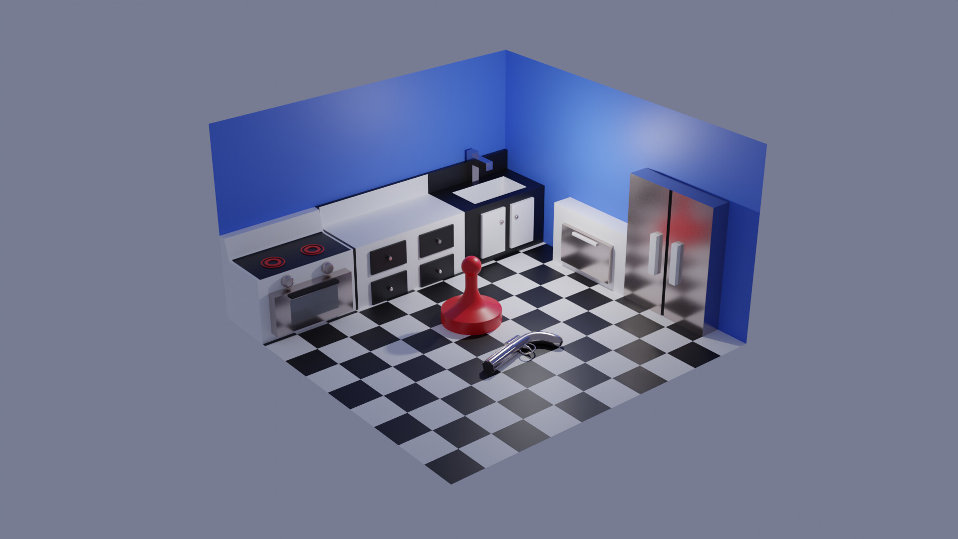
Good idea. I’m sure a lot of people can relate and it will put a smile on their faces. I think a little more time polishing the render would help … the specular on the blue walls, the metal faces look like mirrors, and giving the walls and floor some depth, and making the background not just a solid color (or maybe just a different color).
This one is interesting, abstract. I get 1920’s cultural vibes from it. I think of architectural or sculptural elements. I think of city lights at night. Maybe cars. In the end though it doesn’t really feel so Blender.
That fly is crazy good. I can’t believe you made it in time for the contest. Good composition. Fits the theme for me. Right on! Maybe a more creative name though…
I like the textures and composition. It feels like a scene from a comic book or a CGI video game cutscene. I can tell how carefully the camera was positioned and the objects arranged. I don’t get enough of the scarlet theme. The name is funny.
Basically this one is pretty good, it just needs a little bit more. Maybe if the ground tiles were actual 3D, the vials weren’t so full, and there was a little more geometry, it would be good. It’s a good 3D perspective though and decent composition, and the idea is pretty good. It might need more red/scarlet and cool details to win though.
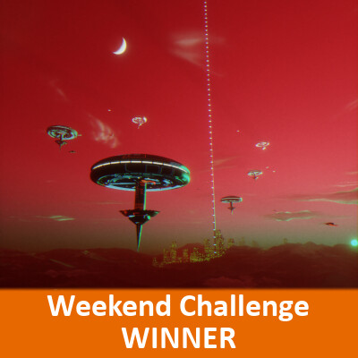
This has a nice epic feel to it. It feels a little orange-y to me. It’s maybe a little bit busy with so much going on: the moon, sun, all the ships, the tall beacon or elevator to space, the clouds, the city… maybe a few less space craft, no moon, and a darker red sky at the top would have done it for me. I like the ship design except the bottom inverted cone on the pointy spire seems a little simple geo (maybe if that was like a smaller version of the top torus-like structure…).
Pretty cool vibe with the misty effect. I can feel some of the emotion here. It has kind of a “high art” feeling like being at a museum. I like the ground texture and the fact it is red too. I wish there was more of a gradual transition from no mist to misty and parts of the image were more clear. I also think it could use a little “something more” but not sure what that would be (maybe like a sphere hovering it the very center of the abstract). The title is good.
I like the title and the idea. The image is a little confusing… I can’t tell what’s up, what’s forward, what’s back, and eventually give up. It reminds me of like a spiral staircase going up, a black hole pulling things inward or the Death Start crumbling apart and exploding. The contrast is a little sharp… it needs more mid tones and some of the objects look strangely placed or flat shaded.
Nice solid still-life with DOF. Good realism. Would have liked the left top/stopper to be a different shape than the center bottle. Could use more variation in Z-depth of the objects from camera. And because scarlet is such a bright color and everything is through glass, it needs some of that bright scarlet. The balls are a good color/material and the glass material is spot on for realism though. DOF is just about perfect. The title seems like some sort of advert. Maybe if it was “Scarlet: smell of beauty” (basically the same).
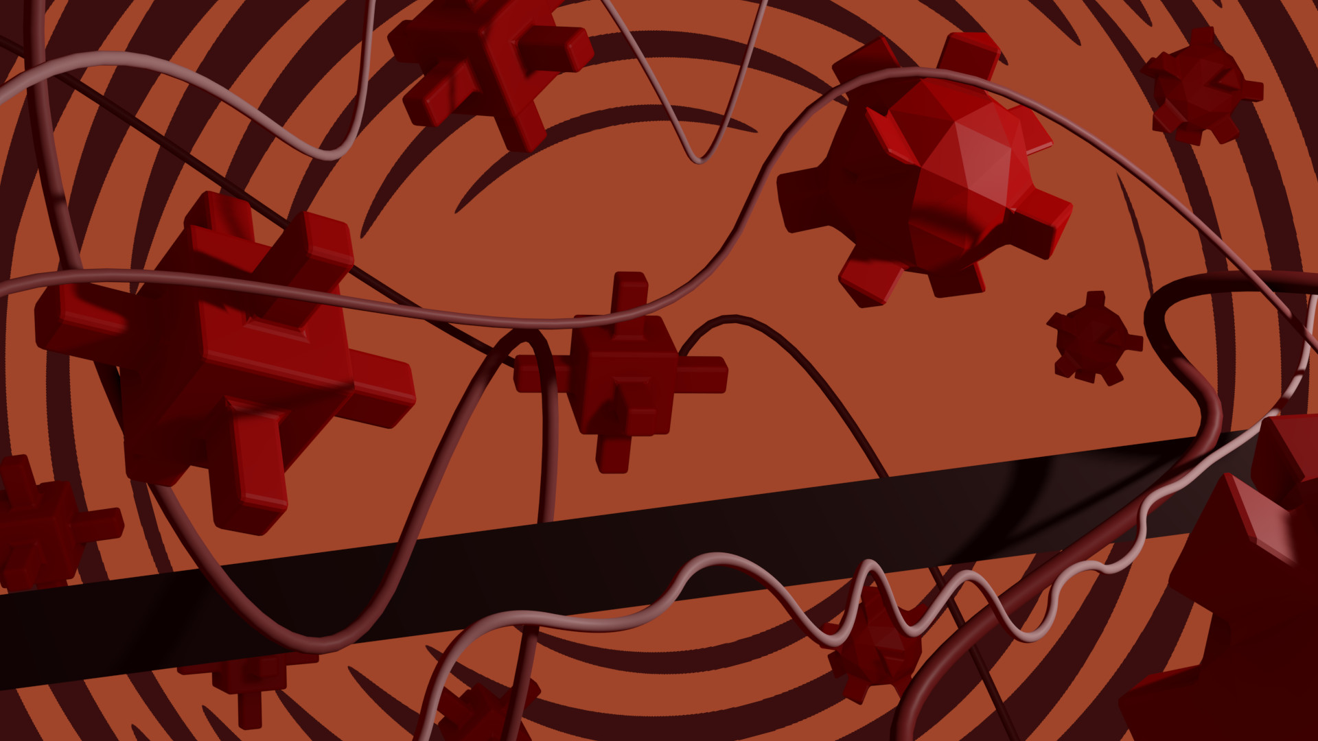
(This is mine) This is very fun to me. It feels like a sort of clash between 3D objects and 2D abstractionism. I love all the little shadows and strings going all over the place. It has a lot of movement. I think the title could be a little more creative and there could be more color variation and shape variation for the objects. There also could be more of a story, like maybe the objects are red blood cells or molecules or space satellites. I can feel the scarlet tho LOL.
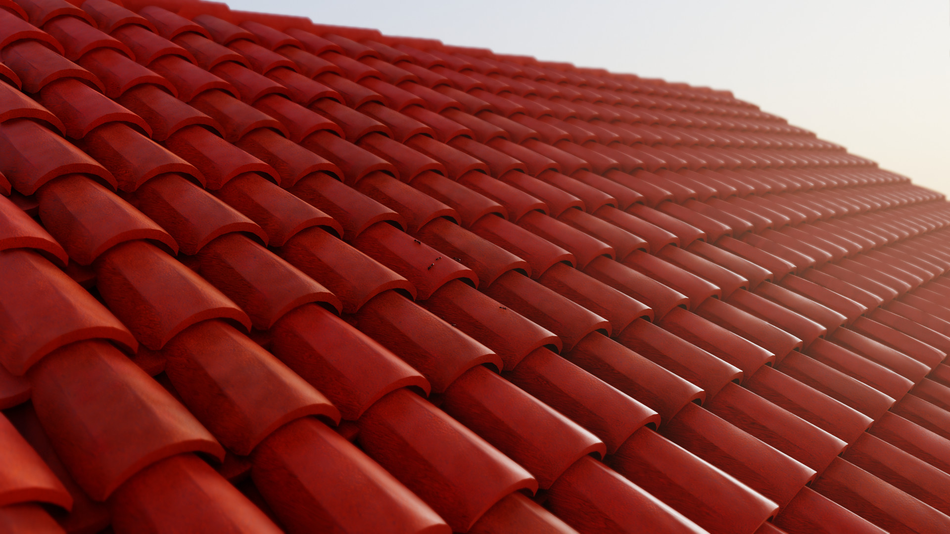
Very solid entry. Nice little in-joke with the ants. For ants though I usually see just one stray ant or there are a bunch (maybe two, but never five), sometimes in a line. Love the material and lighting and composition. Very scarlet. Maybe the ants are supposed to be an Easter egg but I think they will not be hard to find so maybe bring them closer to the camera so they can be seen better.
I really like the feel of this. The couple things that let me down are the red being so dark and the character model looking out of place with proportions and simple geo. I think might be better not to have the person. And what is “the scarlet”? Seems a little silly or something. If you called it something like “Crimson Waters”, took out the mannequin, bloodied up the curtain a bit, it would be a AAA horror diorama.
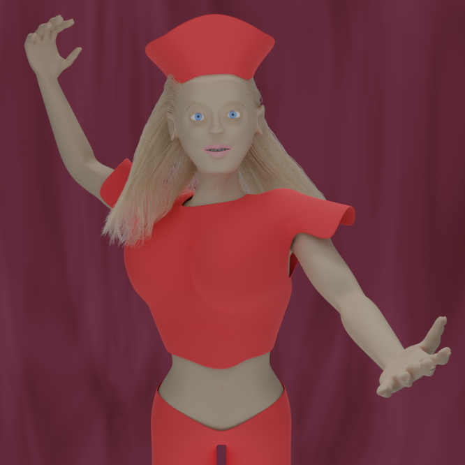
It is nice to see a fully developed human in these challenges. The title doesn’t give me any sort of clue towards the meaning of the piece… and I can’t really place the outfit either. So my suggestions would be to mix it up, maybe make the character darker skinned, make the scarlet color pop more and be less washed out in the final render, come up with a story and title it along those lines. I like the background though, her pose is kind of interesting but a little bit odd, but the outfit is kinda costumey.
I really like the background and how everything is so scarlet. What a funny idea to have a big ol’ dinosaur (that is a T-rex, right?) that actually has a sweet lady name and likes flowers. The only part of the dino model is the foot on the ground looks a little stubby and the arms look a little funny. I’m thinking the arms could be further back and slightly larger. I’m thinking that tail could possibly be longer. The little plant at right stands out a lot. I think if you just increased the red value on it, or made it darker, put some mist on it or lowered the saturation.
I was planning to add some scarlet petals on the floor. Also, “finishing” the architecture would make a big difference I think, since plain flat walls are not very interesting. But when the time budget is short, one needs to cut the production costs.
So true. In addition: When the production costs need to stay low, one needs to cut the time budget. On the other hand, speeding up things usually makes everything a lot more expensive… its a confusing world.
Hi, could you explain a bit of that entry posting ? I saw there had to give some link for the image. I haven’t any idea about it.
Is it ok to post like a reply?
Thanks
Sure, just add your entry image to the reply. That bit about sharing links is a relict from a time when most forums/boards didn’t have image uploads (and images had to be hosted on external services).


")


 .
.