I voted Real vs. Commercial. Good idea and it has just the right amount of realism for me. That really looks like the real burger.
Fast fries station: I like this. I think it’s a little hard to see what is going on with the ketchup and what is that holding the fries together in the center? Could incorporate more “fast food” theme elements.
Runner Beans and Escapeas: I like the composition and the idea is whimsical (maybe to a fault, like a bad pun). I would lower the glare and change the font.
Fast Food Lover…: Amazing. Stunned by the detail and realism. And it does fit the theme! However, I think it gets fewer votes for this because it still could fit many themes.
Fast food on hooves: Pretty creative idea. I think it is a little bright and compositionally has half empty side. The lion to me is not as real as the zebra.
Fast Food: This is just fun (would be my second vote). Needs a few tweaks: smooth shading on shoes, pit, top burger bun / thicker noodle limbs. Better shadows from the characters.
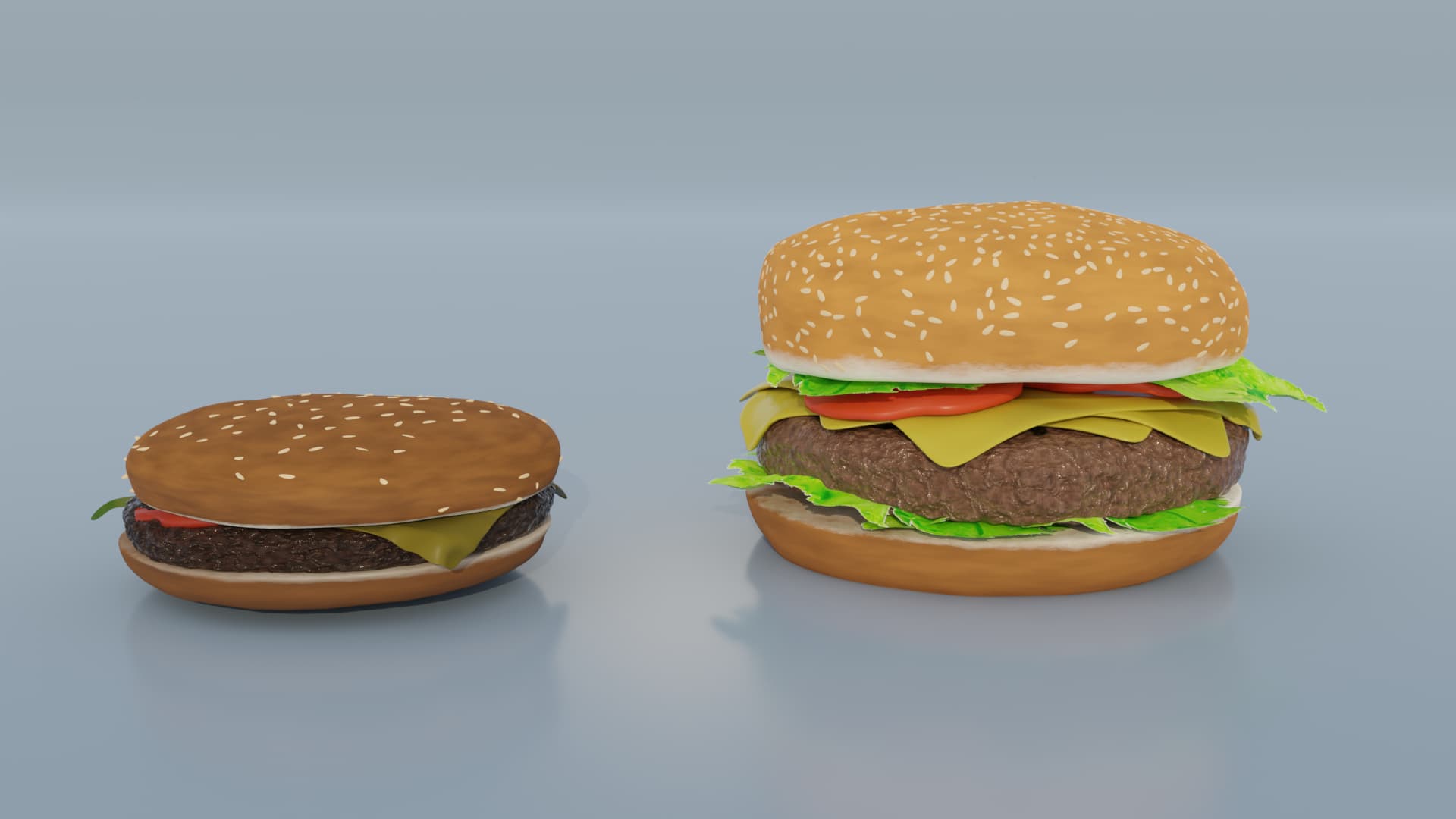
Burger: Quite like it. The patty is really swell. Hits the theme. The white background is too white for me and the very center composition is actually OK in this context, but maybe something interesting with the camera angle or lighting or colors could help.
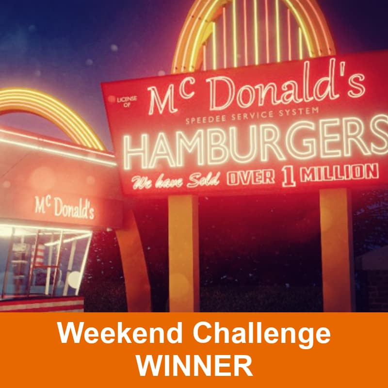
first Mc Donald’s shop: Wow, very classic. Just solid art. Thought for sure this was going to be my first vote, but I think it is maybe too realistic for me. Probably appeals to the most people.
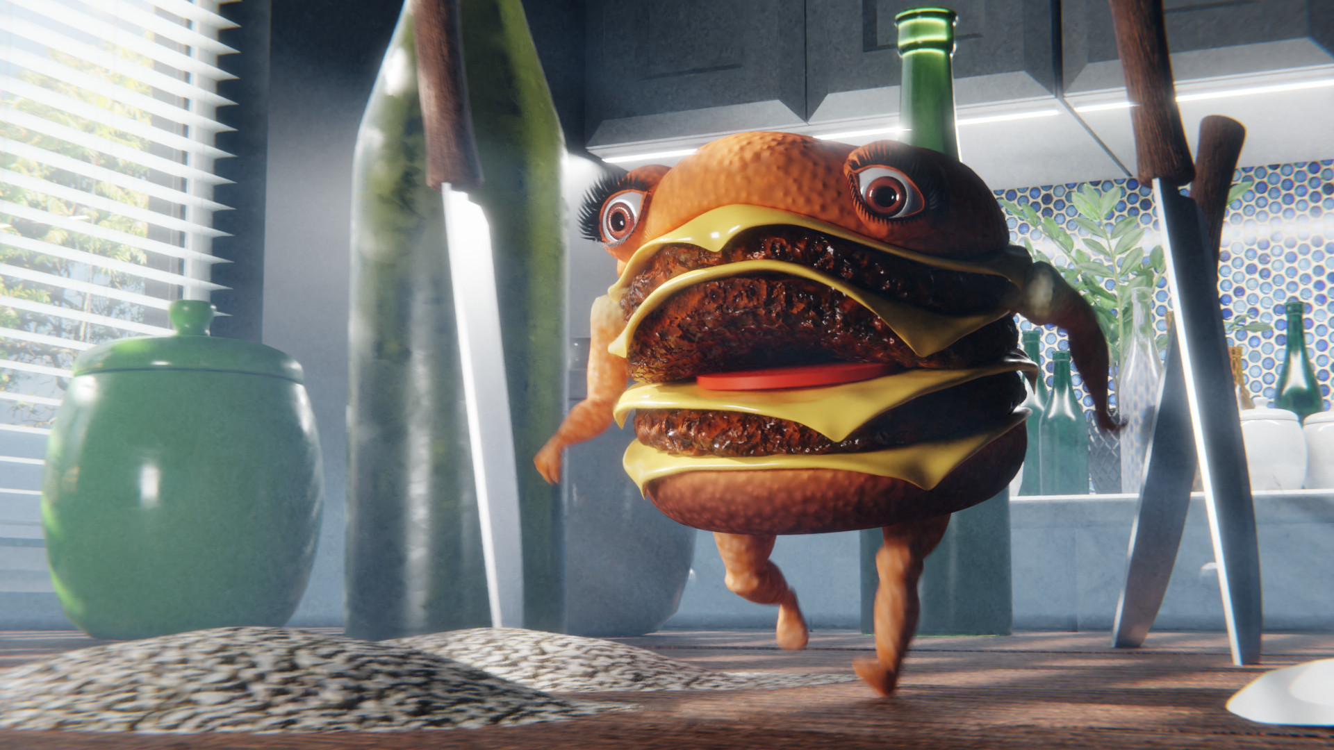
Too Fast for Food: Really well done and made me think of a children’s book. (This would get my third vote.) Is that flour on the table? I would have a few less elements on the table : suggest removing left bottle and rear ceramic pot. That hexagonal texture in the back doesn’t make me think “kitchen” but rather “art decor” like bathroom or living room. The bump on the burger is a little strong.
Hover-Thru: Very solid and complete. Made me think of The Fifth Element. I can’t quite figure out the reason I’m not voting it. I think it is that the hovercraft is the main theme, but kudos for designing the logo and the windows reflection as well as great composition, lighting, modeling, etc.
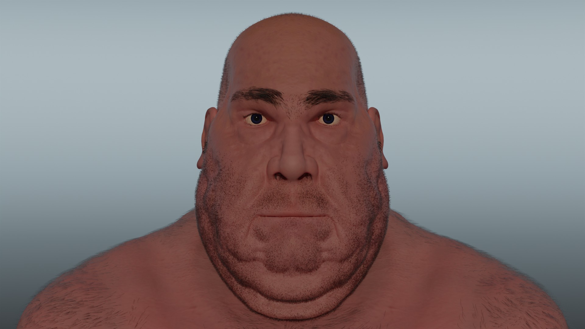
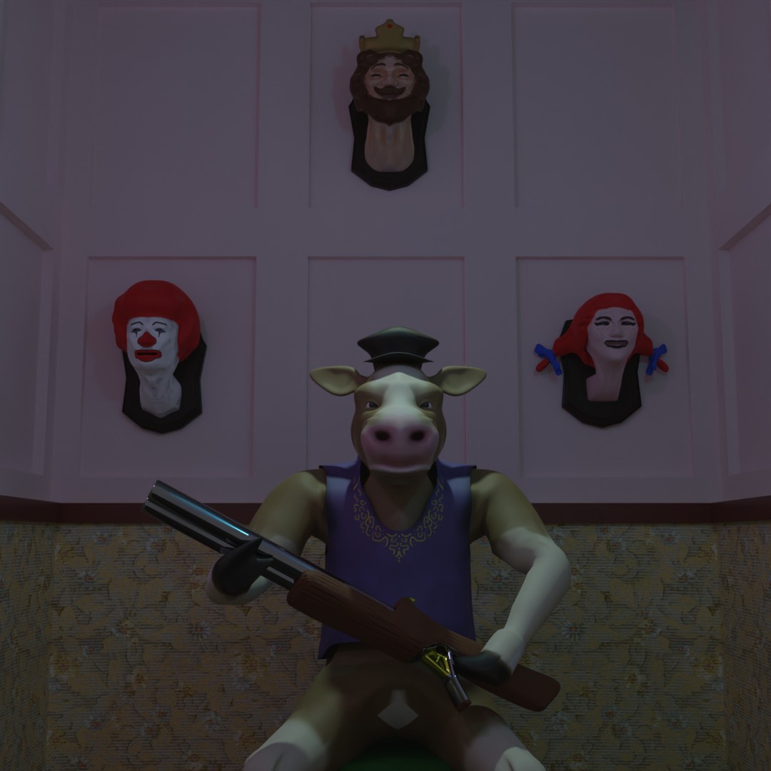
not fast enough: Dark. Does make a statement. Would suggest no walls coming towards the camera. Is the steer sitting on a stool? Has a video game vibe to me like Duke Nukem 3D or Doom. Makes me think of scary clowns too (creepy BK guy). Not sure what the dark lines near the knees are or the white patch in the genital region. I would play with the wall trophy placement so it is not so symmetrical ( just a little , or a lot).
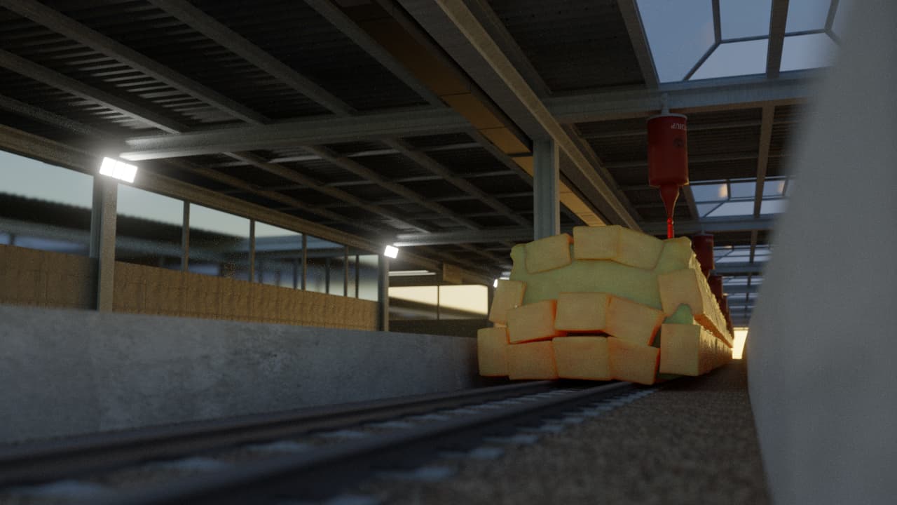
burger fries: I didn’t really put a lot into this entry. The fries really need some work and the back HDRI needs higher res. I like the composition and the feel and the lighting. I would have more fries and texture the tabletop. I like the basket.
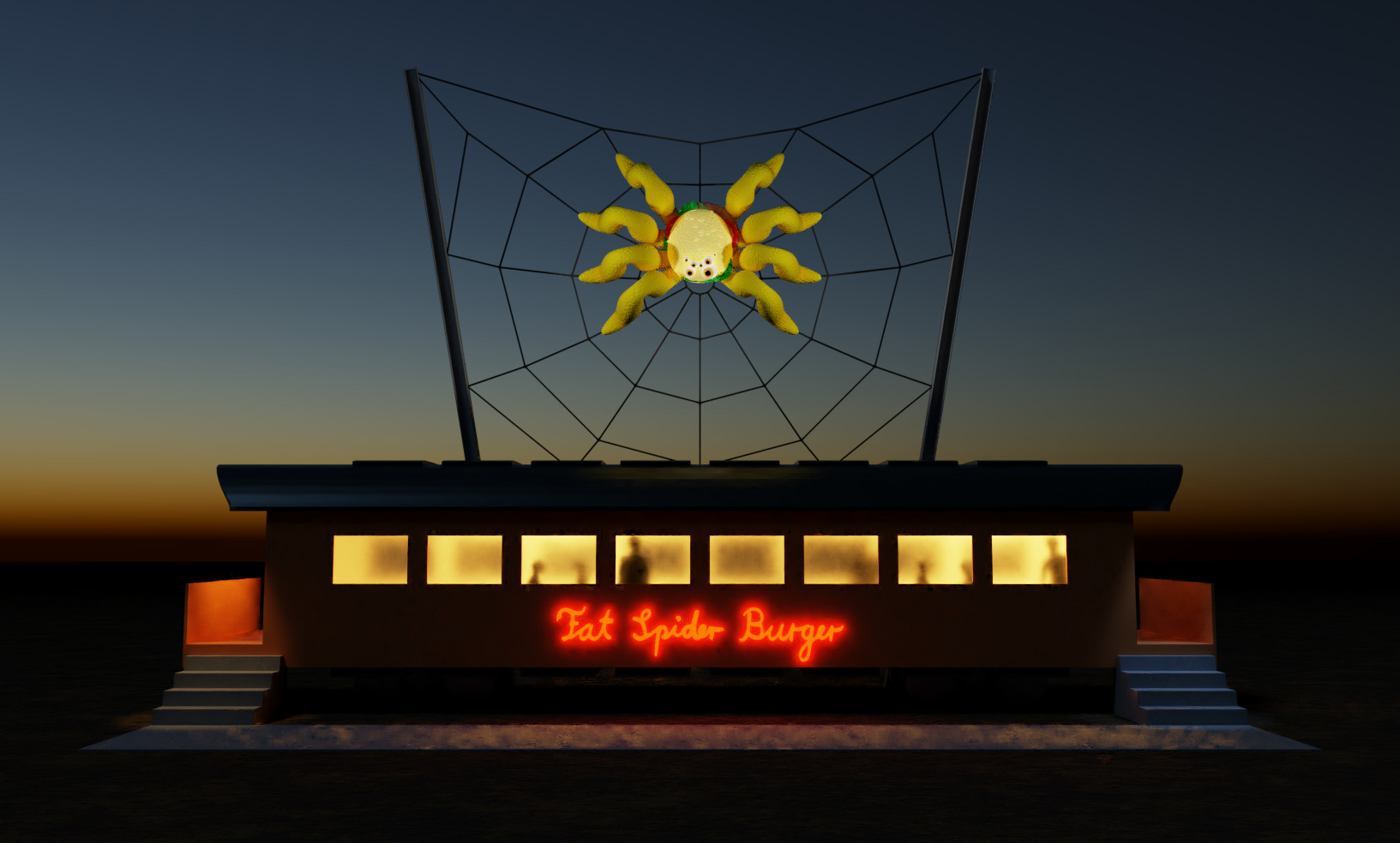
Fat Spider Burger : This also has sort of a video game model vibe for me. Reminds me of mini golf statues. I might move the lettering above the building (on the web), make the spider’s legs thinner. Make the burger body at least 2-3x bigger. Break the symmetry somehow.