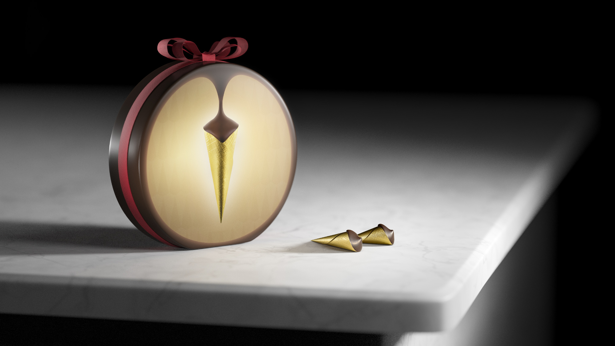
Just looking for some critique and suggestions before doing a final render, regarding lighting, modeling, composition - anything really. Basically, be as nitpicky as you can.
I’ve been thinking of adding some color in the background, but I haven’t figured out how yet…
Hi, I like the simplicity of the render and the positioning of the main item. Also shifting the primary light color to a warmer tone might help. For the color from the background there are several ways to do it.
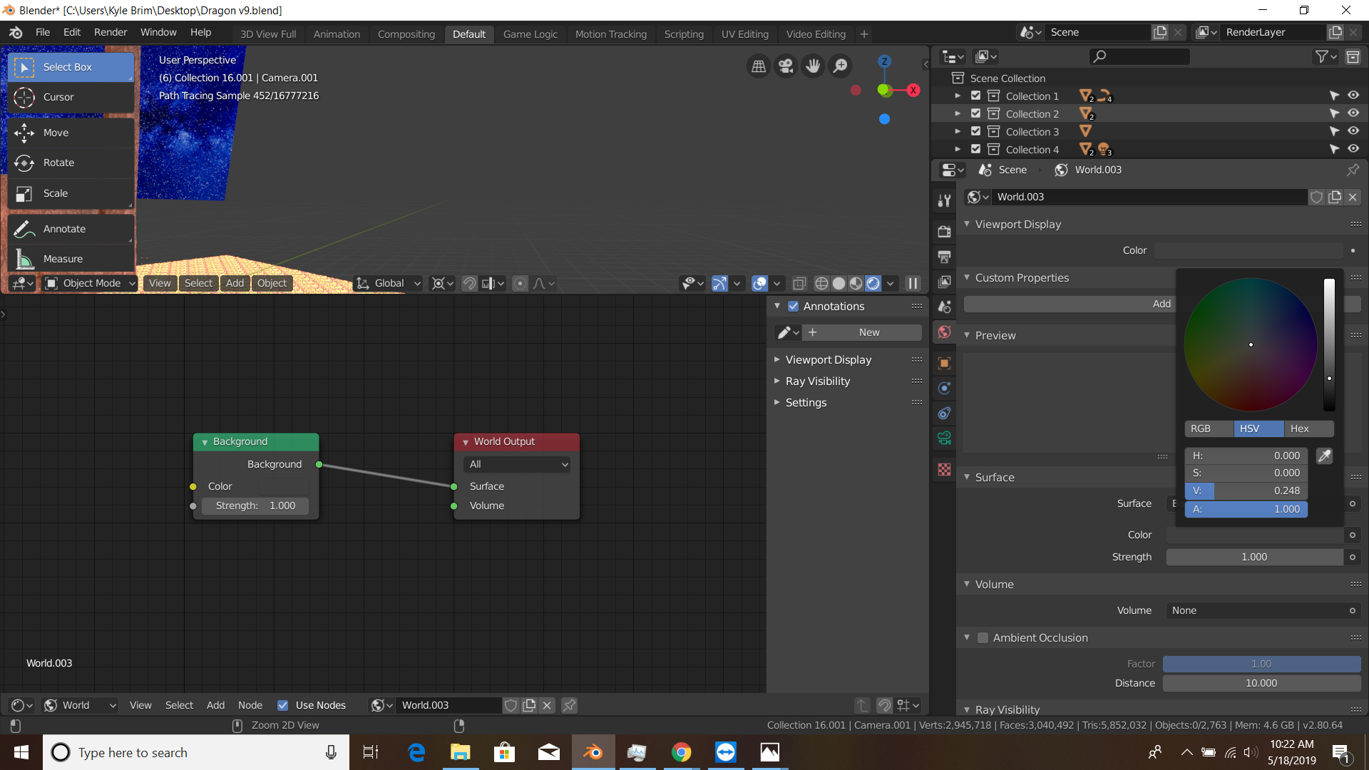
Blender 2.8
Go to the world tab and select New
Then you can head over to color to change the general color and strength to change emmision strength of the background
Or you can head over to the shader editor
Then click delete the default background node, add, texture, image texture, then use an HDRI map as the image

Also it might look cool to make the marble a little shinier, and dull it using a specular map for the material, or randomly using a musgrave texture
The problem I have encountered so far with warmer lights is that it often ends up looking like the whitebalance is off or the marble has the wrong color. But now I’m thinking making some of the secondary lamps warmer could work.
I appreciate the explanation, although I didn’t mean that I don’t know how to add environment maps, but I am looking for a solution to the empty background, which feels unfinished, so I want to add some kind of slightly abstract element (preferrably colored, artificial lighting) - I just don’t know how what exatly yet.
Hi!
There are a few things which could help improving your product shot in my opinion.
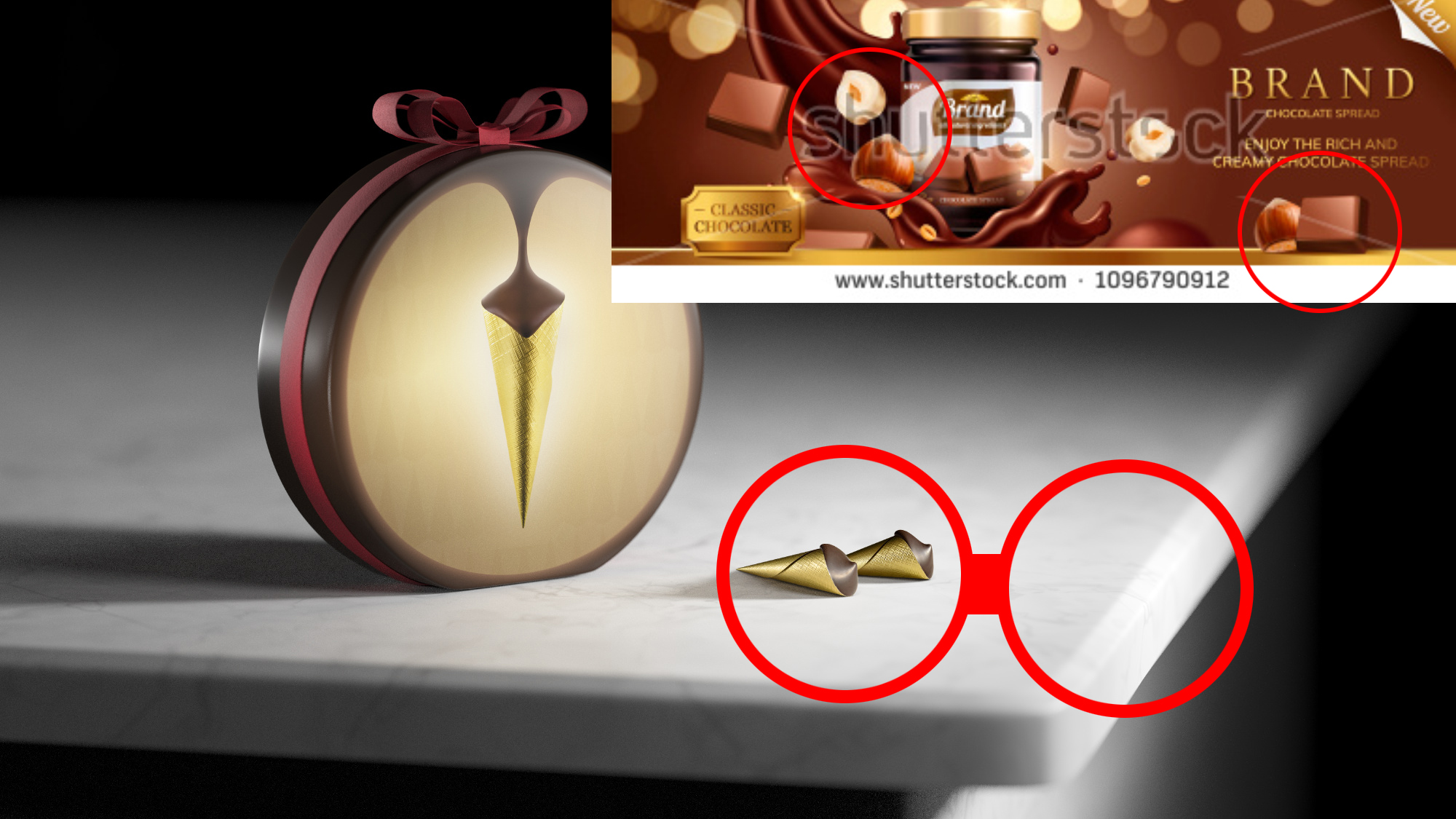
First off the material of the box is hard to read. I assume its made of metal or plastic. In both cases
the refletions are too diffuse (the foil on the chocolate bits is way better). Also try using an HDR image or several area lights from different directions to give it less flat and more realistic reflections. If the box is made of paper try using a normal map giving the surface some strucure.
Concerning the composition I think the chocolate bits could be positioned better. Try using a wider focal length and place them a little closer to the camera to make them look bigger.
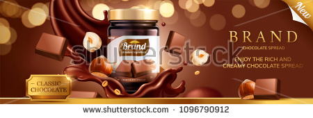
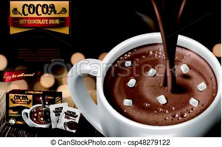
If you look at the reference picture Soul_Gatherer has posted, you see how the nuts and the chocolate bits are scaled unrealisticly big compared to the glass in the background. That’s quite common in food product shots as the ingredients are supposed to catch your eye.
Also the part of the table’s edge which is in focus (and very bright) is positioned directly next to the chocolate bits which drives away your eye from the product. I’d recommend positioning the table differently so that only the blurry front edge is within the framing as the table itself has no importance for the produc shot.
If you run into troubles with the marble color appearing wrong when using warmer lights try rendering it on a seperate render layer and adjusting the colors in post.
Hope I wasn’t too nitpicky