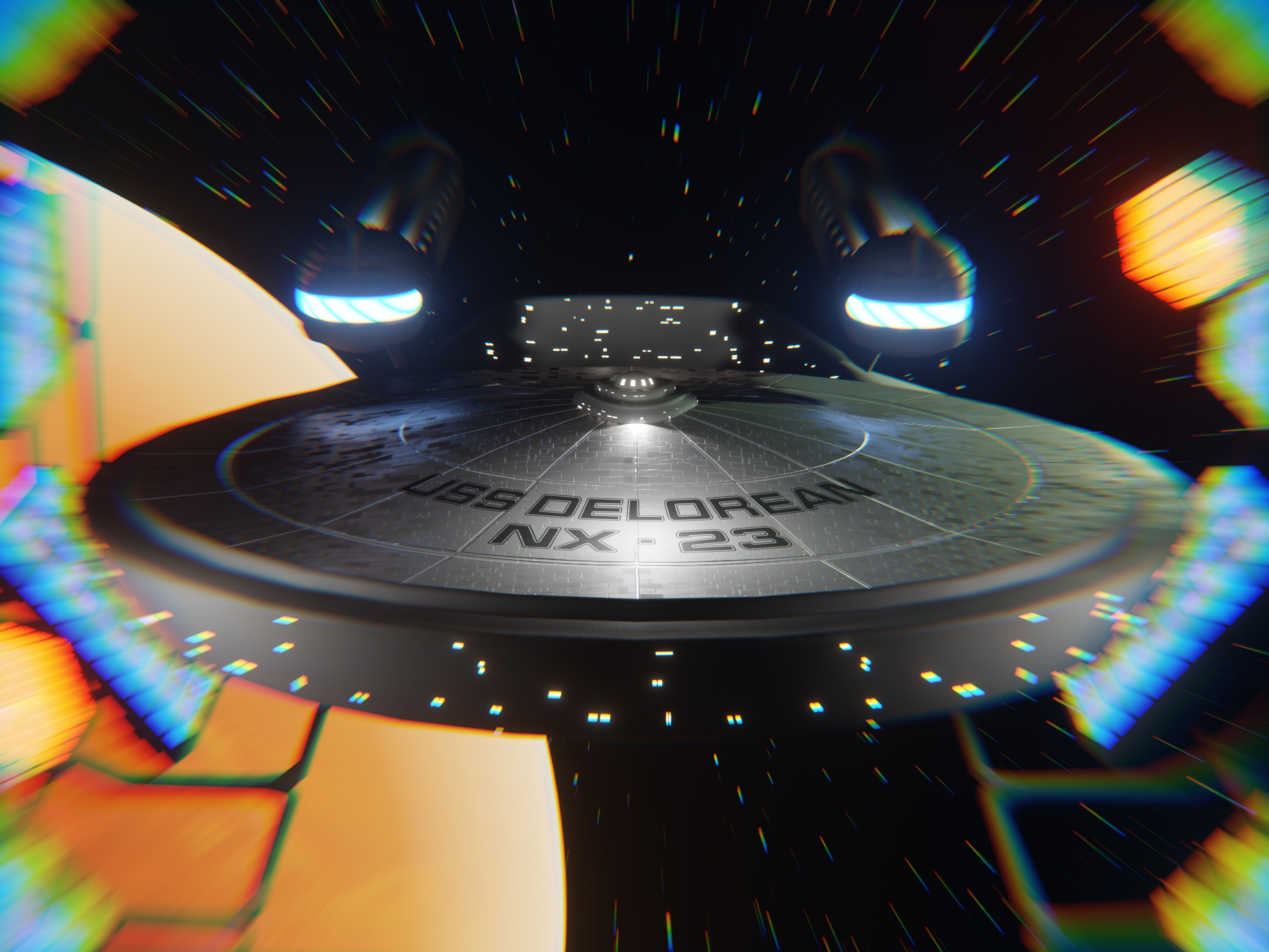
Hi all, I am working on a short animation that sort of mixes up sci fi franchises. However, when I come to a scene, I cant sem to find the right composition. I’ve settled on this one, leaving spacedock, But i have a few other scenes whcich look really amatureish. I probably need to work on lighting, But i cant figure out how to frame these ships to give an adequate sense of scale, or drama
Hmm, composing space elements is probably a bit more challenging than earthbound subjects, since you cant use things like atmospheric fog or something to imply distance.
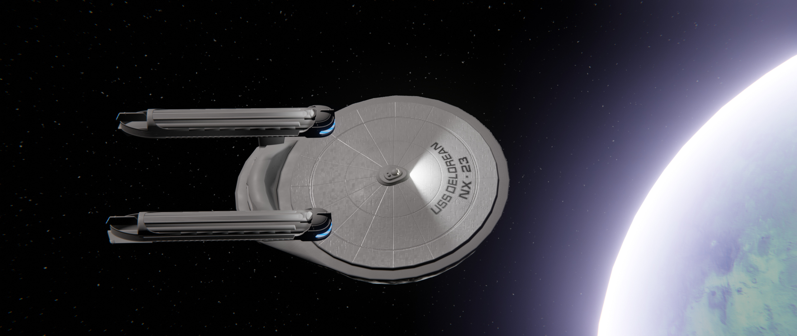
Your first image I would find more appealing if it wasn’t cropped so close to the ships edges, it’s almost a tangent and feels a little cramped to me. If you haven’t already, I suggest checking out tutorials on composition for artists like fore example https://www.youtube.com/watch?v=HtJz_31yaLk
those kind of tutorials will tell you about the golden rules, repetition, and leading the eye through an image, usually. that might inspire you to make some nice compositions.
Another difficulty with space images is that the objects are harshly lit. Maybe you could add more special effects or fake space dust or something to make it seem more exciting, but that is not very realistic so I could understand why that would not be an option. I like the first image more because there is action and colour effects.
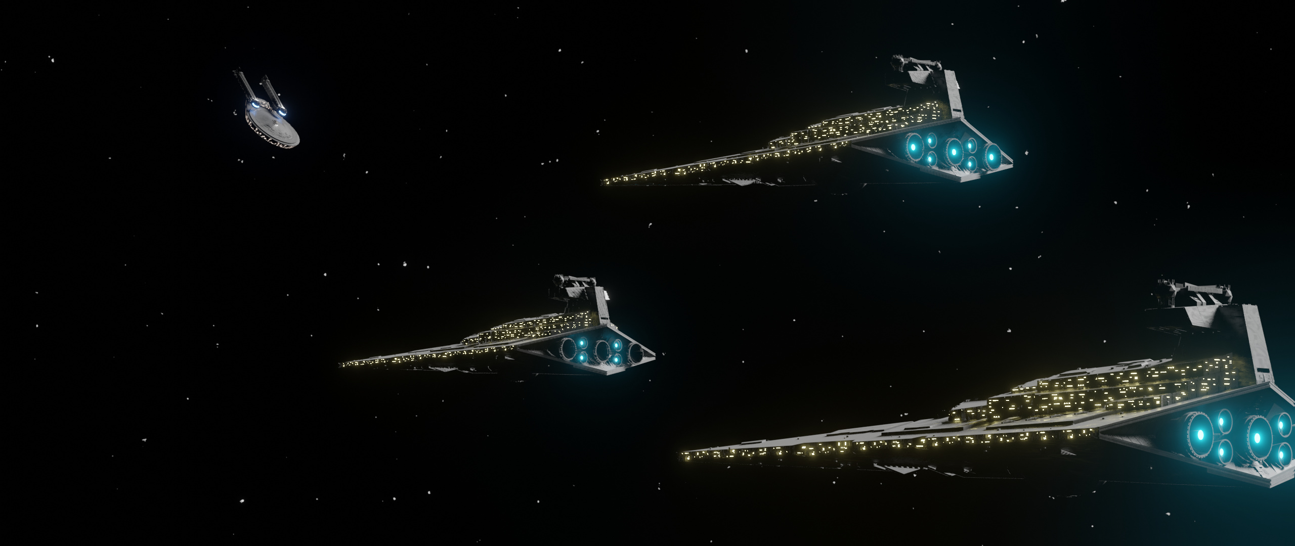
Technically, I think the third composition is “better” in the sense of how the elements are spaced out, my eye flows from the closest ship to the furthest, but since they look all the same, and your “main character” is so far away, it detracts from the potential “story” of the image.
Another alternative to solve this is to add motion blur or “action” to the third image, or maybe reverse the POV: have the startrek like ship up close and the triangle ships further away. You could also make it a space battle to add visual interest and action. explosions and lying debris.
Regardless of how you want to proceed, you should take inspiration from space art like book covers or just sci fi artists (2D and 3D) and check out what makes those pop and see if you can emulate it.
some interesting notes there, I haven’t started on the effects yet, I am still blocking out scenes and stuff, and haven’t put motion blur yet because i am still testing the animations (also, vector motion blur in eevee only works by making a pass in cycles, and that causes some weird artefacts when objects pass over others). I think i need to expand my references a bit, you’re right. I’ve basically been looking at clips from star trek and calling it a day.