Conan the Barbarian NPR / grease pencil turntable

Adobe Express - Conan_horse_grease_pencil_01_ (1)

Here for the higher res turntable: https://www.artstation.com/artwork/Jr6kQz

My cel shaded and inked sculpt version of John Buscema’s Conan the Barbarian 189 cover (December 1986).

I previously shown the chalk render version of the sculpt out of 3DCoat (scroll down here in this post to see how I processed them in Blender).

The final version: materials, grease pencils and NPR render out of Blender, color graded in DaVinci Resolve, and in Photoshop for the static images.

54 Likes

amazing work, looks like pixel art.

1 Like

Hah, lol, it’s not intended, it’s just I had to export a low res version for the gif to have a decent framerate on socials, and still upload.

But thank you! :smile:

1 Like

This is :exploding_head: :exploding_head: :exploding_head: and having grown up reading these it’s also :star_struck: :star_struck: :star_struck:

Could you please show the grease pencil and untextured model separately? I’m trying to understand how this was done.

EDIT: Ok, found the sculpt, but I could not find the grease pencil parts. Is grease pencil just used instead of texture painting, and what’s the benefit of that?

2 Likes

Thank you! :slight_smile:

(I hear you mate, this Conan issue arrived in Italy in the early '90s, when I was about 16yo, and it was late in its run: I much preferred its previous years, but in the covers, at least, Buscema still inked himself, and he was great!)

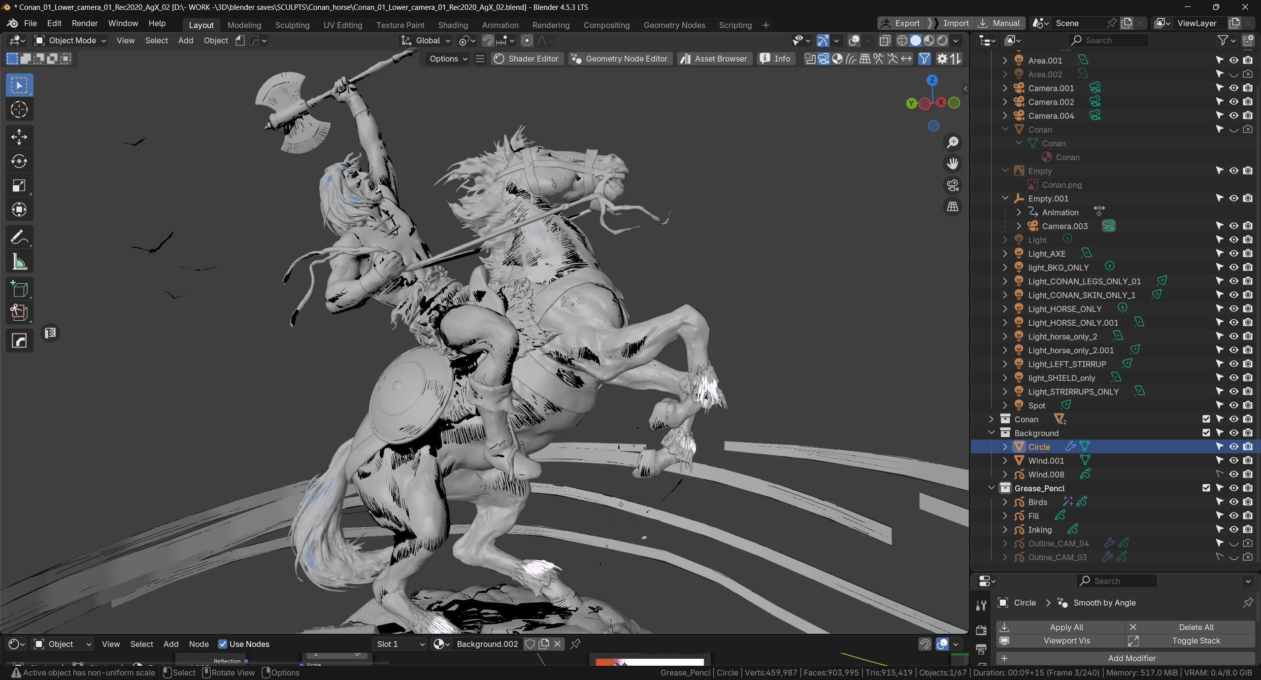
The scene and setup are really simple, if a bit tedious: I sculpted the scene in low / mid density in 3DCoat, and converted it to, like,10M triangles in Blender.

That res and definition makes it really not finished, as a sculpt, and if the sculpt were the object, I would aim for at least 40M total for this piece.
(For instance, this sculpt fails badly to support the shading of the face).

But for the purposes, I decimated to 1/10 of the triangles to ~1M of them, and add a smooth modifier on top on that! (counterintuitive, but needed, to have smoother shadows from the shadeing, and to be able to actually ink in GP, on my low spec PC).

This is the result:

Then I did the cel shading:

The scene is separated in meshes by color, so I don’t have to do any texturing, but only carefully place lights on the scene to make the shader’s ramped colors to “appear” as I needed.

Here’s a material, the horse’s body:

Then I add the manual grease pencil inking and the gp lineart modifier (that is not active in this screenshot, as it’s camera dependent):

In the inking you see I added white and blue strokes where needed on the hair, because the shading was not sufficient (the shadows were too prominent).
And besides, those hairy areas on the hooves, while they work in the voxel sculpt, don’t have enough geometry to live here, these are just bad, my mistake, I’ll possibly go back on them.

Plus, the vultures in the sky I did as a separate grease pencil.

And the wind or vapour dynamic effect I did by mixing a shader like the previous one with a transparent one, driven by a color attribute.

I exported in ReC2020 / AgX to support the final color grading outside Blender to my taste, but before that I tried to be faithful to the colors of the ref (more or less: I had too many moving parts related to the lighting to be actually very accurate):

Finally, I noticed a couple of differences on the pose of the sculpt, in relation to the ref, but as they are not errors per se, in the sculpt, I left them.

Is grease pencil just used instead of texture painting, and what’s the benefit of that?

So yes, and the benefit is that I don’t need to do UVs, plus, texturing, on my PC setup is extremely slow, while GP, in surface mode, on a ~1M triangles scene, has just minimal lag.
The cons of GP, imho, is that you can’t use shaders on them, and its UI/UX could be less convoluted.

12 Likes

Thank you so much for the detailed explanation!

I think I understand now, as the greasepencil strokes are separate from the texture and material, they offer more control (and also, I guess are resolution independent).

The combined effect is super nice! (Also, crazy how faithful it is. I think the issues we got in Sweden were anthologies, because they were almost a hundred pages long and I remember them having beautifully painted covers… I just checked, many of them were apparently by Earl Norem and Bob Larkin.)

1 Like

You’re welcome (and tbh, it just looks faithful from a distance, and from an angle, I guess; I’ve noticed more odd things as I was typing my reply).
But yes, GP is a convenience, for static imagery and animation renders.

Earl Norem… I think I only saw that Silver Surfer famous cover, on actual print; I guess as he was more expensive than regular artists, he was not used on regular covers.

And in Italy, Marvel and DC regular issues were bundled in magazines containing 2,5 stories monthly, among a number of different publishers, while collections, in the early 80s were just unsold magazines glue together and re-sent to newsstands, with no new covers…

So, possibly, in Sweden, your national publisher was more caring for the product than in Italy!

1 Like

I featured you on BlenderNation, have a great weekend!

1 Like

Thank you Bart! You too! :smile:

1 Like

You’re on the featured row! :+1:

1 Like