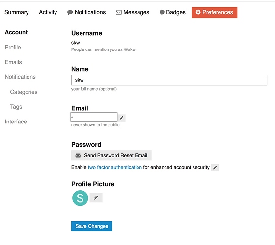
The current forum UI violates the law of similarity, which is a basic principle of interaction design. There are too many styles of buttons for no apparent reason.
See the attached screenshot:
It is hard to tell what is just text, what is an active button and what is an inactive button. Some items have icons (the little pencil), some have icons and text, some only text. Likewise, some buttons have a square border and others don’t. Some use color, some don’t. Some have rollover highlighting (which seems out of place in the age of touch screens), some don’t.
From a quick glance, there are two items that jump at you - the ones in bold colors and squares. Oddly enough, one of them performs an important and destructive action (“Save Changes”), where the other (“Preferences”) triggers a page reload only to bring you to the page where you were already.
The buttons in pure text are close to impossible to tell from non-button text. Note how “Account”, “Activity” and “Username” differ only slightly in looks. One of them is an active button, one is an inactive button and the third is just text.
This is just confusing and turns the page into a “what is clickable?” game of hide and seek. It has been demonstrated in studies that this kind of styling makes for a bad user experience.
May I suggest a consistent style for all items that are clickable? A distinct border, a consistent color or underlining?
