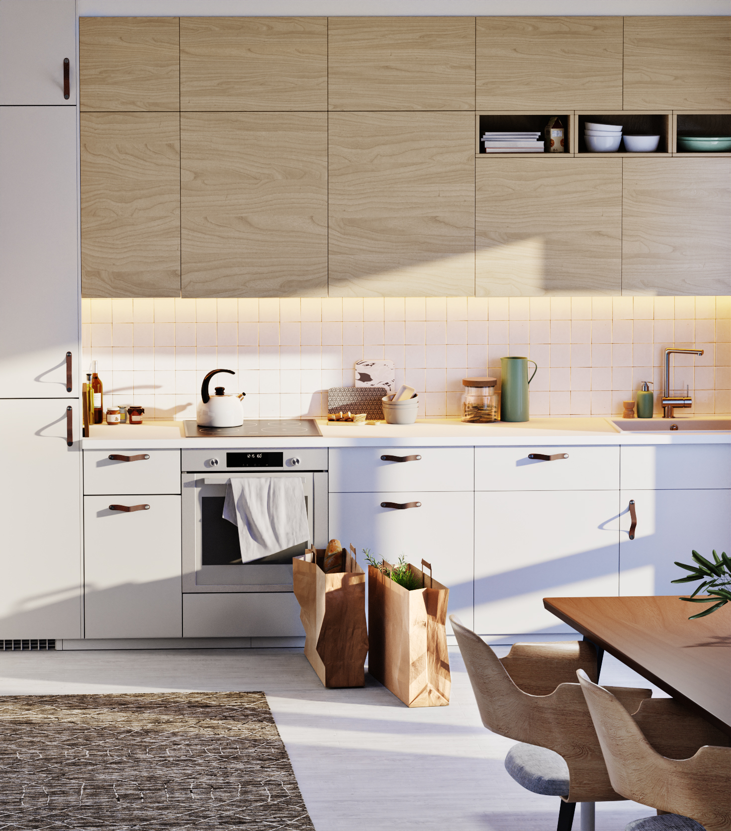
Trying to copy an ikea image, focus on improving workflow.
4,5 hours worktime
Original: https://www.ikea.com/de/de/rooms/kitchen/gallery/zen-kueche-erholungsfaktor-beim-kochen-pub5f889da1
48 Likes
Nice, you got it pretty close.
edit: One note about composition though, in ikea they have this bit of wall on the right side of the image, which also serves as a foreground object to the composition, yours doesn’t have it so it lacks a bit of the depth…
I think it looks pretty good. There’re a few details that could be improved but otherwise it’s nice.
Constructive criticism at its finest. ![]()
2 Likes
Well, I like your tile material.
But I agree the image is a little funky. In particular the object placement is just… off. You made sure to add imperfections to everything so that it’s more realistic, and that’s good but… it’s sort of in the uncanny valley of object placement. The imperfections are just too perfect, if that makes any sense at all. It feels very staged, instead of lived-in.
Also, that counter lighting is way too powerful. There’s not a counter lamp in existence that can do that good a job of competing with the continuous nuclear blast in the sky.
All of this applies to both yours and the ikea images, so if you just wanted to copy it, mistakes and all, good job I guess.
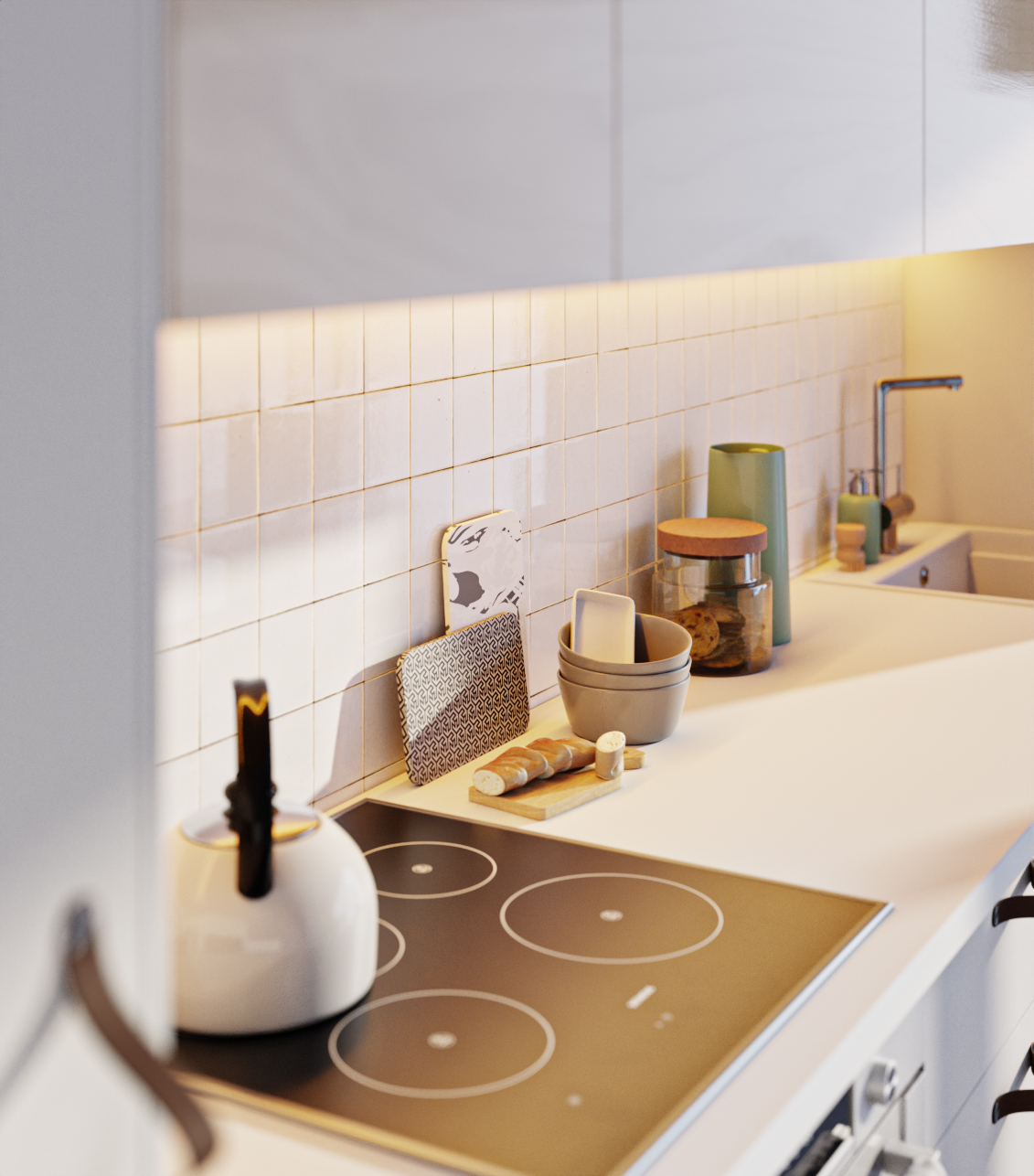
The tile surface is very realistic. The other surfaces are too equal concerning the reflectivity. The ceramics cooking field definitely needs more reflection. The white closet surfaces should be different from the wood colored. Its too perfect to be realistic.
Wow. I hoped it was sarcasm…
2 Likes
that is really fast work! your render is close to the photo.it will be interesting to see this rendered with luxcore.
Thank you.
1 Like
I think it looks great. It’s perfect-world-realism, just like the Ikea photos.
Hi!
Really cool images! Love the way you put this together. I also looked at the original and frankly, it looks better. But IKEA has a whole team dedicated to creating their 3D visualizations and their image was not done in 4.5 hours. I don’t even think they would recreate it in that amount of time.
There are some things that I would like to give feedback on. First lighting, or possibly post processing. I think that you have slightly too high contrast in the image. You lost some detail on the bags thanks to a darker shadow. The handles also stand out as darker.
It is not by much, but perhaps try a different contrast setting in the color management filmic settings.
It also feels a bit too orange. When something gets lighter it should naturally be desaturated and it feels like that is not coming into play correctly in some areas. Perhaps it became more saturated during post processing.
I also think that there is a slight scaling issue with the things on the counter. I think most of the objects are slightly too small. If I Imagine picking up a piece of bread in my hand it feels like it would be a tiny piece in my palm.
Perhaps even remove the bread. It is not very logical to me that you would have fresh bread on the counter, sliced and ready if you just came home from the mall with two large bags. Perhaps add a pair of shoes on the floor instead, like someone kicked off the shoes and left the kitchen for a quick visit to the bathroom or something. My idea is to focus on one story anyway.
My last point. In your second image the handle closest to the camera looks like it is cut off and are not blowing in the wind or something. I am not sure what happened to it, but it does not look real to me.
Hope I made some decent points^^
/Erik
1 Like
Checking the images side by side is really hard to find mistakes. Only by comparing pixel by pixel I can spot some differences and start talking about them. But that would take a long time.
(eg: glass stove needs more reflection, towel and bags need light scattering, bags need more detail, edge of the table would reflect light of the floor, lights at the tiles should color bleed – adding such imperfection might be a good idea)
However these details came up to me after playing the game of spotting the differences. Initially I would not even realize, especially without a reference image to look at. 
1 Like
Thank you.
I featured you on BlenderNation, have a great weekend ![]()

Yes, you should slightly ease up on the contrast, but otherwise you nailed it.
Great work!
What is your lighting setup if it’s not a secret? Blueish environment + yellowish sun lamp?
What are your values for light intensity?
Amazing ! did you make all the model ?
Straight up, this is awesome on its own! Next to the photograph, we could nit-pick all day about the light and proportions and materials but I don’t want to! This is really good, bright and captures the spirit of the original.
I have a thought about the “Uncanny valley” comments. Your grouping and object placement has gone against convention - you use even numbers instead of odd. TWO bags, FOUR groups of items on the counter and they’re strongly separated.
My guess is this subconscious difference is most notable but hardest to rationalize for most viewers? I love this and 4,5 hours is lightning fast in my opinion! Cheers
Yes, exactly.
The most stuff. Rug is from poliigon. books, baguette and water boiler from chocofur.
I liked it. The tiles and the lighting. I would add some grunge, but that’s because I’m a dirty little fellow.
Good work
1 Like
I think you’ve captured the ambient light beautifully and good use of camera focal lengths for effect. Did you make all the models yourself or acquire them ? Just curious about total time required to produce this, and what challenges you faced to produce “copy cat ikea” catalogue. For me it’s always lighting :(…