I’ve been lurking around the forums for a while and really liked the community and the stuff being posted here. Since I want to improve my Blender skills, I decided to join so that I could share my experiences with you and learn from tips and critiques I get from showing my work. I used to do some 3D back in the days using 3D Studio Max under my Student License, but that license expired and I ultimately switched to Blender. I’ve been practicing a lot and learning how to use the software, so I thought I’d share my current project.
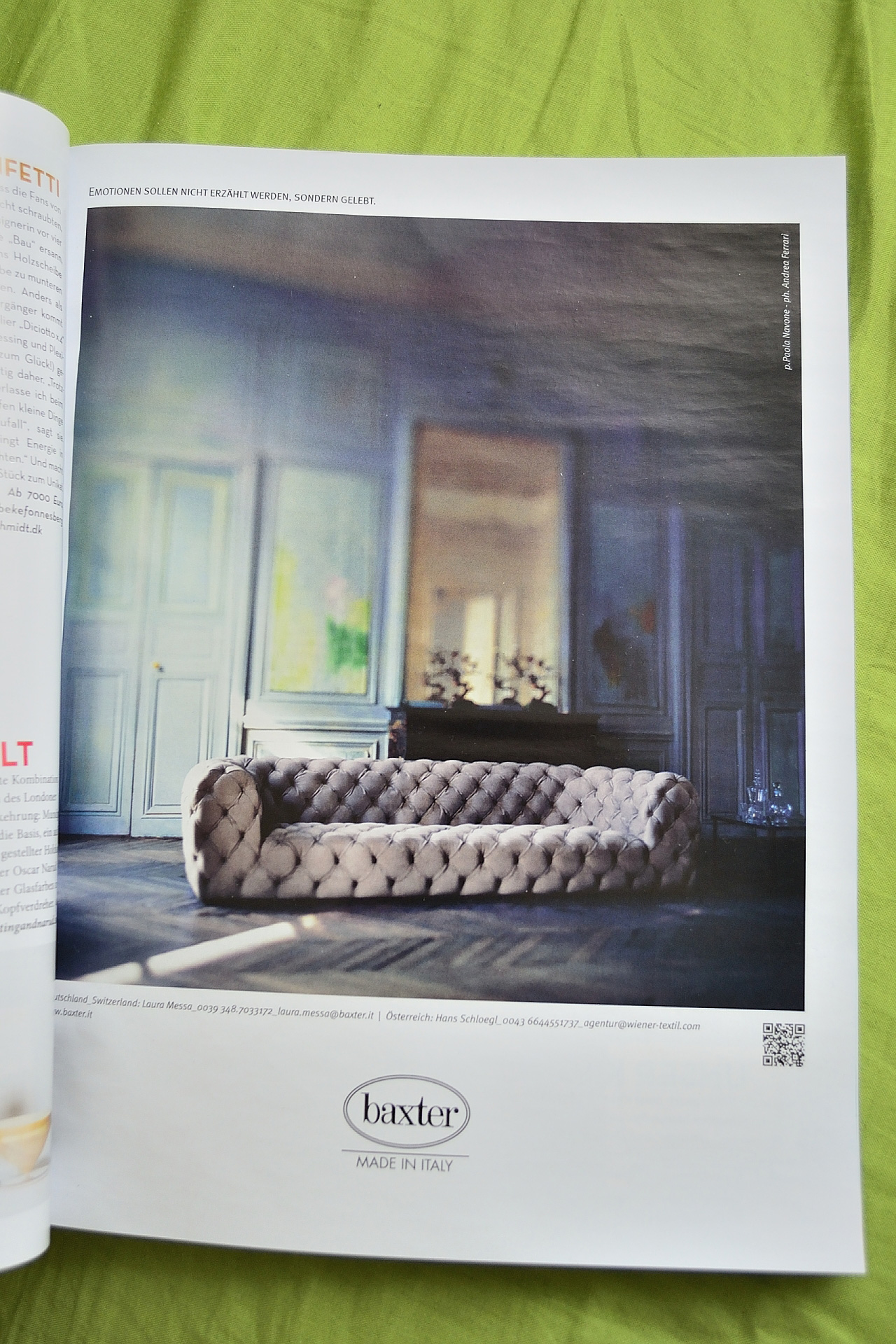
It is an interior design piece of sorts. Some weeks ago I bought an issue of Architectural Digest and saw the following photo of a couch on one of the pages.
It’s an ad of some sorts, but I really dig the entire scene really. The couch looks so bizarre and the lighting is really nice, so I thought I would try to recreate it in blender. Of course I would like to call the photo “reference” and “inspiration”, rather than “concept art”, as I don’t really have any measurements and have to eye-ball all proportions. Not to mention that much of the image is blurred, so I have to imagine what the shapes would look like.
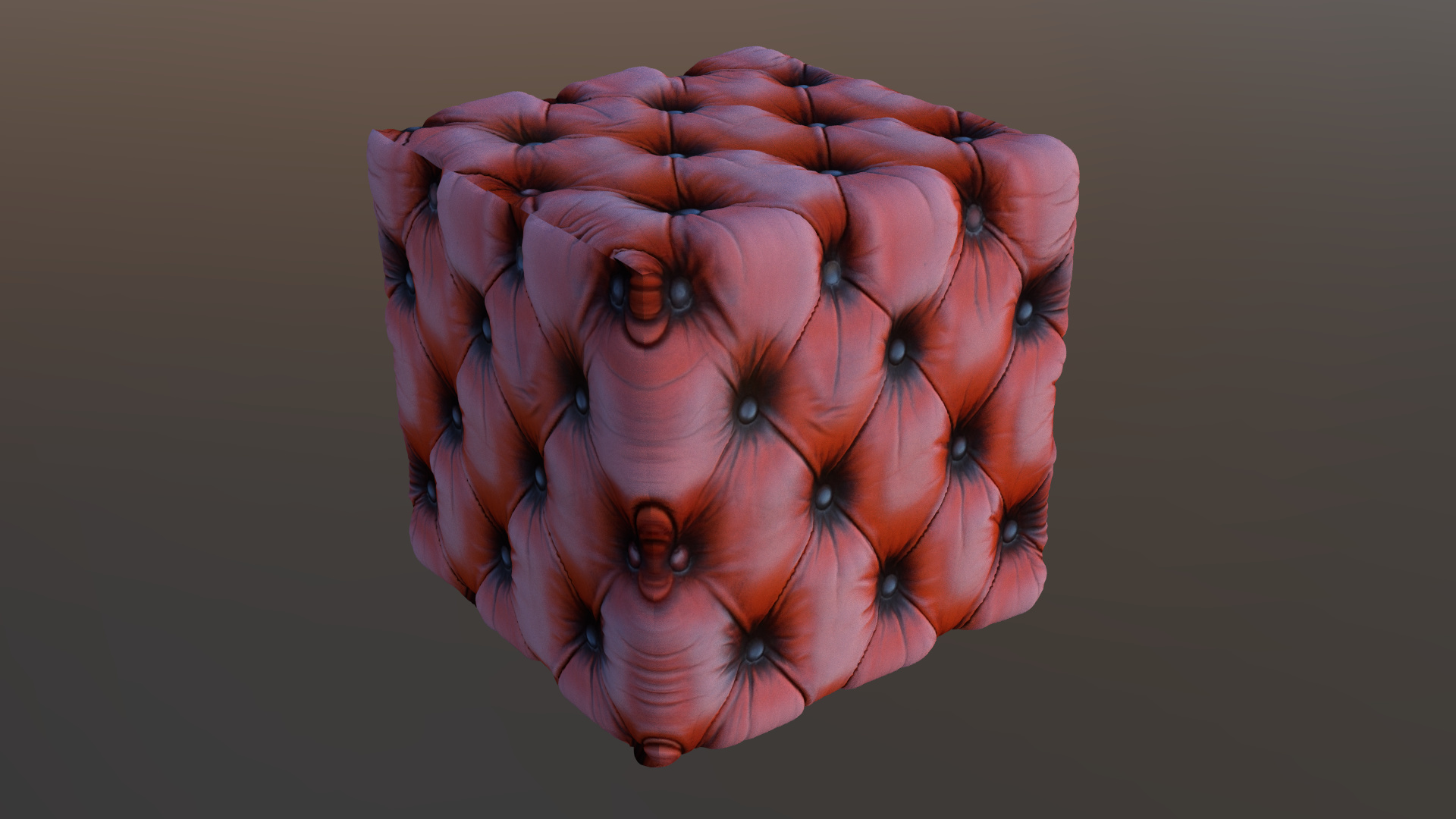
So far I’ve done basic blocking out of the scene and started shaping the panels of the wall in the back ground. I also did some experimentation with materials for the couch and this is the result I have so far:
I did basic cube mapping on the box, so some of the edges came out weird, but the ones that are connected came out really nice in my opinion, so when I UV unwrap the couch I hope it will show up just as nice. The material is a basic mix of diffuse, normal and height map, using true displacement in Cycles.
Quick update. I started separating the elements of the scene. Also some basic UV unwrapping to test the couch material. It’s working ok so far, but it doesn’t look very good without the diffuse map, so I’ll have to make one. UV unwrapping this thing is hard tho… I’ve no idea where to put the seams, because there are many edges that need to be seamless and that will be quite difficult to achieve I think. But for now I’ll model the wooden stand where the small tree/statues are and then I’ll work on my favorite part of the materials - the wooden floor
Thanks for the feedback, Elsdon! Yeah now that you mentioned it the panels looked way too wide. I also realized that the sitting part of the couch is way too high. So I did some modifications to it, unwrapped it and started counting the number of caps on each “plane” of the couch to make sure it resembles the one on the photo as close as possible. I also modeled the stand behind it and since I can’t really see what kind of wood it is, I decided to give it a nice dark walnut material. I threw in an environment map to just see what it looks like, but I think it breaks the mood, so I think I’ll get rid of it.
This is a quick early morning render before I get to work. Nothing too special as progress, but it’s something Also the caps on the couch look like moon craters now, but I’ll repaint them with a nice custom brush, once I have the right amount of caps. When the couch is done, it’s off to the wall material, which will be a beast of a mix with a couple of vertex painted masks, at least the way I imagine it.
Well I did a bit of work on the scene when I got back from work today. I made the little statue/tree things on the stand before the mirror. I tried to match the profile roughly and made them bronze on dark platforms. I’ll have to detail them a bit more later on, but for now they work as place holders. I worked on the uv unwrapping of the couch for quite some time and I’m still not satisfied with it, but I think I’m mostly dissatisfied with the displacement map. I have to figure something else out…
You’re making good progress, tofuman! I really like the couch material from post 1, it looks great! It reminds me of a demo video I saw for Ndo:
When you say you’re using true displacement, do you mean the experimental feature in Cycles? I think I’ve tried using that before, but couldn’t figure out how to get it working.
You may want to try using flags/gobos to block off and feather the light a bit, if you wish to recreate the lighting in your inspiration image. I think you may also be able to give a light a negative value in Cycles, to have the effect of darkening instead of lightening an area. As often, there are multiple solutions.
What is your avatar image from? I really like the look of it! Welcome to the forums!
Hey James! Thanks for the nice words and tips! Yes, I am using the experimental feature in Cycles for the displacement. It can be a bit fiddly to get to work, had trouble with it myself. In this case I had forgotten to set the displacement mode for the object to true - since by default it sits on bump and you barely get any visible result with it. But even if you get it to work it’s still rather unpredictable. The current state of the scene won’t refresh the displacement in render view mode for example. Don’t know if that’s an issue with the GPU render under Cycles or if it is a bug in the current version of the displacement map itself.
EDIT: Oh yeah, I made the normal map and the displacement map myself out of a diffuse map that I got off of cgtextures I think. I used nJob, which is a freeware software for making heightmaps and normalmaps. It’s quite snappy and has worked great for me so far. /EDIT
However I have to say I’m considering moddeling/sculpting the pins on the couch, since using the displacement map requires a propper UV unwrapping and I’ve been messing around with it for so long that it seems impossible to unwrap the couch to fit the inspiration image as close as possible. The shape of the couch itself is really weird so I can’t get it to work… In the end the displacement requires the couch to have so many subdivision levels, that I believe the scene won’t have a problem handling the hand sculpted couch. Then I might just use the automatic unwrapping and bake the ambient occlusion to it, so it gets a bit more depth and use regular cube mapping for the actual fabric of the couch. I’ll see if works out. I can’t really do progress on the scene, since I’m away from my machine until 18th and currently writing from my dad’s pc, which cannot handle blender to save its own life
I don’t really know what flags/gobos are, but I’ll read on it, since the lighting in the scene is one of the things that fascinates me the most. So if it can help me achieve some nice effects, than it’s good in my book! And this with the negative light I didn’t even know! It might turn out to be pretty dang helpful to simulate some artificial light conditions.
Thanks again and I hope to update the thread with some new work soon!
P.S. My avatar is a random picture I found through google when I searched for cyberpunk helmet designs. Cyberpunk is something really inspiring for me
Thanks for such a thorough reply! You may have already looked it up, but just in case, flags and gobos are two types of light modifiers, specifically designed to cut back on light. Flags are basically just black rectangles that are placed in a scene to either directly block or minimize reflections of light, whereas gobos (short for go between) are generally cutout shapes that go directly between the light source and the scene/subject. A common example is leaves on a tree, or window muntins (go ahead and google it, I had to), but a gobo can also be an abstract shape. The basic idea is just to create areas of light and shadow. You will find that these light modifiers are called different things, between photographers, cinematographers, and I’m sure even theater production crews.
A good site to visit is strobist.com . I’ve learned a lot about lighting from it over the years, and everything is well organized and easy to find.
I quite enjoy cyberpunk art myself, I did a quick google search to find your avatar, and spent an hour looking at all the search results!
Hey, James. Yes I did have a quick look into what gobos/flags are. I came across different solutions, one of which was to simply project an image from a light, which I kinda liked, so I might try it in combination with other light sources. Again - thanks for the tip!
Oh, and here’s the first image page from google with the image of the helmet on my avatar:
It shows up on the fourth row, when I open it. In any case, it’s an image found on Pinterest, so not much background to it there sadly…
Ok, so here’s a bit of new stuff:
I was still struggling with the couch and didn’t really like the generated heightmap from the texture that I used before. A buddy of mine suggested I bake my own, so I did. It has a bit less detail than what can be seen in the reference, but the cushions are much better on this one, in comparison to the generated one, so at least I have a good basis to work on. Might just add that extra detail touch with a normal map…
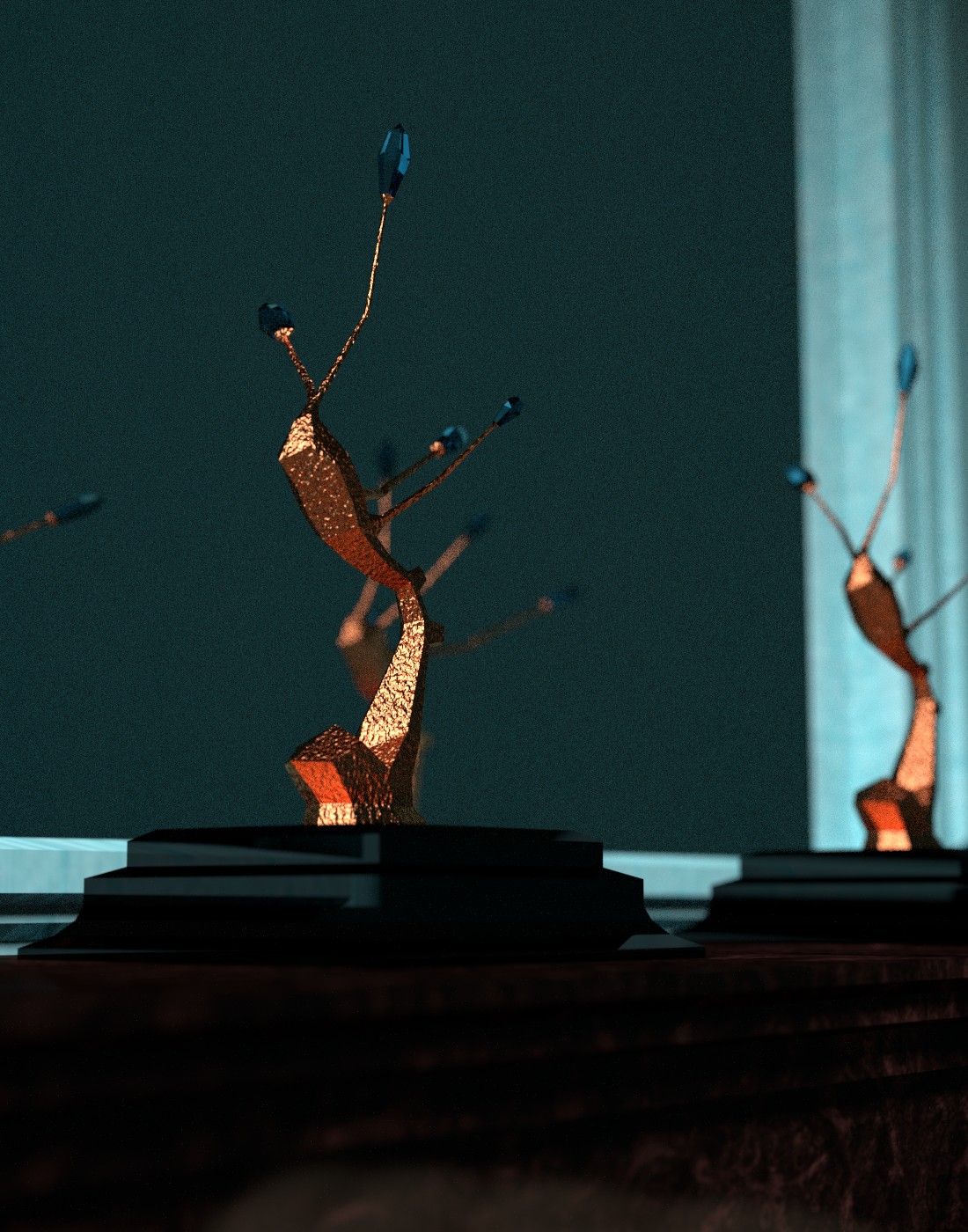
I also remodeled the brass sculpture thingy. I decided to add a bit of fantasy to it, so I made a weird brass/crystal tree thing. I’m thinking if I should make the crystals glow…


 Also the caps on the couch look like moon craters now, but I’ll repaint them with a nice custom brush, once I have the right amount of caps. When the couch is done, it’s off to the wall material, which will be a beast of a mix with a couple of vertex painted masks, at least the way I imagine it.